WORK PORTFOLIO
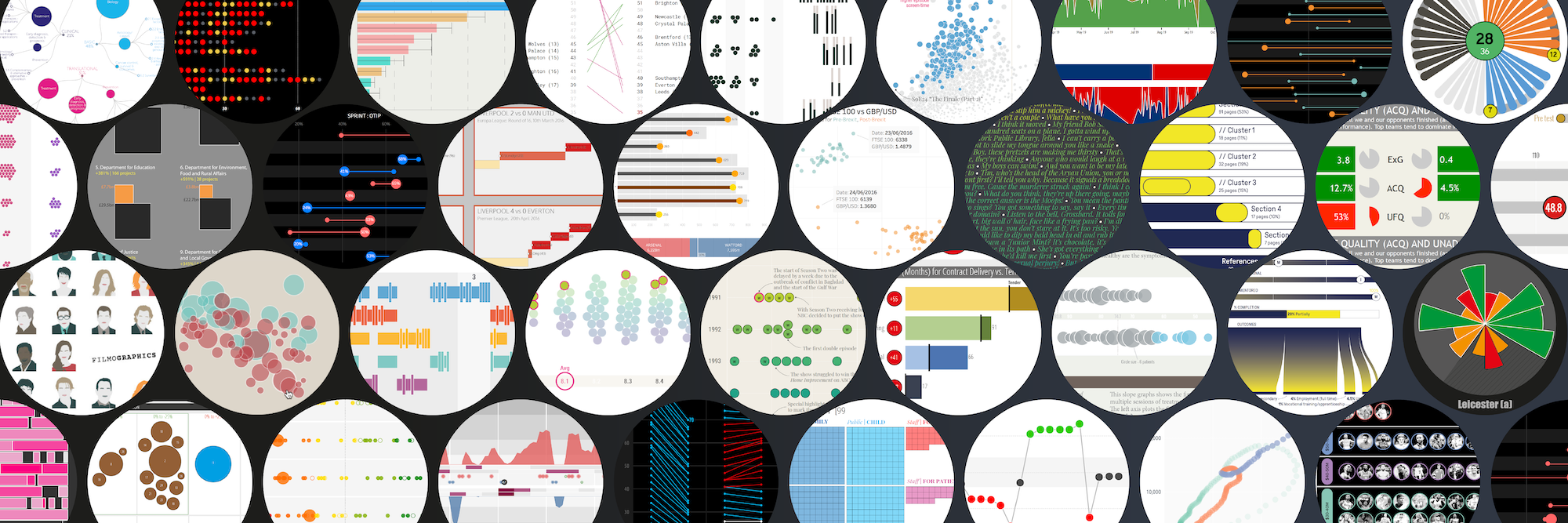
This is a portfolio of work examples that characterise the wide range of my professional and public services, including learning resources and collections, as well as one-off personal projects. Not all commercial projects can be shared publicly but the work that is shown is created and shared with the motivation of spreading knowledge about good data visualisation practice.
Click on these navigation buttons to jump to the relevant sections:
Resources & Collections
CONSULTANCY


A motivation to help client organisations get more from and do more with their data themselves is at the heart of the range of visualisation design and consultancy services I offer.
The emphasis is always on offering best practice advice and assistance for developing client capabilities and solutions to their visualisation challenges. Rather than have data visualisation done to you, my motivation is to help you do it for yourself. My consultancy offerings include the following type of engagements:
- Data Visualisation Evaluation – Reviewing existing visual products (reports, graphics, projects) and providing expert advice on recommendations for potential improvements and enhancements.
- Concept Design Specification – Developing concept design specifications and/or providing detailed recommendations for visualisation solutions fit for an organisation’s purpose and context.
- Facilitated Consultancy – Often an engagement that works as a companion to a training workshop, this service involves helping clients/organisations lead on developing their own potential solution to a workplace challenge under facilitated guidance .
Recent consultancy engagements have included working with Rethink Ireland and NUIG, for whom I advised on and developed visualisations for inclusion in a report presenting findings from ‘An Evaluation of Rethink Ireland’s Education Fund‘:
“Thank you Andy for your expertise and patience as we worked through the final report. Your work has brought so much more clarity and vividness to ours. We very much look forward to working with you again in the future”, Dr. Cormac Forkan, Lecturer and Senior Researcher, University of Galway.
Between 2015 and 2020 I provided design consultancy services to Arsenal F.C. primarily working with the Performance and Research Team and erstwhile Head of Psychology & Personal Development, Dr David Priestley. Now working as an Independent Consultant Psychologist, I continue to collaborate with David developing graphical reports for his work with elite sports people as well as business executives.
“I’ve had the pleasure of working with Andy on many different analysis, data visualisation, and graphical presentation projects since 2012 and I have always greatly valued his expertise and professionalism, as well as his creative and critical thinking. I look forward to more years of collaboration going forward.”, Dr. David Priestley, Psychologist.
During early 2022 I had the pleasure of working with Bletchley Park’s Exhibitions Manager, Erica Munro, Elin Simonsson of Nissen Richards Studio, and other contributors, to provide data visualisation expertise to help shape a temporary exhibition, ‘The Art of Data‘. This exhibition explored how data can be visualised to reveal patterns and stories, helping us understand the world around us, and is framed around many of the themes synonymous with Bletchley.
TEACHING


As well as delivering commercial training, I’ve had over a decade experience of Masters teaching in several esteemed academic institutes. Between 2013 and 2017 I was a (remote) visiting lecturer at the highly respected Maryland Institute College of Art (MICA), in Baltimore (USA), teaching a module on the Information Visualisation Masters programme. Between 2016 and 2018, I also taught a data visualisation module as part of the MSc Business Analytics programme at Imperial College Business School in London (UK). From 2019 to 2024 I taught a data visualisation module on the MSc Business Analytics programme at the University College London (UCL) School of Management (UK). I’ve decided to take a hiatus from formal university teaching (and especially marking!) and look forward to exploring new opportunities in future when the time is right to jump back in.
I continue to enjoy delivering frequent guest lectures to other academic institutes, with the most regular relationship established with the Amsterdam University of Applied Sciences (AUAS), since 2020, teaching students on the Communication and Media Design programmes.
During the UCL academic year 2020/21 I hosted a ‘Data Visualisation Professional Development Q&A’ webinar.
This was organised to offer students, and other invited guests, the opportunity to hear about and ask questions about careers in data visualisation.
I was delighted to welcome an esteemed panel of guests including Lyndsey Pereira-Brereton, Dr Cath Sleeman, Alan Smith OBE, Valentina D’Efilippo, and Kyran Dale. This video was recorded in February 2021.
RESEARCH

Between 2014 and 2015 I was contracted as an external consultant working on a research project called ‘Seeing Data’, funded by the Arts & Humanities Research Council and hosted by the University of Sheffield.
Seeing Data was a group of research studies which aimed to better understand the place of data visualisations in contemporary society. The specific study I was involved in explored the issues of data visualisation literacy among the general public and, among many things, helped to shape an understanding of the human factors that affect visualisation literacy and the effectiveness of design.
Since 2021 I’ve provided expertise on a University of Leeds led, National Institute for Health Research (NIHR) funded research to conduct analysis of our eRAPID cancer patient symptom datasets and evaluate how symptom data can and should be presented to patients.
In July 2022 I was thrilled to be invited to participate (remotely) in the prestigious Dagstuhl seminar about ‘Visualization Empowerment: How to Teach and Learn Data Visualization‘.
WRITING


Beyond writing books, I frequently writes articles for other websites and publications. Some recent pieces include:
- “A Recipe of Capabilities for Pursuing Expertise in Data Visualization: A Practitioner’s Perspective”. This article originally appeared in ‘IEEE Computer Graphics and Applications (vol. 41, no. 1, 2021)‘ and was then also selected for inclusion in the January 2023 issue of ‘Computing Edge‘.
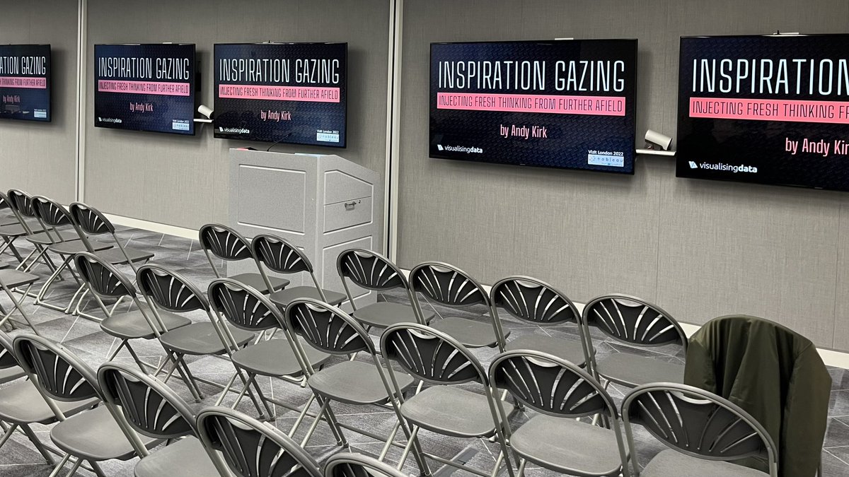
- An article for the second issue of Nightingale magazine, titled ‘Inspiration Gazing: Injecting Fresh Thinking from Further Afield, relates to exploring further afield for sources of inspiration that are somewhat external to and beyond the typical boundaries of what one would see as the data visualisation ‘field’.
- Also for Nightingale, but this time the website version of the journal, a 2019 piece asking (and answering) the question ‘What Makes a Data Visualisation Elegant?
APPEARANCES



![Part of a panel at the Digital Sport North meetup event in Leeds, February 2023 [photo credit: Sarah O'Neill]](https://visualisingdata.com/wp-content/uploads/2023/03/Hero_Talks.jpeg)
I am always really grateful to be invited to give in-person talks at conferences or when visiting organisations, deliver presentations on virtual webinars or online events, and participate as a guest on other podcasts.
Here’s a full compilation of all my past appearances dating back to 2010.
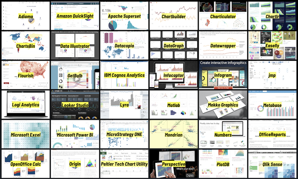
THE DATAVIZ RESOURCES CATALOGUE
My long-running catalogue of Data Visualisation Resources has for many years been the most-popular, most-visited, and most-referenced content on my website. It includes nearly 300 data visualisation and related tools that assist in the process of creating a data visualisation. I try to keep a watchful eye on new resources that need including as well as weeding out those that become obsolete. The resources listed are organised across seven categories, roughly classifying the tools based on their primary form or purpose:
CHARTING: This category includes applications for creating charts, visually exploring data and in some cases developing interactive solutions through no-code/low-code platforms.
CODING: This is a collection of libraries, frameworks, toolkits, and environments used for programmatically developing charts and dynamic visualisations.
COMPLEX: These resources are for handling more complex visualisation tasks involving multivariate and/or qualitative material.
MAPPING: These list some of the many packages, utilities, and libraries for mapping data and performing spatial analysis.
DATA: This is a selection of applications used for the collecting, handling, integrating, and transforming of data.
COLOUR: These resources are useful for generating and editing colour palettes, as well as practical, theoretical, and inspirational sources of guidance.
SPECIALIST: This ‘catch all’ category, finally, covers a broad collection of design, presentation, publishing and other niche resources that can supplement the visualisation development workflow.
THE CHARTMAKER DIRECTORY
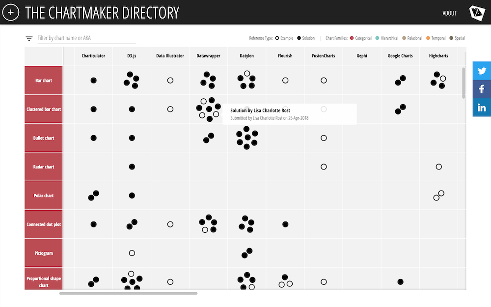
The Chartmaker Directory is a popular catalogue of examples and solution references to help answer common questions that get asked about the capability of different tools with respect to making different charts.
It includes around 40 of the most common tools, drawn from the resources catalogue, whose primary purpose is making charts. The directory then displays 50 distinct chart types and at the intersecting cells for each chart-tool combo, where relevant, are links pointing to examples (indicating the particular chart is possible to make in the particular tool) or, more usefully, to solutions that give the answer to ‘how’ (to make that chart, in that tool).
The directory began life as an organised repository of my collected bookmarks, but was then expanded to become a crowd-sourced and openly published resource, available for anyone to access and contribute.
Though it does not claim to be – nor could it ever be – an exhaustive directory, with nearly 1500 references and growing it should at least offer a useful and practical guide to help you understand what tools can make which charts, and which charts can be made with what tools.
The 'LittLE OF DATA VISUALISATION' SERIES
This is a collection of posts from the ‘little of visualisation design’ series, also known by its shortcut hashtag as the #LittleVis series.
The purpose of the series was to showcase the small design features and smart innovations that make a big difference towards the effectiveness, or otherwise, of data visualisation design.
In each post I focus on one sample project and highlight just a single little feature exhibited, even if there were several to choose from.
For convenience, you can access the full collection, in one place, in chronological order.
THE 'BEST OF...' DATA VISUALISATION SERIES
When I launched my website in 2010, primarily as a blog, I began curating and publishing monthly collections of links to some of the best, most interesting, or thought-provoking data visualisation-related content I come across.
The world of data vis content was much smaller, and easier to find back in 2010. These monthly posts were always published in simplistic list form. I briefly considered committing more time to making them more visual, maybe with image extracts of the works selected for inclusion, but pragmatism was necessary to keep the task viable, and so the trade-off decision to just publish lists was persevered with.
As the field grew in the early 2010s, so too did the explosion of new visualisation work and written content. This led to an extra level of content grouping for the posts:
- Visualisations & Infographics: Covered the latest best visualisation, infographic or other related design works.
- Articles: These were references to written articles, discourse or interviews about visualisation.
- Learning & Development: These links covered any presentations, tutorials, podcasts, academic papers, case-studies, how-tos etc.
- Subject News: Included announcements within the field, such as new sites or resources, new book titles and other notable developments.
- Sundries: These were links to other interesting contents, sometimes informal, but not necessarily related to data visualisation, maybe with have a data, technology or visual theme.
These posts were always very popular, not just in generating traffic to the site but also in the perceived cachet of being included. The selections were always made purely on the basis of what I found to be the best, most interesting, or thought-provoking data visualisation-related content I encountered. I was always more thankful of people producing the great work I linked to, more than they could be to me for including them!
After publishing the round-up of best stuff from December 2021 after 153 editions and 12 years after posting my first, I decided to bring an end to my efforts publishing these collections. This was due to increasingly limited spare capacity to undertake this time-intensive monthly commitment and because the platforms, channels and networks I relied upon to source new content were becoming every more fragmented.
You can browse the full collection, in one place, in chronological order. Please note that some of the URLs within these posts will be broken or obsolete, the inevitable consequence of digital decay.
The '10 SIGNIFICANT DEVELOPMENTS' SERIES
10 significant visualisation developments: July to December 2012
10 significant visualisation developments: July to December 2011
10 significant visualisation developments: January to June 2011
10 significant visualisation developments: July to December 2018
10 significant visualisation developments: January to June 2018
10 significant visualisation developments: January to June 2014
Through the 2010s, it was just about possible to feel like you had a handle on most if not all the latest significant developments in the data visualisation field. Or certainly, the western-dominant, English-speaking dominant part of this field.
During this decade, from the launching of my site in early 2011, to mark each mid-year and end-of-year milestone, I took a reflective glance across the data visualisation field over the previous 6-month period and compiled a collection of what I viewed as some of the most significant developments. These were the main projects, events, new sites, techniques, personalities, and general observations that struck me as being important or influential in shaping the development of the field . In some cases, it was simply some of the things I liked a great deal.
When the new decade arrived in 2020, although it was getting increasingly hard to reliably keep the finger on the pulse of the field, it was ultimately the disruption of the pandemic period that convinced me to bring this series to an end. Hopefully, those of you looking to learn a bit about the history of the data visualisation field will find the 18 collections informative, even if it is just the opinions of one person with a specific vantage point. You can view the series by visiting the link below.
The 'Six Questions With...' Series
Back in 2015/16, in order to sprinkle some stardust into the contents of my books, I conducted a few short interviews with a range of smart and talented professionals I knew from across the data visualisation and related fields. These people spanned a spectrum of industries, backgrounds, roles and perspectives.
I gave each interviewee a selection of question options from which they could choose six to respond, hence the series title being ‘six questions with…’.
Due to space limitations in the book, ultimately I could only include a handle of the countless great nuggets of gold they shared with me and so I turned each interview into an individual blog post. For convenience, you can access the full collection, in one place, in chronological order.
THE SEINFELD CHRONICLES
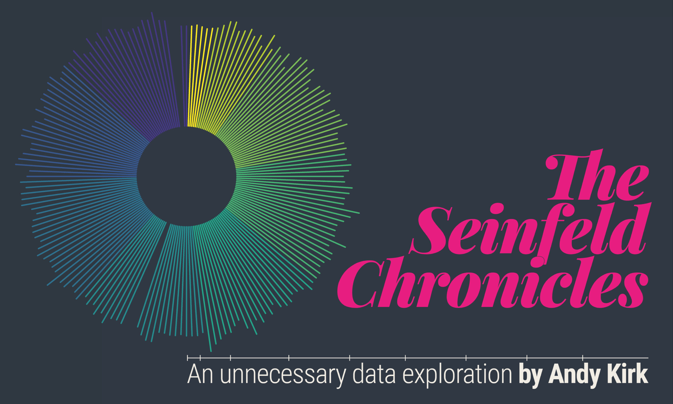


‘The Seinfeld Chronicles’ was the most ambitious data visualisation project I’ve worked on. It is a self-produced book compiling visual analysis in pursuit of a curiosity I had about the rhythm and texture of every episode of Seinfeld.
The musicality of language is something defines the signature comedic talent of Jerry Seinfeld and, co-creator, Larry David. Like music, situation comedy has rhythm and it has texture. The rhythm is shaped by its temporal structures and pacing; textures are formed from the arrangements of characters and locations which amalgamate into the comedy. All orchestrated by the storylines and dialogue emerging from the writers.
This work is an exploration of the show’s musicality. It presents a portfolio of visuals produced, intended for people who share my Seinfeld fanaticism. It is a body of work akin to giving the show something of a sports analytics treatment, investigating how Seinfeld and David utilised their resources – the people, places, and the dialogue – to translate their creativity from the page and onto our screens. The data used in this study did not exist, it had to be manually captured through watching every episode and logging the times, categories, and characteristics of different events within each.
The book was created as a printed product (via a deliberately limited-print run) as well as a digital version of the document, which you can browse through here. The printed product was a 240-page (cover to cover) full-colour, A4-sized, perfect-bound landscape book. Weighing in at 1.1kg it was a dense beast, a suitable physical manifestation of the efforts invested into it. I’m rarely content with anything I create, but I must admit I have a certain satisfaction with how this turned out. And I was not alone, thankfully, as the judges at the prestigious Malofiej 29 awards determined it was worthy of a silver medal!
The printed version was the primary intended format, but I wasn’t looking to formally publish it as a book to buy. I decided to make 176 copies (corresponding to the number of episodes of Seinfeld) available via a pay-what-you-want donation model, with people interested in obtaining a copy invited to donate any amount of their choice. I would personally cover the printing costs, handle all orders, the packing, and the postage of every copy and all proceeds (after shipping costs) would go to charity.
Upon launching the donation process at the end of September 2020 it took only two weeks for all copies to be snapped up. If the demand was overwhelming, the generosity of people was even more so. From the net proceeds of the total donations received (£5180.80) the two recipient charities, namely Samaritans and Rainforest Trust, each received £2590.40.
You can visit the project launch post to read more details, view a sample of the contents or access a digital viewer of the whole work. Additionally, below is a video of a presentation I recorded about the full design process behind this project.
FILMOGRAPHICS: VISUALISATION CASE STUDY
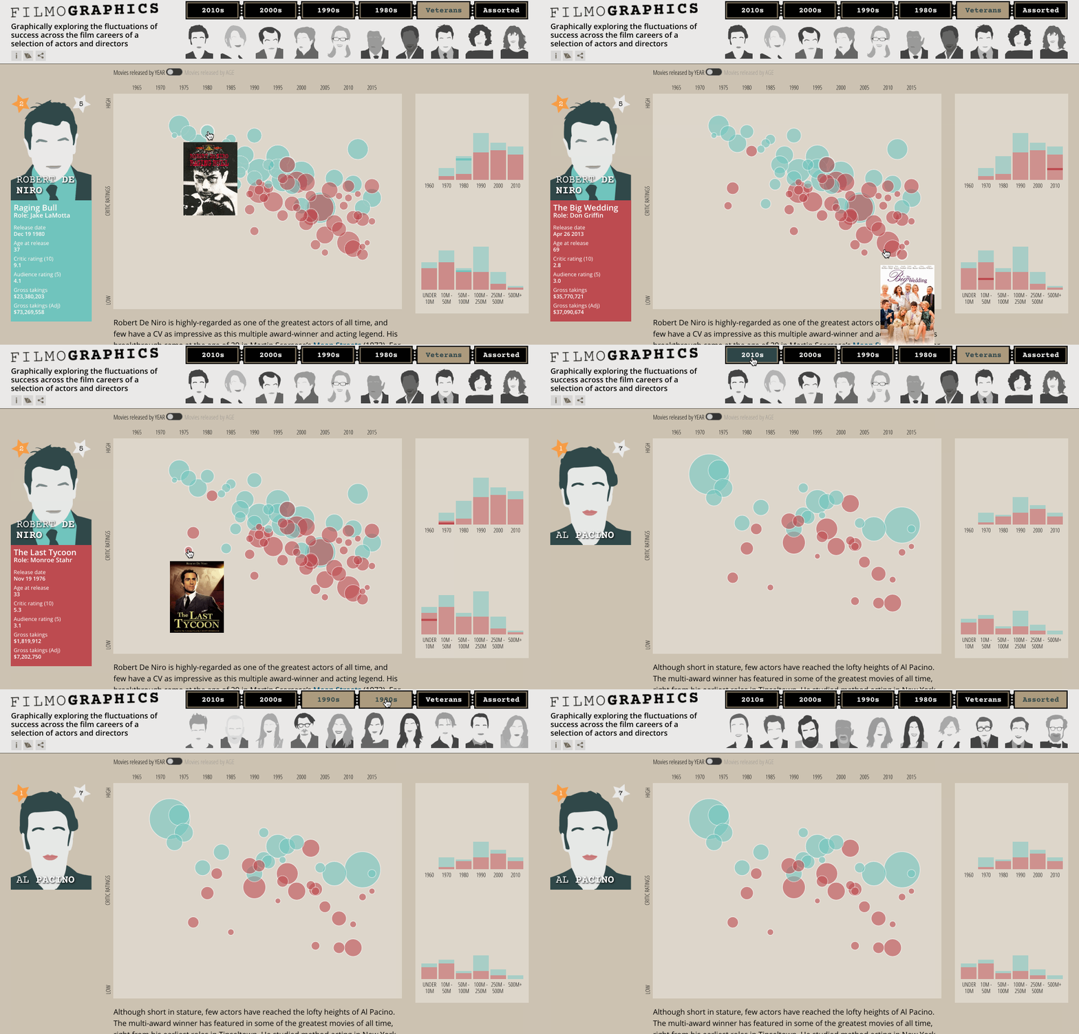
‘Filmographics’ was an interactive data visualisation passion project, developed with my collaborators Matt Knott and Andrew Lim. It was driven by a curiosity to explore the shape of success across the careers of movie stars displaying the ebb and flow of critical ratings and box office takings for a selection of 60 prominent actors and directors, from the 1960s up to 2015.
It was a project I’d had in gestation for quite a while but was held off for release until June 2016 in order to coincide with the publication of the first edition of my book. I used it to offer a case-study demonstration of the process and critical thinking as described in the book’s release.
Originally intended for inclusion in the print version of the book, this detailed narrative had to be taken out due to space limitations. Over on my book’s companion digital site you will find ‘case study’ sections from Chapters 2 through to 10 describing all the ideas, challenges and choices made during the creation of this work.
As a one-off project itself is no longer live online. I had no capacity to continue maintaining the technical aspects of its workings but also had no ongoing desire to keep updating the data, which otherwise was always going to be out-of-date as soon as any new movies came out.
#VISBOOKFLIPBOOK
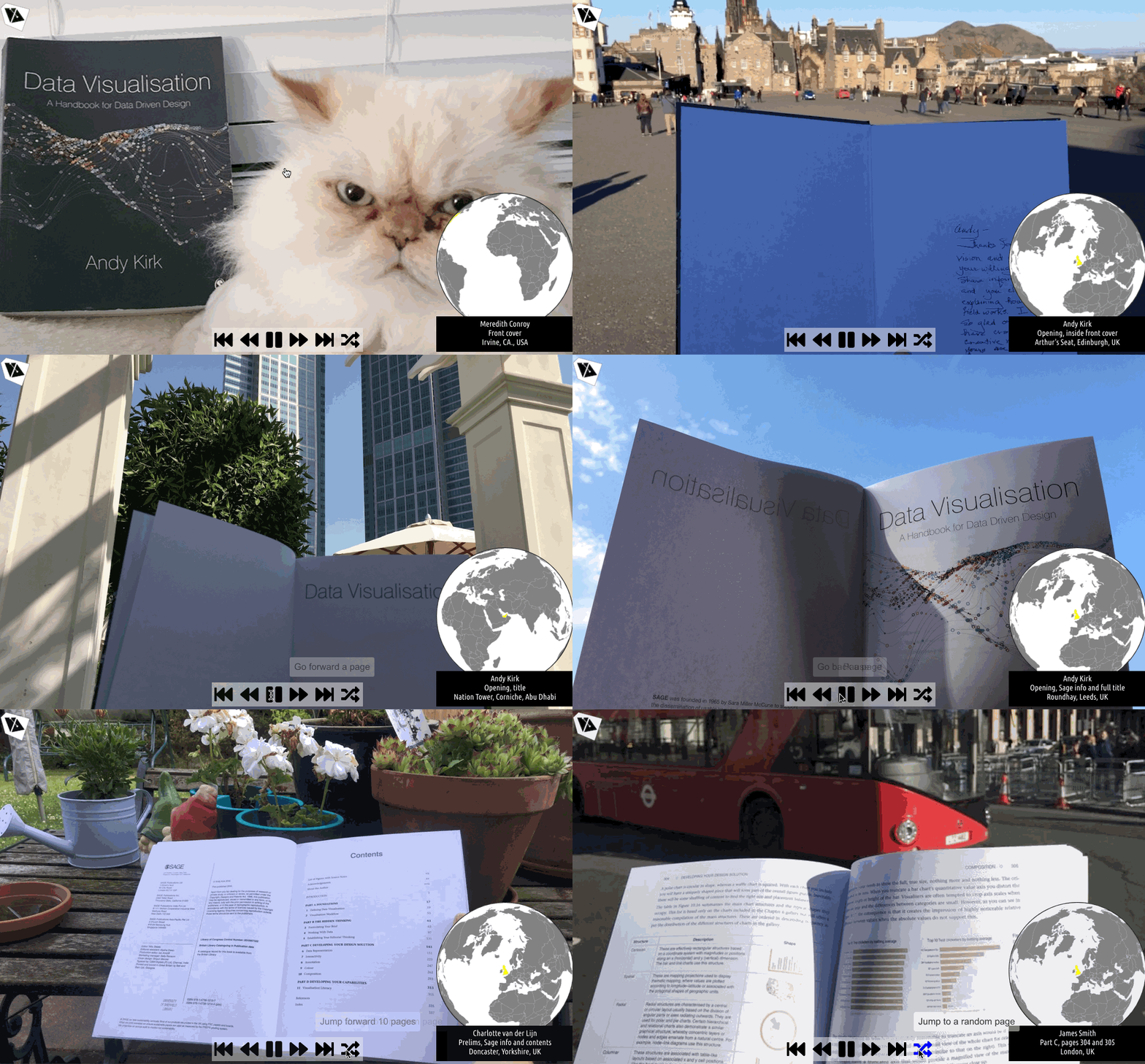
After the release of the first edition of my book ‘Data Visualisation: A Handbook for Data Driven Design‘ I was especially excited to see people sharing photos of receiving their copies in all sorts of locations around the world.
It inspired me to come up with a somewhat impromptu project to try to collect photographs of every 2-page spread in the book in different settings around the world, inviting book owners, friends and family to help me complete a full set. My aim was to compile all the collected photographs and create the effect of a digital flip book, from which the #VisBookFlipBook project was launched!
After a campaign running for a few months by the end of the summer of 2018 the full set of 186 photographs was completed. Then, with the help of my usual trusted technical lieutenant, Mr Andrew Witherley, I launched the VisBookFlipBook viewer.
The viewer commences from the front cover and gradually walks you through the remaining 185 pages towards the back cover. You can just sit back and watch this journey unfold or you can use interactive controls to move backwards and forwards (in chunks of 1 or 10 photos), pause and restart the sequence, or jump to a random photo, from which it will then continue nudging forward one at a time.
The country in which each photo was taken is highlighted on the spinning globe and there are credits displayed detailing who took the photo, exactly where, and which pages are shown.
A huge thank you to everyone who took part in this, with a third edition of the same book on the horizon, I may resurrect this project again in the future!
THE MALOFIEJ EXPERIENCE
Until the Covid-19 pandemic, each year, for a few days during March, visual journalists, designers and developers from across the globe assembled in the city of Pamplona. The University of Navarra was the venue for the annual Malofiej Awards and World Summit, the celebration of the very best in infographic and data visualisation design.
In 2012, I was invited to the 20th edition of this prestigious event. Just attending Malofiej was a privilege in itself, but to participate as a judge and speaker alongside some of the most talented people in the field was a defining experience so early in my career as an independent data visualisation professional.
The 2017 event was the first opportunity I had to return to Pamplona since that earlier experience. But rather than just attend, as this was the 25th anniversary event, I wanted to mark this special occasion and salute its significance to me and my career.
Despite having no experience, no knowledge and, frankly, no prior talent, I aspired to make a short film to document the essence of what makes Malofiej such a unique and enduring event.
Enlisting my trusted co-producer, Matt Knott, armed with only two iPhones, two microphones and two stands, we jetted off from the UK bound for Pamplona to interview some of the principal protagonists and to capture ‘THE MALOFIEJ EXPERIENCE‘.

