
This is part of a series of posts about the ‘little of visualisation design’, respecting the small decisions that make a big difference towards the good and bad of this discipline. In each post I’m going to focus on just one small matter – a singular good or bad design choice – as demonstrated by a sample project. Each project may have many effective and ineffective aspects, but I’m just commenting on one.
The ‘little’ of design today concerns a matter I’ve discussed before relating to the integration of graphic devices into written sentences, as demonstrated in this graphic about the quality of signings being made by football clubs in China signalling the possible emergence of a new power in the game.
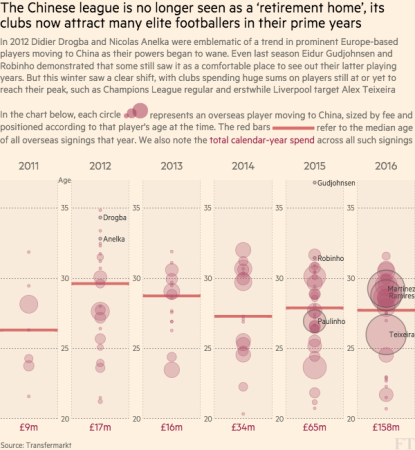
Specifically, in this project, you will see how the ‘key’ explainers that would normally be segregated by a legend adjacent to the chart are instead incorporated into a written guide explaining what the various marks and attributes used in the chart represent. It might look simple but I’m sure it would have been quite a fiddly task making the sizing and alignment of the small graphics align seamlessly with the text and row size.

(Via a tweet from John Burn-Murdoch who created this graphic and authored the article)
