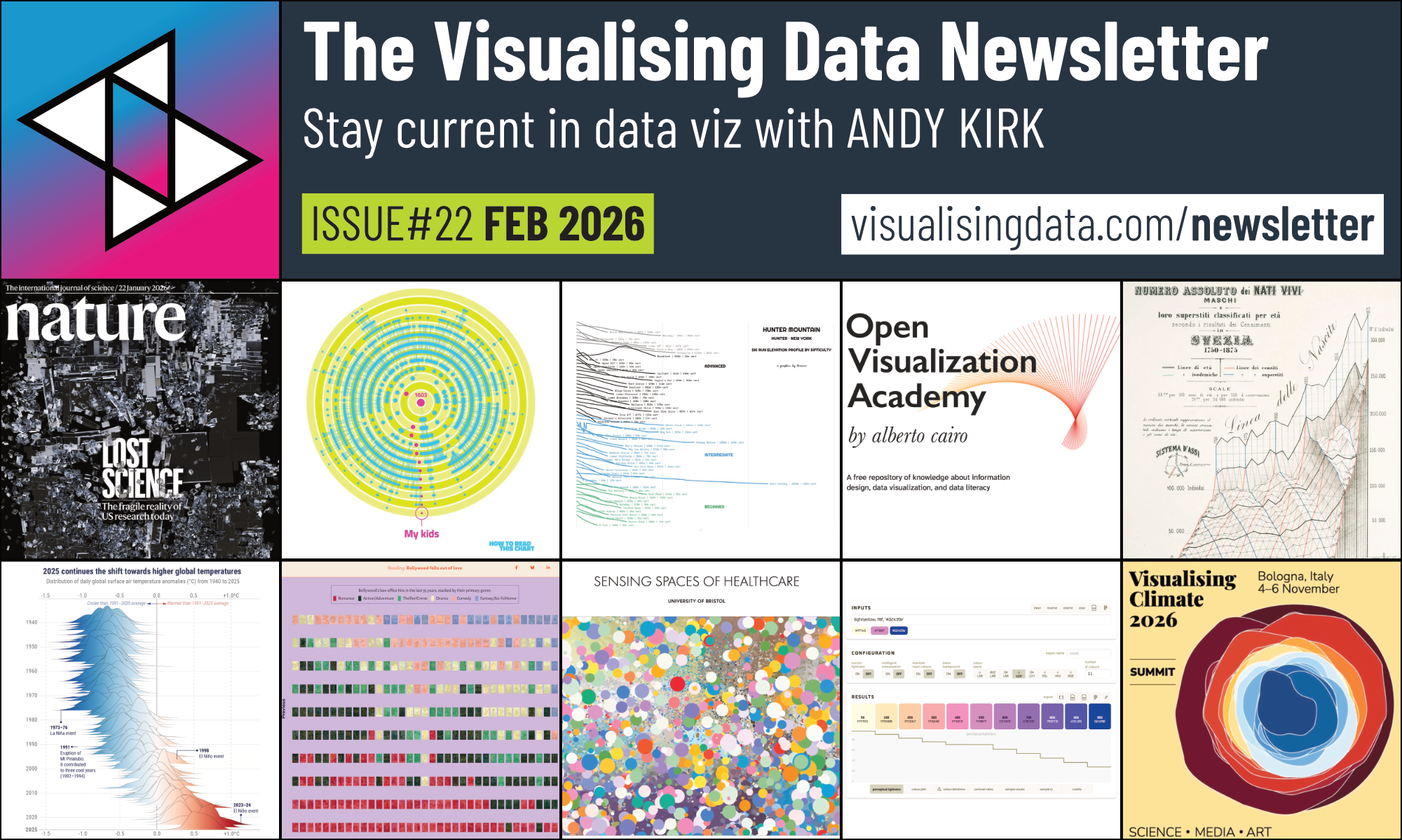
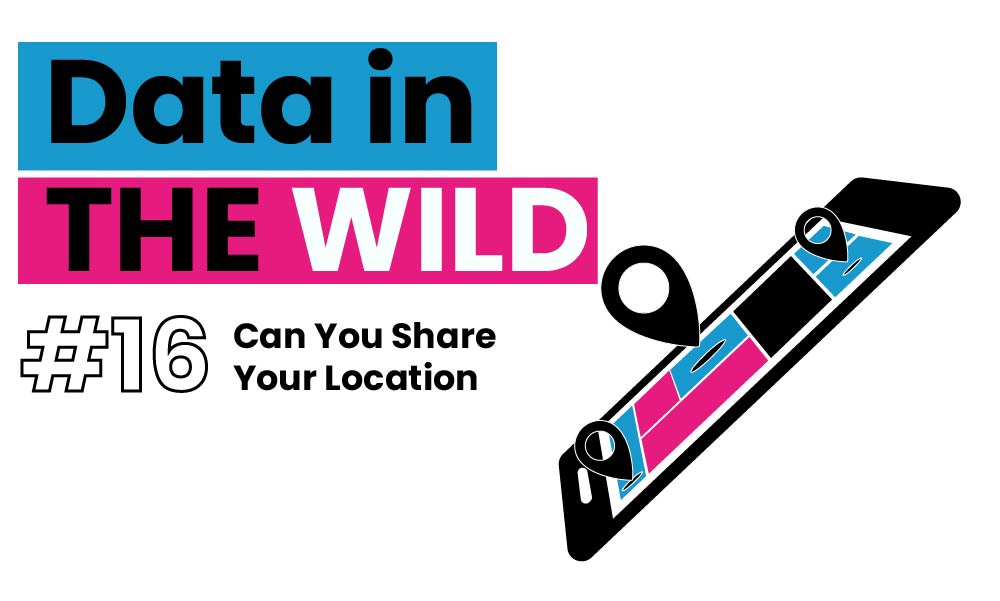
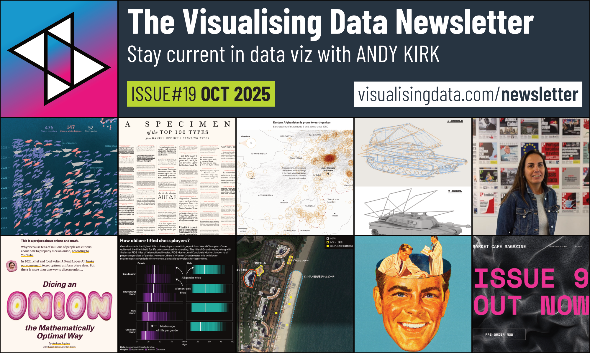
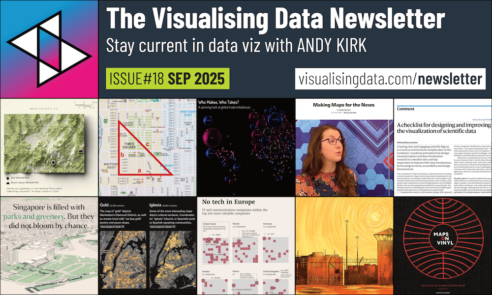
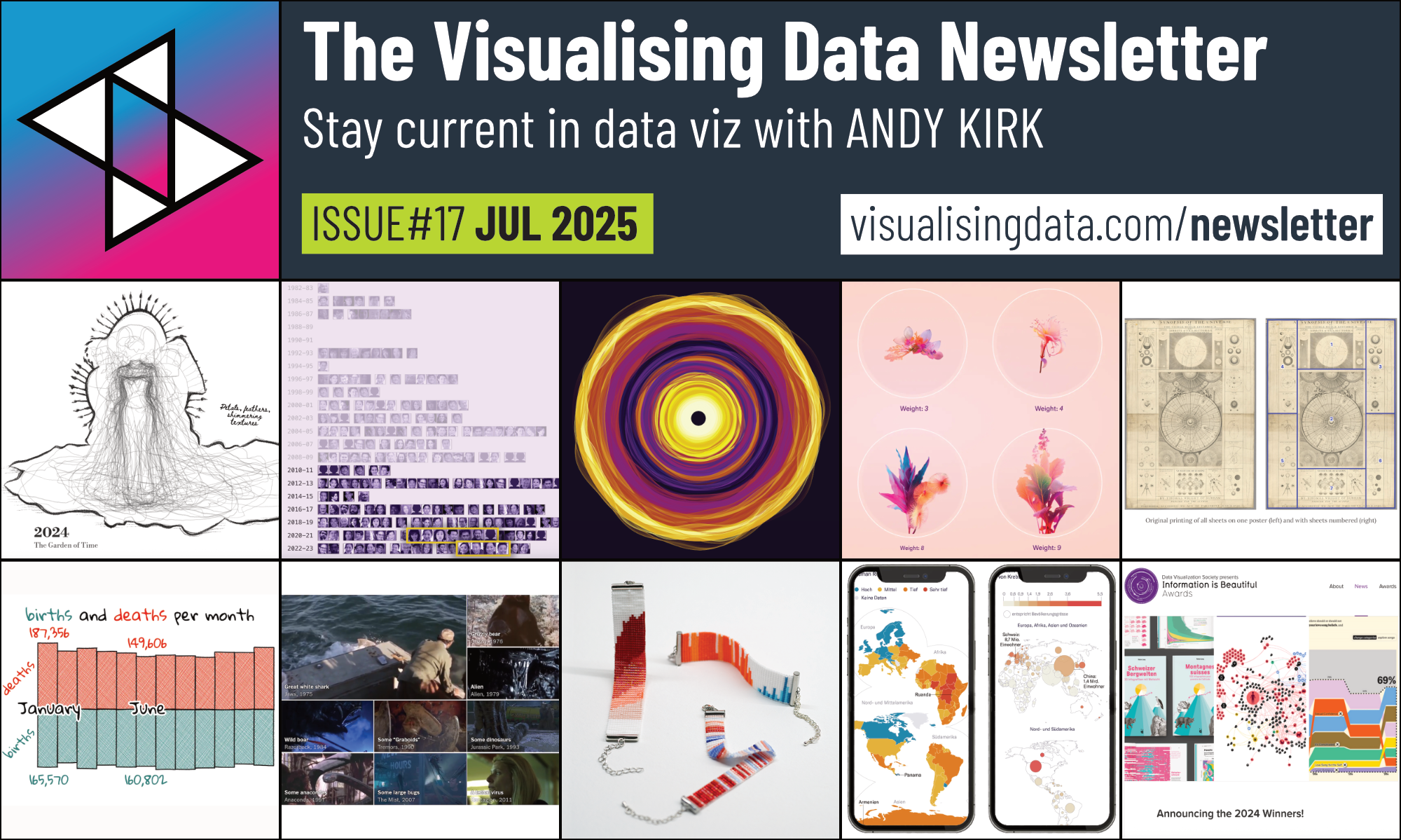
3 x Book Giveaway Contests!
To coincide with my book launch event in London on Thursday 6th February, and to recreate what I did for my previous books, I’m happy to launch not one, not two, but THREE book giveaway contests!
Visualisingdata.com was originally launched in 2010 originally to serve as a blog to help continue the momentum of my learning from studying the subject via a Masters degree. I continue to publish articles and share announcements that track developments in my professional experiences as well as developments in the data visualisation field at large.
This is a collection of all my published posts, starting with the newest and dating back to 2010, tracking. These posts include articles, design commentaries, podcast updates, professional updates, and general news from across the data visualisation field.
To coincide with my book launch event in London on Thursday 6th February, and to recreate what I did for my previous books, I’m happy to launch not one, not two, but THREE book giveaway contests!
On Thursday 6th February I will be running a short but packed event in London, hosted by the lovely people of Canva at their HQ in Hoxton Square.
On Monday 27th January I will be hosting a live webinar featuring a panel of brilliant guests discussing data viz freelancing.
Welcome to S5E9 of Explore Explain, a long-form video and podcast series about data visualisation design. In this episode I chat with Alan Smith, Head of Visual and Data Journalism at the Financial Times in London.
What follows is some analysis about football – Premier league football specifically – and is motivated by my dislike – no, let me raise that to hate – of draws. Some regular readers may wonder if they’ve landed on the wrong website but we’re going to see some charts soon so that does keep it on-brand.
My December newsletter, that was sent out to subscribers at the end of last month, is now open for all to read. You can access this issue, as well as visit the growing catalogue of previous issues, on the Newsletter page.
I’m thrilled to introduce myself as a new voice on this blog. It was nice to meet you virtually! My name is Obinna Iwuji, and I will be supporting Andy for the next few months in a couple of ways but I’ll explain that later.
Welcome to the seventh AND eighth episodes of the fifth season of Explore Explain, a long-form video and podcast series all about data visualisation design. These episodes form a two-part special taken from a recorded webinar held on 4th December 2024 titled ‘The State of Data Viz’ and featuring a panel of esteemed guests.
I’m happy to announce details of a new public training course, the virtual ‘Masterclass in Data Visualisation’ which will take place online, over 18-20 February 2025, running 1pm to 5pm (UK, GMT) each day.
My November newsletter, that was sent out to subscribers at the end of last month, is now open for all to read. You can access this issue, as well as visit the growing catalogue of previous issues, on the Newsletter page.
My October newsletter, that was sent out to subscribers at the end of last month, is now open for all to read. You can access this issue, as well as visit the growing catalogue of previous issues, on the Newsletter page.
On Wednesday 4th December I will be hosting a live webinar featuring a panel of brilliant guests discussing ‘The State of Data Viz’.
Last month I had the pleasure of being invited on to The Chris Gill Podcast, a great series where Chris chats with people working within professional sport from around the world. I was there to talk all about data vis, of course, and its relevance/application to sport.
Welcome to S5E6 of Explore Explain, a long-form video and podcast series about data visualisation design. In this episode I am delighted to welcome Michael Brenner (Head of Creative at Data4Change), Sarah Slobin (Visual Editor, Reuters), and Jon Schwabish (Senior Fellow, Urban Institute) to explore ‘The Tools of Our Trade’.
My September newsletter, that was sent out to subscribers at the end of last month, is now open for all to read. You can access this issue, as well as visit the growing catalogue of previous issues, on the Newsletter page.
Welcome to S5E5 of Explore Explain, a long-form video and podcast series about data visualisation design. In this episode I chat with Kat Greenbrook, Data Storyteller, Author, and founder of Rogue Penguin based in Wellington, New Zealand.
I’m happy to announce details of a new public training course, the one-day classroom based ‘Fundamentals of Data Visualisation’ will take place in London, on 18 December 2024.
I’m delighted to share news that the third edition of my book ‘Data Visualisation: A Handbook for Data Driven Design‘ is nearing completion and will be published in November 2024.
My August newsletter, that was sent out to subscribers at the end of last month, is now open for all to read. You can access this issue, as well as visit the growing catalogue of previous issues, on the Newsletter page.
Happy to share news of the release of a new batch of Explore Explain shorter ‘highlights’ videos for Season 4. The idea is to identify, extract, edit, and package up five key insights to emerge from each episode to create short 10-15 mins highlights.
My July newsletter, that was sent out to subscribers at the end of last month, is now open for all to read. You can access this issue, as well as visit the growing catalogue of previous issues, on the Newsletter page.
Over the past couple of months I had the pleasure of appearing on a couple of podcasts: The Cost of Everything and Data + Love. They were both published this week and so I’m happy to share links to the shows.
Welcome to S5E4 of Explore Explain, a long-form video and podcast series about data visualisation design. In this episode I chat with Dominikus Baur and Alice Thudt about their sensational visual exploration, ‘Full of Themselves: An Analysis of Title Drops in Movies’
My June newsletter is now open for all to read. You can access this issue, as well as visit the growing catalogue of previous issues, on the Newsletter page.
Welcome to S5E3 of Explore Explain, a long-form video and podcast series about data visualisation design. In this episode I chat with Natalie Erdem to explore the story behind TWO-N’s work developing MSNBC’s election big board.
My May newsletter is now open for all to read. You can access this issue, as well as visit the growing catalogue of previous issues, on the Newsletter page.
I’m happy to announce details of a new public training course, the virtual ‘Masterclass in Data Visualisation’ which will take place online, over 10-12 September 2024, running 1pm to 5pm (UK) each day.
I’m happy to announce details of a new public training course, the virtual ‘Fundamentals of Data Visualisation’ which will take place online over 6th and 7th August 2024, running 2pm to 5pm (UK) each day.
Welcome to S5E2 of Explore Explain, a long-form video and podcast series about data visualisation design. In this episode I chat with Jess Carr to explore the story behind a passion project she worked on titled ‘Since When Does Vogue Hate Text?’. This project was a winner of ‘The Pudding Cup’ 2023 gold prize so it’s a great piece to dissect!
My April newsletter is now open for all to read. You can access this issue, as well as visit the growing catalogue of previous issues, on the Newsletter page.