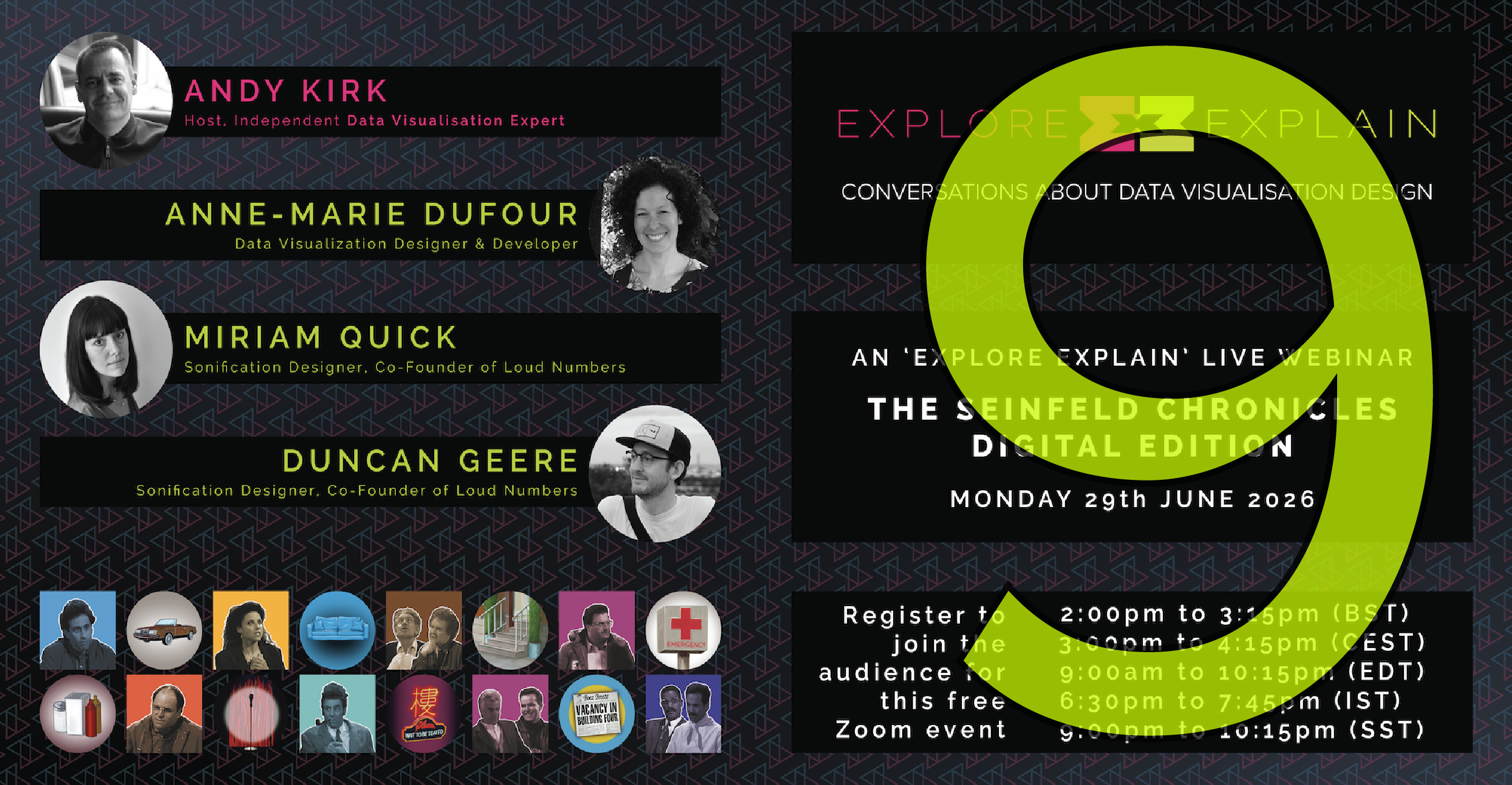
Podcast
Explore Explain S6E9 – The Final Episode!
Welcome to episode 9 of season 6 of Explore Explain, a long-form video and podcast series all about data visualisation design. I am delighted to welcome… me, alongside data visualization designer and developer, Anne-Marie Dufour, as well as sonification superstars Miriam Quick and Duncan Geere, to discuss our new project: ‘The Seinfeld Chronicle: Digital Edition’.


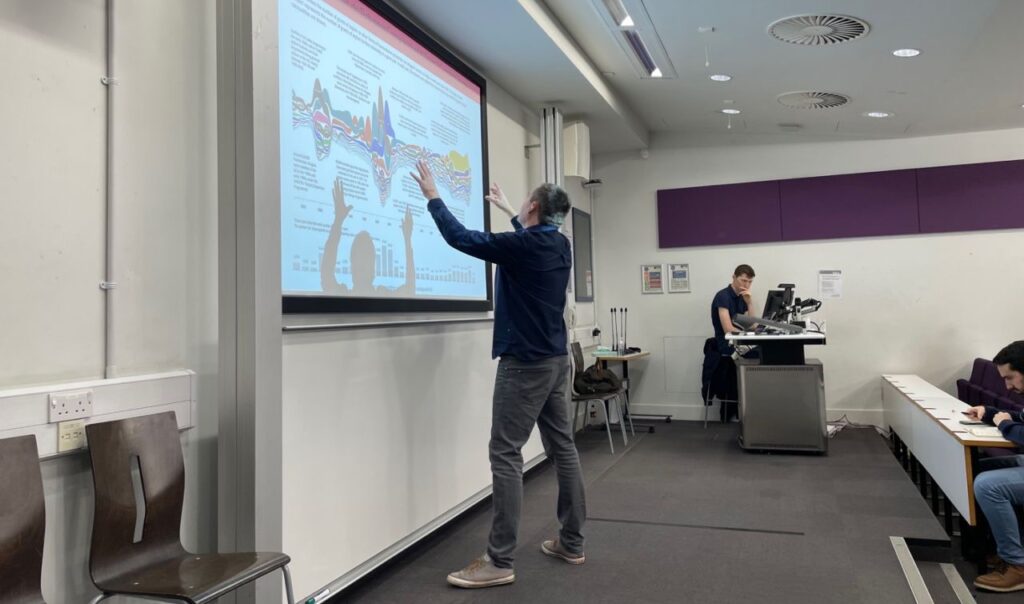
![Part of a panel at the Digital Sport North meetup event in Leeds, February 2023 [photo credit: Sarah O'Neill]](https://visualisingdata.com/wp-content/uploads/2023/03/Hero_Talks-1024x583.jpeg)