Articles
Not ‘sharing the spoils’: A closer look at draws in the Premier League
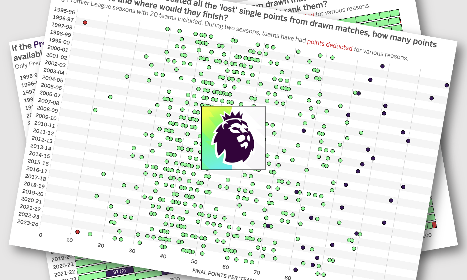
What follows is some analysis about football – Premier league football specifically – and is motivated by my dislike – no, let me raise that to hate – of draws. Some regular readers may wonder if they’ve landed on the wrong website but we’re going to see some charts soon so that does keep it on-brand.