

To mark each mid-year and end-of-year milestone I take a reflective glance over the previous 6-month period in the data visualisation field and compile a collection of some of the most significant developments. These are the main projects, events, new sites, trends, personalities and general observations that have struck me as being important to help further the development of this field or are things I simply liked a great deal. Here’s the full compilation of all my collections.
Earlier in the year I published a collection for the first 6 months of 2014 and now I’d like to reflect on the second half of 2014. I look forward to hearing your suggestions for the developments you believe have been most significant.
And so, as ever, in no particular order…
1. ProPublica’s ‘Losing Ground’
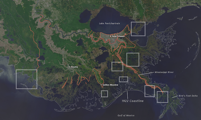
Developed in partnership between ProPublica and The Lens (as well as several other partners), Losing Ground is a simply immense project, one that integrates the best of visualisation, astute journalism, and stunning satellite and photo imagery to present the extreme state of coastal land being lost across the Southeastern region of Lousiana. The project offers big picture perspectives from as far away as 30,000ft right down to individual stories of locals affected by the issues. Here is a behind-the-scenes Q&A with Scott Klein, Assistant Managing Editor, and Al Shaw, News Application Developer – two of the protagoanists behind this exceptional work.
2. Junk Charts
This is more a recognition of sustained high quality than anything that has necessarily significantly ‘changed’ during the past 6 months. The relentlessly valuable (and prolific) critical analysis and makeover work from Kaiser Fung on his Junk Charts site has to be applauded. His contribution to the field is significant, shining a light on the bad and the wrong, and offering a path to the good and the right.
3. NYT’s ‘The Most Detailed Maps You’ll See From the Midterm Elections’
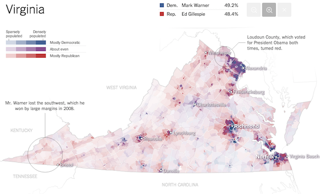
‘Wowsers’ would probably suffice as a summary, but let me offer a little extra. Published for the US midterm elections, this work offered a simply incredible collection of interactive, zoomable maps displaying the story behind some of the closest Senate races at uber-detailed precinct resolution (the smallest level of detail election result reporting). Sure, there will have been plenty of hard preparation work going on in the lead up to the election night but, still, to launch this quality of work, with such ambition in its form and in a real-time context, is mind-blowing.
4. Great designs utilising nothings, blanks, nulls and zeros
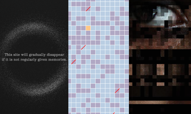
As most readers will be aware, I’ve spent a not-insignificant amount of time this year talking about nothing: my intrigue into the possibilities and challenges of visualising the invisible. Well, the radar has continued blipping away and I’ve really been struck by three further projects in recent months. I therefore thought I’d lump them all into one single entry in this collection as they are all great in different ways. Firstly, technically from earlier in the year, I Remember is a project aiming to help fight Alzheimers disease. It literally lives off memories submitted through photographs and captions but if new memories are not submitted it starts to remove older ones. Secondly, the Hunger Report’s Missing Data uses gaps in photo imagery to represents the data gaps that exist across the developing crountries against the United Nations set of 52 indicators relating to women’s empowerment. Finally, the LA Times ‘Unclaimed Remains‘ campaign to try identify the names of the 1428 unclaimed remains at the L.A. County Cemetery ahead of a planned mass ceremony in early December. Jolly good stuff.
5. Zeit Online’s ‘A Nation Divided’
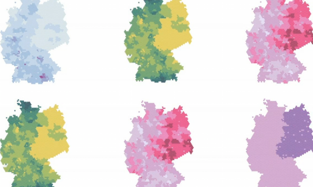
For any journalism organisation facing up to a major historical anniversary there are no doubt all sorts of pressures swirling around like ‘this needs to be the best’, ‘this needs to be different to what we’ve done before’, and, crucially, ‘this needs to be different to what others might do’. I’m sure these were factors faced by the graphics team at Zeit Online, the digital sister publication of “Germany’s most widely read weekly paper”, when the 25th anniversary of the German reunification arrived. Led by Sascha Venohr and Paul Blickle (to pick out just two names) the team responded with a wonderful pair of projects in the shape of ‘A Nation Divided‘ (original German version) and ‘Charting Germany‘, which formed part of the ‘paper’s anniversary coverage. A pair of innovative and informative visualisation works (the former providing inspiration for some of the graphics in this WaPo piece) that offer a perfect blend of exploratory and explanatory experiences. Here is a short video interview with Paul about their design process.
6. Eric Rodenbeck’s Eyeo talk
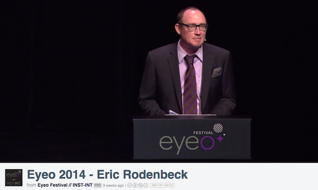
I came across this talk only a few weeks ago but Eric Rodenbeck’s “And Then There Were Twelve” Eyeo talk is a mixtape of compelling, refreshingly honest and sobering insights into his experiences at Stamen. ‘How to (keep) running a successful data visualization and design studio’ is the talk subtitle and in the course of 40 minutes or so we learn about a star agency having to grow and evolve against a context of the ebb and flow of personnel changes and a shifting marketplace around it.
7. Christopher Ingraham
I name-checked Christopher in my previous 6-monthly roundup but I feel he needs to occupy a bullet-pointed place on this list all by himself, such has been the ongoing development of his brand of data journalism work these past few months. From the curioso to the quirky to the current, his wide-ranging and prolific output for the Washington Post emulates the energy and quality that typified the golden period of the Guardian data blog of about 3 years ago.
8. FT Data
FT Data is a “collaborative effort from journalists across the Financial Times working in data journalism, statistics and data visualisation”. Essentially it is the place where the FT’s visualisation work lives and over the past year I’ve seen a growing range and quality of output with people like Martin Stabe and particularly John Burn-Murdoch responsible for some excellent interactive work and analysis. There has been some especially good work exploring sports-related topics through the ‘Baseline‘ series. Looking forward to seeing more great work during 2015.
9. New educational opportunities

Two announcements over the past months should whet the appetite for folks looking at opportunities to study data visualisation and its sibling subject areas. Firstly, the Graduate Center at CUNY announced it had been awarded a multimillion-dollar grant to establish ‘The CUNY Center for Digital Scholarship and Data Visualization’. The Center will ‘train graduate students and employees from the public and private sectors in visualization techniques’. Secondly, an exciting new offering from the School of Communication at the University of Miami through its launch of a new Data Journalism and Visualization track within the MFA in Interactive Media beginning in the Fall (UK translation: Autumn) of 2015. Alberto Cairo (newly appointed ‘Knight Chair in Visual Journalism‘, congrats!) will be one of the lead Faculty members designing and delivering this new programme.
10. Ramon Martinez
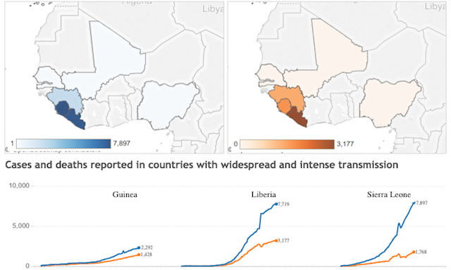
Its been a year full of dreadful news events and world affairs, with the ebola outbreak in Western Africa one of the enduring themes. There has been plenty of coverage across all news media outlets but nobody has done more to offer a rigorous and accessible analytical window into this issue than Ramon Martinez through his zen-mastery Tableau work published on his Health Intelligence blog. Ramon was the first person I saw publishing visualisations about this issue and he’s kept on top of it throughout the cycle of growth, fear, misinformation and then the inevitable post-hype decline in coverage. He’s also a smashing guy too.
Special mentions…
Here are the other highlights from the second half of 2014 that deserve a special mention:
World Chat Clock | A super elegant and (importantly) mega useful world clock device by Darkhorse Analytics that let’s you work out the optimum times for holding meetings across different world cities.
Norway’s new banknotes | A little bit of data visualisation design makes its way on to the beautiful new design for Norway’s banknotes created by Snøhetta.
Phillipp Adrian | On the 9th November 2012 at exactly 14:47:36, 5522 tweets were posted across the world. The #oneSecond project preserves the data of one moment on Twitter and presents it categorised, ordered and visualised across four books.
The Graphic Continuum | Jon Schwabish and Severino Ribecca’s excellent work to create a visual taxonomy of a range of common chart types, available as a convenient and attractive poster.
Poppy Field | Interactive version of Poppy Field by Valentina D’Efilippo and Nicolas Pigelet that achieved some great exposure during the recent milestone of the 100 year anniversary since the start of the first World War.
Pianogram | Such a brilliantly simple and simply brilliant concept. Use the apparatus of a piano and make bar charts out of the keys to reflect the frequency of notes used in a series of pieces of music.
Quartz | A really excellent project by David Yanofsky and Tim Fernholz to visualise ‘every active satellite orbiting Earth’
Data Viz Process | A valuable project by Scott Murray to research and distill the ‘Keys to a Successful Data Design Process’
Giorgia Lupi | Sneaking into the qualifying period by a single day, this is such a beautifully conceived and executed annotated slidedeck titled ‘The shapes of my thoughts’, exploring Giorgia’s passion for drawing and its influence on her data visualisation work.
