

In an attempt to increase my blog post frequency, this year I’m going to publish more smaller posts that try to impart morsels of advice or thought-provocations about certain visualisation design matters. No deep dive theoretical exploration, just some practical tidbits most probably relating to quite narrow design considerations.
I’m going to start off 2015 focusing on a long-held gripe I have with map-based visualisations that colour the sea.
A tweet popped up on my timeline earlier from Max Gadney @aftertheflood commenting on a pair of maps comparing immigration levels with high numbers of UKIP voters in the UK.
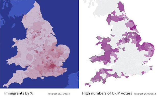
You’ll see the map on the left has a large amount of clutter created by the unnecessarily coloured sea. As Max correctly recommends, we don’t need to draw such prominent salience to the sea, it has nothing to do with this data display. It also makes the judgment of colour scales within the left map harder (and obstructs the comparison with the right hand display, which has no sea colouration). A colour judgment made against a backdrop of a saturated colour can lead to very different perceptions compared to a backdrop of white.
We almost never have a need to care about the world’s seas and oceans in a display about geospatial data. In the majority of occasions the data relates to things that have a ‘land’ relationship. Yet, so often we have these big saturated areas dominating our view with nothing more than decoration.
It is especially problematic if blue is used for the sea but blue is also being used for a quantitative or categorical colour scale within the map. We have mentally committed to reading blue as meaning the sea but we now have to contend with an additional association.
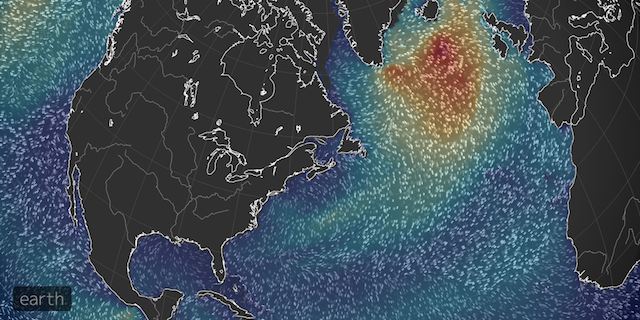
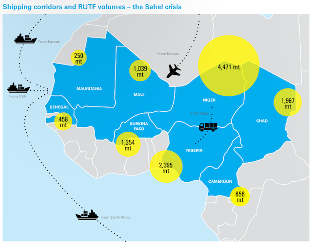
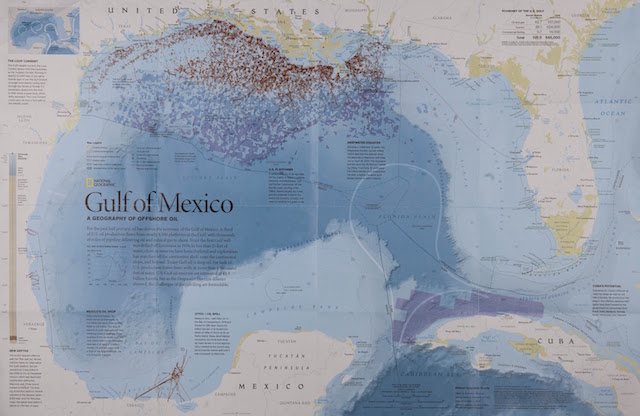
The only times we usefully need to colour the sea are when there is visual relevance in the relationship between land and sea (usually distinguishing with an emphasis on what is land) OR the focus of your data portrayal concerns what is happening on or over the sea, like the patterns of wave heights or shipping routes seen in the below.
If you’re not going to use the sea for these reasons then turn it off or at least turn it down.
