
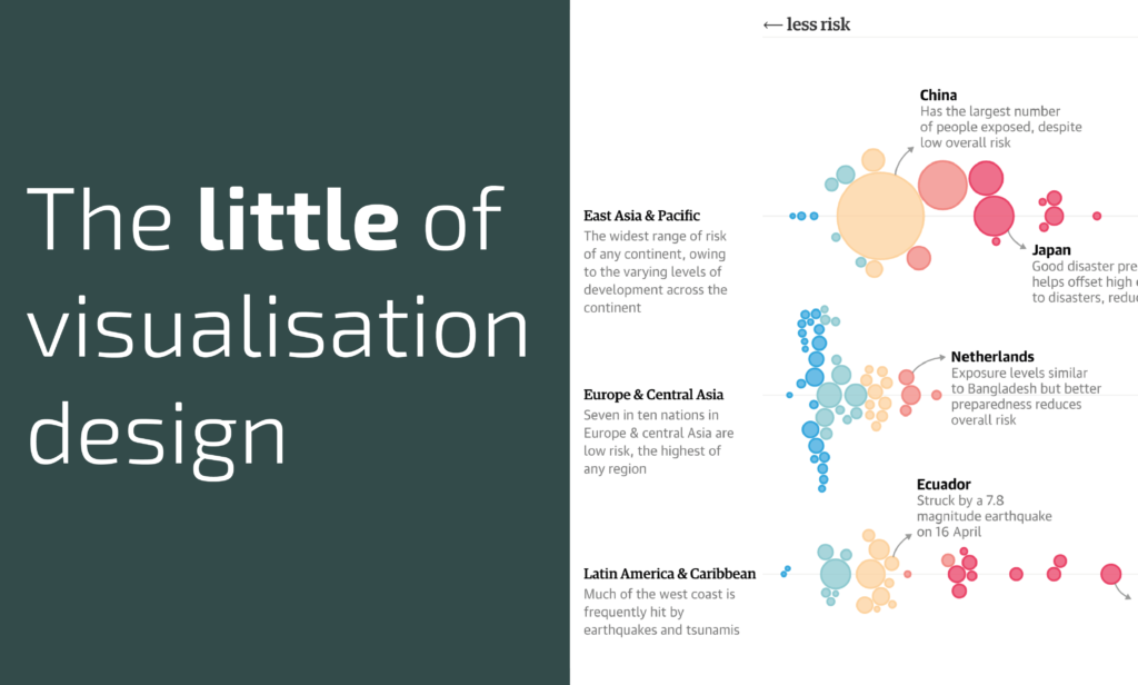
This is part of a series of posts about the ‘little of visualisation design’, respecting the small decisions that make a big difference towards the good and bad of this discipline. In each post I’m going to focus on just one small matter – a singular good or bad design choice – as demonstrated by a sample project. Each project may have many effective and ineffective aspects, but I’m just commenting on one.
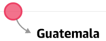
The ‘little’ of this next design concerns the decisions involved when including arrows in your work to act as pointing or directional devices. A recent project that uses arrows comes from the Guardian, titled ‘Where is the riskiest place to live?‘ by Josh Holder, based on the world risk index. As you can see in the project there are several features of the chart that have associated captions, connected by arrows, to help draw to the surface some key or interesting insights from the data. (Note, there is a second use of arrows to indicate the general ‘Low’ or ‘High’ risk direction along the x-axis but I’m going to focusing on the ‘pointer’ arrows in the body of the chart.)
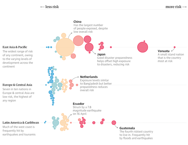
There isn’t an instruction manual for the most effective way to design and integrate arrows into your display. Instead, as with many things in data visualisation, it is about judging what will offer the most legible and elegant solution to suit the overall visual balance. There is a really nicely judged lightness to the visual weight of the arrows in this piece. They are short in length and consistent in appearance, which ensures they supporting the display not dominate it. Perhaps the most unusual feature is how the arrow head points towards the caption, rather than the other way round.
Arriving at the ‘best’ choice involves a surprisingly high number of decisions: What arrowhead* to use? What colour? How long/how far away should the caption be from the item of interest? What weight to apply to the line? Will it be straight or curved? Which is the start and which is the end? Where specifically to point the arrow to and where from? The next time you see an arrow, just remember how much thought has gone into what you might otherwise think is a straightforward choice.
(* Reminds me that Jane Pong ran a quick survey on peoples’ preferences for the arrows available in Illustrator)
