This is part of a series of posts about the ‘little of visualisation design’, respecting the small decisions that make a big difference towards the good and bad of this discipline. In each post I’m going to focus on just one small matter – a singular good or bad design choice – as demonstrated by a sample project. Each project may have many effective and ineffective aspects, but I’m just commenting on one.
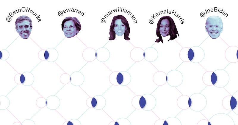
The ‘little’ of this next design concerns the subtle use of coloured apparatus to indicate categorical association. The graphic in this case was produced by Gus Wezerek for an article titled ‘Which 2020 Candidates Have The Most In Common … On Twitter?‘. Using a matrix of Venn diagrams, this explores the proportions of twitter followers that are common to each Democratic candidate pairing.
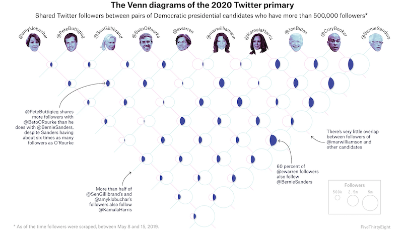
This work alone could provide a year’s worth of little observation but I’m just going to focus on the smart way colours are used along the apparatus of the matrix to inform the reader which Venn diagram set relates to which candidate. You might think that to show this many distinct combinations would involve lots of varied categorical colours, but though there are ten candidates, it is the ‘two’ that matters in each diagram case – whose circle set is on the left and whose is on the right.