#LittleVis
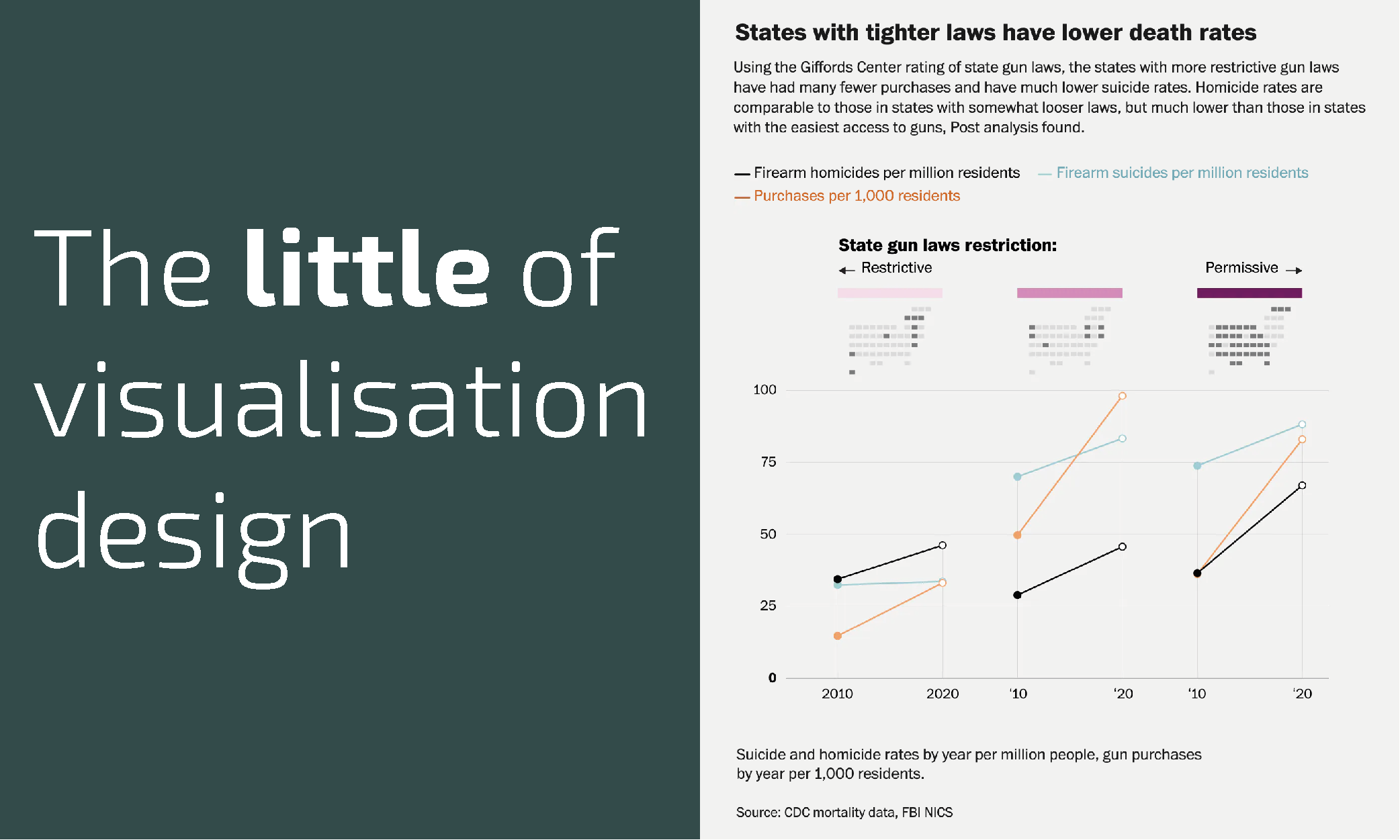
The little of visualisation design: Part 75
This is part of a series of posts about the ‘little of visualisation design’, respecting the small decisions that make a big difference towards the good and bad of this discipline.

This is part of a series of posts about the ‘little of visualisation design’, respecting the small decisions that make a big difference towards the good and bad of this discipline.
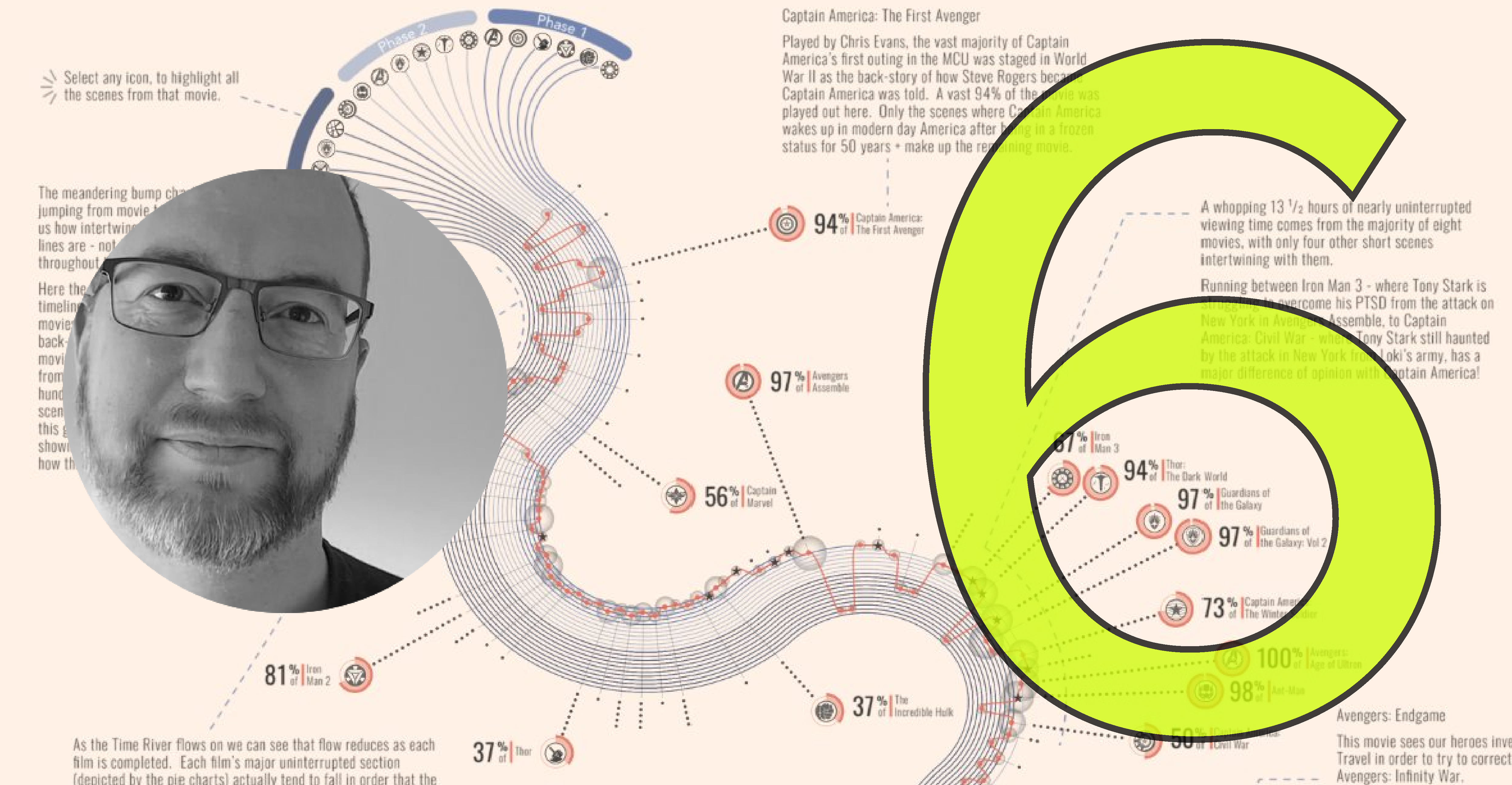
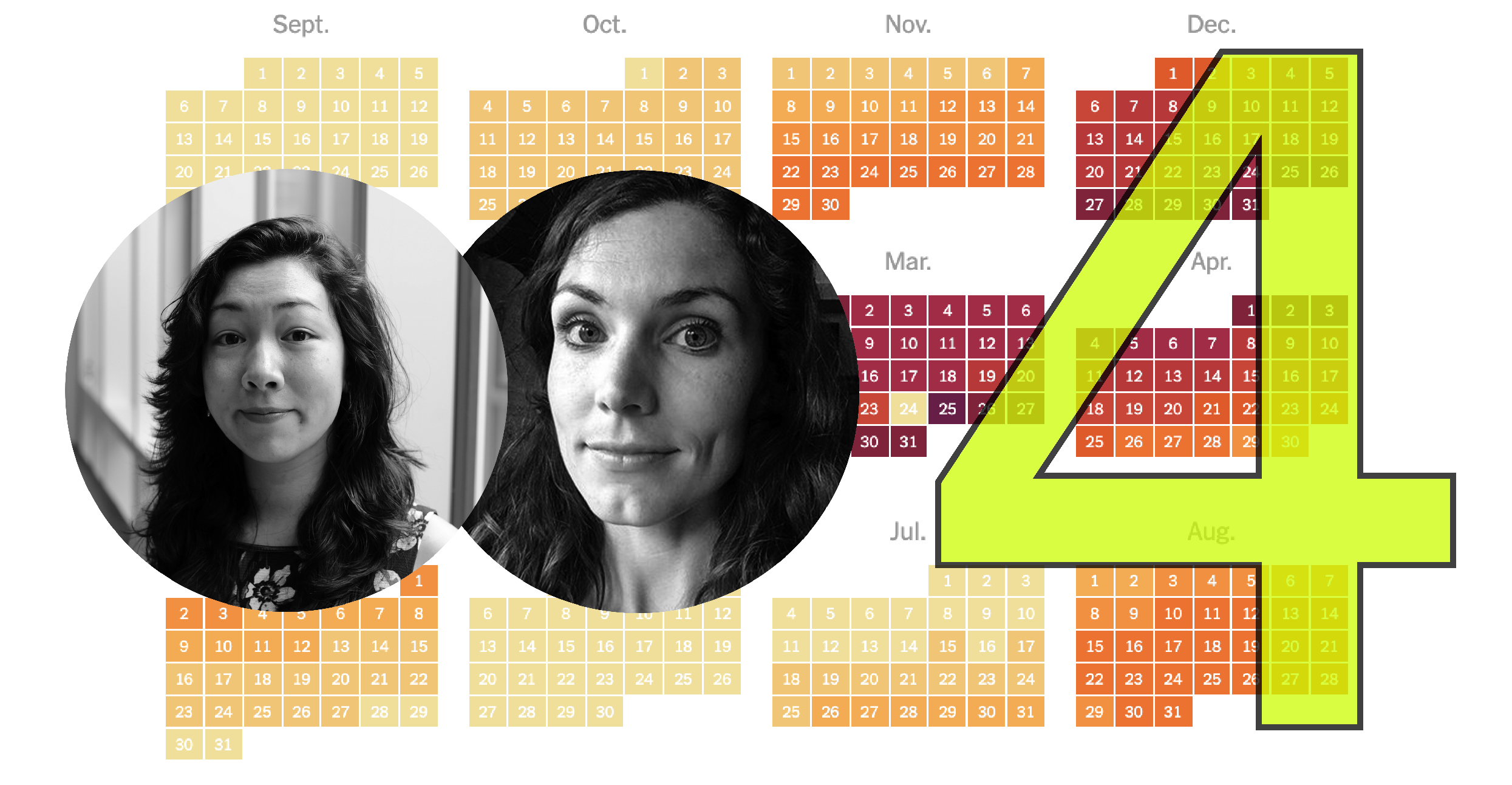
I’m delighted to launch the third season of Explore Explain, a long-form video and podcast series about data visualisation design. For episode six it was a pleasure to welcome Sam Parsons.
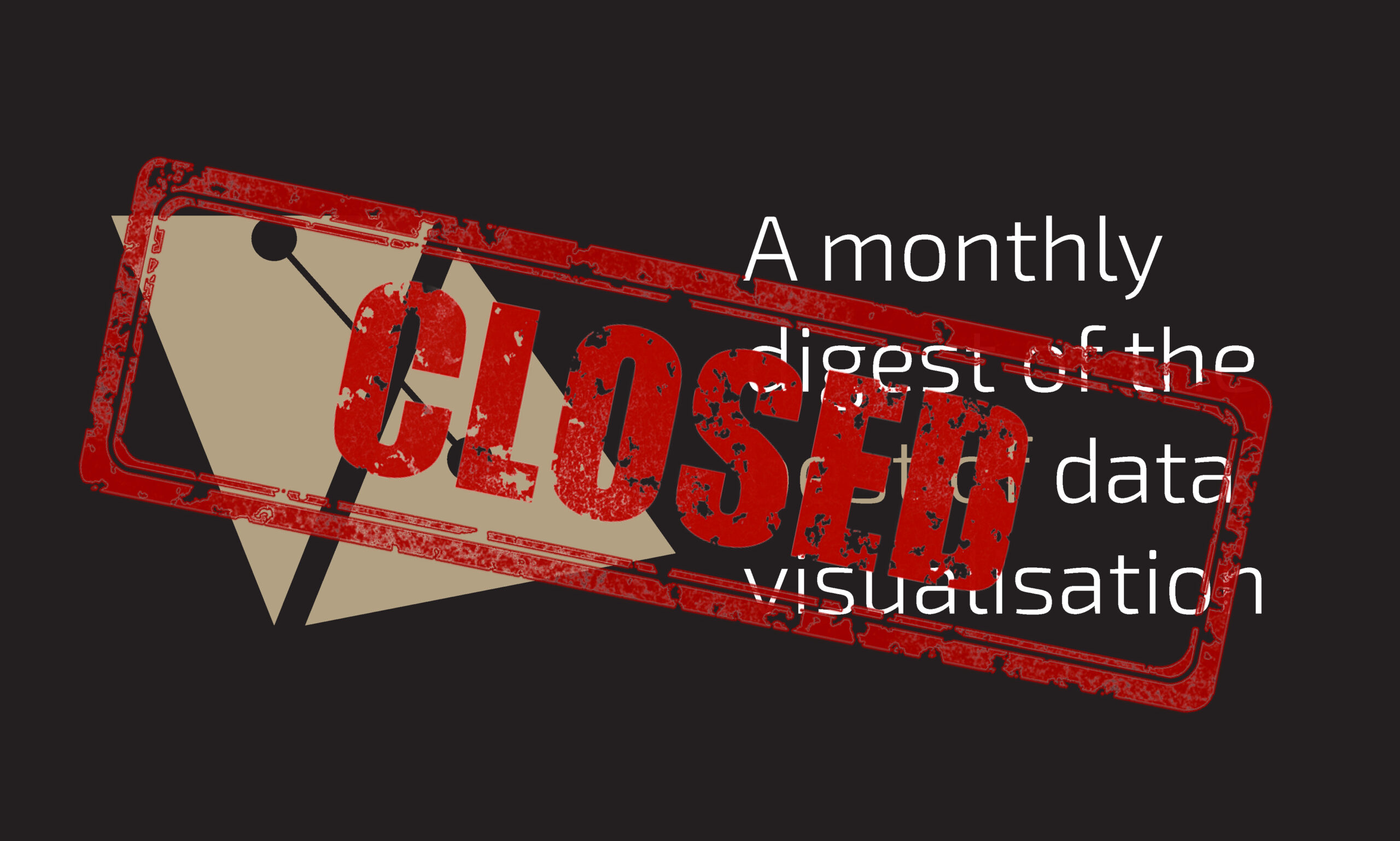
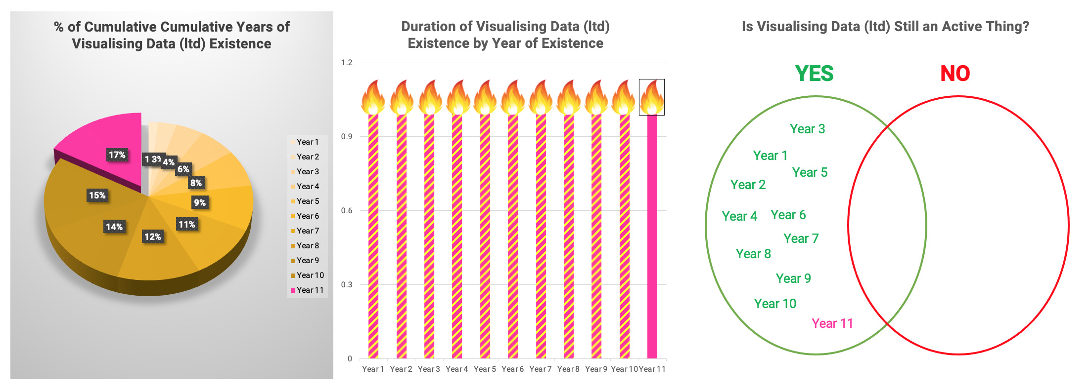
After 153 editions, just over 12 years after posting my first, I have decided to end my attempts to monitor and publish collections of the best visualisation content encountered each month.
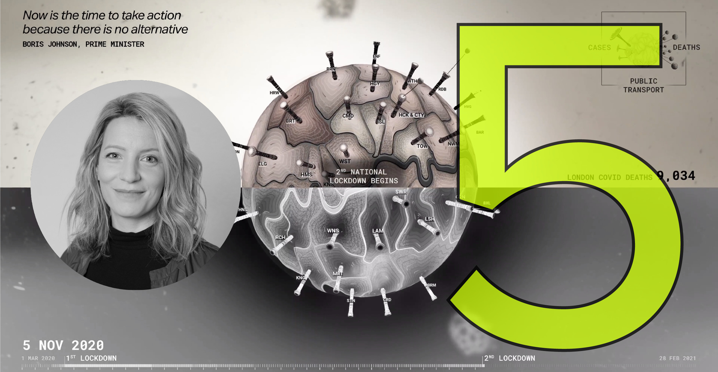
I’m delighted to launch the third season of Explore Explain, a long-form video and podcast series about data visualisation design. For episode five it was a pleasure to welcome Valentina D’Efilippo.

Since 2010 I have compiled and published monthly collections of links to some of the best, most interesting, or thought-provoking data visualisation-related content I come across. Here’s a collection of content collected during December 2021.
Since 2010 I have compiled and published monthly collections of links to some of the best, most interesting, or thought-provoking data visualisation-related content I come across. Here’s a collection of content collected during November 2021.
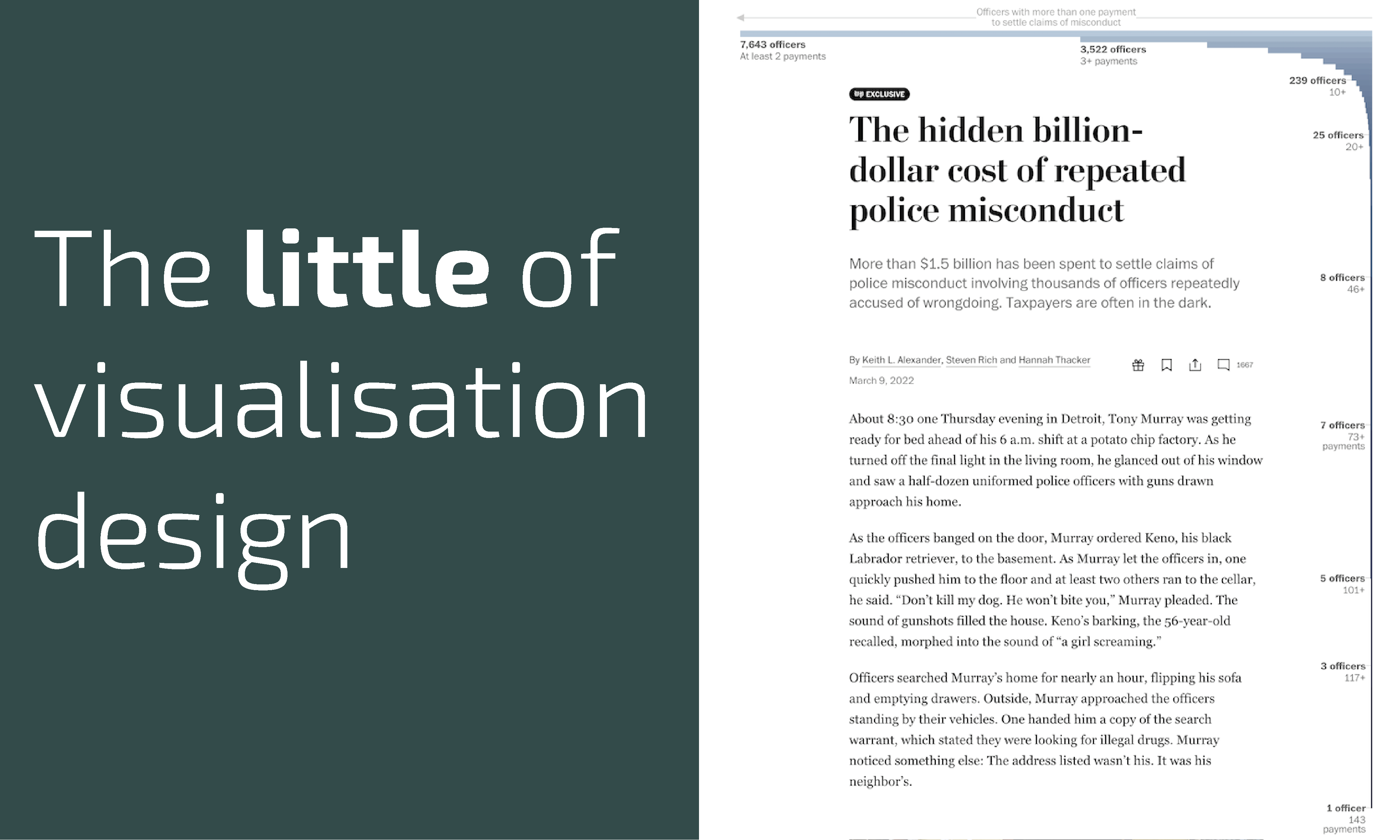
This is part of a series of posts about the ‘little of visualisation design’, respecting the small decisions that make a big difference towards the good and bad of this discipline.
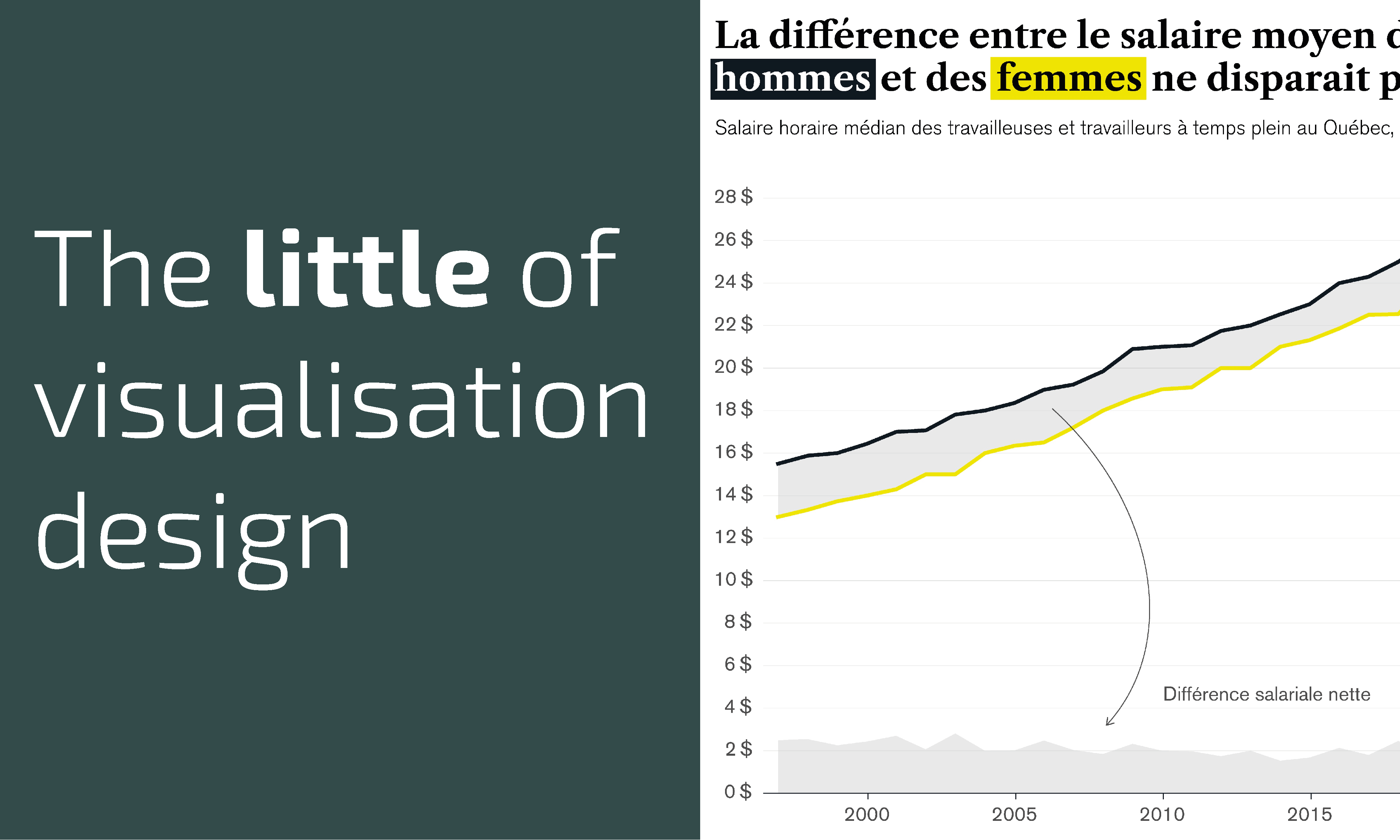
This is part of a series of posts about the ‘little of visualisation design’, respecting the small decisions that make a big difference towards the good and bad of this discipline.
Since 2010 I have compiled and published monthly collections of links to some of the best, most interesting, or thought-provoking data visualisation-related content I come across. Here’s a collection of content collected during October 2021.
Since 2010 I have compiled and published monthly collections of links to some of the best, most interesting, or thought-provoking data visualisation-related content I come across. Here’s a collection of content collected during September 2021.
Since 2010 I have compiled and published monthly collections of links to some of the best, most interesting, or thought-provoking data visualisation-related content I come across. Here’s a collection of content collected during August 2021.
Since 2010 I have compiled and published monthly collections of links to some of the best, most interesting, or thought-provoking data visualisation-related content I come across. Here’s a collection of content collected during July 2021.
Since 2010 I have compiled and published monthly collections of links to some of the best, most interesting, or thought-provoking data visualisation-related content I come across. Here’s a collection of content collected during June 2021.
At the end of each month I pull together a collection of links to some of the most relevant, interesting or thought-provoking web content I’ve come across during the previous month. Here’s the latest collection from May 2021.
I’m delighted to launch the third season of Explore Explain, a long-form video and podcast series about data visualisation design. For episode four it was a pleasure to welcome fourth episode it was a pleasure to welcome Eleanor Lutz & Lisa Wannanen Jones.

10 years ago today I took the first steps towards making the most significant change in the future direction of my working career.

Last month marked 14 years since I first discovered the subject of data visualisation and started the process of developing my knowledge. It is 10 years since I began my exit from ‘normal’ employed life to become a freelancer specialising in this field
At the end of each month I pull together a collection of links to some of the most relevant, interesting or thought-provoking web content I’ve come across during the previous month. Here’s the latest collection from April 2021.
At the end of each month I pull together a collection of links to some of the most relevant, interesting or thought-provoking web content I’ve come across during the previous month. Here’s the latest collection from March 2021.
On Friday 15th June, the results of the Malofiej 29 awards were revealed and, incredibly, I was one of those who received a medal!
At the end of each month I pull together a collection of links to some of the most relevant, interesting or thought-provoking web content I’ve come across during the previous month. Here’s the latest collection from February 2021.
I’m delighted to launch the third season of Explore Explain, a long-form video and podcast series about data visualisation design. For episode three it was a pleasure to welcome Jane Zhang.
At the end of each month I pull together a collection of links to some of the most relevant, interesting or thought-provoking web content I’ve come across during the previous month. Here’s the latest collection from January 2021.
I’m delighted to launch the third season of Explore Explain, a long-form video and podcast series about data visualisation design. For episode two it was a pleasure to welcome Thomas Clever.
I’m delighted to launch the third season of Explore Explain, a long-form video and podcast series about data visualisation design. For episode one it was a pleasure to welcome Andrea Lau.
At the end of each month I pull together a collection of links to some of the most relevant, interesting or thought-provoking web content I’ve come across during the previous month. Here’s the latest collection from December 2020.
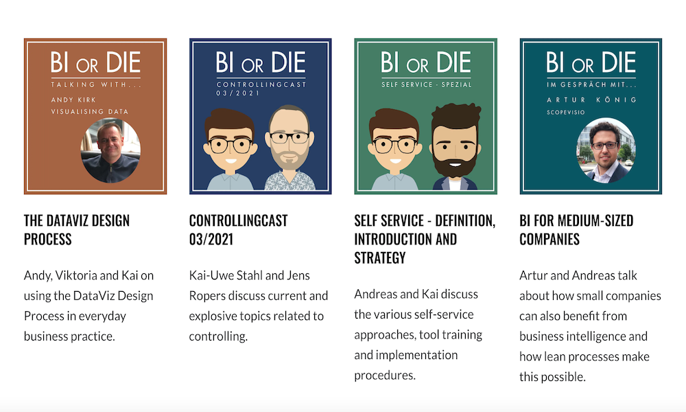
Last week I had the pleasure of being invited to record an episode of the ‘BI or Die’ podcast.
At the end of each month I pull together a collection of links to some of the most relevant, interesting or thought-provoking web content I’ve come across during the previous month. Here’s the latest collection from November 2020.
Today is the 1st anniversary of my celebrating the 10th anniversary of my website launching. And what a year this has been.
At the end of each month I pull together a collection of links to some of the most relevant, interesting or thought-provoking web content I’ve come across during the previous month. Here’s the latest collection from October 2020.
