#LittleVis
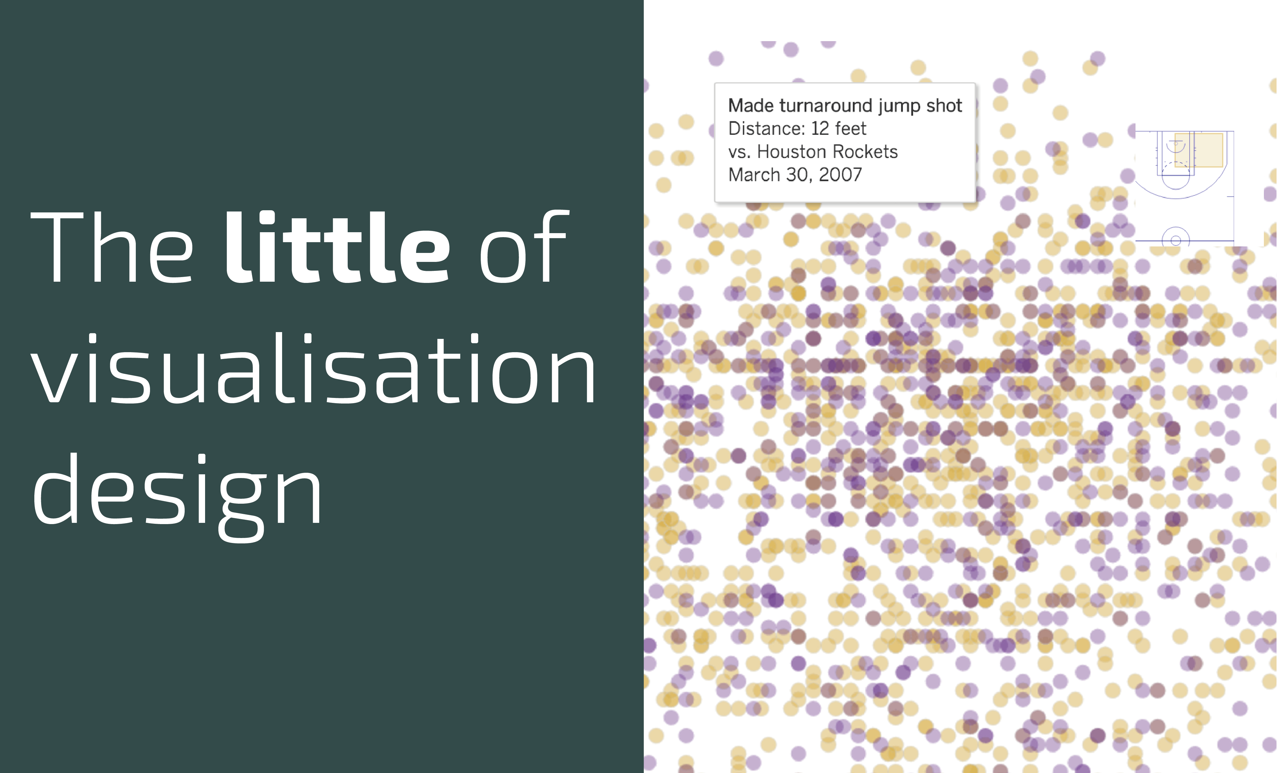
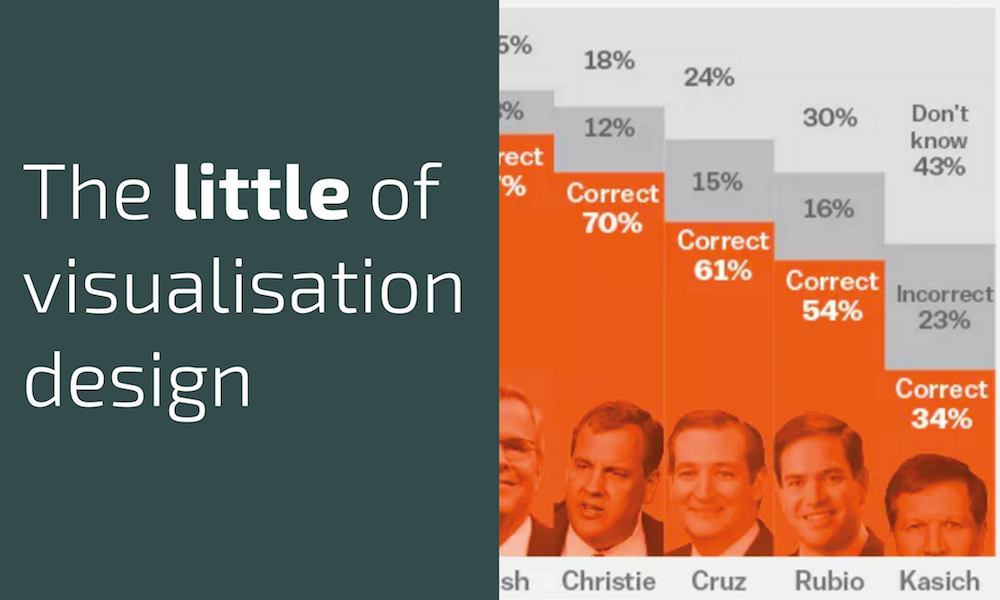
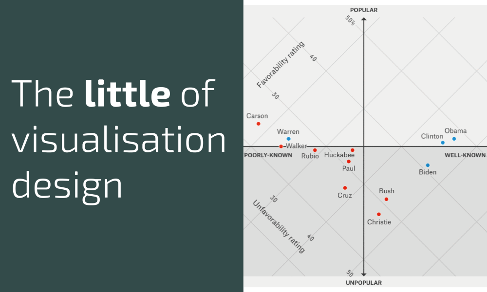
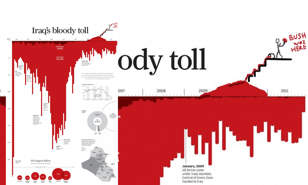
The little of visualisation design: Part 16
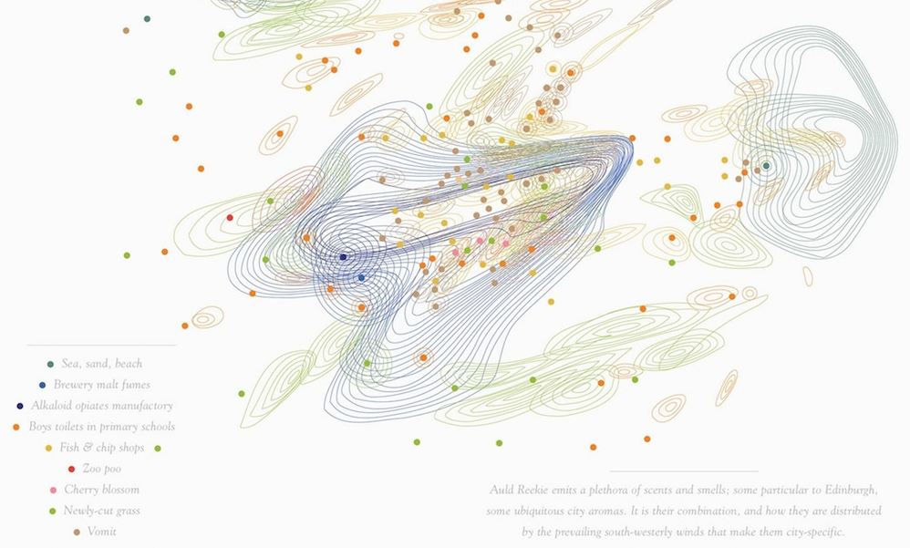
This is part of a series of posts about the ‘little of visualisation design’, respecting the small decisions that make a big difference towards the good and bad of this discipline.

This is part of a series of posts about the ‘little of visualisation design’, respecting the small decisions that make a big difference towards the good and bad of this discipline.
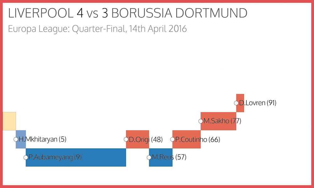
It has been a long time since I had the chance to undertake a self-initiated visualisation project but I blocked out a couple of days this week to work on a new graphic to mark the ending of the football season.

At the end of each month I pull together a collection of links to some of the most relevant, interesting or thought-provoking web content I’ve come across during the previous month. Here’s the latest collection from March 2016.
In order to sprinkle some star dust into the contents of my book I’ve been doing a few interviews with various professionals from data visualisation and related fields. These people span the spectrum of industries, backgrounds, roles and perspectives.
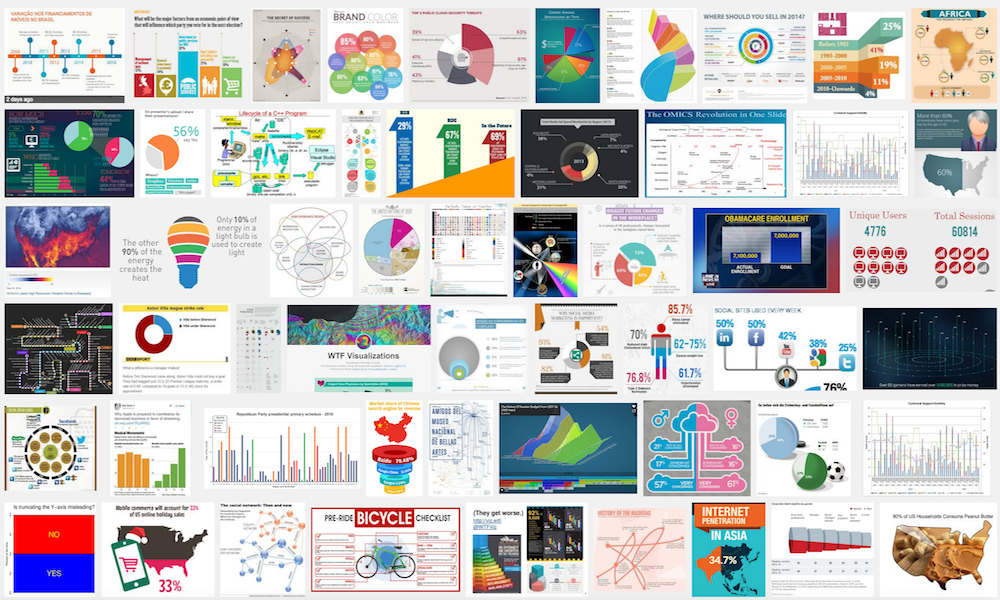
Over the past two months I have held contests (1 #Graphiti, 2 #BestWorstViz) for successful participants to win a free copy of my book when it is released in June. I was really impressed with the creativity exhibited in both these contests and so I am launching a third, and final, challenge.
In order to sprinkle some star dust into the contents of my book I’ve been doing a few interviews with various professionals from data visualisation and related fields. These people span the spectrum of industries, backgrounds, roles and perspectives.
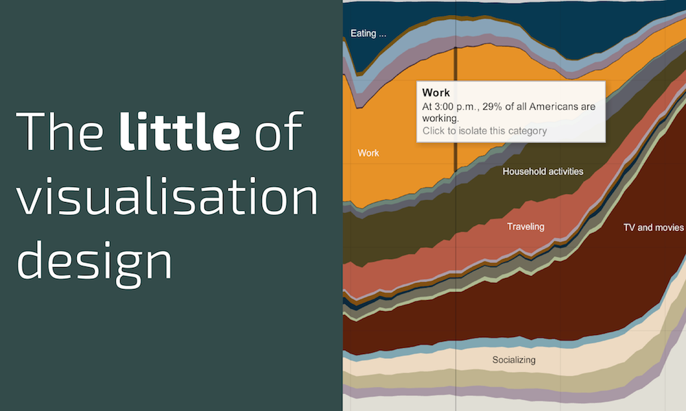
This is part of a series of posts about the ‘little of visualisation design’, respecting the small decisions that make a big difference towards the good and bad of this discipline.

In order to sprinkle some star dust into the contents of my book I’ve been doing a few interviews with various professionals from data visualisation and related fields. These people span the spectrum of industries, backgrounds, roles and perspectives.
This is part of a series of posts about the ‘little of visualisation design’, respecting the small decisions that make a big difference towards the good and bad of this discipline.
In order to sprinkle some star dust into the contents of my book I’ve been doing a few interviews with various professionals from data visualisation and related fields. These people span the spectrum of industries, backgrounds, roles and perspectives.

A couple of weeks ago I launched a second contest inviting people to send me examples of their best worst visualisation work. It had to be their work, though, not just submissions of bad visualisations they’ve seen elsewhere.
At the end of each month I pull together a collection of links to some of the most relevant, interesting or thought-provoking web content I’ve come across during the previous month. Here’s the latest collection from February 2016.
This is part of a series of posts about the ‘little of visualisation design’, respecting the small decisions that make a big difference towards the good and bad of this discipline.
This is part of a series of posts about the ‘little of visualisation design’, respecting the small decisions that make a big difference towards the good and bad of this discipline.
In order to sprinkle some star dust into the contents of my book I’ve been doing a few interviews with various professionals from data visualisation and related fields. These people span the spectrum of industries, backgrounds, roles and perspectives.
Last month I launched a contest based around the theme of ‘#graphiti’, inviting people to send in visualisation modified with their doodle-based daubings. Having really enjoyed running that contest I checked with my publishers to see if we could run two more before publication date and they were up for it!
This is a collection of the entire series of short articles titled ‘six questions with…’. The purpose of this growing set of interviews is to provide a conveniently sized platform to offer perspectives about data visualisation-related topics from professionals within, around or outside of the field.
In order to sprinkle some star dust into the contents of my book I’ve been doing a few interviews with various professionals from data visualisation and related fields. These people span the spectrum of industries, backgrounds, roles and perspectives.
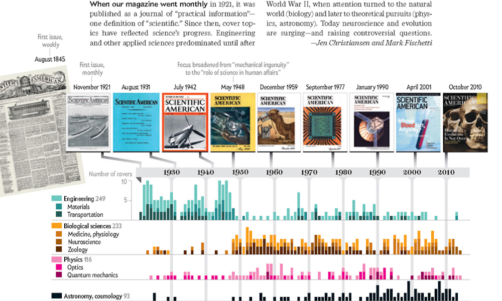
This is part of a series of posts about the ‘little of visualisation design’, respecting the small decisions that make a big difference towards the good and bad of this discipline.

This is part of a series of posts about the ‘little of visualisation design’, respecting the small decisions that make a big difference towards the good and bad of this discipline.
For the purpose of convenience, this is a collection of all the articles, posts and other outputs from the Seeing Data’ research work.
This is a collection of the entire, growing series of posts about the ‘little of visualisation design’, respecting the small decisions that make a big difference towards the good and bad of this discipline.
This is part of a series of posts about the ‘little of visualisation design’, respecting the small decisions that make a big difference towards the good and bad of this discipline.
This is part of a series of posts about the ‘little of visualisation design’, respecting the small decisions that make a big difference towards the good and bad of this discipline.
A couple of weeks ago I launched a small contest inviting folks to send me examples of graphiti – the clever ways can you think of combining the world of doodling and visualisation. The winner would receive a free copy of my upcoming book as soon as it is published.
This is part of a series of posts about the ‘little of visualisation design’, respecting the small decisions that make a big difference towards the good and bad of this discipline.
This is part of a series of posts about the ‘little of visualisation design’, respecting the small decisions that make a big difference towards the good and bad of this discipline.
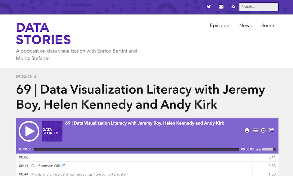
A couple of weeks ago I had the pleasure of joining Helen Kennedy, leader of the Seeing Data research project I’ve been working on, and Jeremy Boy to record episode 69 of the Data Stories podcast.
In order to sprinkle some star dust into the contents of my book I’ve been doing a few interviews with various professionals from data visualisation and related fields. These people span the spectrum of industries, backgrounds, roles and perspectives.
At the end of each month I pull together a collection of links to some of the most relevant, interesting or thought-provoking web content I’ve come across during the previous month. Here’s the latest collection from January 2016.