This is part of a series of posts about the ‘little of visualisation design’, respecting the small decisions that make a big difference towards the good and bad of this discipline. In each post I’m going to focus on just one small matter – a singular good or bad design choice – as demonstrated by a sample project. Each project may have many effective and ineffective aspects, but I’m just commenting on one.
The ‘little’ of this next design concerns a nice way, proposed by Tim Brock, of handling some of the concerns that people raise about the potential misleading effect of using of a non-zero value-axis origin in line charts. (You don’t need to start line chart value axes at zero but I’m not going to get into that here and now).
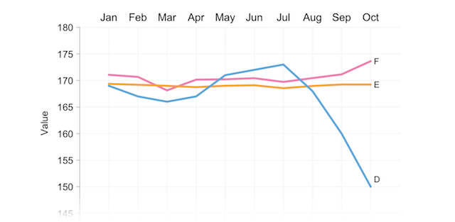
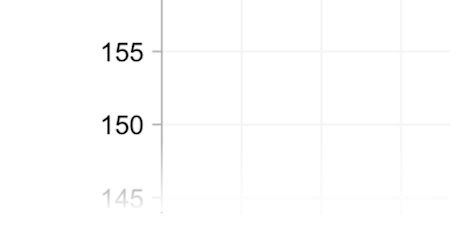
In an excellent article Tim discusses various approaches that help avoid giving the reader the sense that the ‘bottom’ of a chart should be read as a zero baseline. One solution that catches my eye is the use of a fading effect at the lower end of the chart. By decreasing the opacity for the colouring of the axis line, any tick marks and the value label, this makes visually clearer that the chart’s view is only presenting the observed range of values.