
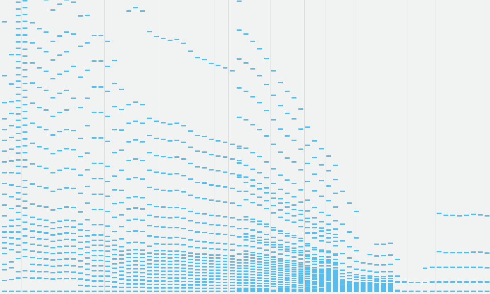
In my recent ‘Ask Andy Anything’ webinar Andy Cotgreave and I were faced with a particularly challenging pair of questions, one about sharing ‘success stories’ and the other inviting us to offer an elevator pitch for the value of data visualisation. I think this project by the excellent Alvin Chang of Vox is a perfect exhibit of the role of data visualisation. It visualises ‘100 years of tax brackets, in one chart’. Technically, it doesn’t just do this in one chart because it builds up the narrative through a series of carefully introduced sequenced snippets before the big reveal of the full 100 year chart.
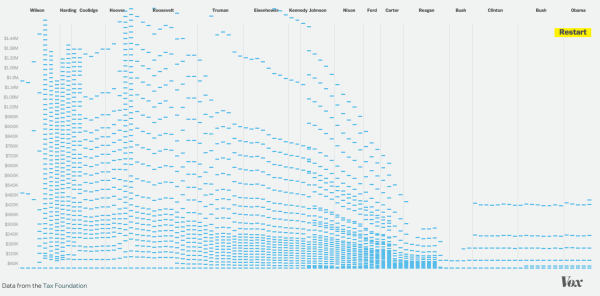
What it shows is the incredibly complex brackets that were in place for so many years – but arguably reflecting a more equal society – and then the hugely reduced and simplified model of the latter years of Reagan’s term, down to just two bands – with middle earners facing the same taxes as the wealthy.
This is data visualisation at its best as a device for facilitating understanding in a way no other form could achieve. You can see the data. You can learn something about the subject if you are new to it, you can confirm what you suspected about the subject if you are not. When next I find myself in an awkward elevator situation being asked about the value of data visualisation, I’m going to have a laminated print-out of this example ready to whip out.
(As a sidenote, take a look at how the responsive design modifies the appearance of the President labels as you widen/narrow the screen)
