

This is the second in a series of three blogposts about the Seeing Data project. The first post was written by Professor Helen Kennedy, director of Seeing Data, and discussed some of the findings and what they meant for how we think about ‘effective’ visualisations. In this second post, I reflect on one of the research methods that we used, called ‘Talking Mats’, which we think offers some really exciting possibilities for measuring the effectiveness of data visualisations.
Part 2: Talking mats as a visual method for assessing and discussing data visualisations
One of the central research activities during this project involved the nine focus groups, with a total of 46 participants involved. The purpose of these focus groups was to invite the participants to spend time looking at, exploring and reflecting on their experiences of working with up to eight different visualisation projects.
The projects were selected according to a range of different characteristics in order to expose participants to a diverse set of subject matters, chart types, and formats. They were asked to spend up to 40 minutes experiencing as many of the projects as possible but with no fixed time limit – they could stay immersed for longer in some and quickly move on from others should they wish to.
In addition to a capturing their responses about their experiences across different prompts via a written template, we also invited participants to log their perceptions about the projects they had spent time with using a technique called a ‘Talking Mat’ (developed by Murphy and Cameron at the University of Stirling, 2008).
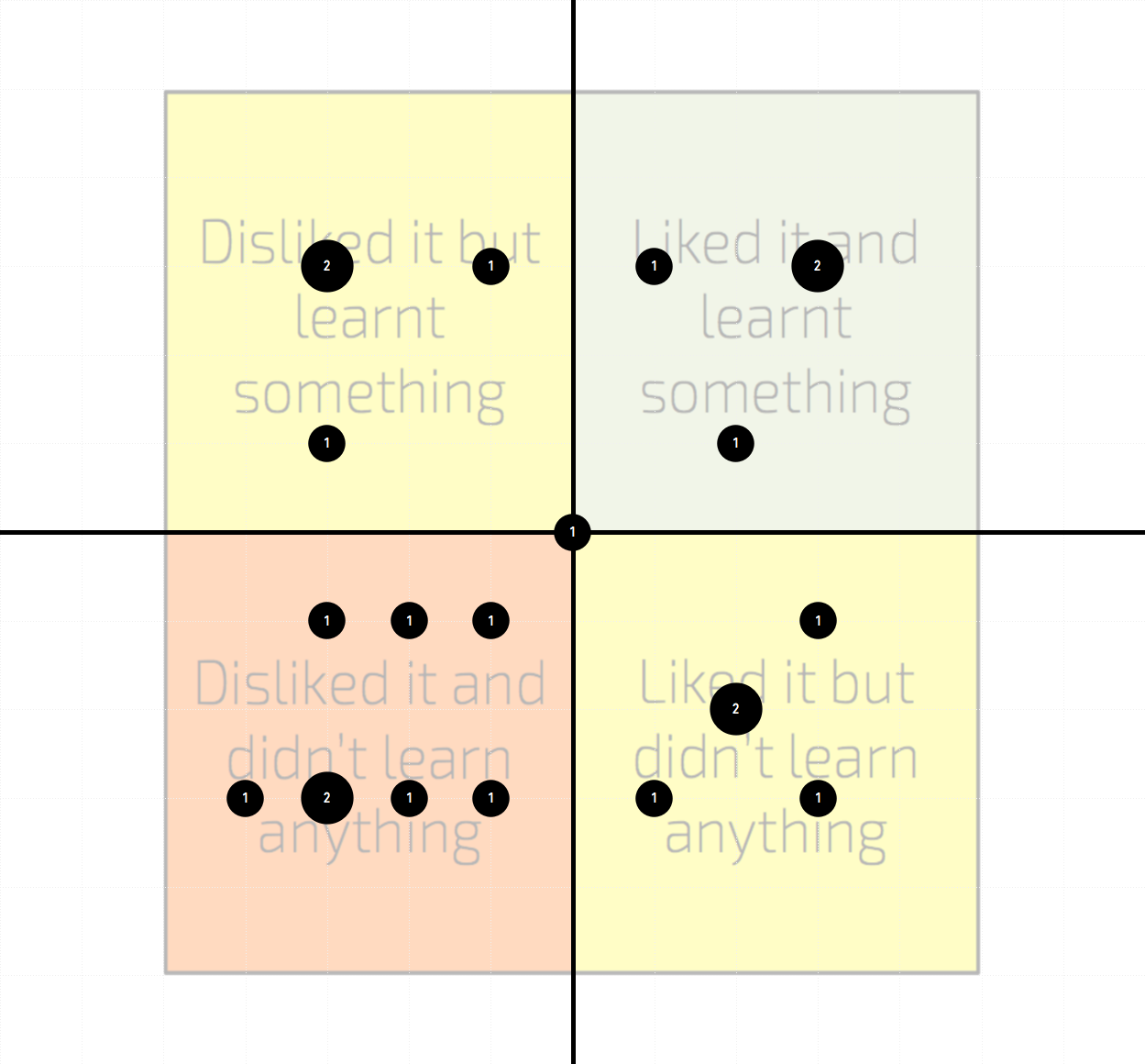
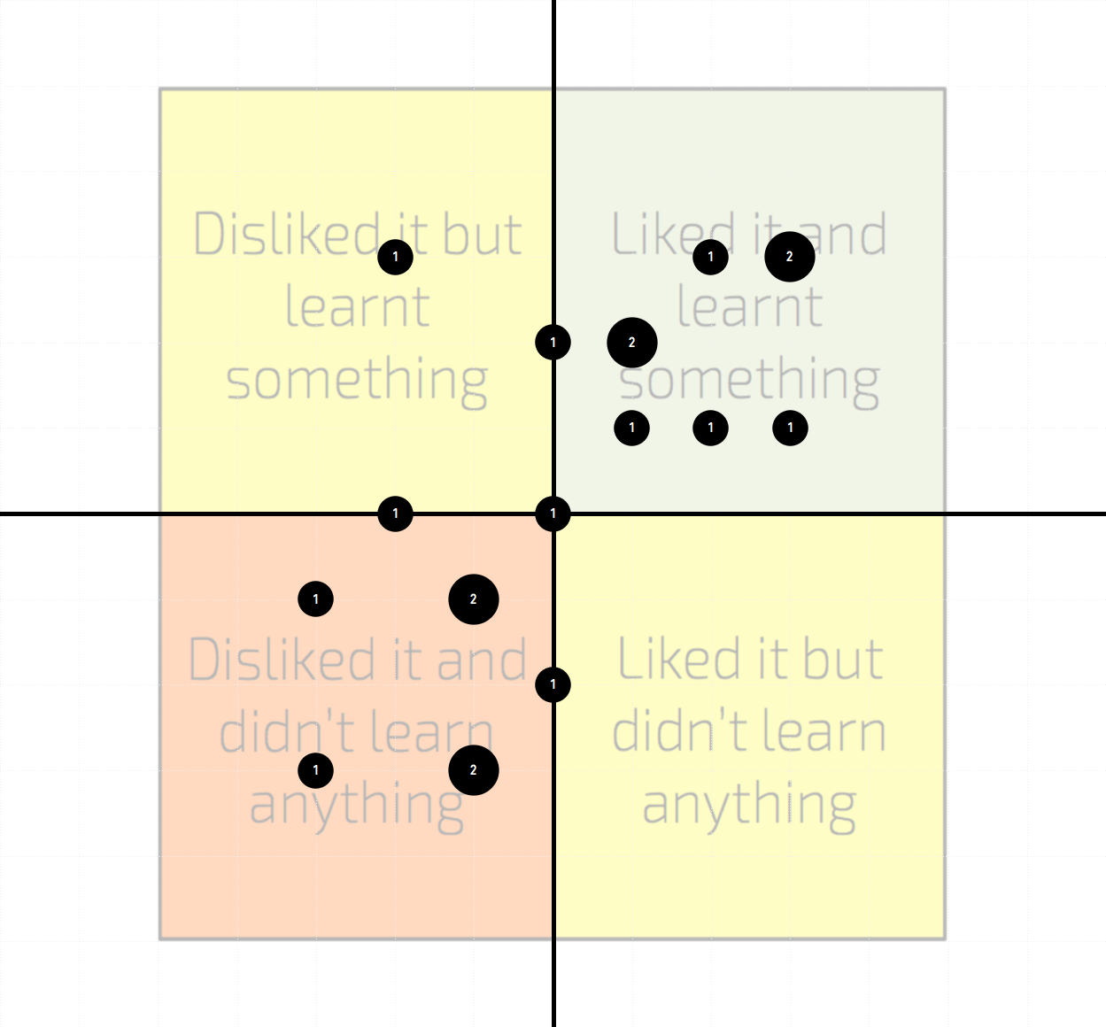
The Talking Mat is a 2×2 grid on which participants could position a representative thumbnail image of the visualisations they had looked at to express their feelings and reactions across two dimensions of assessment: like and learn. The ‘like’ dimension would allow them to express what level of appeal they subjectively felt towards the work (like to the right, dislike to the left). The ‘learn’ dimension was a term to capture the participants impression of whether they felt the visualisation had facilitated understanding for them, whether through new understanding or through confirming existing understanding (learnt to the top, didn’t learn to the bottom).
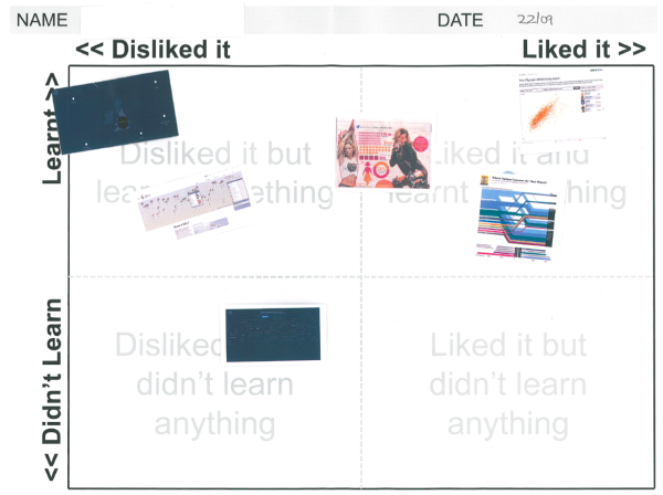
We used the terms ‘like’ and ‘learn’ to reflect the everyday language of people who are not expert in data visualisation (inspired by Andrew Sayer’s Why Things Matter to People’ in which he encourages researchers to do this). It also enabled participants to really grasp the type of judgments we were seeking of them.
VISUALISATION RATINGS
Below you see the collection of ratings formed by our focus group participants about the visualisation projects used. The size of the bubble indicates the number of responses where participants shared the same rating location (the circle labels also indicate this value). Note that not all participants managed to find time to explore all visualisations so, with the sequence of visualisations to assess preserved for all involved, the sample size of ratings diminishes as you reach the lower projects in this list. The coloured background regions simply emphasise the sense that the top-right quadrant is the ‘ideal’ location for a project to be rated, the top-left and bottom-right demonstrate a perceived shortcoming in one dimension of judgment, and the bottom-left would reflect a general view of a project being less than effective.
As you will see some projects were perceived more favourably, across both dimensions, than others, but, critically, there were no universal opinions, showing again that the notion of ‘perfect’ in visualisation is a permanently elusive state. One could argue that even if a project was ‘disliked’, if a participant felt they had learnt something (top-left) then that could be seen as a better outcome than a ‘liked’ project that did not appear to facilitate ‘learning’ (bottom-right). Click on the thumbnails to view each project.
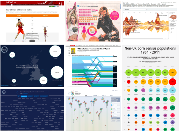
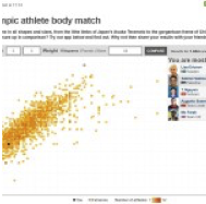
1. Your Olympic Athlete Body Match, BBC online

2. Migration In The Census, produced for The Migration Observatory, University of Oxford, by Clever Franke


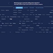
3. Migration In The News, produced for The Migration Observatory, University of Oxford, by Clever Franke

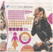
4. The Clicks Don’t Lie, The Metro newspaper

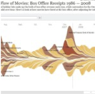
5. The Ebb & Flow of Box Office Receipts, 1986-2008, New York Times
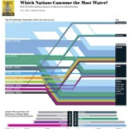
6. Top Ten Freshwater Consumers, Scientific American magazine
7. Better Life Index, The Organisation for Economic Co-operation and Development (OECD)

8. Non-UK Born Census Data, Office for National Statistics (ONS)

EVALUATING VISUALISATIONS WITH TALKING MATS
The 2×2 grid helped us capture the emotional nature of responses to data visualisations and the relationship between the feelings visualisations evoke (like) and the thoughts they instigate (learn). It captured these precisely through the gradation of locations that it offered. But our use of the Talking Mat also raises this question: do people respond viscerally/affectively to visualisations, or did this method draw out the visceral/affective? Does the method play a role in prioritising certain (visceral/affective) responses, or ways of responding, over others?
The process of positioning the visualisations on the mats was fun for our participants; they enjoyed comparing their responses to other participants and were interested in the differences and similarities. As we had hoped, our use of Talking Mats enabled discussion. By allowing participants to look at their own responses as a whole, it enabled them to evaluate their responses to data visualisations intertextually (that is, in relation to other visualisations). For example, participant Robert, a business analyst, held up his Talking Mat and said ‘I must be in really bad mood today’, because of his positionings of all the visualisations.
Talking Mats do have some limitations though. The language of ‘like/learn’ on the grid framed focus group discussion about what participants liked and learned, perhaps directing them away from other interesting things they might have said. As mentioned, ‘like’ and ‘learn’ are vague and fluid terms, and represent only two possible responses and reactions to data visualisations. It might be hard for participants to classify their responses in these simultaneously narrow and ill-defined terms.
The grids didn’t allow for nuance or ambivalence: participants may have liked bits of visualisations, but not others (they might be interested in the subject matter but not like the aesthetic style), but the Talking Mat didn’t allow them to record this. Participants are pushed to commit to a decision; using Talking Mats might close down the possibility of changing position later.
‘Despite these limitations, as a research team, we feel that Talking Mats offer a practical, relevant and valuable way for gathering useful ratings of the effectiveness of a project as perceived by its user or reader. Because of our positive experience of using Talking Mats during the research, we developed an application/module on our Seeing Data project website, where visitors can record their responses to visualisations and compare these with the responses of other visitors. Additionally, in my capacity as a lecturer and trainer, I have found these approaches valuable for conducting evaluation exercises with my students and delegates.
Our website application has been extremely well received, by our project advisory board, visualisation experts at the University of Oxford and others. We think there is lots of potential to develop it further, so we’re trying to secure funding to develop an open source widget that can be used across visualisations, platforms and devices and which is freely available to all visualisation designers. Watch this space, as we might be asking you to help us beta test it some time soon!
