
Design
Monitoring live energy usage at London’s Olympic landmarks
Arriving in time for the start of the Olympics today, Power the Games Live is a new development from Applied Works for the official energy provider EDF,

Arriving in time for the start of the Olympics today, Power the Games Live is a new development from Applied Works for the official energy provider EDF,

I was recently interviewed by Kyle Ellis for the excellent Society of News Design (SND) website, to discuss data visualisation and the Olympics. Anyway, if you haven’t had quite enough of my thoughts and opinions of late, then do take a look!

The Wall Street Journal have tonight released a massive, immersive and ambitious data visualisation project entitled ‘Political Moneyball’, which visualises over a million records to reveal the networks and relationships that exist behind political contributions.
Over the past few months its been hard to ignore the quantity of stories, incidents and awful mis-judgments that highlight a certain under-representation and sub-standard treatment of women amongst the science and technology sectors

The London 2012 Olympic Games is nearly upon us and, naturally, in the lead up to such a major sporting event that will generate incredible quantities of data and create fantastic opportunities for analysis, there are a number of interesting visualisation and infographic developments making their way around the field.

Back in May I invited people interested in my data visualisation training courses to register their preferred location with me so that I could start to design my next schedule of events based on where the main clusters of potential interest were. Here’s an intermediate update to give people a sense of how things are looking.

Yesterday evening, on a train journey home, I was musing about the reading I need to line up over the summer. One of the subjects that jumped to the front of my mind was that of typography.

With the start of the 2012 London Olympics fast approaching, the quantity of infographics and visualisations about the games are naturally popping up everywhere.
To mark the milestone of each mid-year and end of year I try to take a reflective glance over the previous 6 months period in the data visualisation field and compile a collection of some of the most significant developments.
I was recently interviewed for Tiago Veloso’s Visual Loop website, a site for which I have a great affinity. Tiago and I both started our blogging lives at around the same time and he’s a really smashing guy so do check out his site for a relentless stream of visual eye-candy.

At the end of each month I pull together a collection of links to some of the most relevant, interesting or thought-provoking web content I’ve come across during the previous month. Here’s part two of the latest collection from June 2012
At the end of each month I pull together a collection of links to some of the most relevant, interesting or thought-provoking web content I’ve come across during the previous month. Here’s part one of the latest collection from June 2012

Just come across this, the Sectra Visualisation Table, a touch screen table that allows, in its early offering, medics to collaborate interactively to learn about and prepare for surgical procedures.
A guest article I wrote for the excellent O’Reilly Radar site has just been published. Titled ‘Walking the tightrope of visualization criticism’ this rather long piece reflects on some of the key experiences of my training courses and some general observations about the level and appropriateness of critique that exists in the field.
I was recently interviewed for Mindjet’s ‘Conspire’ website, a new resource which I’ve admittedly only come across over the past couple of months but seems to have some great content. Anyway, if you are so inclined, just click on the image below to be taken to a page containing my ramblings…
At the end of each month I pull together a collection of links to some of the most relevant, interesting or thought-provoking web content I’ve come across during the previous month. Here’s part two of the latest collection from May 2012
At the end of each month I pull together a collection of links to some of the most relevant, interesting or thought-provoking web content I’ve come across during the previous month. Here’s part one of the latest collection from May 2012
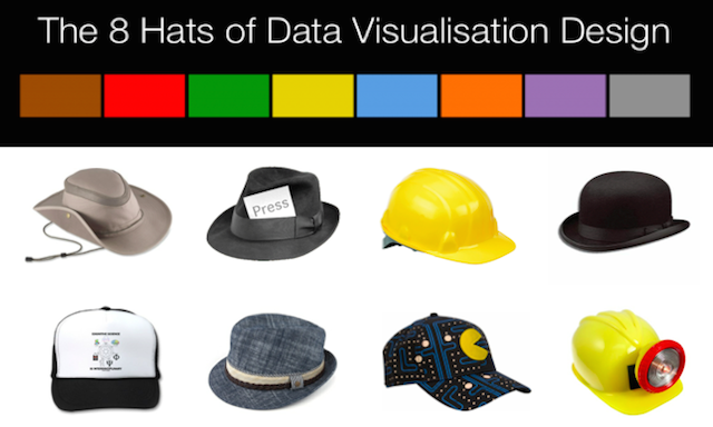
Last week I posted a slideshare version of my slides from a recent pair of presentation events in Chicago. The title of this talk was “The 8 hats of data visualisation”.
Last Thursday I had an enjoyable half hour or so chatting with Ben Jones of DataRemixed.com. Ben recorded the conversation and has now published both the audio and some narrative of this chat on his site.
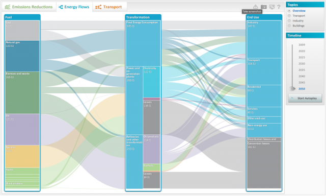
We’ve had a number of interesting new project releases of late (see this, this and that) and today continues that pattern with another super visualisation development produced for the International Energy Agency (IEA) on energy technologies.

One of the matters that I cover at the start of my data visualisation training courses is a brief reflection on visualisation’s popularity in a mainstream sense and how it has now penetrated (and continues) parts of culture and society that it would never really have managed to do even 5 years ago.
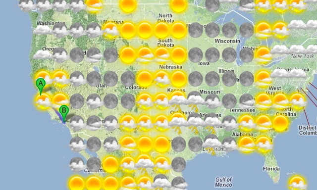
The smart folks over at Stamen Design have come up with some more of their mapping goodness with a great tool that I’m pretty sure everybody will appreciate: a travel planner that includes a layer of weather forecast data for your journey
We’ve seen a number of recent developments where particle flow has been visualised in fascinating ways to depict natural phenomena such as wind, the Oceans and water.

Santiago Ortiz, genuinely one of the most creative and interesting freelance designers practicing in the field right now, has published a new interactive project: the ‘Data visualization references network’.

The issue of plagiarism vs. inspiration is not a new topic, it has been with us for years and is the fundamental basis of copyright and IP, but it is an increasingly important consideration for us in the visualisation field.
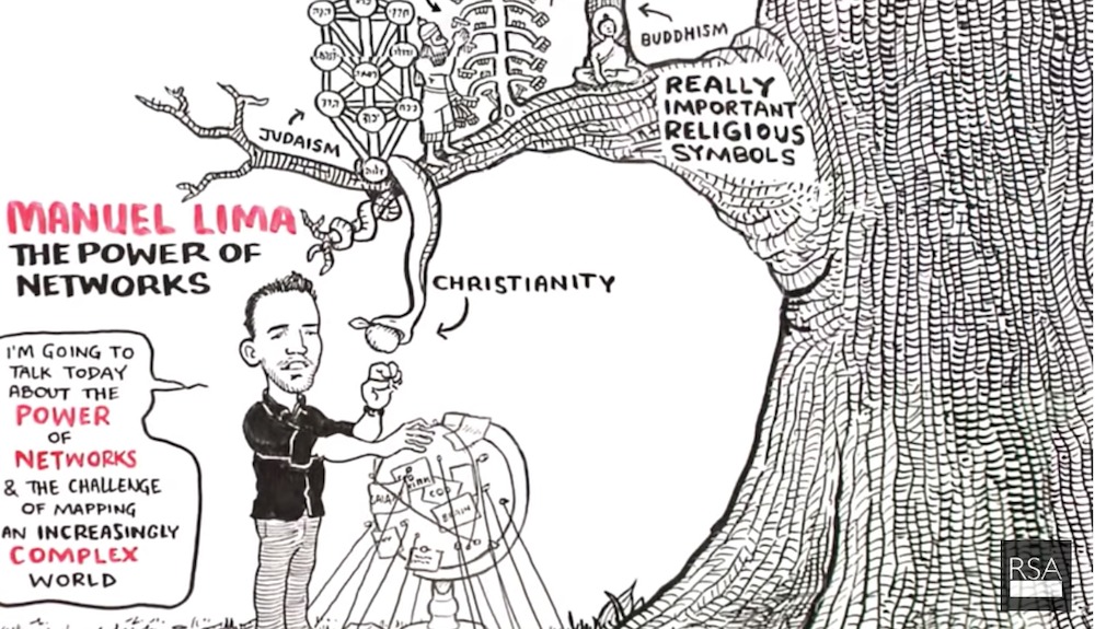
Those of you who have watched the video footage from the recent SEE conference may have seen Manuel Lima’s talk on the ‘The Power of Networks: Knowledge in an age of infinite interconnectedness’.
At the end of each month I pull together a collection of links to some of the most relevant, interesting or thought-provoking web content I’ve come across during the previous month. Here’s part one of the latest collection from April 2012.
At the end of each month I pull together a collection of links to some of the most relevant, interesting or thought-provoking web content I’ve come across during the previous month. Here’s part one of the latest collection from April 2012
Hello everyone. I felt compelled to break the silence with a brief update on matters. I’ve had quite a lot of traffic round these parts of late, thanks to sharing of my data journalism handbook post and Nathan’s inclusion of my site on his collection of blog reads.
Hot from the Bremen sound studio is the brand new release of Episode 5 of the Data Stories podcast with Enrico, Moritz and me, as a returning invited guest. In this episode we cover the subject of data visualisation training, a subject clearly close to my heart.