Articles
What do charts actually show us?
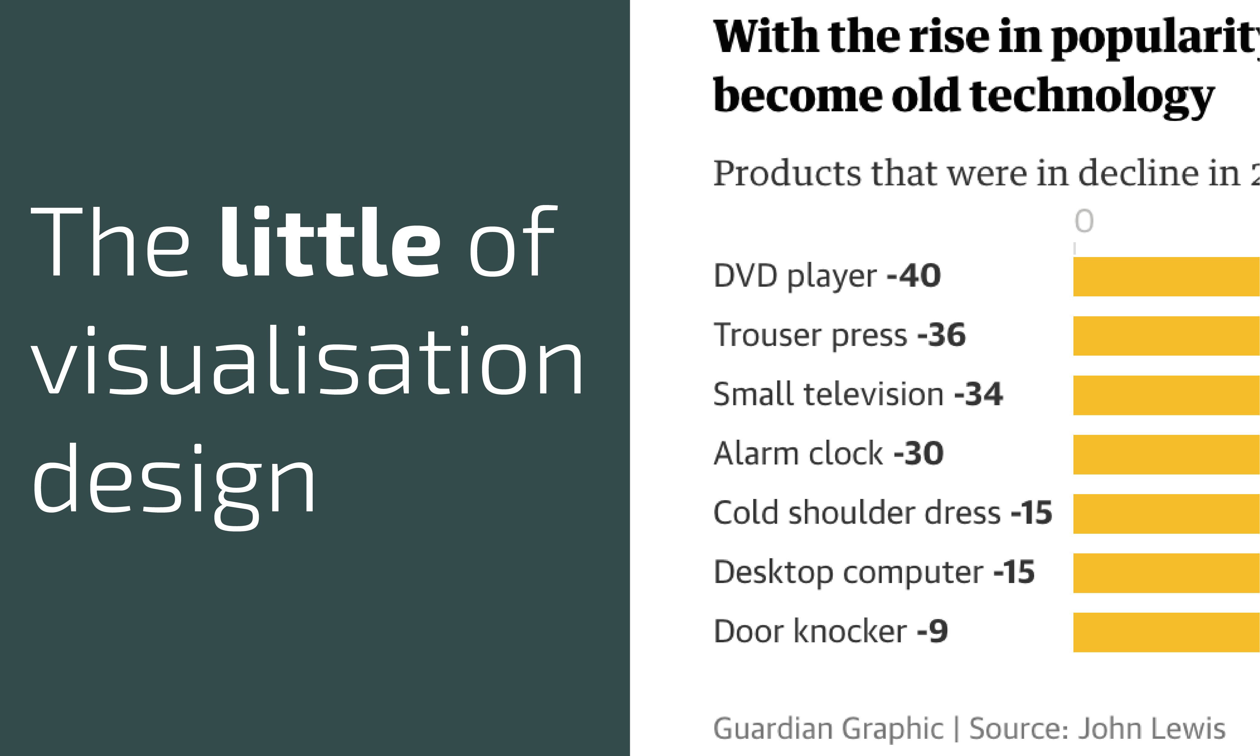
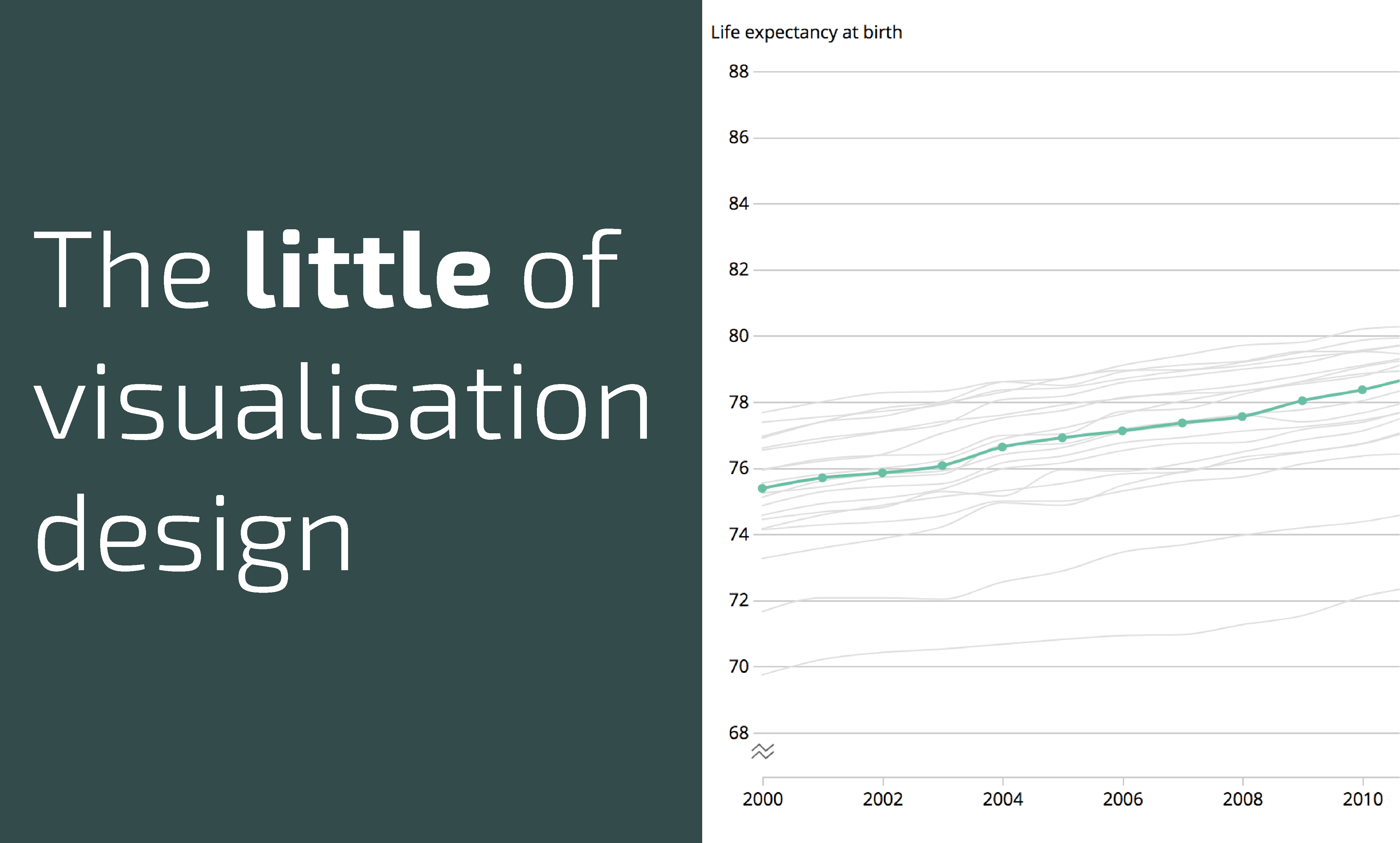
As consumers of visualisations, before we form interpretations and conclusions from the charts we see, we have to remember that they are only a visual display of the data that has been collected and the way that data has been transformed.