
To mark each mid-year and end-of-year milestone I take a reflective glance over the previous 6-month period in the data visualisation field and compile a collection of some of the most significant developments. These are the main projects, events, new sites, trends, personalities and general observations that have struck me as being important to help further the development of this field or are things I simply liked a great deal. Here’s the full compilation of all my collections.
Earlier last year I published a collection for the first 6 months of 2017 and now I’d like to reflect on the second 6 months. I look forward to hearing from you with suggestions for the developments you believe have been most significant.
And so, as ever, in no particular order…
1. Datawrapper
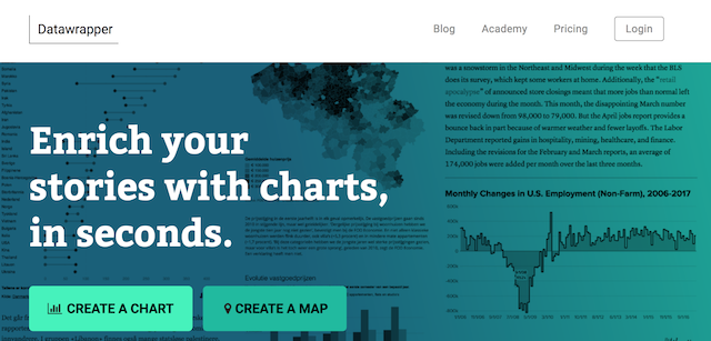
We begin the list with a few mentions for visualisation tools/applications. Datawrapper has been around for several years, offering a very neat method for quickly creating charts and maps online. However, it feels like these past few months of 2017 will be looked back on as something of a watershed. With the tool continuing to mature substantially, especially in the breadth of chart types and customisations that are possible, the recent inspired appointments of stellar talents Lisa Charlotte Rost and Gregor Aisch to the team show things are moving forward in a very exciting direction. Tool aside, let me recommend you find a way to add Lisa’s excellent and prolific blog posting to whatever feed mechanism you follow these things through.
2. Project Lincoln
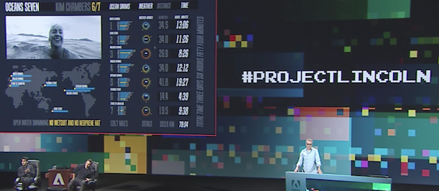
This video is from the Adobe MAX 2017 event and offers a ‘sneak peak’ presentation from Bernard Kerr about a tool he has been working on, known for now as Project Lincoln. As I wrote back in October, I was very fortunate have the chance to see a preview of this tool early in 2017 and, should it be backed by Adobe, it looks like a really exciting development for visualisation designers. The fact it is being showcased at this event suggests progress is positive so fingers-crossed.
3. Bee-swarm charts
This is not a new plot – it seems there have been R packages for several years and Nathan did this tutorial post over a year ago – but in terms of observing trends I feel the past half year has seen a lot of growth in the deployment of this technique (examples: 1, 2, 3, 4). They are deployed when you want to show the distribution of values in a dataset but in a way that maintains the resolution of every data point rather than displaying aggregated bins (histogram) or potentially abstract summary statistics (box-and-whiskers plot).
4. How do you draw a circle?
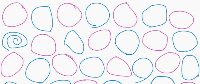
Apart from exhibiting a super slick set of visuals across a wonderfully composed and deeply insightful report, this work resonated with me simply as somebody who has always been intrigued by this most seemingly basic of things – the technique of drawing a circle. I was amazed at the range and diversity of methods taken by people from across the globe.
5. Peak Spotting
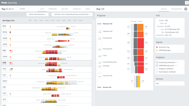
Based on a collaboration between superstars Studio NAND, Moritz Stefaner, Stephan Thiel, Christian Laesser et al, Peak Spotting isn’t just a particularly elegant visualisation combining a range of sophisticated visual techniques but, perhaps more importantly, it is also a practical tool created for Deutsche Bahn to help “yield and capacity managers to identify potential bottlenecks early on and react through price management, communications or logistic solution”. Wonderful to see such high-calibre work being created for the purpose of valuable utility.
6. Flowing Data
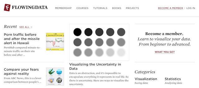
2017 marked 10 years of Nathan running the ever-superb Flowing Data and I feel it is really important to not only celebrate his reaching this milestone but to thank him for his relentlessly prolific profiling of the latest visualisation works and techniques, as well as his excellent tutorials and own visual explorations. Here’s to the next 10 years, Nathan!
7. Twitter
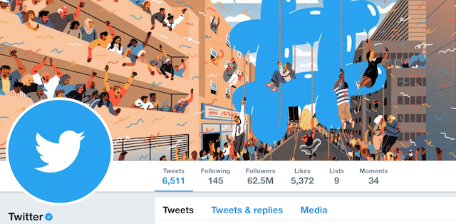
For many years now Twitter has been firmly established as the primary social media platform for posting, discovering and interacting with folks in data visualisation. Pretty much everyone of note is on there and is very active with it. Personally speaking it has been a tremendously important method for developing ones profile over several years. During the past two years, though, it is fair to say that the political landscape has altered the focus of conversation and attention. It is clear just looking at one’s timeline how visualisation is almost a secondary subject, which is entirely understandable. However, through the vaccuum of leadership from the ‘leaders’ of Twitter, failing to provide responsible custodianship in the face of growing volumes of extremist voices (human or otherwise), as people become exposed to an increasingly poisonous atmosphere beyond the immediate data visualisation bubble, there has been a growing sense that a tipping point may be imminent. Increasing numbers of people are voicing intent to leave Twitter or seeking new platforms to conduct their interactions elsewhere. Whether this elsewhere is Facebook or Mastodon, which has been tip-toeing slowly into the consciousness, remains unclear. It may not even happen. However, I do feel the visualisation-twitter world has changed and we could be reaching something of a junction in how this field exists and networks online.
8. Open Access VIS
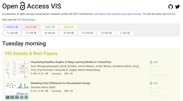
Steve Haroz’s work to create an accessible platform offering ‘a collection of open access visualization research papers, material, and data’ is a very useful and very appreciated development, especially for those outside of the academic communities with limited access to these important materials and/or those who don’t have the patience to collect and organise themselves.
9. Dear How To
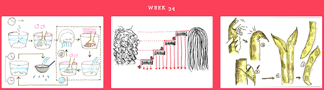
There have been several projects inspired by and emulating the essence of the rightly, highly celebrated ‘Dear Data‘ project, but ‘Dear How to‘ is perhaps my favourite. Taking a direction that goes beyond visualisation in a pure sense and more into explanation diagrams/information design, this project is based on a year of hand-drawn instructions. Each week Sol, Josefina and Tomoko (designers who met at the MA Information Design at Reading University) draw instructions on a blank postcard and sends it in turn to one or the other with the primary rule being ‘no text allowed!’.
10. What’s Going On in This Graph?
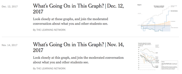
This is a new monthly feature from the New York Times, partnering with the American Statistical Association (ASA), motivated by a recognition of the importance, as a key 21st-century skill, of ‘teaching students how to read, interpret and question graphs, maps and charts’. Each month they publish a graph and invite people to consider and discuss three things: 1) What do you notice? 2) What do you wonder? 3) What’s going on in this graph?. Wonderful to see such prominent attention being placed on readers and their responses to and abilities to consume different types of visual portrayals.
Special mentions…
Here are the other highlights from the second half of 2017 that deserve a special mention:
The longest running study on wild elephants | The Amboseli Trust for Elephants has been studying the elephants of Amboseli, Kenya since 1972 following the lives of more than 3200 individuals born into 68 families and this interactive project cleverly shows the development of the Amboseli study population over time.
Face of a Nation | A very clever concept developed by Güney Soykan, this portfolio of images creates “portraits of different nations based on [images of] their leaders from the past 50 years”.
Font Map | This project offers an interactive map to explore over 750 fonts, formed by artificial intelligence used to surface new characteristics, relationships and means of organisation
Flourish Studio | Included ‘only’ in the special mentions because I’ve not yet had chance to find time to play but I’m very interested to see the capabilities of this tool from the talented folks at Kiln, with my appetite only whetted by this twitter thread.
German Election Visuals | There was some stunning visualisation work created before, during and since the German elections and this is a great compilation
Hurricane Visuals | Similarly, there were some very innovative visuals produced to cover the devastating US Hurricanes and this collection provides a nice snapshot
Shadow Peace | Neil Halloran’s excellent sequel to ‘The Fallen of World War II’, ‘The Shadow Peace’ is a “web series that combines data-visualization and cinematic storytelling to explore the driving factors of war and peace”.
