

This is part of a series of posts about the ‘little of visualisation design’, respecting the small decisions that make a big difference towards the good and bad of this discipline. In each post I’m going to focus on just one small matter – a singular good or bad design choice – as demonstrated by a sample project. Each project may have many effective and ineffective aspects, but I’m just commenting on one.
The ‘little’ of this next design concerns the choice of axis scale intervals. The graphic in focus is taken from a screen shot of BT Sports (UK) TV coverage of the Australia vs. England 1-day cricket match. I suspect the visuals are produced by the host broadcasters in Australia (most likely Channel 9).
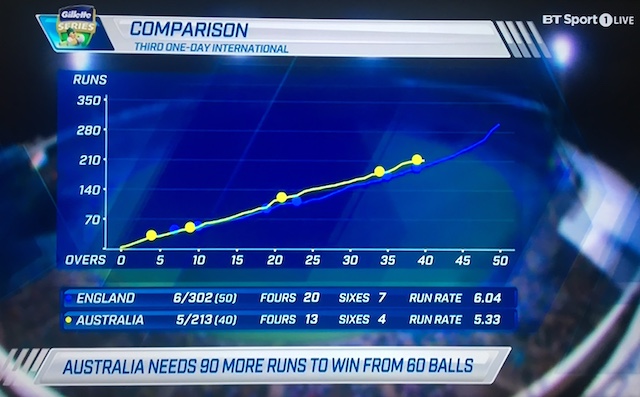
This chart shows the cumulative progress of run scoring for each team across the 50-overs that each team bats for. The chart helps to show whether Australia appear to be on track for victory or otherwise given England’s rate of run scoring. My issue with this chart’s design concerns the y-axis scale intervals that use units of 70 runs.
It isn’t that you CAN’T get a sense of the quantitative positions of the line heights but more that it puts greater burden on the eye and the brain to work out what the values are between these intervals. Surely it would be much easier to perceive if the chart used axis intervals of 50, 100, 150 etc.? Judging runs in units of centuries and half-centuries is integral to the language, focus and statistical chunking of cricket so I just do not see the merit of using the 70, 140, 210 scales.
