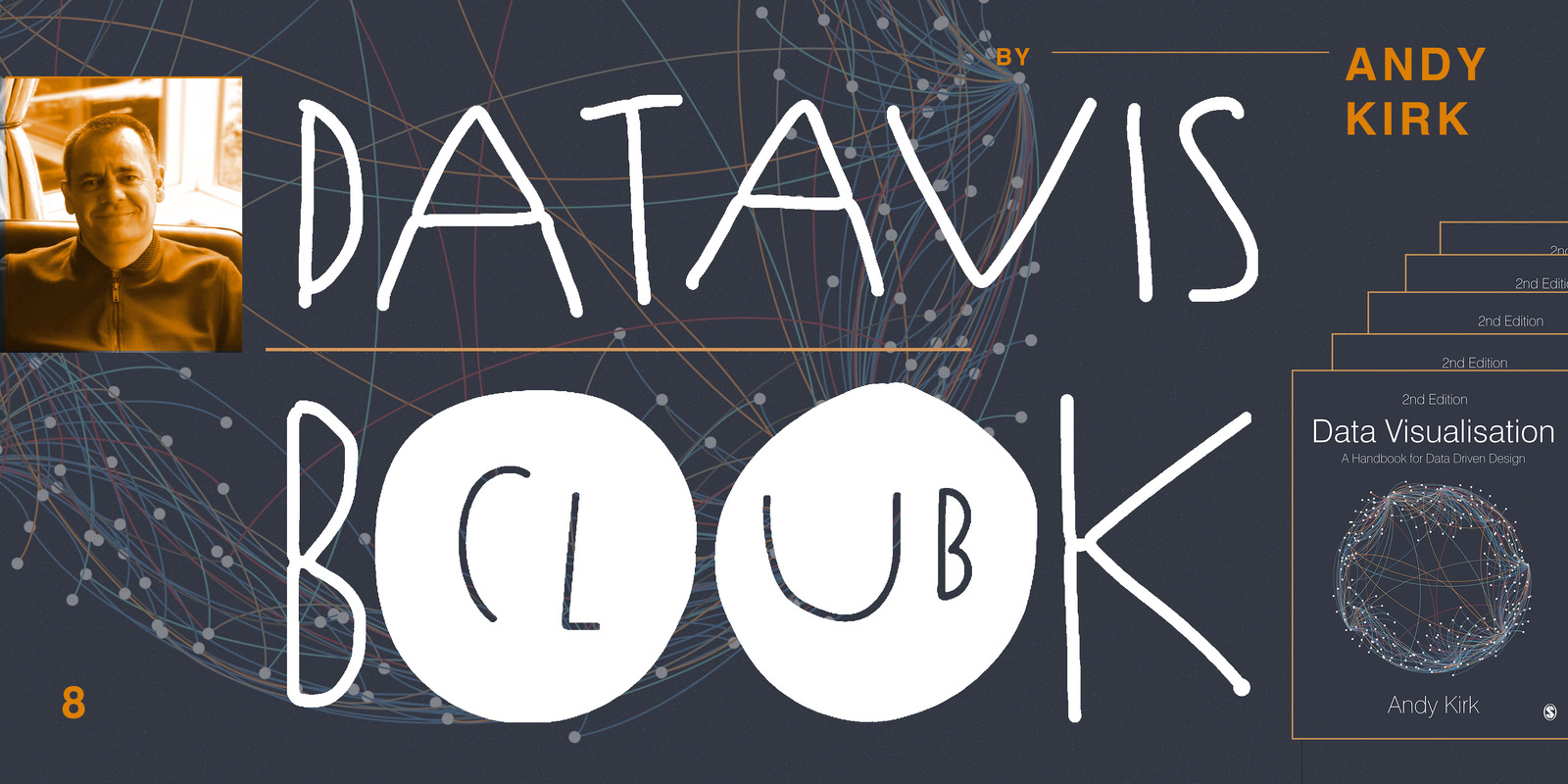
The little of visualisation design: Part 65
This is part of a series of posts about the ‘little of visualisation design’, respecting the small decisions that make a big difference towards the good and bad of this discipline.
Visualisingdata.com was originally launched in 2010 originally to serve as a blog to help continue the momentum of my learning from studying the subject via a Masters degree. I continue to publish articles and share announcements that track developments in my professional experiences as well as developments in the data visualisation field at large.
This is a collection of all my published posts, starting with the newest and dating back to 2010, tracking. These posts include articles, design commentaries, podcast updates, professional updates, and general news from across the data visualisation field.
This is part of a series of posts about the ‘little of visualisation design’, respecting the small decisions that make a big difference towards the good and bad of this discipline.
At the end of each month I pull together a collection of links to some of the most relevant, interesting or thought-provoking web content I’ve come across during the previous month. Here’s the latest collection from March 2019
This is part of a series of posts about the ‘little of visualisation design’, respecting the small decisions that make a big difference towards the good and bad of this discipline.
Yesterday I ran a simple Twitter poll about the relative ease of learning R vs. Python. Although a correct answer to this query will ALWAYS have to be based on nuances like pre-existing skills and the scope of need, this originates from people telling me they encounter job or career profiles that list a need for R and/or Python.
I’m delighted to share news that the second edition of my book ‘Data Visualisation: A Handbook for Data Driven Design’ is nearing completion and will be published in the UK in July 2019.
My next two-day data visualisation training course in London will be held on Wednesday 14th and Thursday 15th August. Registration is open now with earlybird discount rates available until the end of June.
I wanted to share details of a new longer-form data visualisation training course I am working on with methods@manchester and delivering in July as part of their summer school 2019 series of training courses. The course will be held over five days, Monday 8th to Friday 12th July.
It is the final week of earlybird tickets for the Encode conference taking place in London over 19th and 20th September. Encode is a brand new two-day conference that aims to ‘bring the creative community together to debate, share and explore the future of data-driven stories’.
I’m delighted to have been invited to join the judging panel for the data visualisation track of the Ocean Plastic Innovation Challenge, launched by National Geographic and Sky Ocean Ventures.
I wanted to share a brief update, which is a rubbish label to attach to this post but I’m all out of other better ways to position it.
At the end of each month I pull together a collection of links to some of the most relevant, interesting or thought-provoking web content I’ve come across during the previous month. Here’s the latest collection from February 2019.
This is part of a series of posts about the ‘little of visualisation design’, respecting the small decisions that make a big difference towards the good and bad of this discipline.
Earlier today I had the pleasure of delivering my first webinar presentation for Tableau this year. The title of my talk was ‘The Design of Time’.
At the end of each month I pull together a collection of links to some of the most relevant, interesting or thought-provoking web content I’ve come across during the previous month. Here’s the latest collection from January 2019.
This is part of a series of posts about the ‘little of visualisation design’, respecting the small decisions that make a big difference towards the good and bad of this discipline.
To mark each mid-year and end of year milestone I try to take a reflective glance over the previous 6 months period in the data visualisation field and compile a collection of some of the most significant developments. These are the main projects, events, new sites, trends, personalities and general observations that have struck me as being important to help further the development of this field.
Last year I compiled a Twitter list, my first ever Twitter list I’ll have you know, to create a visible membership formed of ‘Freelancers offering data visualisation/infographic design and consultancy services around the world’.
As consumers of visualisations, before we form interpretations and conclusions from the charts we see, we have to remember that they are only a visual display of the data that has been collected and the way that data has been transformed.
At the end of each month I pull together a collection of links to some of the most relevant, interesting or thought-provoking web content I’ve come across during the previous month. Here’s the latest collection from December 2018.
Whilst driving yesterday evening I was listening to BBC Radio 6 Music and heard an interesting interview with members of the band Field Music. They are doing a pair of performances at the Imperial War Museums inspired by a document called ‘The End of the War’.
This is part of a series of posts about the ‘little of visualisation design’, respecting the small decisions that make a big difference towards the good and bad of this discipline.
At the end of each month I pull together a collection of links to some of the most relevant, interesting or thought-provoking web content I’ve come across during the previous month. Here’s the latest collection from November 2018.
This is part of a series of posts about the ‘little of visualisation design’, respecting the small decisions that make a big difference towards the good and bad of this discipline.
2018 was a milestone year with regards to delivering data visualisation training. I ran 38 different events around the world, of which 32 were private events and 6 were public courses, with training delivered to 1001 delegates in total.
This is part of a series of posts about the ‘little of visualisation design’, respecting the small decisions that make a big difference towards the good and bad of this discipline.
At the end of each month I pull together a collection of links to some of the most relevant, interesting or thought-provoking web content I’ve come across during the previous month. Here’s the latest collection from October 2018.
This is part of a series of posts about the ‘little of visualisation design’, respecting the small decisions that make a big difference towards the good and bad of this discipline.
I’m delighted to announce that the second edition of my book “Data Visualisation: A Handbook for Data Driven Design” will be published in July 2019.
At the end of each month I pull together a collection of links to some of the most relevant, interesting or thought-provoking web content I’ve come across during the previous month. Here’s the latest collection from September 2018.