
This post is by Arran Ridley, PhD Candidate at the School of Media and Communication, University of Leeds. Arran is working on a White Rose/ESRC funded project entitled ‘Measuring Visualisation Engagement’ which extends the work that originated from the Seeing Data project I was a member.
Data visualisations are becoming ever more common in the public sphere as complex, large scale data sets are illustrated for public consumption. User-testing is a valuable and necessary part of any design project and this tool has been developed in response to both previous studies and an ethnographic study undertaken within a digital design studio which revealed the need for conducting user-testing within potential limited resources.
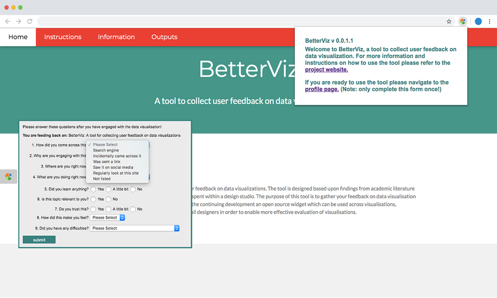
The automated tool captures engagement with data visualisation published online, which could be bar charts, maps or network graphs, usually found in news articles or public service communication for example. Building on research which identified the factors that impact on the engagement process the tool focuses on capturing aspects of the sociocultural context of the audience to build a more nuanced understanding of the engagement process and move beyond understanding effectiveness from the position of insight towards the impact it has in daily life.
It is now available as a Google Chrome extension found here. It is currently in the format of a closed experiment, limited to a number of websites. This limited approach will allow for more concentrated data to be collected on the user’s engagement with the data visualisations and allow for a better comparison.
Here is a short video that demonstrates the extension in practice:
The plan is to release a version that will work with every website in the near future.
For more information about this project, please refer to the project website.
