This is part of a series of posts about the ‘little of visualisation design’, respecting the small decisions that make a big difference towards the good and bad of this discipline. In each post I’m going to focus on just one small matter – a singular good or bad design choice – as demonstrated by a sample project. Each project may have many effective and ineffective aspects, but I’m just commenting on one.
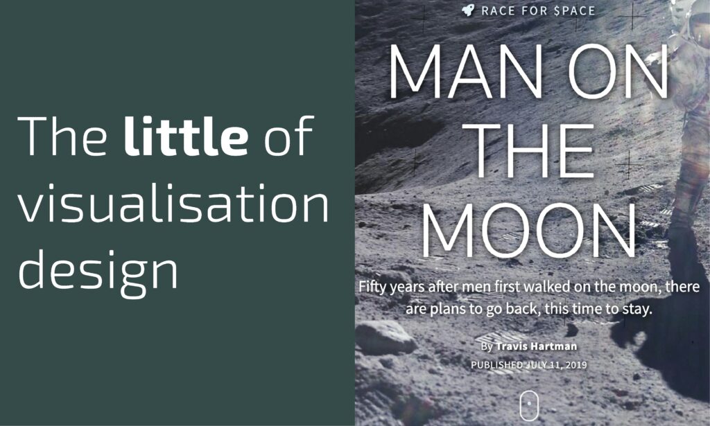
The ‘little’ of this next design concerns the clever offering of user-interaction prompts. The work in focus was produced by Travis Hartman for Reuters titled ‘Man on the Moon‘.
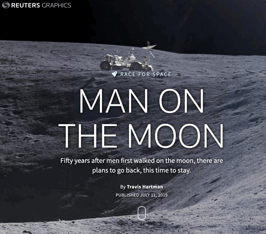
The little design choice I like about this project is how it provides a simple animated guide for how readers should navigate through this work. The animated mouse clearly implies that the reader should browse through the content by scrolling down the page with the mouse-wheel, as suggested, or as an equivalent, with the swipe action of a track pad/touch screen. Though for some it might be intuitively obvious how they should scroll down the page, there will be some for whom it is helpful to have that prompt. The inclusion of this feature demonstrates that extra sense of care and attention to detail.