In this series I am looking at different contextual, editorial, analytical, or design challenges encountered when working on data visualisation tasks. Each will be framed around a specific ‘everyday’ challenge with five possible methods, ideas or observations presented. Focusing on just five is deliberately arbitrary and non-exhaustive: just enough to provide some different ideas but not enough to pretend to be definitive.
What are five different ways of presenting bar charts?
“Bar charts are boring”, say many people. “How can we make them more attractive”, say many desperate clients. Bar charts are ubiquitous because they are the reliable and trusted lieutenants often relied upon to show the always-common quantitative comparisons across different categories. Their frequent use can induce ‘boredom’ through the familiar but, in particular, accusations of inelegance can be raised with the default tool styles many creators lean on.
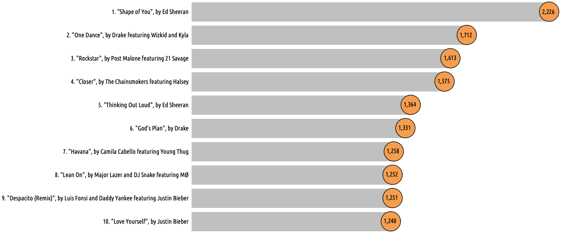
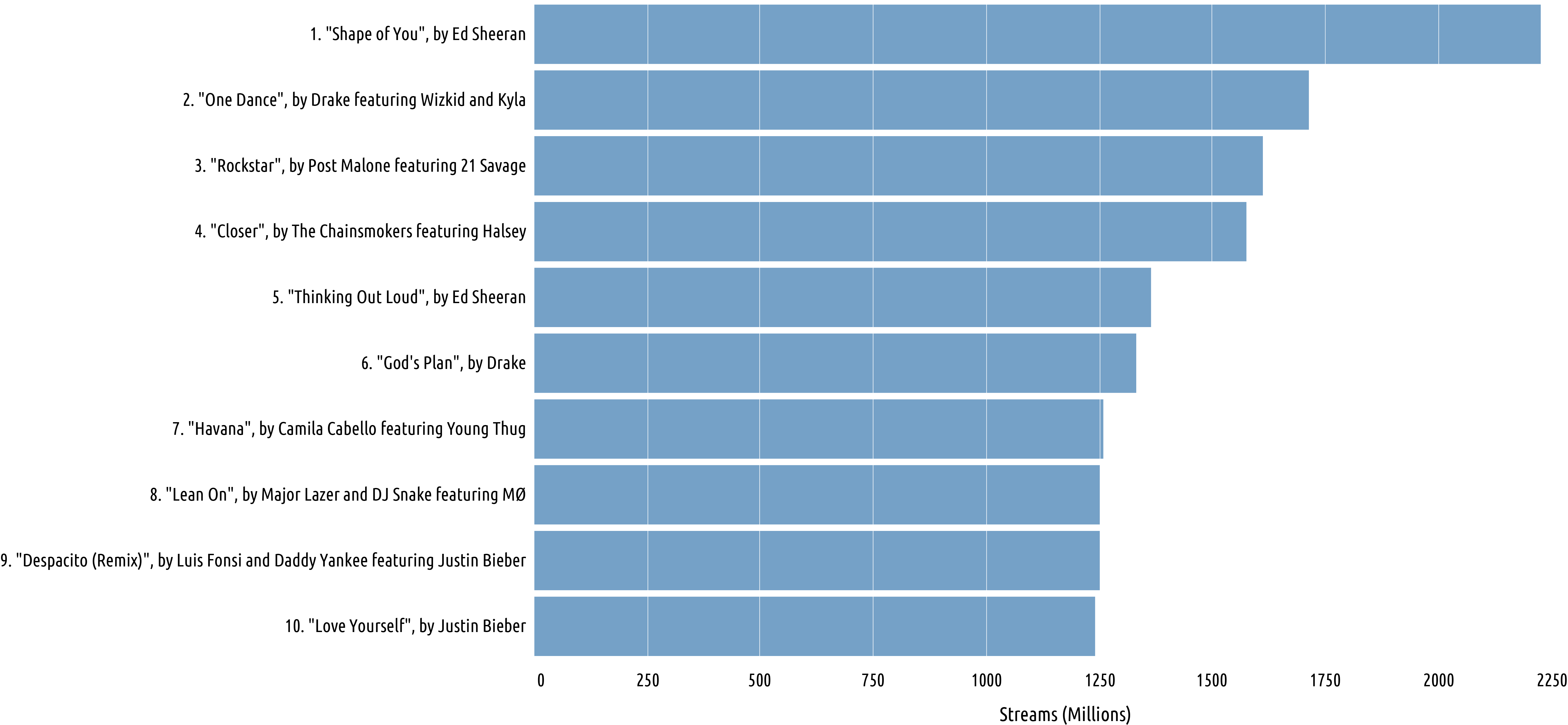
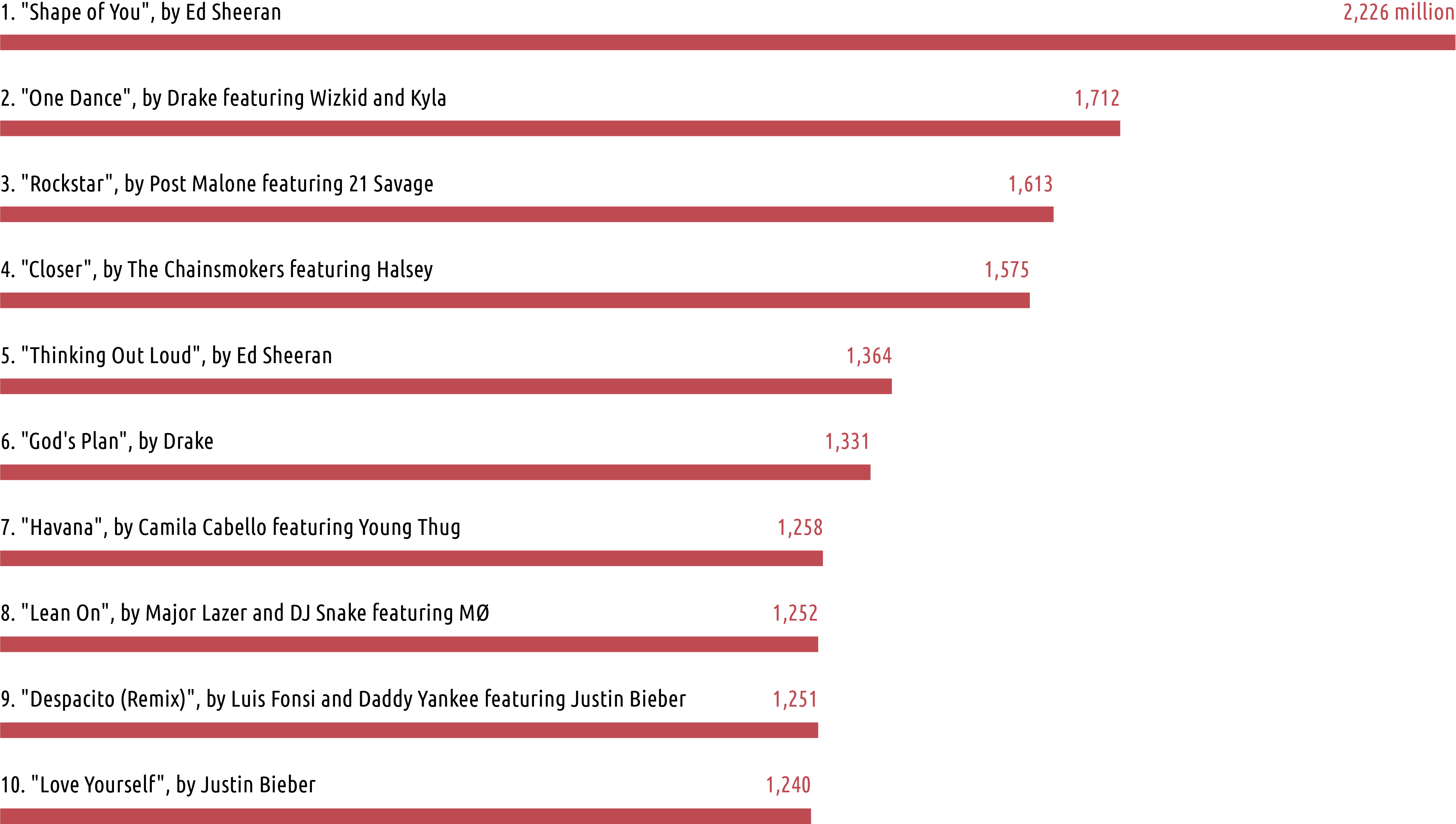
The five charts below just offer some different ways you might style them, through variations in the use of functional colour properties, chart apparatus and layout decisions, in particular. The reasons why you would choose to use any of these methods are varied and especially contextually dependent, based on matters like space to work in, range of quantitative values, size of category labels, number of bars, importance of precise readability. The charts are all showing the all-time top 10 most streamed songs on Spotify, as of July 2019, with data from wikipedia.
1. Font-height bars, with grey panel and white gridlines

2. Bars with ‘invisible’ gridlines
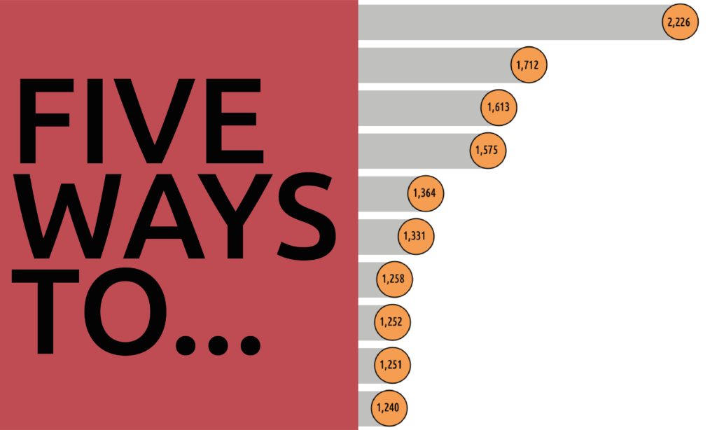
3. Bars with direct labels at bar ends

4. Thin bars with category and value labels placed above
5. Bars with ‘lollipop’ ends housing value labels