
#LittleVis
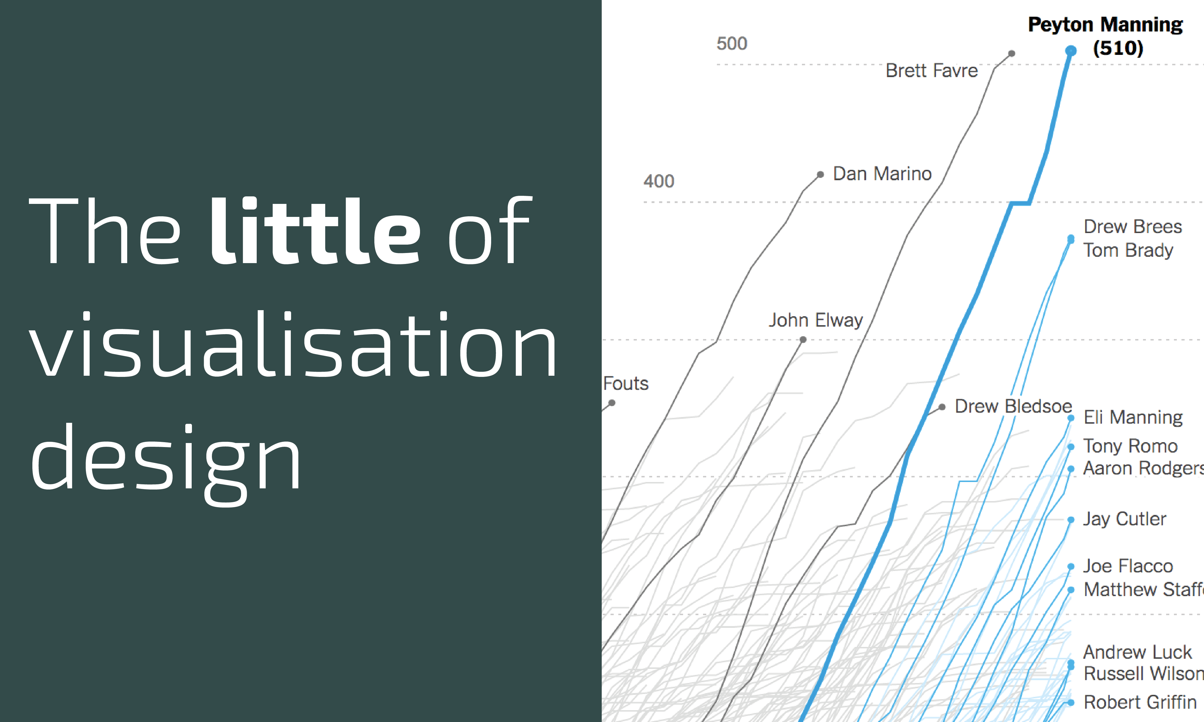
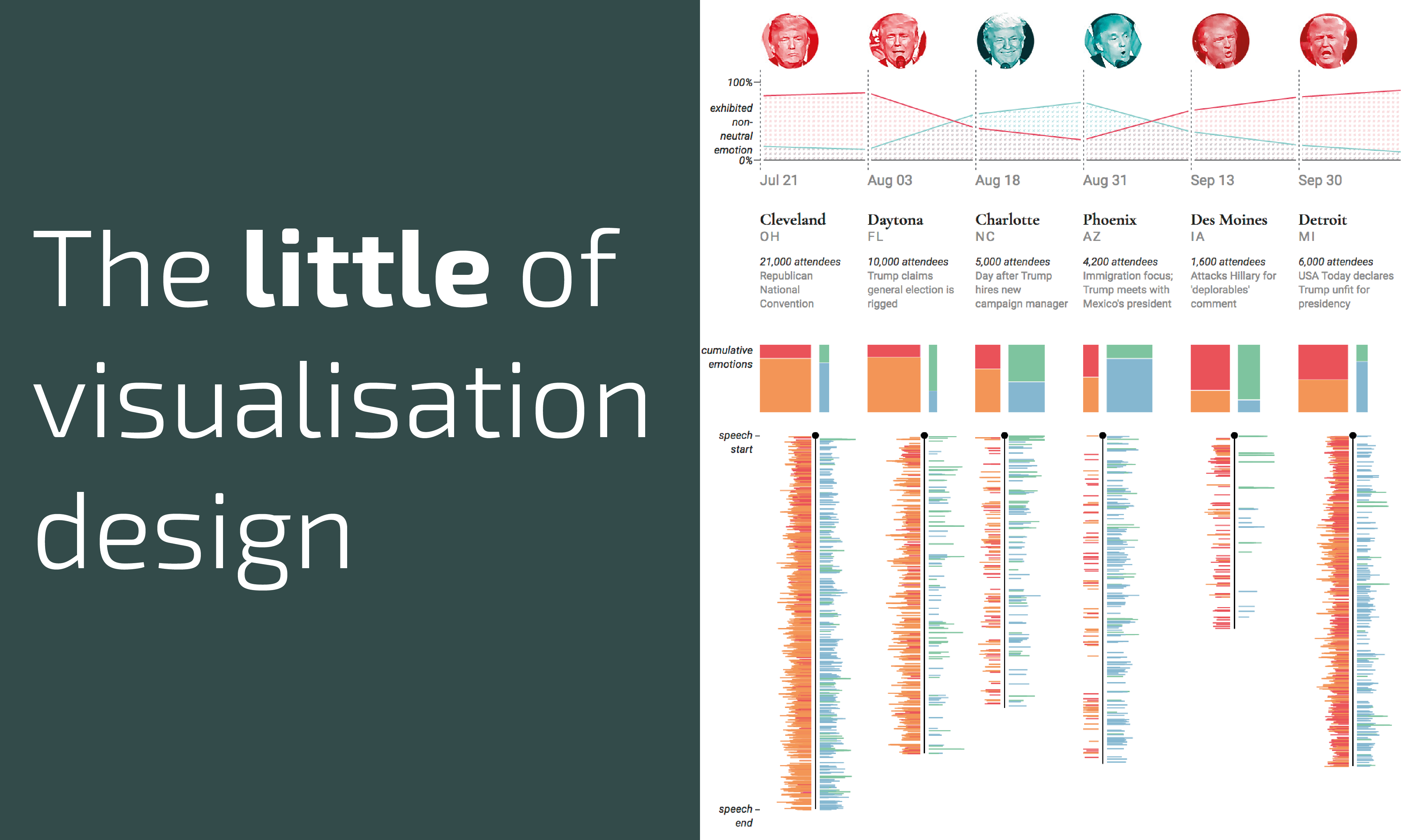
The little of visualisation design: Part 37
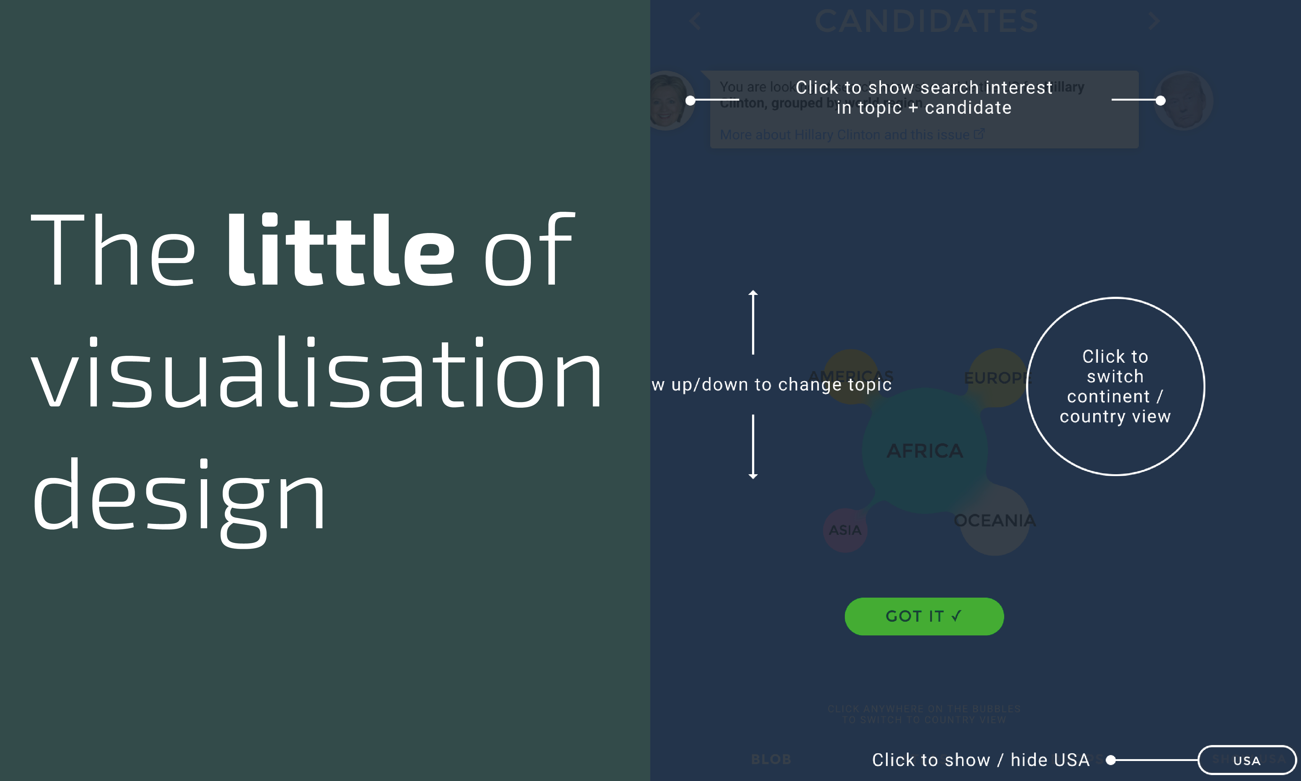
This is part of a series of posts about the ‘little of visualisation design’, respecting the small decisions that make a big difference towards the good and bad of this discipline.

This is part of a series of posts about the ‘little of visualisation design’, respecting the small decisions that make a big difference towards the good and bad of this discipline.

I wanted to share news of an upcoming project that I’ve been working on for far too long but finally will be able to launch in the coming few weeks: The Chartmaker Directory.

At the end of each month I pull together a collection of links to some of the most relevant, interesting or thought-provoking web content I’ve come across during the previous month. Here’s the latest collection from March 2017.
This is part of a series of posts about the ‘little of visualisation design’, respecting the small decisions that make a big difference towards the good and bad of this discipline.
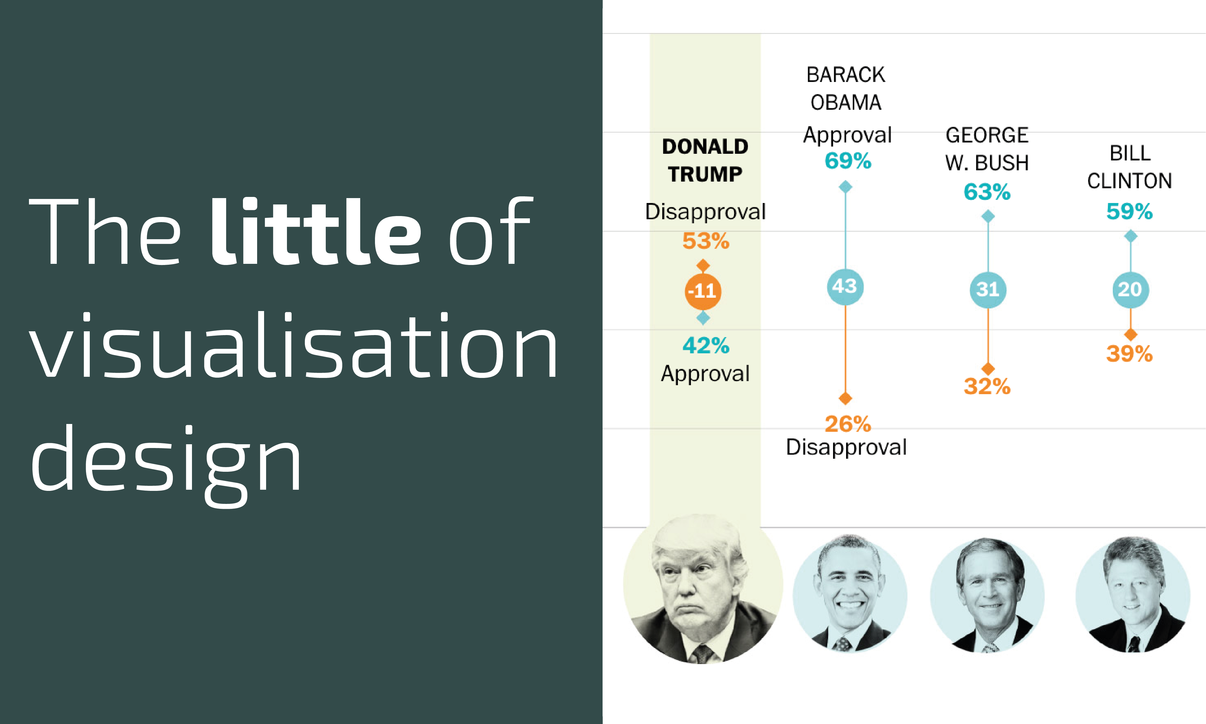
This is part of a series of posts about the ‘little of visualisation design’, respecting the small decisions that make a big difference towards the good and bad of this discipline.
At the end of each month I pull together a collection of links to some of the most relevant, interesting or thought-provoking web content I’ve come across during the previous month. Here’s the latest collection from February 2017.

Earlier today I had the pleasure of being invited back by Tableau to deliver a webinar presentation. The title of my talk was ‘The Seven Hats of Visualisation Design: A 2017 Reboot’.

I have just returned from attending the always inspiring, humbling and exhausting Malofiej conference in Pamplona. This year was an extra special occasion in that it was the 25th annual event and was the first time I had returned since five years earlier
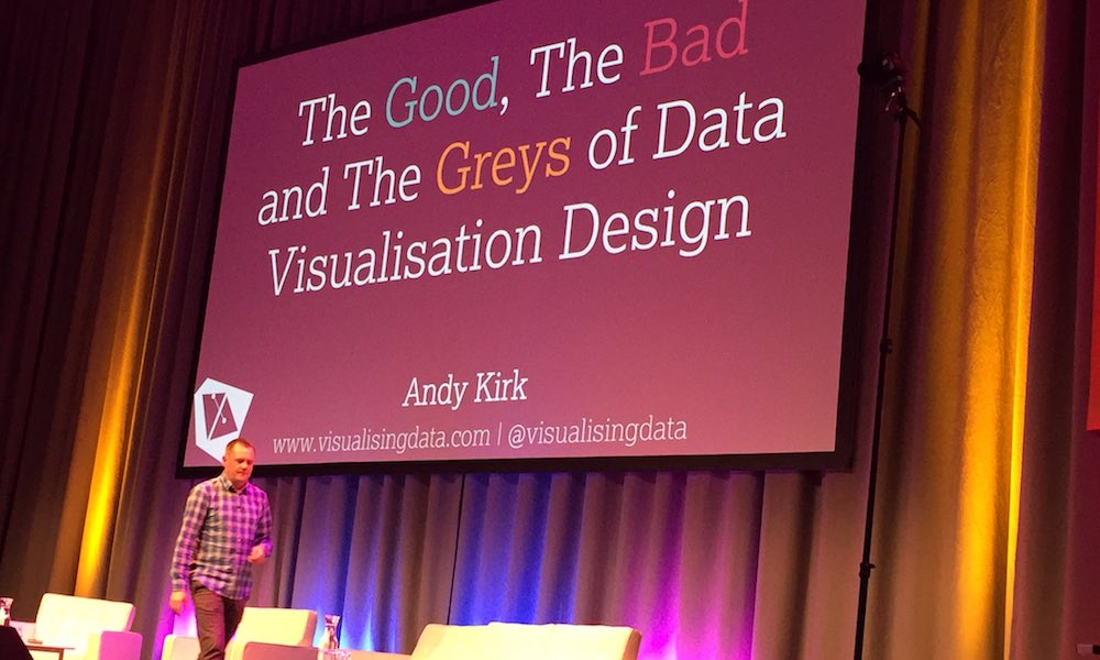
Yesterday I had the pleasure of giving a short talk at the Data Summit 17 conference, part of the Data Fest 2017 festival in Edinburgh. My talk was titled ‘The Good, the Bad and the Greys of Data Visualisation Design’
This is an appeal for anyone who has bought/read my book to possibly take out a few moments from their busy schedules to drop a short review on Amazon.
This is part of a series of posts about the ‘little of visualisation design’, respecting the small decisions that make a big difference towards the good and bad of this discipline.
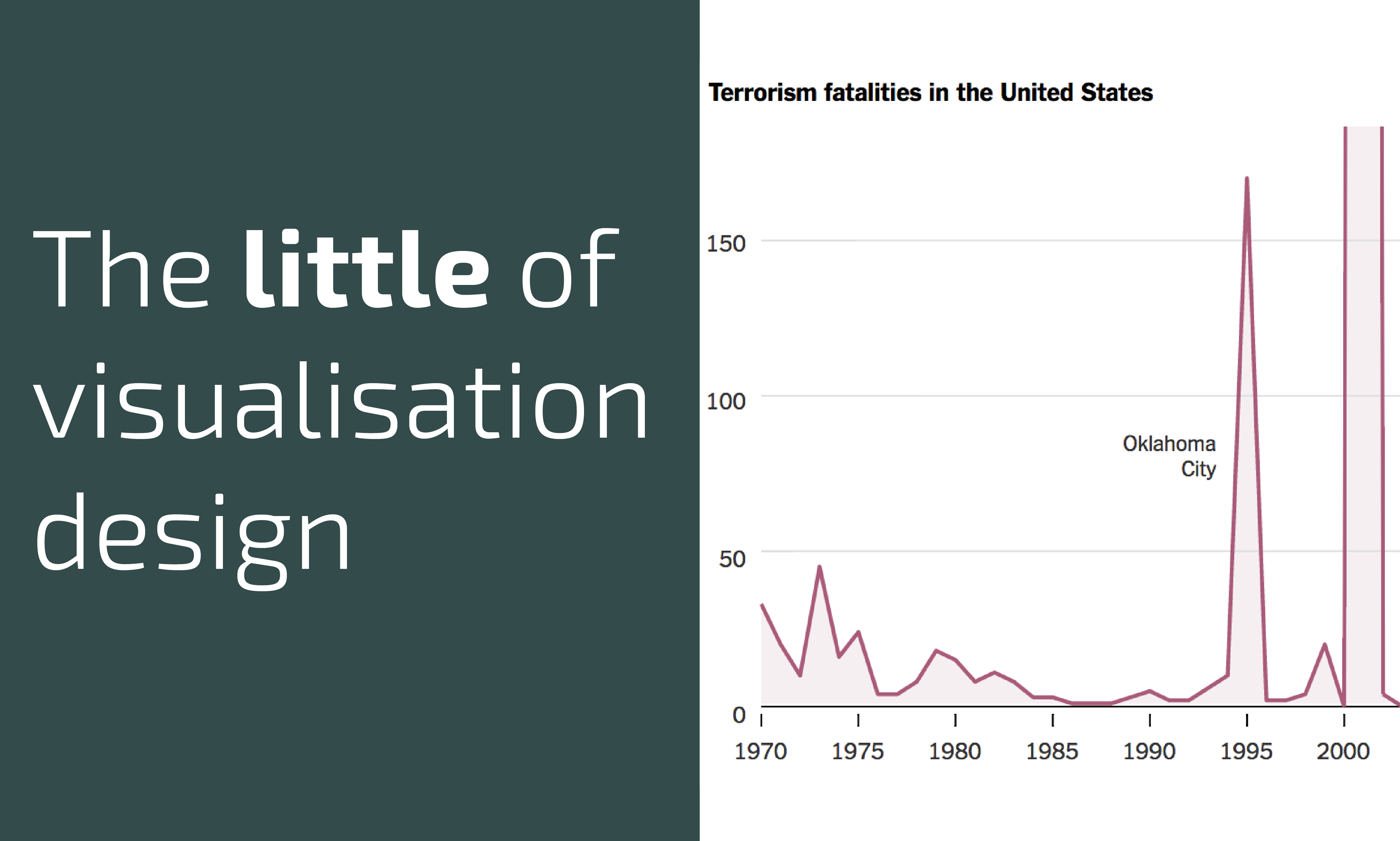
I want to reflect on another occasion where the innocent intent of a chart has been at odds with the perceived incompetence claimed by a snarling audience. This is something of a companion piece to a similarly-motivated post I published almost three years ago.
At the end of each month I pull together a collection of links to some of the most relevant, interesting or thought-provoking web content I’ve come across during the previous month. Here’s the latest collection from January 2017.

As previewed last week, myself and Francis Gagnon organised a poster session at Tapestry to tap in to the collective wisdom of attendees seeking suggestions on how we as a community can help to navigate the choppy waters of this era of fake news etc.
It was a pleasure to have the chance to share a short recorded tribute to the legacy of Hans Rosling in this special Data Stories episode where Enrico and Moritz offered their own remembrance alongside several other familiar contributors.
As you may or may not have noticed, we are living through a rather interesting time, to say the least. Indeed some may prefer I use far stronger words than interesting, but this is a family show.
This post compiles a collection of sites that provide data, covering curated collections, data releases through Open Data movements or ‘Data-as-a-Service’ platforms.
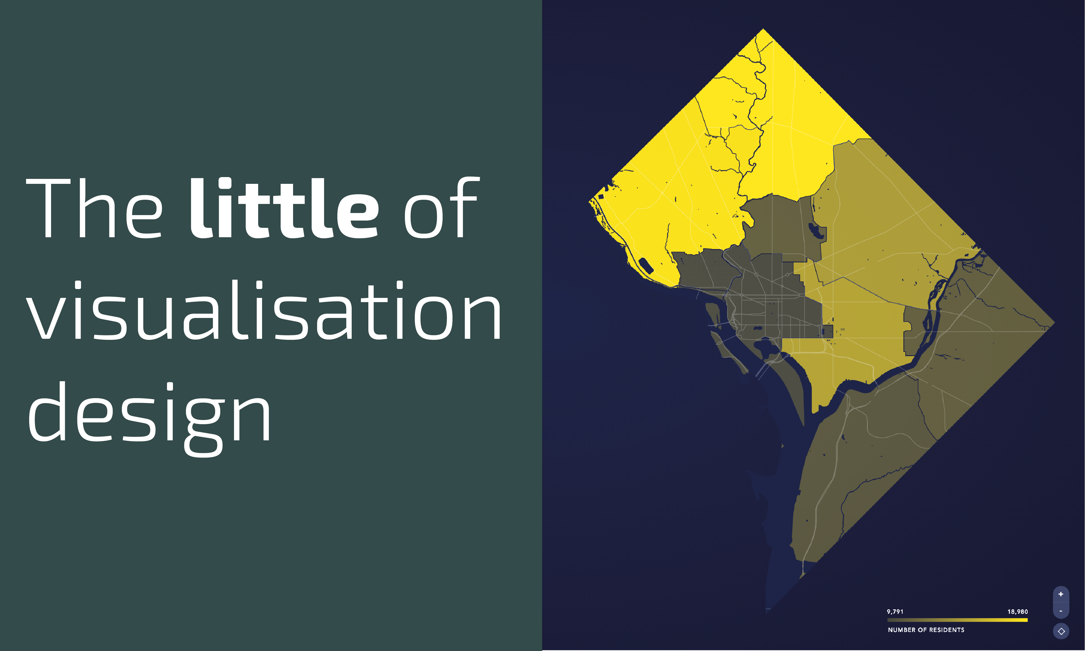
This is part of a series of posts about the ‘little of visualisation design’, respecting the small decisions that make a big difference towards the good and bad of this discipline.

Yesterday we learnt the terribly sad news of the passing of Hans Rosling. My condolences go out to his family, friends, and colleagues as well as the countless others who were affected by this news.
Yesterday, 5th February 2017, marked seven years since I launched visualisingdata.com. It genuinely feels like only yesterday when I first clicked on ‘Add New’ and began the long journey towards composing over 750 posts.
At the end of each month I pull together a collection of links to some of the most relevant, interesting or thought-provoking web content I’ve come across during the previous month. Here’s the latest collection from December 2016.
This is part of a series of posts about the ‘little of visualisation design’, respecting the small decisions that make a big difference towards the good and bad of this discipline.
This is part of a series of posts about the ‘little of visualisation design’, respecting the small decisions that make a big difference towards the good and bad of this discipline.
To mark each mid-year and end-of-year milestone I take a reflective glance over the previous 6-month period in the data visualisation field and compile a collection of some of the most significant developments.
To mark each mid-year and end of year milestone I try to take a reflective glance over the previous 6 months period in the data visualisation field and compile a collection of some of the most significant developments. These are the main projects, events, new sites, trends, personalities and general observations that have struck me as being important to help further the development of this field.
At the end of each month I pull together a collection of links to some of the most relevant, interesting or thought-provoking web content I’ve come across during the previous month. Here’s the latest collection from November 2016.
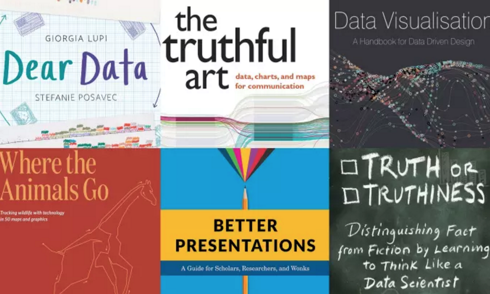
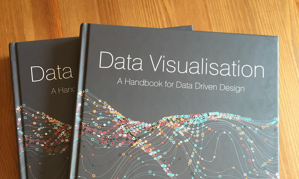
A momentary vanity post, if you will oblige me. I’m delighted see that my book, ‘Data Visualisation: A Handbook for Data Driven Design’ has been included by Alan Smith, the Financial Times’ Data Visualisation Editor, as one of 2016’s “best books for data geeks”.

This is part of a series of posts about the ‘little of visualisation design’, respecting the small decisions that make a big difference towards the good and bad of this discipline.
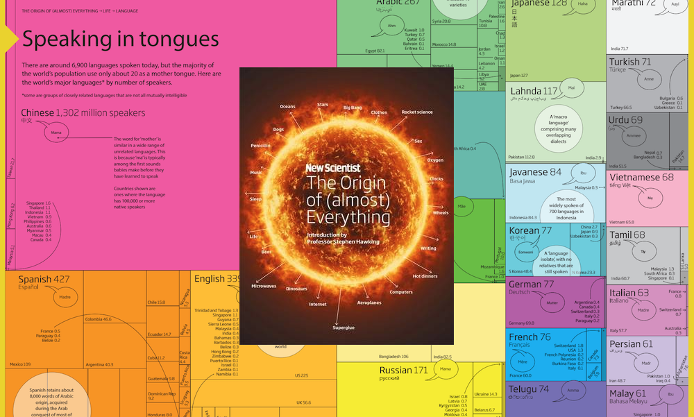
I wanted to briefly profile this beautifully produced new book, titled ‘The Origin of (almost) Everything‘ from the New Scientist, authored by Graham Lawton and
At the end of each month I pull together a collection of links to some of the most relevant, interesting or thought-provoking web content I’ve come across during the previous month. Here’s the latest collection from October 2016.