

This is part of a series of posts about the ‘little of visualisation design’, respecting the small decisions that make a big difference towards the good and bad of this discipline. In each post I’m going to focus on just one small matter – a singular good or bad design choice – as demonstrated by a sample project. Each project may have many effective and ineffective aspects, but I’m just commenting on one.
The ‘little’ of this next design concerns the inclusion of a ‘reset’ button. The project in focus here was produced by FiveThirtyEight and is titled ‘What Would It Take To Turn [Red/Blue] States [Blue/Red]?‘, offering an amazing (and rightly celebrated) multi-faceted tool to simulate the 2016 presidential election outcome based on the potential party preferences and turnout % of different demographic groups.
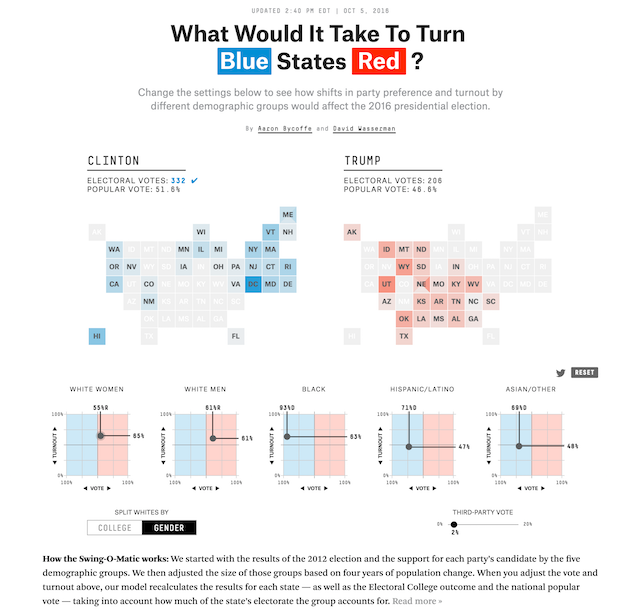
The main interactive operators exist as draggable scatterplotted marks, representing the turnout % (y-pos) and overall party voting % (x-pos) for several major demographic groups. When you reposition the point markers the red/blue state swings in the grid maps above are modified accordingly as is the overall outcome. As you change the positions a feint ghost marker is left behind indicating the starting values (I guess based on current polling).
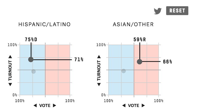
I believe the inclusion of the ‘Reset’ button is of critical value here. In offering the means to intricately alter several value settings, it is very useful to be quickly able to return the state of an interactive right back to its starting calibration (and do it in a way that doesn’t require an inelegant browser page refresh). Surprisingly, I find this is an oft-neglected feature but certainly very useful.
