The (nuclear) dust settles at the end of a seismic week in history, as the fallout and angry finger-pointed fall outs continue to dominate the media and social media landscape, with people looking to make some sense of the non-sense by finding that single person or single thing that should be to blame. Pundits, pollsters, polling methods and data modelling techniques are certainly taking lots of heat. Data visualisation may not be directly in the firing line but I suppose there is a guilt by association.
The fact is, of course, that a visual and its underlying data carry a shared responsibility for understanding. A visualisation is only as good as the data it portrays. This principle stands just as important as ever today.
Given the deluge of different visualisations used during the build up, the event itself and now in the post-mortem phase of the election, it is understandable that some people have expressed severe fatigue from seeing so many election-related visuals (I imagine heightened by the outcome, for many). However, I do feel that we should acknowledge some of the excellence that has been produced during this period. After all, this is a 4-yearly event which, for many journalism organisations, represents the biggest platform to mobilise their focus and talents.
I have therefore picked out a collection of twelve projects that I’ve seen from across (some of) the journalism landscape (admittedly I’ve not seen or had access to ALL election graphic work) that I felt demonstrated the best of this art during this event.
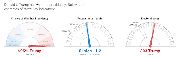
I’m not going to provide design commentary for these, it’s more a collection of inspiration. However, the first project listed below does require some further analysis and I will follow up with a piece about the gauge chart specifically. The order of those listed is entirely incidental but loosely grouped around those used during and viewed after the election.
ON-THE-NIGHT
New York Times – Forecast Gauges
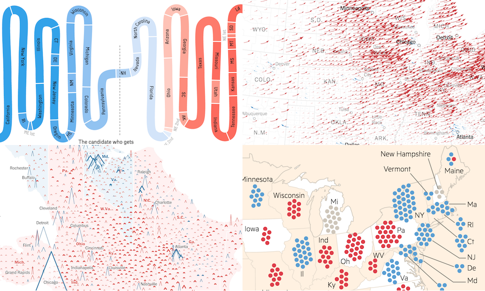
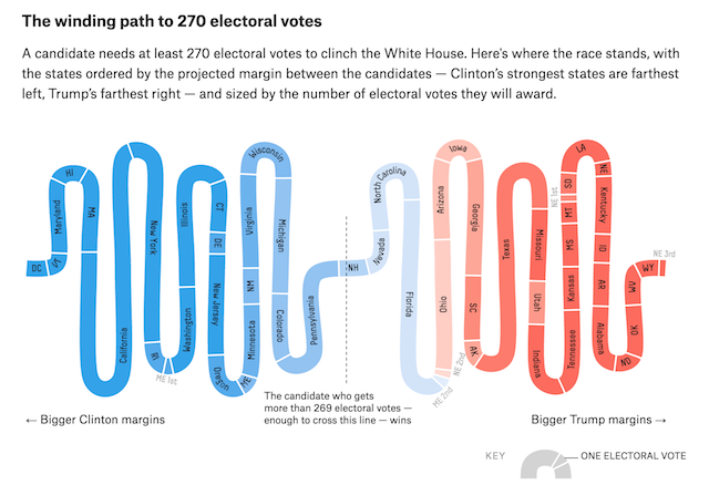
FiveThirtyEight – Snake Chart
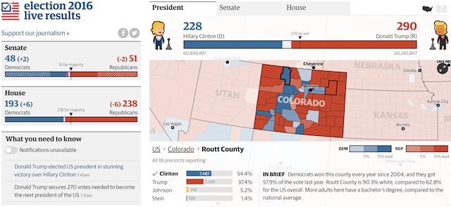
The Guardian – Election Dashboard
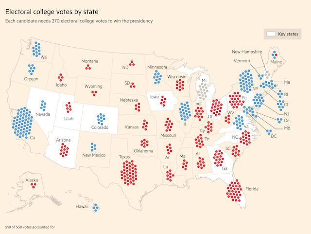
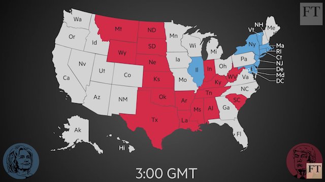
Financial Times – Weighted Dot Map
(Inspired by The Guardian)
AFTERMATH
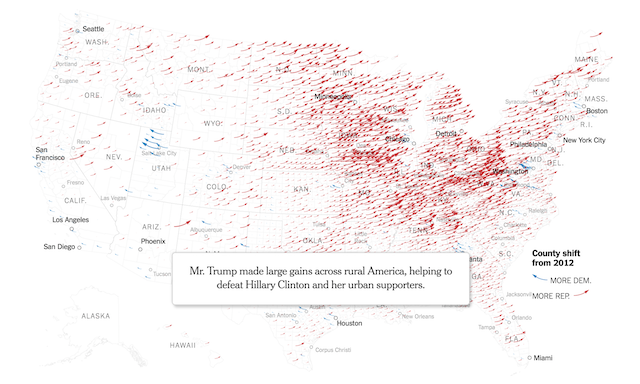
New York Times – Arrows Map
(Building on their previous work for the 2012 Election)
Washington Post – Vote peaks
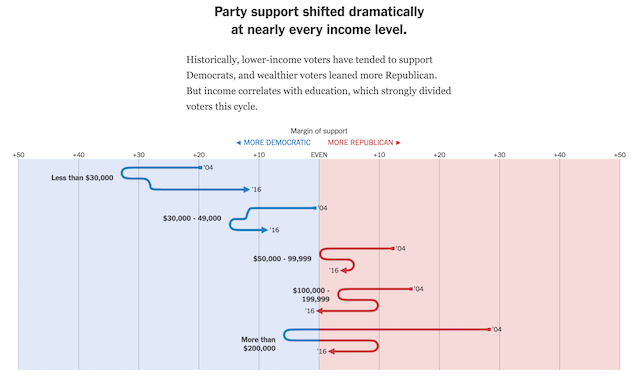
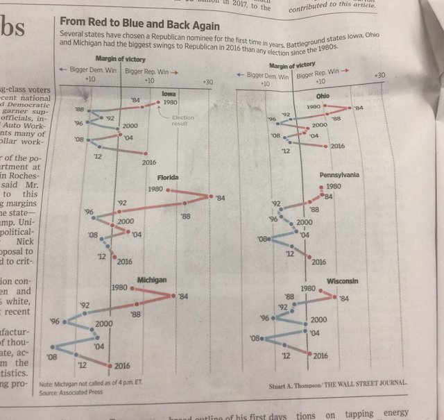
New York Times & Wall Street Journal – Scribble Plots
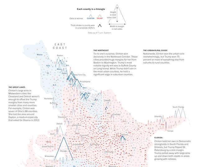
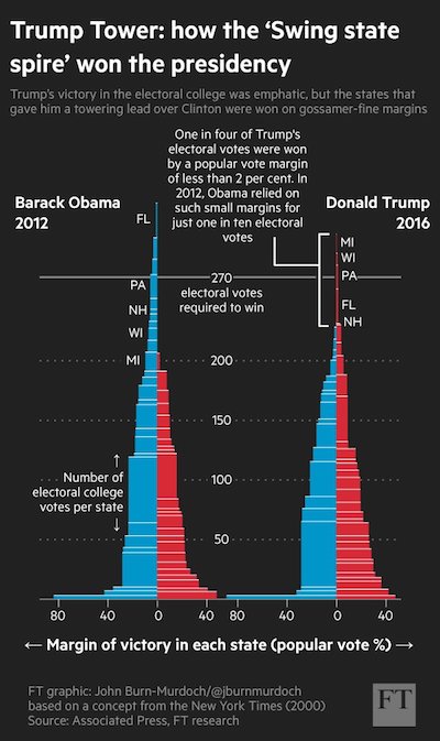
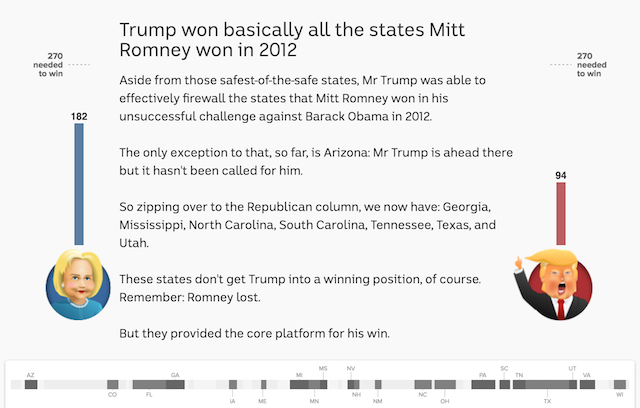
Financial Times – Tower Chart
Inspired by this 2000 Election Graphic by NYT
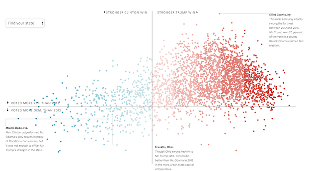
Wall Street Journal – Scatter Plot
STORIES
ABC – Story of the Night
Financial Times – Video Explainer
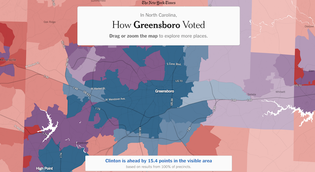
New York Times – Precint Stories