BOOK ONLINE RESOURCES

WELCOME READERS!
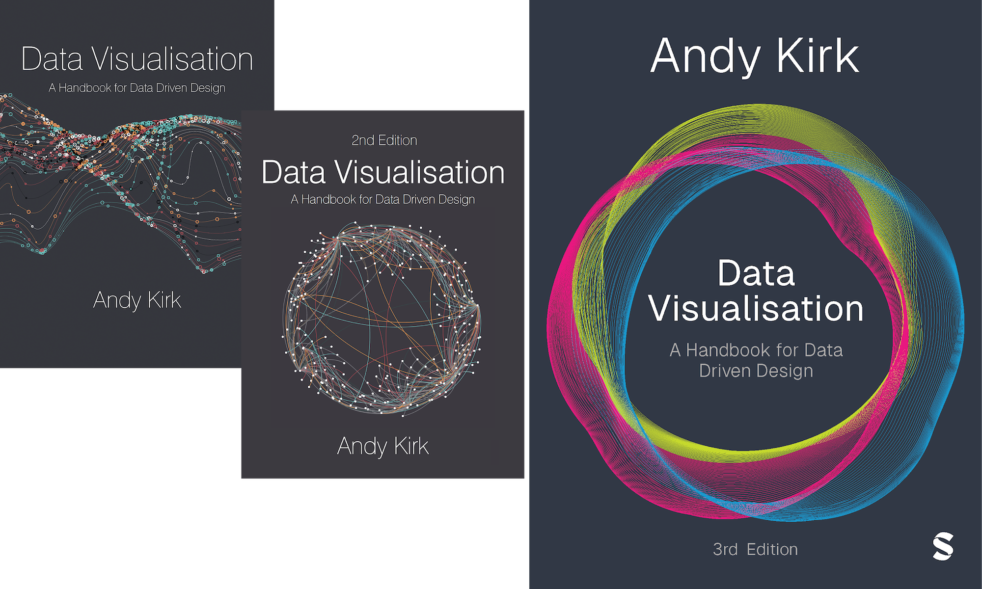
Welcome to the digital companion site for the book ‘Visualising Data: A Handbook for Data Driven Design‘ written by me, Andy Kirk, and published by Sage. This is a sub-site of visualisingdata.com dedicated to providing readers of all editions of this book with useful additional resources and references to supplement their learning from the book’s content. It has been updated to reflect the latest chapter structure of the third edition (published November 2024) but it remains relevant for readers of the first two editions.
CHAPTER RESOURCES
To accompany each chapter in the book there are (up to) four sections of additional digital content for readers to browse and work through:
EXPLORE THE FIELD!
The ‘Reading’ contents offer a curated collection of recommended links to web articles, papers and texts, and other relevant visualisation references associated with the topics covered by each chapter. They are provided to supplement the contents of the book, to expand your knowledge and reinforce the learning process about data visualisation. This collection of reading materials will be refined as and when new references are discovered.
TRY FOR YOURSELF!
The ‘Exercises’ sections offer some ideas for practical tasks readers might consider carrying out in order to revise, reflect, and refine their skills and to substantiate your learning the topics covered in each chapter. The nature of the self-directed activitie varies from sketching ideas, doing design evaluations, conceiving ideas for how to design to different scenarios and working with data.
LEARN FROM THE BEST!
The topics covered in this book reflect many of the key talking points covered my the ‘Explore Explain’ podcast and video series, where I explore the visualisation design processes of guest designers, developers, and visual journalists from across the world as they explain the stories behind the inspirational works they’ve created. Listed here are short snippets taken from the full episodes to provide insight into how today’s professionals navigate through all stages of contextual, analytical, editorial, and creative activity outlined through this book. Please note this section of suggested resources is currently only based on selections from Seasons 3 and 4 – highlight reels for episodes from Seasons 1, 2, and 5 will be produced by the end of April and the relevant links added here thereafter.
FIGURE SOURCES
The ‘Figures’ sections provides links to the source websites relating to each figure published in the book that was created by and contributed (with thanks) by people other than me, the author.
ADDITIONAL REFERENCES
Across other parts of visualisingdata.com you will find many further sources of valuable data visualisation content and reference to enhance your learning:
- The Resources collection: This is an ongoing catalogue of data visualisation technologies providing a curated and organised library linking to over 300 data visualisation tools, applications and libraries that are currently available and being used by people across the field.
- The Chartmaker Directory: This project was developed in order to tie together two fundamental perspectives of data visualisation development: charts and tools. The directory offers hundreds of crowd-sourced references that help to answer the perennial curiosities: Which charts can be made in which tools? Which tools can make which charts? This growing directory of examples and technical solutions will help all practitioners with the process of chart building.
- The Visualising Data Newsletter: Each month this newsletter chronicles 50 of the most insightful and delightful data viz content. Subscribers receive this collection straight to their inboxes but you can also browse through the archive of monthly issues on the website. This includes: the freshest data visualisation (or related) design pieces and collections; relevant articles, interviews, or videos to help further your data viz learning; the latest developments or announcements affecting the data viz world; and links to further pieces covering broader data, tech, or design matters.
Do you still need more help grasping this subject? Do you work with a team of colleagues or a group of students who could benefit from some expert guidance? Maybe you would prefer to learn through teaching rather than reading, in which case why not visit the my training page to learn about the various public and private training courses I offer to accelerate and elevate your learning journey.
Part A - THE FOUNDATIONS
Part C - THE DESIGN THINKING
CHAPTER 1 - What is Data Visualisation?
EXPLORE THE FIELD
Here are links to some suggested web articles or relevant references associated with the topics covered by this chapter [Website/author with link – Description]
- EagerEyes – ‘Definition of data visualization’
- ACM Digital Library – Paper: ‘Preattentive processing in vision’, by Anne Treisman, Computer Vision, Graphics, and Image Processing, Volume 31, Issue 2, Pages 156-177
- Datavis – ‘Milestones in charts, graphics and statistics’
- Visual Complexity – This ‘Information visualisation manifesto’ post is often cited as one of the landmark blog posts and discussion pieces
- EagerEyes – ‘Difference between information visualisation and infographics’
- Flowing Data – ‘The many words for visualisation’
- Success – ‘Definitions of data, information and knowledge’
- Scientific American – Visualizing Science: Illustration and Beyond. Where does the illustrator end and the infographer begin? How does data visualization fit in?’
- Lisa Charlotte Muth – Why do we visualise data?
TRY FOR YOURSELF
Here are some suggested practical exercise activities to try out to help apply the learning from this chapter:
(1) WHY ARE YOU HERE?
Consider the personal reasons that led you to buy this book. How would you assess your visualisation skills, your interests in this subject and your workplace or studies and the duties they entail: What help are you seeking from this book and what do you hope to achieve? What aspects of your visualisation capability do you feel is most lacking or most fertile for improving? This kind of personal assessment will help frame your focus during the reading of the book and offer a means of assessing the ultimate value of the book once you have finished it.
(2) LIKES AND DISLIKES
Before you get too deep in to the book’s contents let’s think about your own convictions, or more precisely, your preferences…
- Identify one or a few visualisations you think are especially effective.
- Identify one or a few visualisations you think are especially ineffective.
For each selection, consider the reasons that led you to make that choice? What design or content factors shaped your selection? What are the specific reasons for liking or disliking each piece? Do you feel your reasons are objective and rational or (understandably) irrational and possibly instinctive?
If you need a source to find a selection of visualisations why not visit the ‘Information is Beautiful Awards‘ showcase of over a decade of different works. Although they are included because they were deemed to be of sufficient quality to at least make it on to a long-list of the awards process, it doesn’t mean you will inevitably like each piece.
Remember your selections: as you progress through the different stages of the book’s content, revisit these choices to consider whether your mind has been changed and, if so, why?
(3) VISUALISATION IN REAL-LIFE
Think about the world around you and your daily life. Whether you are aware or not you are exposed to and use visualisations in all sorts of different ways, whether in your place of work, place of study or in your personal life. Some things are deliberately designed visual tools like weather maps, sat nav devices or stock charts, others are more subtle and form the fabric of nature, the colour of the sky, the length of a queue in a store, or the emergence of desire paths.
Challenge yourself to become more conscious about how these visual aides help inform your world view and support your activities. How do they affect your understanding or your decision-making? Maybe log what you see with an informal diary, scrapbook or collection of bookmarks to show how much of this stuff is all around us.
LEARN FROM THE BEST
Here are links to suggested sections/clips from the ‘Explore Explain’ podcast and video series relating to relevant topics covered in this chapter.
- S3E7 Episode Highlights – Clip #1: Looking outside the western bubble
- S3E7 Episode Highlights – Clip #5: Graphic design sensibilities
- S3E9 Episode Highlights – Clip #1: A growing field
- S3E9 Episode Highlights – Clip #2: Information design is a personality trait
- S4E1 Episode Highlights – Clip #1: Do what you love doing
CHAPTER 2 - THE PROCESS & PRINCIPLES OF VISUALISING DATA
EXPLORE THE FIELD
Here are links to some suggested web articles or relevant references associated with the topics covered by this chapter [Website/author with link – Description]
- YouTube – Talk: ‘Open Source Your Data Design Process’ by Scott Murray
- C82 – Design process for the ‘Making of the Illustrations of the Natural Orders of Plants’
- Studio Terp – ‘Trees, clouds and waves. Or, how I visualized data on suicide.’
- Truth & Beauty – Design process narrative for ‘Project Ukko’
- Aligned Left – A collection of blogs and articles offering visualisation design process narratives, curated by Scott Murray
- Amazon – Book: ‘Raw Data: Infographic Designers’ Sketchbook’, by Steven Heller and Rick Landers – contains lots of design case studies and behind-the-scenes narratives
- Medium – ‘Crafting a custom, mobile-friendly data visualization: The design process, from science paper to responsive interactive’
- blprnt – Designing ‘138 years of Popular Science’
- The Guardian – ‘Visualising gay rights across US states needed more than a map. Guardian in America interactive designer Feilding Cage talks through how he did it’
- Amazon – Book: ‘Beautiful Visualizations’, by Noah Illinsky and Julie Steele – focused on a set of visualisation project case studies by prominent designers
- Knight Lab – ‘Behind the dialect map interactive: How an intern created The New York Times’ most popular piece of content in 2013’
- Twitter – What does 50 years of human migration look like? For @NatGeo, I worked on how to visualize this in a graphic.’
- Twitter – Some design background on the NYT’s “Apollo 11: As They Shot It” project’
- Medium – Behind the Scenes: How We Made Our “Feather” Visualization’
- Visualising Data – Making sense of data visualisation and AI (part 1)
- Visualising Data – Making sense of data visualisation and AI (part 2)
PRINCIPLES
- Medium – Design and Redesign in Data Visualization by
Fernanda Viégas and Martin Wattenberg - Youtube – Video series ‘DataViz Critques’ by Jon Schwabish
- Vitsoe – Dieter Rams’ 10 principles of good design
- YouTube – ‘What Makes a Visualisation Good?’ by Jeff Heer
- Amazon – Book: Ive, Jonny, Kemp, Klaus and Lovell, Sophie (2011) ‘Dieter Rams: As Little Design As Possible’. London: Phaidon Press.
- Visualising Data – ‘Success in data visualisation’
- Archive – Wooton, Sir Henry (1624) ‘The Elements of Architecture’. London: Longmans, Green.
- Visualising Data – ‘Should you trust a visualisation?’
- Pete Warden – ‘Why you should never trust a data scientist’
- Guardian – ‘Why you should never trust a data visualisation’
- Harvard – Paper: “What Makes a Visualization Memorable?”, by M. A. Borkin, et al. IEEE Transactions on Visualization and Computer Graphics (Proceedings of InfoVis 2013), 2013.
- Computer Society – Paper: ‘Beyond Memorability: Visualization Recognition and Recall’ by Michelle A. Borkin*, Member, IEEE, Zoya Bylinskii*, Nam Wook Kim, Constance May Bainbridge, Chelsea S. Yeh, Daniel Borkin, et al
- Medium – ‘Not fit to print: When good design goes bad. A lesson from the New York Times on how to mislead with numbers’
- Visualising Data – ‘What’s happened to the trust?’
- Amazon – Book: ‘How to Lie with Statistics’ by Darrell Huff
- Citylab – ‘When Maps Lie: Tips from a geographer on how to avoid being fooled.’
- Visualising Data – ‘When 3D works’
- Nightingale – ‘The Power Behind Physical, 3-D Visualizations’
- EagerEyes – Profile of the paper ‘An Evaluation of the Impact of Visual Embellishments in Bar Charts’
- UX Blog – The ways of lying and telling the truth with your colour classification choices
- Amazon – “How Charts Lie” by Alberto Cairo
- New York Times – Opinion: Those Hurricane Maps Don’t Mean What You Think They Mean?’, by Alberto Cairo With Tala Schlossberg
- Linnaeus University – Paper: ‘Graph Construction: An Empirical Investigation on Setting the Range of the Y-Axis’ by Jessica K. Witt
- Chartability – “Chartability is a set of heuristics (testable questions) for ensuring that data visualizations, systems, and interfaces are accessible.”
- Sarah L Fossheim – “An intro to designing accessible data visualizations”
- Visualising Data – ‘Appreciating the critical role of subject matter’
- Amazon – Book: Connie Malamed ‘Visual Language for Designers’ (Principle 5, Clarify Complexity: pages 169 to 202)
- Washington Post – ‘Difference between complicated and complex’
- Visualising Data – Example of a ‘slow thinking’ visualisation
- Nightingale – ‘What makes a visualisation elegant?’
- Nightingale – Collection of articles about accessibility
- Medium – ‘The Architecture of a Data Visualization’
- Shape of Design – ‘The Shape of Design’ by Frank Chimero
- Datawrapper – ‘Data Vis Do’s and Dont’s’ by Lisa Charlotte Muth
TRY FOR YOURSELF
Here are some suggested practical exercise activities to try out to help apply the learning from this chapter:
(1) DECISION FORENSICS
Look at any sample visualisation project and try to forensically decipher all the design and preparation decisions you can see evidence of. Try to deconstruct all the individual jigsaw pieces of thinking that are evidenced by a final piece of work. It can be any visible design feature that is included or some of the hidden contextual, data or editorial decisions that might have been present behind the scenes. As a tactic, maybe start from the top left of the display and work downwards/ rightwards to try ‘hoover’ up even the most minute of decisions.
(2) ASSESS YOUR CURRENT DESIGN APPROACH
Reflect on your most recent visualisation project and try to sketch or write out the approach you took. What stages of activity did you undertake and in what sequence? Did it feel efficient or chaotic? Was it interrupted by changes, uncertainty or a sense of too much choice? Before you can seek to improve your ongoing approach it is worth unpicking what you currently do and how you do it.
(3) A QUESTION OF CONTEXT
Ahead of chapter 3, imagine receiving a meeting invite from your manager, the only details you have are that she wants to meet up to go through a visualisation project she wants you to undertake. Brainstorm as many different ideas as possible about the type and range of bits of information, requirements you would need to her to clarify to help give you a clear understanding of the expectations and scope of this task.
(4) CRITICAL EVALUATIONS
Now that you have learnt about the definition of data visualisation and the key principles that distinguish good from bad visualisation design (trustworthy, accessible, elegant), undertake some reflective evaluations on any visualisation you come across. It might be your own work, it might be work you receive from others or it could be just work from around the web. There are hundreds being shared on a daily basis online via social media, blogs and news media, you won’t struggle to find any! (If you do, check out the reading materials alongside each chapter and you’ll find many examples). Give yourself time to fully immerse yourself and experience each one (whether small and instant or long and involving) and consider the following prompts:
- What one word describes how you instinctively feel about the work within the first 5-10 seconds? Is it positive or negative?
- Very subjective but do you like the visualisation (might be the subject or visual form)? What score on a scale of 0 to 10 would you give it (10 is best)? Consider what factors influenced your ratings?
- Do you feel the project successfully – and sufficiently – facilitates understanding (does it help you learn something about the subject matter or, at least, confirm/reinforce what you already knew)? What score on a scale of 0 to 10 would you give it (10 is best)? Consider what factors influenced your ratings?
- Consider the project’s effectiveness or otherwise in demonstrating the principles of trustworthy, accessible and elegant design: where does it succeed and where does it fail?
- Whilst you may not know much about the project’s hidden context, what would you do differently? How would you help to get these pair of ratings higher towards the maximum of 10?
LEARN FROM THE BEST
Here are links to suggested sections/clips from the ‘Explore Explain’ podcast and video series relating to relevant topics covered in this chapter.
- S3E4 Episode Highlights – Clip #4: Making the inaccessible, accessible
- S3E4 Episode Highlights – Clip #5: No pressure to differentiate
- S3E5 Episode Highlights – Clip #1: Collecting and preserving for posterity
- S3E7 Episode Highlights – Clip #2: Challenging myths empirically
- S4E3 Episode Highlights – Clip #3: Iterating the aesthetics
- S4E3 Episode Highlights – Clip #4: Little design details
- S4E5 Episode Highlights – Clip #2: Document your work!
- S4E6 Episode Highlights – Clip #2: The benefit of doing redesigns
- S4E6 Episode Highlights – Clip #3: Calling a project done
- S4E7 Episode Highlights – Clip #5: Having a wider argument toolbox
- S4E8 Episode Highlights – Clip #5: Untapped subjects for data visualisation
- S4E9 Episode Highlights – Clip #2: The craft of analog data visualisations
FIGURE SOURCES
Here are links to the original source websites/pages for those figures included in the book that are originally published on the web. Please note some websites may have paywalls.
- Figure 2.2 – Sketches from the process behind “The Food Your Grandmother Made”, by Jane Zhang
- Figure 2.8 – America’s Economic Growth in the 21st Century
- Figure 2.9 – America’s Economic Growth in the 21st Century (Revised)
- Figure 2.10 – “Gun Deaths in Florida” (Reuters Graphics)
- Figure 2.11 – “Iraq’s Bloody Toll” by Simon Scarr (South China Morning Post)
- Figure 2.12 – Details from “175 years of word usage patterns in Scientific American”, designed by Mortiz Stefaner, directed by Jen Christiansen
- Figure 2.13 – “Asia Loses Its Sweet Tooth for Chocolate” by Graphics Department (Wall Street Journal)
- Figure 2.14 – “Razor Sales Move Online, Away From Gillette” by Graphics Department (Wall Street Journal)
CHAPTER 3 - FORMULATING THE BRIEF

EXPLORE THE FIELD
Here are links to some suggested web articles or relevant references associated with the topics covered by this chapter [Website/author with link – Description]
- Visualising Data – Interesting video about the constraints and aims of cartoons published in the New Yorker magazine
- Visualising Data – ‘Appreciation context: Inuit wood maps’
- Seeing Data – ‘What does ‘design for an audience’ really mean?’
- Style – ‘Design for an Audience’ by Jonathan Corum
- Harvard Business Review – Article by Amanda Cox about the ‘The power of aha moments in data visualisation’
- Seeing Data – ‘Recognising the purpose of a visualisation’
- Online Journalism Blog – ‘This simple piece of visualisation will have you rethinking what you know about impact and mobile’
- EagerEyes – ‘The Value (and distinct role) of Illustrating Numbers’
- Worry Dream – ‘Explorable Explanations: What does it mean to be an active reader?’
- Visualising Data – ‘The success of participative visualisations’
- EagerEyes – ‘Visualization makes things real’
- Perceptual Edge – ‘What makes a chart boring’
- Wait But Why – ‘7.3 Billion People, One Building’
- TED – Hans Rosling’s famous TEDtalk ‘The Best Stats you’ve Ever Seen’
- You Tube – Al Gore’s presentation of a correlation chart from ‘An Inconvenient Truth’ (2006).
- University of Maryland – Paper: Shneiderman, Ben (1996) ‘The Eyes Have It: A Task by Data Type Taxonomy for Information Visualizations’. Proceedings of the IEEE Symposium on Visual Languages, Washington, DC: IEEE Computer Soc
- The Guardian – ‘You can have too much precision’
- Reuters – Strong example of a visualisation where the style/look/representation method is clearly drawn from the subject matter
- Amazon – Book: Kahneman, Daniel (2011) ‘Thinking Fast and Slow’. New York: Farrar, Straus & Giroux.
- Visualising Data – ‘Data is your raw material not your ideas’
- Visualising Data – ‘Importance of sketching and initial perceptions of ideas’
- Visualising Data – ‘Taking influence from other works and practitioners’
- Data Stories – Episode #23: Inspiration or Plagiarism? with Bryan Connor and Mahir Yavuz
TRY FOR YOURSELF
Here are some suggested practical exercise activities to try out to help apply the learning from this chapter:
(1) PERSONAL SEVEN-HATS ASSESSMENT
Read through the book’s profile of the different capabilities and attributes associated with each ‘hat’. Spend time performing a self-assessment to determine where your skills, knowledge and strengths lie and, conversely, where you might identify shortcomings. Of those shortcomings, which do you feel would be possible to address and where do you recognise some sense of a boundary – the things you will never expect to obtain. Furthermore, which of the listed attributes can you call upon from other colleagues or collaborators?
(2) CONTEXTUAL THINKING ABOUT DIFFERENT SCENARIOS
This exercise involves you using imagination and logical reasoning to occupy the mindset of a visualiser facing the task of formulating a brief for different scenarios. Imagine you are given the challenge of creating a visualisation/infographic in each of the following made-up scenarios relating to the subject of Oil Spills.
Scenario A: A broadsheet newspaper reporting on the regions and communities affected by oil spills
Scenario B: Analysts at the International Tanker Owners Pollution Federation (ITOPF) providing business intelligence reporting to support operational colleagues
Scenario C: Presentation to shareholders of BP (British Petroleum) demonstrating the reduction in spill-related losses
Website reference: The International Tanker Owners Pollution Federation (ITOPF) statistics page
Compile a document outlining your assumptions, definitions and ideas about the context and vision for each of the scenarios presented above. Get into the mindset of the potential creators and audiences. If you were them what do you think you might be faced with in terms of requirements, constraints, needs and possibilities?
(Context) CURIOSITY: Outline what you think might be the essence of the trigger curiosity behind each scenario?
(Context) CIRCUMSTANCES: Work through the list shared in the book of the main circumstantial headings and list or describe your creative and critical judgment about the inevitable, assumed, or self-defined factors you think might be relevant or existent in each scenario. Consider the reasons behind your judgments
(Context) PURPOSE: How might you describe or articulate what you imagine the purpose of the work associated with each scenario would be: how might success, impact or effectiveness be expressed and measured? What is the right kind of experience and tone of voice that would reflect the best fit creative direction (could be a singular location or a journey across the dimensions of the map).
(Vision) IDEAS: Sketch out your instinctive ideas about what you think the visual work for each scenario look’s like in your mind’s eye: what colours, forms, keywords, layouts, thoughts come to mind when you think about the subject at hand? What other work can you find through research or past experience that may offer inspiration, influence or reference for your thinking?
There is no need to do any data extraction or analysis, just use your imagination for what data could exist and could be available. There is no perfect answer, no right and no wrong: it is about using a degree of practical imagination and empathy (your ability to occupy the mindset of others). You will need to make many assumptions and take the initiative to define things yourself.
LEARN FROM THE BEST
Here are links to suggested sections/clips from the ‘Explore Explain’ podcast and video series relating to relevant topics covered in this chapter.
- S3E1 Episode Highlights – Clip #1: When storytelling is out of scope
- S3E1 Episode Highlights – Clip #3: When preconceived client thinking helps
- S3E2 Episode Highlights – Clip #1: Selecting client projects
- S3E2 Episode Highlights – Clip #2: Genuine collaboration
- S3E3 Episode Highlights – Clip #1: Artistic talent not required
- S3E3 Episode Highlights – Clip #2: Not necessary to always address weaknesses
- S3E3 Episode Highlights – Clip #3: The audience of ‘you’
- S3E4 Episode Highlights – Clip #1: Evolving purpose
- S3E5 Episode Highlights – Clip #3: Storyforming vs storytelling
- S3E5 Episode Highlights – Clip #4: Inspiration from morphology
- S3E6 Episode Highlights – Clip #1: The value of self-initiated projects
- S3E6 Episode Highlights – Clip #2: Who you’re designing for?
- S3E6 Episode Highlights – Clip #3: Experimenting with your style
- S3E6 Episode Highlights – Clip #4: Knowing just enough is often good enough
- S3E7 Episode Highlights – Clip #4: Finding the iconic visual tone
- S3E8 Episode Highlights – Clip #1: Data-driven and agenda-driven design
- S3E8 Episode Highlights – Clip #4: Print and digital as design equals
- S3E8 Episode Highlights – Clip #5: Sketching with the right tool for you
- S4E2 Episode Highlights – Clip #2: Delivering smart brevity
- S4E2 Episode Highlights – Clip #4: Investing in time and effort
- S4E5 Episode Highlights – Clip #3: The influence of ‘situatedness’
- S4E7 Episode Highlights – Clip #1: News reporting vs. opinion
- S4E8 Episode Highlights – Clip #1: The curse of the curious!
- S4E9 Episode Highlights – Clip #1: Don’t underestimate your readers
- S4E9 Episode Highlights – Clip #4: Creative coherence and joy
FIGURE SOURCES
Here are links to the original source websites/pages for those figures included in the book that are originally published on the web. Please note some websites may have paywalls.
- Figure 3.3 – ‘Popularity of International Outlets’, by Amy Cesal
- Figure 3.5 – The Symphonic Canon: A Timeline’, by Chris Ingraham
- Figure 3.9 – ‘Fuzzy dreams in a week’, by Kosara Keskinova
- Figure 3.10 – ‘Buying Power: The Families Funding the 2016 Presidential Election’ (New York Times)
- Figure 3.11 – ‘Finviz: Standard and Poor’s 500 Index Stocks’ (www.finviz.com)
- Figure 3.13 – “Mizzou’s Racial Gap Is Typical On College Campuses” by FiveThirtyEight
- Figure 3.15 – Dimensional Changes in Wood, by Luis Carli (luiscarli.com)
- Figure 3.16 – How Y’all, Youse and You Guys Talk, by Josh Katz and Wilson Andrews (New York Times)
- Figure 3.17 – ‘Alisson Becker Touches’ by Opta Analyst
- Figure 3.18 – Jamie Carragher presenting analysis of passing profiles, courtesy of Sky Sports
- Figure 3.19 – ‘Grape Expectations’, by S. Scarr, C. Chan and F. Foo (Reuters Graphics)
- Figure 3.20 – “MeTooMentum” by Valentina D’Efilippo (design); Lucia Kocincova (development)
CHAPTER 4 - WORKING WITH DATA

EXPLORE THE FIELD
Here are links to some suggested web articles or relevant references associated with the topics covered by this chapter [Website/author with link – Description]
- EagerEyes – ‘Spreadsheet thinking vs. database thinking’
- Viz Painter – ‘Dates in Tableau make me want to tear my hair out’
- Perceptual Edge – Quantitative data vs categorical data, explained by Stephen Few
- EagerEyes – Continuous data vs. categorical data, explained by Robert Kosara
- Plus Magazine – ‘Understanding uncertainty: Visualising probabilities’
- Andrew Gelman – ‘What’s the most important thing in statistics that’s not in the textbooks?’
- Amazon – Book: ‘Statistics in a Nutshell’ (2nd Edition) by Sarah Boslaugh
- Wikipedia – ‘The levels of measurement’ the NOIR classification devised by Psychologist Stanley Smith Stevens
- Wikipedia – A list of ‘Cognitive biases’, “tendencies to think in certain ways that can lead to systematic deviations from a standard of rationality or good judgment, and are often studied in psychology
- Medium – An article about not “looking just at data, but at the entire system that the data is a part of”
- Dear Data – A long-term project characterised by a curiosity driving the weekly acquisition of primary data
- Harvard Business Review – Article by Kate Crawford ‘The Hidden Biases in Big Data’
- Medium – ‘Data visualisation: what’s next?’ includes discussion about the ‘meaning of data’
- Junk Charts – ‘De-noising data’
- EagerEyes – Article about ‘Francis Anscombe’s ‘Quartet’’
- Wikipedia – ‘There are known knowns’ – article about Rumsfeld’s famous statement
- Data Animator – ‘Looking beyond known knowns’
- The American Statistician – Paper: Tukey, John W. (1980) ‘We Need Both Exploratory and Confirmatory’. The American Statistician, vol. 34, no. 1, pp. 23–5.
- New York Times – ‘For Big-Data Scientists, ‘Janitor Work’ Is Key Hurdle to Insights’
- Amazon – (Book) Stephen Few’s “Now You See It” – focused on the role of visualisation for analysis and data exploration, and offers a good treatment of the subject of ‘Graphical Literacy’
- Social Research Methods – Deductive vs. inductive reasoning explained
TRY FOR YOURSELF
Here are some suggested practical exercise activities to try out to help apply the learning from this chapter:
(1) LEARNING ABOUT YOUR DATA
This exercise involves you working with a dataset of your choosing. Visit somewhere like the ‘Awesome Public Datasets‘ repository website, browse through the table of contents then find and download a dataset of interest. With the data gathering step completed work through the remaining key steps of examining, transforming and exploring your data. You can do this just by noting down ideas through these potential steps:
- Examination: Thoroughly examine the physical properties (type, size, condition) of your dataset, noting down useful observations or descriptions where relevant.
- Transformation: What could you do/would you need to do to clean or modify the existing data to create new values to work with? What other data could you imagine would be valuable to consolidate the existing data?
- Exploration: Using a tool of your choice (such as Excel, Tableau, R) to visually explore the dataset in order to deepen your appreciation of the physical properties and their discoverable qualities (insights) to help you cement your understanding of their respective value. If you don’t have scope or time to use a tool, use your imagination to consider what angles of analysis you might explore if you had the opportunity? What piques your interest about this subject?
(You can, of course, repeat this exercise on any subject and any dataset of your choice)
LEARN FROM THE BEST
Here are links to suggested sections/clips from the ‘Explore Explain’ podcast and video series relating to relevant topics covered in this chapter.
- S3E1 Episode Highlights – Clip #4: Finding a scalable information architecture
- S3E1 Episode Highlights – Clip #5: The political sensitivities of data
- S3E4 Episode Highlights – Clip #2: Vast data gathering machinery
- S3E4 Episode Highlights – Clip #3: The responsibilities of data
- S3E8 Episode Highlights – Clip #2: Innovative data methodology
- S4E2 Episode Highlights – Clip #5: Data sourcing challenges
- S4E3 Episode Highlights – Clip #1: Familiarising with unstructured material
- S4E3 Episode Highlights – Clip #2: Appreciating the data you’re working with
- S4E7 Episode Highlights – Clip #4: When imprecise data looks conveniently precise
- S4E8 Episode Highlights – Clip #2: Tapping into community contributed datasets
FIGURE SOURCES
Here are links to the original source websites/pages for those figures included in the book that are originally published on the web. Please note some websites may have paywalls.
- Figure 4.2 – “One Angry Bird: Emotional arcs of the past ten U.S. presidential inaugural addresses” by Periscopic
- Figure 4.3 – Method statement from ‘One Angry Bird’
- Figure 4.4 – Excerpt from ‘Taylor Swift is Mostly Happy, Quite Often Sad, Sometimes Mad, and Occasionally Really Scared’, by Shirley Wu
- Figure 4.9 – Distribution of Marathon Finishing times’ (taken from Allen, et al)
- Figure 4.11 – ‘What Good Marathons and Bad Investments Have in Common’, by Justin Wolfers (New York Times)
CHAPTER 5 - EDITORIAL THINKING

EXPLORE THE FIELD
Here are links to some suggested web articles or relevant references associated with the topics covered by this chapter [Website/author with link – Description]
- Seeking Alpha – Interview with Amanda Cox about the New York Times’ famous ‘Ebb and flow’ stream graph
- Well-Formed Data – ‘Worlds not stories’ discussing, amongst many things, the parallels in thinking about visualisation and photography
- Datawrapper – “Emphasize what you want readers to see with color”
TRY FOR YOURSELF
Here are some suggested practical exercise activities to try out to help apply the learning from this chapter:
(1) EDITORIAL EXTRACTION
Select any visualisation/infographic and looking at any individual chart included. Try to extract and write down in language terms what this chart shows across the angle, the framing, and (where relevant) the focus?
Does it feel that the definition you have arrived at is consistent with the aims/claims of the chart as it is published? In other words does the chart show and include what you think it is actually supposed to be doing or is there a disconnect?
(2) EDITORIAL BRAINSTORMING
Building on your work in the Chapter 4 exercises (linked to the Police Killings or Olympic Medallists datasets) work up a list of as many different potentially interesting editorial perspectives (angle, framing, focus) that could be considered based on a) the data you have and/or b) the data you have and could reasonably imaging also gathering
LEARN FROM THE BEST
Here are links to suggested sections/clips from the ‘Explore Explain’ podcast and video series relating to relevant topics covered in this chapter.
- S3E7 Episode Highlights – Clip #3: Editorial framing
- S4E5 Episode Highlights – Clip #5: Editorial challenges
- S4E7 Episode Highlights – Clip #2: Finding fresh angles to engage audiences
- S4E7 Episode Highlights – Clip #3: Get to the point
FIGURE SOURCES
Here are links to the original source websites/pages for those figures included in the book that are originally published on the web. Please note some websites may have paywalls.
- Figure 5.2 – Why Peyton Manning’s Record Will Be Hard to Beat, by Gregor Aisch and Kevin Quealy (New York Times)
- Figure 5.13 – Excerpt from ‘The Seinfeld Chronicles’, by Andy Kirk
- Figure 5.14 – “Mind the gap: Only 7% of Nobel prize winners are women” by Vanessa Fillis
CHAPTER 6 - DATA REPRESENTATION
EXPLORE THE FIELD
Here are links to some suggested web articles or relevant references associated with the topics covered by this chapter [Website/author with link – Description]
- Washington Post – When visual representation really isn’t necessary – ‘These are the 91 young children killed by deliberate gunfire in 2012’
- ACM Digital – Paper: McKinlay, J. D. (1986) “Automating the design of graphical presentations of relational information”. ACM Transactions on Graphics, 5(2), 110-141.
- Amazon – Book: Bertin, Jacques (2011) Semiology of Graphics: Diagrams, Networks, Maps. Redlands, CA: ESRI Press.
- FiveThirtyEight – Further example of using shaded banding to overlay further data encodings
- EagerEyes – ‘Spelling things out’, describing and illustrating the benefits of redundancy, encoding the same data values with more than one attribute
- Perceptual Edge – ‘Developing a new encoding concept – ‘bricks’ – strengths and weaknesses analysed and considered’
- Visualising Data – Talk slides from ‘The Design of Nothing’ webinar
- ACM Queue – ‘A Tour through the Visualization Zoo: A survey of powerful visualization techniques, from the obvious to the obscure’
- Data Viz Catalogue – Collection/gallery of charts for inspiration and reference
- Material.io – Collection/gallery of charts for inspiration and reference
- bl.ocks – ‘Comparing Map Projections’
- UC Merced – ‘Uncertainty Visualization. To appear in, Handbook of Computational Statistics and Data Science.’
- Visualising Data – ‘Dendrochronology and visualisation literacy’
- New York Times – An example of a connected dot plot
- Xenographics – A collection of ‘Weird but (sometimes) useful charts’
- WE Forum – A variation on the connected dot plot – the carrot chart – using a tapered line to connect two quantitative value positions, with the line width indicating the time direction (narrow = before,
- FiveThirtyEight – A variation on the range chart and the box-and-whisker plot
- Guardian – A variation on the matrix chart, using a radial display to show the status of gay rights across different aspects of life in each US State
- Vox – A further example of the matrix chart
- New York Times – A further example of a pictogram, this time used to portray part-to-whole analysis
- New York Times – A variation on the dot plot, showing the distribution of ranked units within each category
- Guardian – A variation on the 2-part pie chart, a nested proportional shape chart
- InfoWeTrust – A variation on the pie chart, the donut chart used here to breakdown activities across a 24-hour period
- NPR – A further example of the back-to-back bar chart
- SCMP – An example of a treemap using a voronoi tessellation
- Visualising Data – A variation on the stacked bar chart, using an approach that could be considered consistent with the waterfall chart, breaking up the component values of a whole to portray a story within
- Guardian – An example of a tree-hierarchy using a combination of a dendrogram with a node-link diagram
- ESPN – An example of a linear bracket diagram
- Champs Ring – An example of a radial or ‘ring’ bracket
- FiveThirtyEight – An example of an Euler diagram
- GitHub – A technique called UpSet used to visualise intersecting sets
- Visualising Data – Manuel Lima’s talk: “The Power of Networks”
- New York Times – A variation on the bubble chart where the area is a proportional replica of the dimensions of the artwork canvases
- Rasagy – A further variation on the node-link diagram, this is an example of an arc diagram, positioning and linking to all nodes along a single axis
- Bloomberg – A variation on the instance chart (half way down) with a bit of Gantt chart mixed in for good measure
- SCMP – Using a (inverted) bar charts to show trends and instances over time
- Interactive Things – An example of what might be described as a back-to-back area chart
- New York Times – An alluvial diagram showing value trends and rankings over time
- Washington Post – A slight variation on the gantt chart, compacting all ‘live’ lanes of activity
- MIT Press – ‘History on the Line: Time as Dimension’
- Time Viz – ‘The TimeViz Browser: A visual survey of visualisation techniques for time-oriented data’
- Visualising Data – Talk slides from ‘The Design of Time’ webinar
- BioFabric – Another alternative approach to displaying network relationships, replacing nodes with horizontal lines
- The Guardian – Nice example of an instance chart showing the phasing out of coal in Britain
- IDV Solutions – Very useful guidance for developing your mapping skills ’20 Unrequested Map Tips part 1′, with a link to part 2 at the end.
- The Washington Post – A hexagon grid map applied to the spatial patterns of baseball
- Graphics Info – A variation on the flow map, plotting a series of connected pairs, point A to point B
- UX Blog – A variation on the dot map technique, using dot-density levels within spatial areas to represent different quantitative scales
- Lab Rat Revenge – An example of the Dasymetric mapping method, displaying variation across a quantitative scale at a more detailed geographical level
- New York Times – An example of a Demers cartogram
TRY FOR YOURSELF
Here are some suggested practical exercise activities to try out to help apply the learning from this chapter:
(1) FORENSIC DESIGN ASSESSMENTS
This task relates to a sequence of assessments that will be repeated across Chapters 6, 7, 8, 9 and 10. Select any example of a visualisation or infographic, maybe your own work or that of others. The task is to undertake a deep, detailed ‘forensic’ like assessment of the design choices made across each of the five layers of the chosen visualisation’s anatomy. In each case your assessment is only concerned with one design layer at a time.
For this task, take a close look at the data representation choices:
- Start by identifying all the charts and their types
- How suitable do you think the chart type choice(s) are to display the data? If they are not, what do you think they should have been?
- Are the marks and, especially, the attributes appropriately assigned and accurately portrayed?
- Go through the set of ‘Influencing factors’ from the latter section of the book’s chapter to help shape your assessment and to possibly inform how you might tackle this design layer differently
- Are there any data values/statistics presented in table/raw form that maybe could have benefited from a more visual representation?
(2) CHART VOCABULARY: CAPABILITIES
Evaluate your ability to potentially create as many as possible of the chart types presented in the Chapter 6 chart gallery. Go through each chart assigning a score based on the points system (0, 1, 2, 3) described in the ‘Influencing factors’ section at the end of the chapter.
(3) CHART VOCABULARY: THINKING
Building on your data familiarisation and editorial thinking work over the past two chapters, pick one of the subjects you have been looking at and follow one of three different data representation task tracks, referring to the book’s chart type gallery in each case:
- Identify a chart type that could be used to display the different editorial perspectives you identified in your brainstorming activity of chapter 4
- Identify as many chart types as possible that could show something interesting about the subject in general, though maybe not confined to the data you have been looking at
- Force yourself to identify at least 2 chart types from each of the 5 classifying chart families (CHRTS) that could portray different interesting editorial perspectives about this subject, starting with the data you have and then considering what additional data you would need to fulfil this activity
LEARN FROM THE BEST
Here are links to suggested sections/clips from the ‘Explore Explain’ podcast and video series relating to relevant topics covered in this chapter.
- S3E2 Episode Highlights – Clip #3: One memorable thing
- S3E5 Episode Highlights – Clip #5: Beyond the visual: the sonification of data
- S4E5 Episode Highlights – Clip #4: Data ‘visualisation’, ‘representation’, or ‘rendering’?
- S4E6 Episode Highlights – Clip #1: Extending your visual vocabulary
- S4E6 Episode Highlights – Clip #5: Consistency in charts
- S4E9 Episode Highlights – Clip #3: Creating an organic texture
FIGURE SOURCES
Here are links to the original source websites/pages for those figures included in the book that are originally published on the web. Please note some websites may have paywalls.
- Figure 6.3 – ‘The Symphonic Canon: A Timeline’, by Chris Ingraham
- Figure 6.6 – An example of a pictogram
- Figure 6.7 – An example of a bar chart
- Figure 6.8 – An example of a bubble chart
- Figure 6.9 – An example of a radar chart
- Figure 6.10 – An example of a clustered bar chart
- Figure 6.11 – An example of a connected dot plot
- Figure 6.12 – An example of a box plot
- Figure 6.13 – An example of a dot plot
- Figure 6.14 – An example of a beeswarm plot
- Figure 6.15 – An example of a histogram
- Figure 6.16 – An example of a pie chart
- Figure 6.17 – An example of a waffle chart
- Figure 6.18 – An example of a stacked bar chart
- Figure 6.19 – An example of a diverging bar chart
- Figure 6.20 – An example of a waterfall chart
- Figure 6.21 – An example of a marimekko chart
- Figure 6.22 – An example of a treemap
- Figure 6.23 – An example of a sunburst chart
- Figure 6.24 – An example of a scatter plot
- Figure 6.25 – An example of a bubble plot
- Figure 6.26 – An example of a correlation matrix
- Figure 6.27 – An example of a heat map
- Figure 6.29 – An example of a sankey diagram
- Figure 6.30 – An example of a chord diagram
- Figure 6.31 – An example of a network diagram
- Figure 6.32 – An example of a line chart
- Figure 6.33 – An example of a bump chart
- Figure 6.34 – An example of a slope graph
- Figure 6.35 – An example of a area chart
- Figure 6.36 – An example of a stacked area chart
- Figure 6.37 – An example of a alluvial diagram
- Figure 6.38 – An example of a gantt chart
- Figure 6.39 – An example of a strip plot
- Figure 6.40 – An example of a dot map
- Figure 6.41 – An example of a bubble map
- Figure 6.42 – An example of a choropleth map
- Figure 6.43 – An example of a connection map
- Figure 6.45 – An example of a grid map
- Figure 6.46 – ‘Which teams profile most similarly to Bayer Leverkusen in 2023/24?’ by Mark Carey for TheAthletic
- Figure 6.49 – ‘Simulated Dendrochronology of U.S. Immigration’, by Pedro Cruz, John Wihbey, Avni Ghael and Felipe Shibuya
- Figure 6.52 – All the Buildings in Manhattan, by Taylor Baldwin (tbaldw.in)
CHAPTER 7 - INTERACTION AND DYNAMIC DESIGN

EXPLORE THE FIELD
Here are links to some suggested web articles or relevant references associated with the topics covered by this chapter [Website/author with link – Description]
- Bost.ocks – Discussing ‘How to scroll: five rules for employing scrolling effectively’
- The Atlantic – ‘The New York Times’ Most Popular Story of 2013 Was Not an Article’
- ACM Queue – Paper: Heer, Jeffrey and Schneiderman, Ben (2012) ‘Interactive Dynamics for Visual Analysis’. ACM Queue, vol. 10, no. 2, p. 30.
- Amazon – Book: ‘Don’t make me think’ by Steve Krug
- Harvard Business Review – ‘Tell Better Data Stories with Motion and Interactivity’
- GA Tech – Paper: ‘Toward a deeper understanding of the role of interaction in information visualization’ by JS Yi, Y Kang, JT Stasko, JA Jacko. IEEE Transactions on Visualization and Computer Graphics 13 (6), 1
- ACM Digital – Paper: Shneiderman, Ben (1996) ‘The Eyes Have It: A Task by Data Type Taxonomy for Information Visualizations’. Proceedings of the IEEE Symposium on Visual Languages, Washington, DC: IEEE Computer Soc
- A Book Apart – Book: ‘Responsive Web Design’ by Ethan Marcotte
- Medium – Article about ‘Transitional Interfaces’ – kids, this article contains some swear words
- Amazon – Book: ‘Sketching User Experiences’ by Bill Buxton
- Amazon – Book: ‘Interactive Data Visualization for the Web’
- Worry Dream – ‘Magic Ink: Information Software and the Graphical Interface’
- Slideshare – Edward Segel talk ‘How to Tell Stories with Data’
- Storytelling With Data – Limited by Excel/Powerpoint? Here’s a tutorial for creating a ‘workable animated solution’
- Stanford – Paper: Tversky, Barbara and Bauer Morrison, Julie (2002) ‘Animation: Can it facilitate?’. International Journal of Human-Computer Studies – Special issue: Interactive graphical communication, vol. 57,
- Harvard – To show – and let users explore – 15 trillion dollars of world trade, you’re probably going to need to employ interactivity…
- Github – Archie Tse talk at Malofiej 24 ‘Why are we doing fewer interactives?’
- Earth Observatory – ‘Is Animation an Effective Tool for Data Visualization? ‘
- @flantz – Wonderful collection of examples of the so-called ‘interactive essay’
- Datawrapper – Interview with Maarten Lambrechts about explorable explanations, why not more newsrooms use them and how one can lure non-experts into getting curious about a topic.
- Datawrapper – “Which fonts to use for your charts and tables… and how to customize them.”
- Medium – 4 Observations on Animating Your Data Visualizations’
- Interaction Design – Shneiderman’s Eight Golden Rules Will Help You Design Better Interfaces
TRY FOR YOURSELF
Here are some suggested practical exercise activities to try out to help apply the learning from this chapter:
(1) FORENSIC DESIGN ASSESSMENTS
This task relates to a sequence of assessments that will be repeated across Chapters 6, 7, 8, 9 and 10. Select any example of a visualisation or infographic, maybe your own work or that of others. The task is to undertake a deep, detailed ‘forensic’ like assessment of the design choices made across each of the five layers of the chosen visualisation’s anatomy. In each case your assessment is only concerned with one design layer at a time.
For this task, take a close look at the interactivity choices:
- Start by identifying all the interactive features deployed, listing them under the headers of either data or presentation adjustments
- How suitable are the choices and deployment of these interactive features? If they are not, what do you think they should have been?
- Go through the set of ‘Influencing factors’ from the latter section of the book’s chapter to help shape your assessment and to possibly inform how you might tackle this design layer differently
- Also, considering the range of potential interactive features and functions, what would you do differently or additionally?
(2) ARTIFICIAL CIRCUMSTANCES
Select any example visualisation or infographic and imagine the contextual factors have changed:
- If the selected project was a static work, what ideas do you have for potentially making it usefully interactive? How might you approach the design if it had to work on both mobile/tablet and desktop?
- If the selected project was an interactive work, what ideas do you have for potentially deploying the same project as a static work? What compromises might you have to make in terms of the interactive features that wouldn’t now be viable?
LEARN FROM THE BEST
Here are links to suggested sections/clips from the ‘Explore Explain’ podcast and video series relating to relevant topics covered in this chapter.
- S3E3 Episode Highlights – Clip #5: Stop-motion explainer video
- S3E5 Episode Highlights – Clip #2: Creating for simultaneous participation
- S4E8 Episode Highlights – Clip #4: The interactivity “i would value”
FIGURE SOURCES
Here are links to the original source websites/pages for those figures included in the book that are originally published on the web. Please note some websites may have paywalls.
- Figure 7.1 – Excerpt from the World Bank’s ‘ATLAS of Sustainable Development Goals 2023’
- Figure 7.2 – Excerpt from ‘A visual guide to Eurovision’ by Dea Bankova, Prasanta Kumar Dutta, Anurag Rao and Aditi Bhandari (Reuters Graphics)
- Figure 7.3 – ‘Losing Ground’, by Bob Marshall (The Lens), Brian Jacobs and Al Shaw (ProPublica)
- Figure 7.4 – ‘100 Years of Tax Brackets, in One Chart’, by Alvin Chang for Vox
- Figure 7.5 – ‘Congested’ by Rudi O’Reilly Meehan
- Figure 7.6 – ‘Who Old Are You?’, by David McCandless and Tom Evans
- Figure 7.7 – ‘All the Ways to Make Bubble Tea, Taiwan’s Pearl-fect Drink’, by Julia Janicki and Daisy Chung
- Figure 7.8 – ‘Sugar Quiz: How Much Sugar Is in Our Food?’, by Claudine Ryan, Ben Spraggon and Colin Gourlay
- Figure 7.9 – ‘Beauty Brawl: How inclusive are beauty brands around the world?’ by Jason Li and Amber Thomas for The Pudding
- Figure 7.10 – ‘Finviz: Standard and Poor’s 500 Index Stocks’ (www.finviz.com)
- Figure 7.11 – ‘Day of the year with peak cherry tree blossom in Kyoto, Japan’, by Our World in Data
- Figure 7.13 – ‘NYC Street Trees by Species’, by Jill Hubley
- Figure 7.14 – ‘Earth’, by Cameron Beccario (earth.nullschool.net)
- Figure 7.15 – ‘London Under the Microscope’ by Valentina D’Efilippo [coding: Arpad Ray; sonification: Duncan Geere]
- Figure 7.17 – ‘Pavement, 1933 – 2023’, by Denise Lu
- Figure 7.18 – ‘Royal Constellations’ by Nadieh Bremer
- Figure 7.19 – Excerpts from ‘Taiwan’s mangoes’ by Julia Janicki, Jane Guan & Daisy Chung | ‘Why does Vogue hate text?’ by Jess Carr | ‘Full Of Themselves: An analysis of title drops in movies’ by Dominikus Baur & Alice Thudt
- Figure 7.21 – ‘Anthony Bourdain’s Travels’ by Varun Jain
- Figure 7.22 – ‘One Angry Bird: Emotional arcs of the past ten U.S. presidential inaugural addresses’ by Periscopic
- Figure 7.23 – ‘What Spotify data show about the decline of English’ by Ros Pearce, for The Economist
- Figure 7.24 – ‘Pickup Trucks: From Workhorse to Joyride’ by Will Chase and Jared Whalen, for Axios
CHAPTER 8 - ANNOTATION

EXPLORE THE FIELD
Here are links to some suggested web articles or relevant references associated with the topics covered by this chapter [Website/author with link – Description]
- Poynter – ’10 questions to help you write better headlines’ (about journalism but applicable thinking for determining visualisation titles)
- Excel Charts – Article about judging what the audience knows/doesn’t know – ‘Patterns of Knowledge’
- New York Times – Example of a project that elegantly incorporates different forms of imagery to substantiate the presentation of data
- Practical Typography – ‘Typography in ten minutes’
- Amazon – Book: ‘The Elements of Typographic Style’ by Robert Bringhurst
- Amazon – Book: ‘Thinking With Type’ by Ellen Lupton
- WhatTheFont – ‘WhatTheFont’ is a browser plug-in to help you identify fonts on webpages
TRY FOR YOURSELF
Here are some suggested practical exercise activities to try out to help apply the learning from this chapter:
(1) FORENSIC DESIGN ASSESSMENTS
This task relates to a sequence of assessments that will be repeated across Chapters 6, 7, 8, 9 and 10. Select any example of a visualisation or infographic, maybe your own work or that of others. The task is to undertake a deep, detailed ‘forensic’ like assessment of the design choices made across each of the five layers of the chosen visualisation’s anatomy. In each case your assessment is only concerned with one design layer at a time.
For this task, take a close look at the annotation choices:
- Start by identifying all the annotation features deployed, listing them under the headers of either project or chart annotation
- How suitable are the choices and deployment of these annotation features? If they are not, what do you think they should have been?
- Go through the set of ‘Influencing factors’ from the latter section of the book’s chapter to help shape your assessment and to possibly inform how you might tackle this design layer differently
- Also, considering the range of potential annotation features, what would you do differently or additionally?
(2) ARTIFICIAL CIRCUMSTANCES
Find a visualisation that relates to a potentially niche subject or is largely aimed at a domain-knowledgable audience. Identify all features of annotation and consider how you might need to apply some variation in approach to ensure the work was accessible to a potentially less well-informed and captivated audience.
LEARN FROM THE BEST
Here are links to suggested sections/clips from the ‘Explore Explain’ podcast and video series relating to relevant topics covered in this chapter.
- S3E2 Episode Highlights – Clip #5: Giving credit and ‘paying it forward’
- S3E3 Episode Highlights – Clip #4: Sometimes, it’s hard to beat a photo
- S3E6 Episode Highlights – Clip #5: Annotated assistance
- S4E1 Episode Highlights – Clip #5: Writing introductions is hard!
- S4E2 Episode Highlights – Clip #1: Illustrating ‘hero’ images
- S4E6 Episode Highlights – Clip #4: Caring to explain things
- S4E8 Episode Highlights – Clip #3: Writing for an intimate audience
- S4E9 Episode Highlights – Clip #5: Collaborating with photographers
FIGURE SOURCES
Here are links to the original source websites/pages for those figures included in the book that are originally published on the web. Please note some websites may have paywalls.
- Figure 8.1 – Excerpt of the titles and headings from ‘Beauty Brawl: How inclusive are beauty brands around the world?’ by Jason Li and Amber Thomas for The Pudding
- Figure 8.6 – Excerpts from ‘What’s the state of Southeast Asian sci-fi?’ by Angel Martinez, Siti Aishah, Bianchi Dy, Amanda Teo, and Griselda Gabriele for Kontinentalist; ‘Pickup Trucks: From Workhorse to Joyride’ by Will Chase and Jared Whalen, for Axios; ‘Why does Vogue hate text?’ by Jess Carr; ‘Making Sense of Skills: A UK Skills Taxonomy’, by Dr Cath Sleeman for Nesta
- Figure 8.7 – ‘All the Ways to Make Bubble Tea, Taiwan’s Pearl-fect Drink’, by Julia Janicki and Daisy Chung
- Figure 8.8 – ‘T.Hanks for the Movies’ by Lisa Trescott
- Figure 8.9 – Excerpt from ‘The Food Your Grandmother Made’, by Jane Zhang
- Figure 8.10 – Excerpt from ‘Migration between Search & Reality’, by Mohamad Waked, supported by Google Trends
- Figure 8.12 – Excerpt from ‘Migration between Search & Reality’, by Mohamad Waked, supported by Google Trends
- Figure 8.13 – Excerpt from ‘Making Sense of Skills: A UK Skills Taxonomy’, by Dr Cath Sleeman for Nesta
- Figure 8.14 – ‘Tenkyu: Average pleasantness score of language’, by Adam Meara, for The Economist
- Figure 8.15 – ‘Many countries have grown unsustainably’, from the ATLAS of World Sustainable Goals 2023
- Figure 8.16 – ‘Spain lives in flats: why we have built our cities vertically’ by Raúl Sánchez and Analía Plaza, for elDiario.es
- Figure 8.17 – ‘Traveling June Bug’, by Steph Bradley
- Figure 8.18 – ‘What’s the state of Southeast Asian sci-fi?’ by Angel Martinez, Siti Aishah, Bianchi Dy, Amanda Teo, and Griselda Gabriele for Kontinentalist
- Figure 8.19 – Excerpt from ‘24 hours in an invisible epidemic’ by Alvin Chang for The Pudding
- Figure 8.20 – Excerpt of the method statement from ‘Beauty Brawl: How inclusive are beauty brands around the world?’ by Jason Li and Amber Thomas for The Pudding
CHAPTER 9 - COLOUR
EXPLORE THE FIELD
Here are links to some suggested web articles or relevant references associated with the topics covered by this chapter [Website/author with link – Description]
- Color Matters – Useful overview of basic colour theories
- Visualization Design Lab – Paper: ‘Examining Implicit Discretization in Spectral Schemes’ – in other words, why the rainbow colormaps are bad
- Worqx – Collection of articles providing an in-depth overview of colour theory
- Colour Lovers – ’32+ Common Color Names for Easy Reference’
- ACM Digital Library – Paper: ‘Selecting semantically-resonant colors for data visualization’ by Sharon Lin, Julie Fortuna, Chinmay Kulkarni, Maureen Stone, Jeffrey Heer
- SCMP – Example of using colour to achieve editorial salience ‘Reaching for the sky: Hong Kong’s changing harbour front’
- New York Times – Another example of using colour to achieve editorial salience ‘How Far Is Europe Swinging to the Right?’
- The Nib – A slideshow/article sequencer discussing the depiction of skin colour in visual portrayals
- EagerEyes – ‘How The Rainbow Color Map Misleads’
- Visualising Data – ‘Make grey your best friend’
- Amazon – Book: White, Alex (2002) ‘The Elements of Graphic Design’. New York: Allworth Press.
- Perceptual Edge – ‘Choosing Colors for Data Visualization’ article by Maureen Stone
- Data Stories Podcast – Episode #7 ‘Color’, featuring Gregor Aisch
- Amazon – Book: ‘A Field Guide to Digital Color’ by Maureen Stone
- Amazon – Book: ‘Visual Thinking for Design’ by Colin Ware
- Amazon – Book: ‘Information Visualization: Perception for Design’ by Colin Ware
- Kahome – An online version of the ‘Lüscher Colour Test’
- If We Assume – ‘Colors in Visualizations, a Rainbow of References’
- FiveThirtyEight – When colour choices are coherent with the subject matter…
- Nielsen Normal Group – Dark Mode vs. Light Mode: Which Is Better?’
- Who Can Use – Who can use this color combination?
TRY FOR YOURSELF
Here are some suggested practical exercise activities to try out to help apply the learning from this chapter:
(1) FORENSIC DESIGN ASSESSMENTS
This task relates to a sequence of assessments that will be repeated across Chapters 6, 7, 8, 9 and 10. Select any example of a visualisation or infographic, maybe your own work or that of others. The task is to undertake a deep, detailed ‘forensic’ like assessment of the design choices made across each of the five layers of the chosen visualisation’s anatomy. In each case your assessment is only concerned with one design layer at a time.
For this task, take a close look at the colour choices:
- Start by identifying all the applications of colour deployed, listing them under the headers of 1) perceptual legibility and 2) functional decoration.
- How suitable are the choices and deployment of these colours? If they are not, what do you think they should have been?
- Go through the set of ‘Influencing factors’ from the latter section of the book’s chapter to help shape your assessment and to possibly inform how you might tackle this design layer differently
- Also, considering the range of potential applications of colour, what would you do differently or additionally?
(2) ARTIFICIAL CIRCUMSTANCES
Select a sample visualisation or infographic project and identify all the ingredients of colour usage on display. Pretend you are now the designer working up some new colour choices in the face of having to accommodate new contextual factors, how might you colour this project if…
- You had to demonstrate the worst possible data visualisation colour practices
- You had to force yourself to use as few different colours as possible?
- You had to make it work for non-colour printing?
- (if you began with a colour property of red or green) you now have to make it red-green colourblind friendly?
- (if your chosen project was related, in any way, to a specific organisation) you now have to use only their corporate colours
LEARN FROM THE BEST
Here are links to suggested sections/clips from the ‘Explore Explain’ podcast and video series relating to relevant topics covered in this chapter.
- S3E1 Episode Highlights – Clip #2: Bivariate choropleth maps
- S3E8 Episode Highlights – Clip #3: Designing with sensitivity
FIGURE SOURCES
Here are links to the original source websites/pages for those figures included in the book that are originally published on the web. Please note some websites may have paywalls.
- Figure 9.3 – Colors of the Rails, by Nicholas Rougeux (www.c82net)
- Figure 9.8 – Examples from ‘Sleepless in Singapore’ by Ang Yi Zhe et al, for Straits Times, and from ‘Spain lives in flats: why we have built our cities vertically’ by Raúl Sánchez and Analía Plaza, for elDiario.es.
- Figure 9.9 – ‘Pavement, 1933 – 2023’, by Denise Lu
- Figure 9.10 – ‘My decade in Chillwave, Electro House, and R&B’, by Antonio Sarcevic, for the Datawrapper blog
- Figure 9.11 – ‘What Spotify data show about the decline of English’ by Ros Pearce, for The Economist
- Figure 9.12 – Excerpt from ‘My decade in Chillwave, Electro House, and R&B’, by Antonio Sarcevic, for the Datawrapper blog
- Figure 9.13 – ‘Full Of Themselves: An analysis of title drops in movies’ by Dominikus Baur & Alice Thudt
- Figure 9.14 – ‘Submarine cables 1989-2026’, by Wendy Shijia Wang
- Figure 9.15 – ‘Wind Map’, by Fernanda Viégas and Martin Wattenberg
- Figure 9.16 – ‘Traveling June Bug’, by Steph Bradley
- Figure 9.17 – Process sketches showing references for the look & feel for ‘London Under the Microscope’ by Valentina D’Efilippo [coding: Arpad Ray; sonification: Duncan Geere]
CHAPTER 10 - COMPOSITION

EXPLORE THE FIELD
Here are links to some suggested web articles or relevant references associated with the topics covered by this chapter [Website/author with link – Description]
- Amazon – Book: Wurman, Richard Saul (1997) ‘Information Architects’. New York: Graphis. This is the origin of the ‘LATCH’ information sorting acronym.
- Mobilevis – ‘Collection of Mobile Information Visualisation Patterns’
- Forbes – ‘When Should I Use Logarithmic Scales in My Charts and Graphs?’
- Evergreen Data – ‘Three Ways to Show Down is Good’
- UX Blog – Demonstration of how simple changes to the composition of a chart can have a big effect on the understanding it facilitates
- Vizual-Statistix – ‘Areal distortion of global map projections’
- xkcd – ‘What your favourite map projection says about you’
- Tate – A definition and description of composition in art
- You Gov – Example of a project where the orientation is consistent with the subject’s meaning
- EagerEyes – Article about chart baselines
- EagerEyes – ‘Aspect Ratio and Banking to 45 Degrees’
- Berkeley – ‘Multi-Scale Banking to 45 Degrees’ Jeffrey Heer, Maneesh Agrawala. IEEE Transactions on Visualization and Computer Graphics (TVCG), 12(5). Sep/Oct 2006.
- Evergreen Data – ‘The Difference Between Sloppy and Pro’
- Interaction Design – Summary of the ‘Gestalt Principles’
- Creative Bloq – ‘The Golden Ratio: a designer’s guide’
- Amazon – Book: ‘Wall Street Journal Guide to Infographics’ by Dona M Wong (Chapter 2, discussing the mechanics of bar charts, line charts and pie charts)
- Amazon – Book: ‘Designing Visual Interfaces’ by Kevin Mullet and Darrell Sano
- A Book Apart – Book: ‘Responsive Web Design’, by Ethan Marcotte
- Wikipedia – List of map projections
- Projection Wizard – Site that generates recommendations for the best-fit mapping projection
- Washington Post – Very clever use of page space (and navigation direction) exploring the ‘Scaling of Mount Everest’
- Pew Research Center – Good example of how to handle layout choices on desktop compared to mobile
TRY FOR YOURSELF
Here are some suggested practical exercise activities to try out to help apply the learning from this chapter:
(1) FORENSIC DESIGN ASSESSMENTS
This task relates to a sequence of assessments that will be repeated across Chapters 6, 7, 8, 9 and 10. Select any example of a visualisation or infographic, maybe your own work or that of others. The task is to undertake a deep, detailed ‘forensic’ like assessment of the design choices made across each of the five layers of the chosen visualisation’s anatomy. In each case your assessment is only concerned with one design layer at a time.
For this task, take a close look at the composition choices:
- Start by identifying all the applications of colour deployed, listing them under the headers of 1) project composition, and 2) chart composition
- How suitable are the choices and deployment of these composition properties? If they are not, what do you think they should have been?
- Go through the set of ‘Influencing factors’ from the latter section of the book’s chapter to help shape your assessment and to possibly inform how you might tackle this design layer differently
- Also, considering the range of potential composition approaches, what would you do differently or additionally?
(2) ARTIFICIAL CIRCUMSTANCES
Select a sample visualisation or infographic project and identify all the composition choices on display. Pretend you are now the designer working up some new composition choices in the face of having to accommodate new contextual factors, how might you colour this project if…
- You had to demonstrate the worst possible data visualisation composition practices (in the same space)
- You had to force yourself to use as small a space as reasonably possible?
- You have to transpose the work from landscape > portrait or vice-versa?
LEARN FROM THE BEST
Here are links to suggested sections/clips from the ‘Explore Explain’ podcast and video series relating to relevant topics covered in this chapter.
- S3E2 Episode Highlights – Clip #4: Mobile is always first
- S4E2 Episode Highlights – Clip #3: Handling mobile vs. desktop
FIGURE SOURCES
Here are links to the original source websites/pages for those figures included in the book that are originally published on the web. Please note some websites may have paywalls.
- Figure 10.1 – ‘Why does Vogue hate text?’ by Jess Carr
- Figure 10.2 – ‘City of Anarchy’, by Adolfo Arranz (for South China Morning Post)
- Figure 10.3 – ‘Press Freedom Index’ by Chimdi Nwosu
- Figure 10.5 – ‘Digging for Clean Water’ by Dennis Kao
- Figure 10.6 – ‘Simulated Dendrochronology of U.S. Immigration’, by Pedro Cruz, John Wihbey, Avni Ghael and Felipe Shibuya. Assembled by Steve Costa.
- Figure 10.7 – On Broadway, by Daniel Goddemeyer, Moritz Stefaner, Dominikus Baur and Lev Manovich
- Figure 10.8 – ‘The Symphonic Canon: A Timeline’, by Chris Ingraham
- Figure 10.9 – ‘The major symphonies of the Western canon: A timeline’, by Chris Ingraham
- Figure 10.10 – ‘Which teams profile most similarly to Bayer Leverkusen in 2023/24?’ by Mark Carey for TheAthletic
- Figure 10.11 – ‘Who speaks about whom in The Office’ by Ansgar Wolsing
- Figure 10.12 – ‘Nutrition Values of Dim Sum Dishes’ by Kevin Wee
- Figure 10.13 – Excerpt from ‘The Food Your Grandmother Made’, by Jane Zhang
- Figure 10.14 – Excerpt from ‘24 hours in an invisible epidemic’ by Alvin Chang for The Pudding
