

I’ve not been able to keep up with all threads but it seems there have been a number of interesting discussions over the past few days covering various aspects of the role of data visualisation and what we should expect from it. Thought I’d join the party late and throw in a few thoughts of my own as I was planning on writing something about these subjects anyway.
Storytelling in visualisation
Firstly, I would recommend you take a look at Moritz Stefaner’s post about the different functions of visualisations – those that tell (or more specifically show) stories and those that don’t. I particularly suggest you read the comment responses at the bottom of the post, I haven’t read them word-for-word but skimming through reveals some good discussions in there. Interestingly, you can see how often the nuances and semantics of the written word are at the root of many disagreements about perspectives when they are actually the same views just articulated differently.
I’m not going to get into deep discourse about what I believe a story is and how that relates to visualisation but I just wanted to share my view on the distinction I personally make between the two main types of visualisation function: exploratory and explanatory.
Exploratory visualisations create an interface into a dataset or subject matter. They do not propose a single narrative, nor actively draw out key insights or headlines. Instead, they facilitate the user exploring the data, letting them unearth their own insights: findings they consider relevant or interesting. It is a discovery process that could potentially lead to the finding of many different insights or maybe none at all, depending on the user’s context. Typically, we might consider exploratory visualisations to be interactive in format (and indeed often we are talking about a ‘tool’ of some description) but they are not limited to being interactive.
Explanatory visualisations are focused, editorially driven works that aim to surface key findings. Whilst they may contain several different dimensions of analysis this doesn’t mean they are exploratory in the sense of facilitating broad manipulation of the variables being displayed. It is in these types of visualisation that we would most associate the function of storytelling with data, often attributed to how they are structured.
In many cases it is hard to exactly identify or purely distinguish whether a project is exploratory or explanatory in nature. In some cases this is the failing of the design. It might neither draw out the key findings nor let you explore the subject’s data. In other cases the difficulty might be because the designer has created an effective combination of both.
The way I judge whether a visualisation is exploratory or explanatory is to ask myself ‘who does the work to reveal insights?’ (BTW, this is not a unique idea, I’ve heard of others who propose the same).
If I, as the reader, have to do the work (either visually or interactively) to find insights it is more exploratory than explanatory. By contrast, if the designer is the one who takes the responsibility to present the main insights, I see that as more explanatory than exploratory.
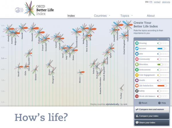
Let’s look at the example of Moritz’s work on the OECD Better Life Index. This is an exploratory tool to allow people to investigate the different quality of life indicators and measures for a range of countries across the world. This project is entirely user-driven Is there a single or group of important findings? No, there are many possible insights contained within this dataset. These only become insights once a pattern reveals something relevant to a user. With (I recall) 34 countries and 11 different quality of life indicators, there are many ways a user can slice, analyse, sort and explore this data.
Similarly, the next example from Kristina Szucs is exploratory in nature. It is a static project that provides insight into the combination of film review scores and movie profitability. Whilst the subject matter is filtered to show a specific view of the data (just the top 3 profitable movies, by genre by year) this is still exploratory. You learn how to read the chart using the legend at the top of the display then apply that lens across the piece to discover the films, genres, and shapes that most interest you. The design does not include a specific headline discovery or conclusion, it simply acts as an interface for you to find what strikes you as an insight. Once again, you as the reader do the work to find what is interesting to you.

By contrast, this piece from Simon Scarr is contains a main narrative, the striking reverse bar chart shows the fatal impact of the Iraq conflict. Accompanied by a few supplementary charts for additional context, this is a focused story principally about one dimension of the subject matter. The size of the chart, the colour scheme and the overall architecture are representative of the designer taking responsibility to highlight a story for you to consume.

Success in visualisation
The other issue that has been aired in recent days – but also discussed for a long time in general – is the question of where are the visualisation success stories? It is something we posed in the Data Stories podcast 16 and I know it will be discussed in podcast 21.
There is always a strong appetite to find examples of where visualisations have made a difference: opinion changes, behaviour changes, money savings, great discoveries and maybe even life saving.
It is natural for us all to seek a marquee and tangible example that indisputably provides popular evidence of the value of this subject. That’s perhaps why so many of us cling on to story of the John Snow ‘Cholera Map’. Regardless of the true nature of the impact of his dot plot map, we can use this to fit in with our agenda of wanting to show how visual portrayal is so important at influencing decisions and situations.
However, I’m increasingly aware of how ‘success’ of visualisation is rarely tangible nor grand in nature. And it doesn’t need to be. It is ultimately a form of communication. We don’t seem to put the same weight of expectation or desire for outcome measures on many written forms of communication, do we?
The main issue is what does success look like? Yes, that awful management phrase that invokes a chill down the spine. Well, naturally and boringly, we have to think first about intent and context: What are you trying to achieve and what are the expectations in terms of outcome?
Using the first of two horse-related idioms or phrases, it is all about horses for courses.
Building on the discussion above, let’s think about the distinction between success from exploratory visualisations and explanatory ones.
It would seem to me that the ability to attribute ‘success’ is more tangible with exploratory experiences, either as an exercise in visual analysis (where it might be you as the audience) or as an interactive experience for others.
Suppose a particular combination of variables, filters or selections reveals an insight. That is a discovery. If this discovery was achieved as a result of the visual portrayal and something that we may not have seen visible with statistics or data alone, then that success has to be attributed to visualisation.
Whether this changes the course of society is another matter. Someone might have unearthed the discovery that a vaccine can cure a certain disease or it might be that you spent more money last year in Nandos than you’d realised. The contexts are very different and similarly the impact is likely to be very different (unless Nandos was the cure…) but success has occurred: something interesting or relevant has been found in the data and the expectation was fulfilled. 1-0 to visualisation.
Now the chances are that the Nando’s situation is a good deal more likely to be happening day in day out than the Hollywood-esque discovery of the vaccine’s positive effect. However, the Nando’s example will be happening in very personal and private settings. We don’t necessarily have widespread access to these stories because they are ultimately quite minor and we don’t really have them on our radar because we want to aim higher. But they happen to all of us almost subconsciously everyday and they are important.
On the other side of the equation, the explanatory visualisations, what should we expect from them?
I’ve recently been thinking about the possible parallels between visualisation and marketing communication theory. In particular, the concept of AIDA, which describes the incremental events or effects of advertising.

I’m no expert in Marketing Communications – as will be seen clearly over the next few paragraphs – but having learnt about it a few years ago it has always struck me as potentially transferable (with a few tweaks), perhaps into a AIIA model of Attention, Informing, Influencing and Acting:
Some adverts are intended to simply achieve ‘Attention‘ or ‘Awareness‘, the first ‘A’ in AIDA. Attracting the attention of the customer and making them aware of the existence of that product/service is the limit of the ambition so achieving that is success. That’s why you might see, for example, so many god-awful annoying adverts that exist to stand out from crowd. They might not convince you to buy anything but that’s not the aim at this stage. Likewise with visualisation, some projects are probably achieving success (in their minds) if you have achieved such attention, somebody has simply looked or engaged with them. Quite a low ambition, of course, but this might be exemplified by the setting of visualisation as a prop or artefact, maybe in a magazine to focus your eyes on that article.
The ‘I’ part of the AIDA acronym is about raising ‘Interest‘ by demonstrating the benefits and advantages of a product or service. Maybe the equivalent in visualisation is about informing somebody, by providing a visualisation that addresses a gap in understanding about a subject.
‘D‘ is for ‘Desire‘, to convince the potential customer why they should need this product or service. Perhaps in a visualisation context the equivalent would be something more around influencing, going beyond simply informing and starting to have an impact on somebody’s belief system or choices they make. Maybe an example of this was the Drones Strike or US Gun Deaths projects? Neither of these works are likely to have the ambition of stopping drone strikes overnight. But the more people who digest them and who are affected by the human messages contained, it is not hard to imagine how a chain of events layers up with other information could ultimately lead to protest or opposition action to government policy? (Incidentally, not the attempt at evaluating success at the end of this post).
The final ‘A’ is for ‘Action’, to take the customer towards the act of purchasing. For visualisation this idea of action could be consistent with the ultimate success measure: you have sufficiently influenced somebody about a given subject matter that you have triggered an action, a decision, a change. Is it the impact of Al Gore’s rise in his cherry picker to follow the projected temperature forecasts? Or was that less about the visualisation and more about the drama of the delivery? Who knows, but this is the holy grail, the type of ‘success stories’ we’re all keen to find examples of.
This model is not a perfect fit, nor do I propose that these equivalent levels of success measurement are the best way of judging impact, but I feel it is worth the discussion about how other communication-related disciplines define tiers of success.
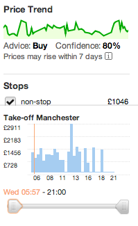
Perhaps we just need to wake up more to when they happen and notice them. This morning I have been looking on Kayak at flights prices for a forthcoming trip. I never even thought about the display that was influencing my decisions but I’ve revisited it just now. Decision-support devices like this are everywhere but we take them for granted. A visualisation success story is that I am now in position to buy this flight with confidence and know that I’ve got the best price for the date on which I’m leaving.
Final Reflections
Finally, we need to acknowledge the things that have most impact. People.
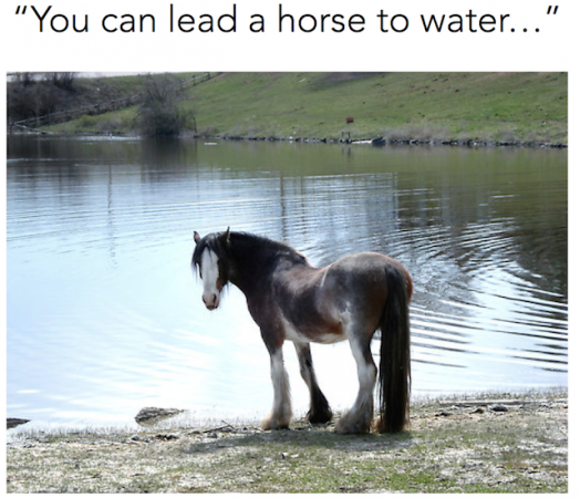
People are irrational. They are inconsistent, moody, prejudiced, have tastes, have pressures, are influenced by political factors. In my training materials I include the image below, related to my second horse-related phrase for the day: You can lead a horse to water, buy you can’t make it drink.
You can only do your best to put forward a visualisation that most effectively serves the needs of the subject matter, the context and the audience you’re reaching. Beyond that, the ultimate success is out of your hands.
Regardless of the information Kayak provided me with I might have booked an expensive flight in the mid-afternoon just because it suited me better, maybe I am superstitious and like to leave at 12 noon precisely. An irrational choice given the information I had to hand. If I don’t follow the implied advice the data visualisation presents to me, it’s not that it failed it is just because people are and can be be odd but they are such an important part of the measurement of success.
I look forward to any discussions, comments in the boxes below…
