

On December 21st 2013 the New York Times published a project titled ‘How Y’all, Youse, and You Guys Talk’, developed by Wilson Andrews and Josh Katz. The project is based on Josh’s own research exploring ‘Regional Dialect Variation in the Continental US‘ building on questions and data from the Harvard Dialect Survey, a linguistics project by Bert Vaux and Scott Golder.
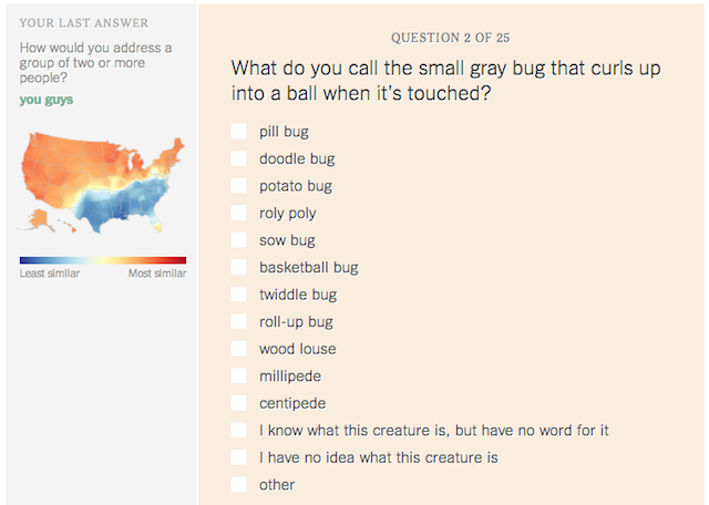
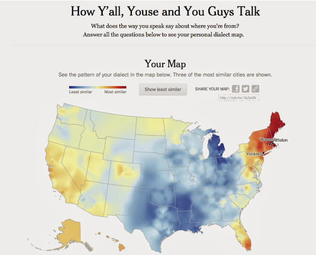
By responding to the 25 different questions about the language you most likely use in different situations the project builds a picture of your dialect. Once you have completed the quiz a final heat map provides an indication of the “probability that a randomly selected person in that location would respond to a randomly selected survey question the same way that you did”. In other words, where in the US would you most likely find somebody who uses a similar dialect to you.
Taken in isolation, it is a terrific project, but its success in the context of visitor levels is quite staggering.
As the year closed out, analysis was conducted on the most visited pages across the entire New York Times’ website throughout the year and this project was ranked the number 1 most visited content of 2013.
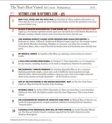
In only 11 days – a period that includes the distractions of Christmas and New Year holidays – it had achieved more attention than the NYT’s articles covering subjects such as the Boston bombings, the appointment of a new Pope, and a highly-publicised Op-Ed by Vladimir Putin. We clearly don’t know from this metric what level of engagement was achieved – how long people stayed on the site, how many went through the full quiz, for example – but this is clearly an extraordinary and landmark achievement.
So, what does this tell us?
I think the main takeaway from this is how people love to participate: we are enthusiastic about anything that will result in a new understanding of where our views or attributes fit in the world. Recent projects from the BBC Graphics Team – including the global pay scale, global fat scale, 7 billionth birth, class calculator (developed in partnership with Applied Works) – have similarly shown how successful and popular participation based projects can be.
Other popular examples such as the NYT’s 512 paths or the Guardian’s ‘Balloons‘ projects are also participatory but in a different way. Rather than directly feed them with specific data you are invited to simulate the outcome of the key swing states in the lead up to the 2012 US elections.
These examples go beyond ‘just’ interactivity in the sense of exploring different views or diving into details of our data. Instead, we are directly involved in arriving at some outcome, some final ‘answer’ that let’s us understand a subject from our perspective.
This isn’t an attempt to express a paradigm shift in thinking across the field but it feels an important juncture to acknowledge ‘participative’ visualisation as an important sub-set of the interactive visualisation landscape.
