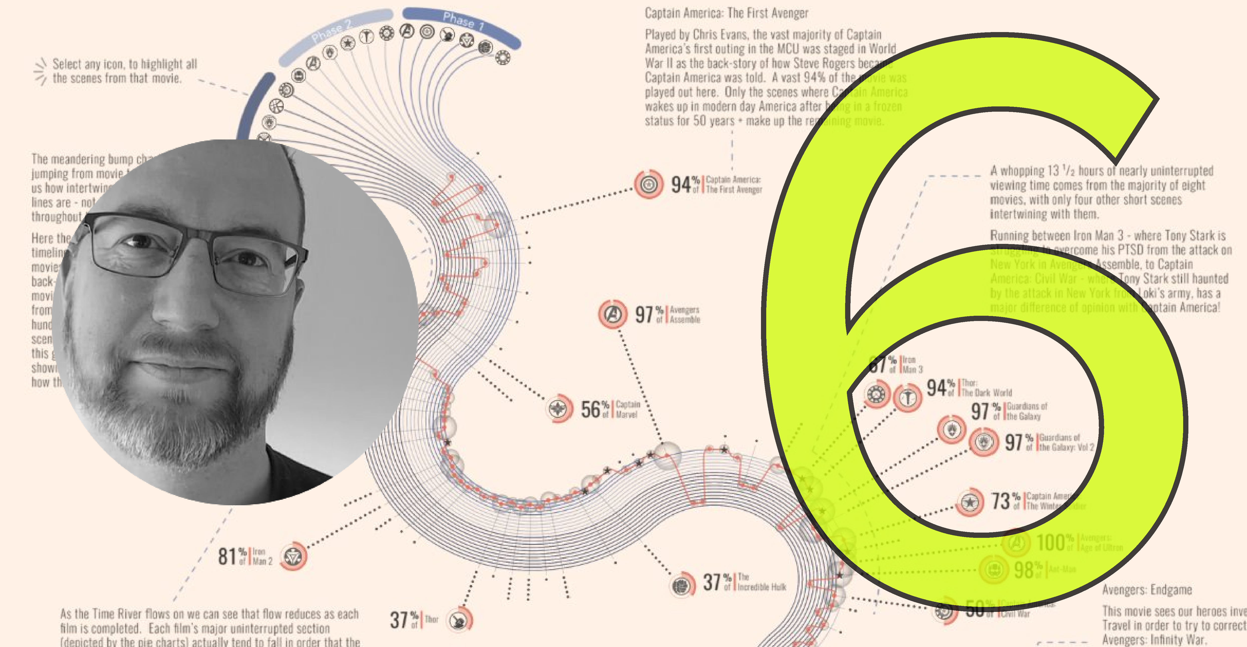
Podcast
Explore Explain S4 E8: Denise Lu
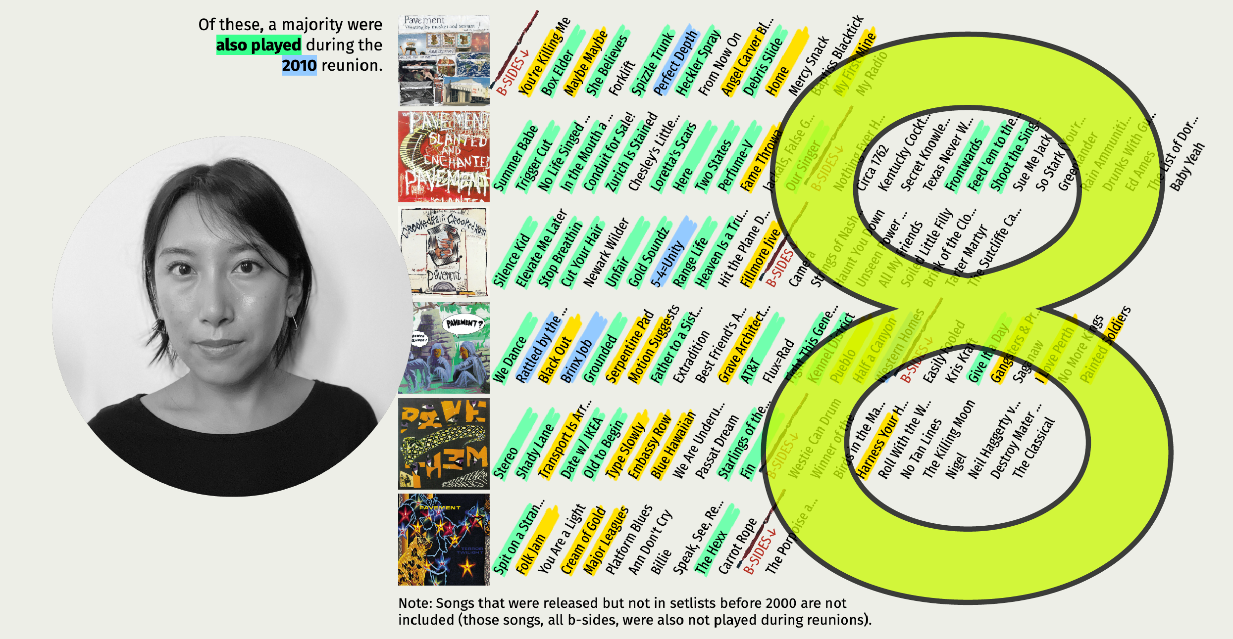
Welcome to S4E8 of Explore Explain, a long-form video and podcast series about data visualisation design. In this episode I chat with Denise Lu about her side project visualising analysis of the tracks played during the reunion shows of her favourite band: this is ‘Pavement 1933-2023’.