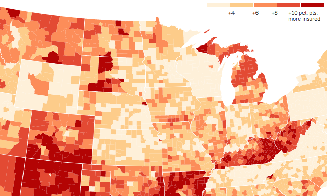
Updated training schedule
Just a quick note to share an update on my upcoming ‘Introduction to Data Visualisation & Infographic Design’ public training workshops.
Visualisingdata.com was originally launched in 2010 originally to serve as a blog to help continue the momentum of my learning from studying the subject via a Masters degree. I continue to publish articles and share announcements that track developments in my professional experiences as well as developments in the data visualisation field at large.
This is a collection of all my published posts, starting with the newest and dating back to 2010, tracking. These posts include articles, design commentaries, podcast updates, professional updates, and general news from across the data visualisation field.
Just a quick note to share an update on my upcoming ‘Introduction to Data Visualisation & Infographic Design’ public training workshops.
At the end of each month I pull together a collection of links to some of the most relevant, interesting or thought-provoking web content I’ve come across during the previous month. Here’s the latest collection from May 2014.
For cross-posting purposes: Over on the Seeing Data research project blog, I have posted a collection of 8 articles concerning visual and visualisation literacy.
I’ve had this short post sat in my draft folder for weeks now, awaiting the right context before publishing. I’m finally motivated to post it having seen a few discussions on Twitter last week whilst on holiday.
I want to share some information about a really interesting research project I’m fortunate to be working on with a small research team from the Institute of Communication Studies at the University of Leeds and The Migration Observatory. The study is titled ‘Seeing Data’ and is funded by the Arts & Humanities Research Council (AHRC). Having commenced in January of this year the project runs through to March 2015.
As ever it was a privilege to be invited to take part in the latest episode 37 of the Data Stories podcast. I joined Enrico and Moritz alongside Scott Murray to discuss the challenges of learning and teaching data visualisation.
Data Cuisine is an experimental workshop investigating the creative possibilities at the intersection between food and data: “exploring food as a medium for data expression”
Visits is a new visualisation tool by Alice Thudt, Sheelagh Carpendale and Dominikus Baur that lets you browse your location histories and explore your trips and travels. The tool is based on a research project from the University of Calgary.
Occasionally I invite folks to contribute guest posts to profile their work, ideas or knowledge. This guest post comes from Benn Stancil from a startup called Mode who have created a really interesting tool that allows you to reverse engineer analysis/visualisations in order to potentially take them in new directions.
A quick announcement to the broader visitorship out there, having briefly tweeted about it last week I am thrilled to have received approval to start work on my second book, which will be published by SAGE.
At the end of each month I pull together a collection of links to some of the most relevant, interesting or thought-provoking web content I’ve come across during the previous month. Here’s the latest collection from April 2014.
Over the past couple of days I’ve been asking people in my corner of Twitter for suggestions for classic book titles from subject areas that are not data visualisation but that do hold many interesting related ideas, theories and concepts. Things that we can draw from and apply to our understanding of data visualisation.
I’m currently in Chicago for a couple of days to deliver my public workshop. Thanks to the recommendation of Tom Schenk Jr. I had chance to quickly see a really nice free exhibition at the Chicago Architecture Foundation called ‘Chicago: City of big data’.
I recently had the pleasure of meeting Miguel Nacenta, University of St Andrews, was one of the people behind the development of the FatFonts technique. Whilst chatting with Miguel he showed me a short video of another tool he has co-worked on developing called Transmogrifiers.
A pictoral insight into the challenge of teaching. “People might seek teaching in data visualisation because they find themselves doing this…”
It is self-promotion day here on Visualising Data! Just published now is a podcast I did with Julie Gould from the NatureJobs blog, discussing various aspects of the data visualisation game.
I was recently asked to write about the subject in an article for the Harvard Business Review: ‘Visualizing Zero: How to Show Something with Nothing’. This piece offers a brief overview of the content of my talk at OpenVisConf.
At the end of each month I pull together a collection of links to some of the most relevant, interesting or thought-provoking web content I’ve come across during the previous month. Here’s the latest collection from March 2014.
Below you will find an embedded slideshare version of the slides used in last week’s talk at OpenVisConf 2014 held in Boston (well, officially Cambridge but Boston was only a bridge away).
This is an administrative, bullet-pointy post to share a few quick updates about my training workshops requiring more than twitter’s 140 characters limit.
I’m posting this as a separate discussion thread but in follow up to the previous post about the Gun Crimes chart and the issue of confusion vs. deception.
Overnight I saw quite a few tweets spinning off an article ‘How to Lie with Data Visualisation’. Initially, I mistakenly thought this had been written by Aatish Bhatia but it was actually from Ravi Parikh. It is a good article picking up on some of the classic subjects of our ire (Fox News, truncated y-axes).
At the end of each month I pull together a collection of links to some of the most relevant, interesting or thought-provoking web content I’ve come across during the previous month. Here’s the latest collection from February 2014.
As I mentioned in my previous post, many moons ago, I am giving a talk at the OpenVisConf in 3 weeks’ time. The title of my talk is ‘The design of nothing’ and in this last post I reached out for people to send in stories or examples related to this matter.
In one month from now the 2014 OpenVisConf will be held in Boston, MA. Having watched coverage of the inaugural 2013 conference from afar (check out the highlight reel and watch the talks, it looked super) I am thrilled to be one of the chosen few to join the speaker line-up for this year’s two-day event.
This morning I tweeted an interesting observation made on BBC News discussing the missing Malaysian airline “We are now not used to no information”. It is entirely true. In this age of so much, any gaps become so extraordinary.
I was really interested to see the Sunlight Foundation share details of its internal ‘Data Visualization Style Guidelines’ the other day. Whilst I’ve not had chance to take a magnifying glass to the specific details of advice, I am impressed with how they have framed this document.
Just a little update about things relating to this site. I am currently working behind the scenes with a couple of bright design and developer minds on a brand new website and design identity.
At the end of each month I pull together a collection of links to some of the most relevant, interesting or thought-provoking web content I’ve come across during the previous month. Here’s the latest collection from January 2014.
They (human people) say the key to comedy is timing. Well timing is also a key factor with regards to blogging, certainly when covering particular subjects. So a write-up of Tapestry Conference 2014, which took place almost a week ago, is already tiptoeing sheepishly outside the ‘news cycle’.