
Intermission time
As I’m reaching a critical stage with my book writing – a draft script is due shortly – I will be dropping off the radar
Visualisingdata.com was originally launched in 2010 originally to serve as a blog to help continue the momentum of my learning from studying the subject via a Masters degree. I continue to publish articles and share announcements that track developments in my professional experiences as well as developments in the data visualisation field at large.
This is a collection of all my published posts, starting with the newest and dating back to 2010, tracking. These posts include articles, design commentaries, podcast updates, professional updates, and general news from across the data visualisation field.

As I’m reaching a critical stage with my book writing – a draft script is due shortly – I will be dropping off the radar

At the end of each month I pull together a collection of links to some of the most relevant, interesting or thought-provoking web content I’ve come across during the previous month. Here’s the latest collection from April 2015.

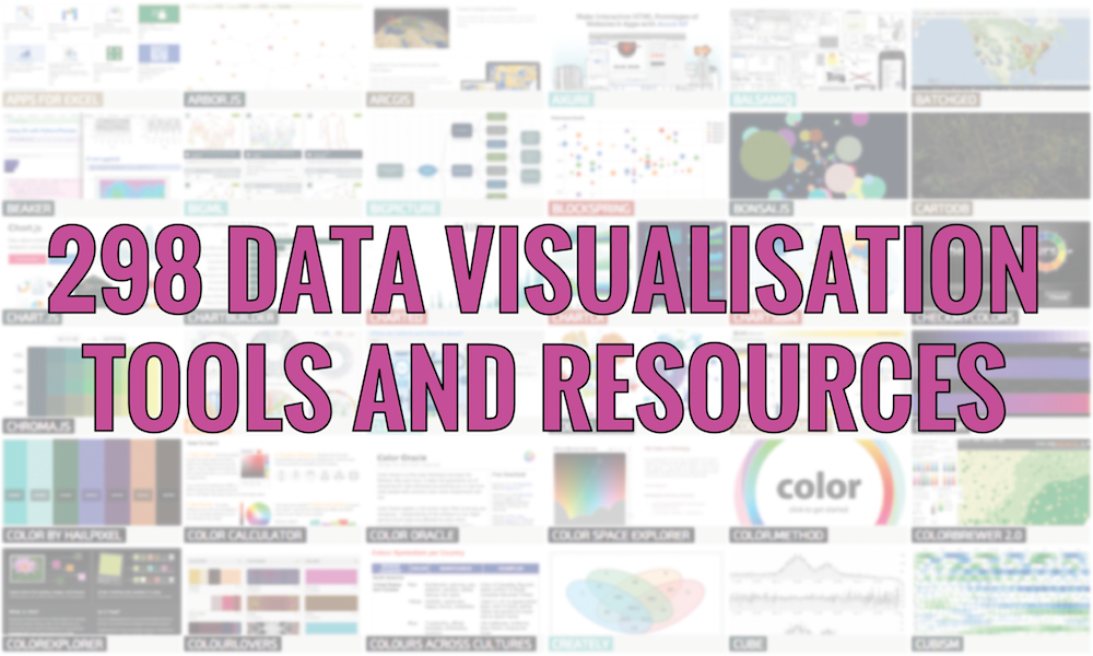
I’ve been updating my collection of data visualisation resources after receiving suggestions for additions over the past few months. The collection now has 298 records covering the spectrum of applications.

When considering the trajectory and development of the data visualisation field I contemplate the dual role of the scientific and creative communities: I believe scientists tell us what we should do and creatives tell us what we could do.

As I am in the process of writing my book I find that the same challenges in the use of language crop up. The main one I have difficulty being consistent about is how to term the person who reads, uses, consumes etc. visualisation work. Especially, when I am constructing a sentence that really needs a singular catch-all label and not a multi-comma-separated list – that just makes it clumsy both to write and to read.

A very quick post just to share this graphic from the WSJ that was published a couple of days ago. The reason for profiling it is simply because I think this is a great example of an infographic that includes worthwhile visual embellishments: useful chartjunk if we want to go there.

With the dust settling after the UK elections, a brief reflection on the winners and losers from a data and visualisation perspective. I have selected two of each as follows…

At the end of each month I pull together a collection of links to some of the most relevant, interesting or thought-provoking web content I’ve come across during the previous month. Here’s the latest collection from March 2015.

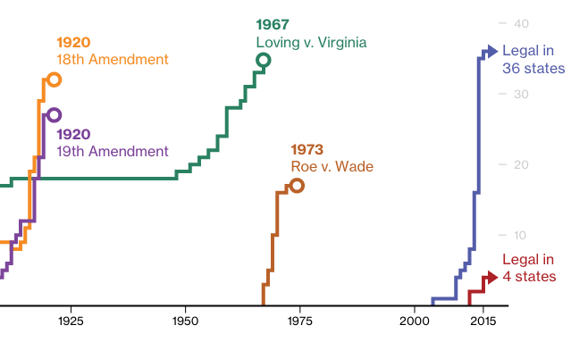
Really like this piece of visual journalism by Alex Tribou and Keith Collins of the Bloomberg Visual Team who have looked at ‘How Fast America Changes Its Mind’ over some of the biggest social issues.

Stereotropes is an interactive experiment, developed by the Data Visualisation team at Bocoup, which examines the use of a range of common tropes in TV and movies and how they reflect, shape or counter against gender stereotypes in society.

Back in January I claimed that I would be hitting the new year with plans of more frequent smaller posts to offer ‘some practical tidbits most probably relating to quite narrow design considerations’. That lasted for about a week, so its certainly long overdue that I pick this back up.

Regular readers will be somewhat aware of my involvement in a research project called ‘Seeing Data’, a 15 month study funded by the UK Arts and Humanities Research Council and led by Professor Helen Kennedy from the University of Sheffield.

At the end of each month I pull together a collection of links to some of the most relevant, interesting or thought-provoking web content I’ve come across during the previous month. Here’s the latest collection from February 2015.

MapWheel is a new product from Waypoint Ventures, a Sydney based start-up founded by Russell Bolden and Jesse Little, which offers the means to create a customised ‘toposcope’ plaque showing the exact direction and distance to treasured locations around the world relative to your specified ‘home’.

It is always a privilege to be asked to give talks and this last week I’ve given two more at the National Audit Office as well as a webinar for Tableau. As many people like to have access to the slide content after each talk I don’t mind at all sharing them.

As we enter the final few weeks before the UK General Election on Thursday 7th May, I would be really keen to shine a finger-pointing light on any party who put their names to any manipulative and deceptive visuals.

A quick profile of Dear Data, a lovely ‘artisan visualisation’ concept from the brains and pens of Giorgia Lupi and Stefanie Posavec. It has had plenty of coverage on other sites and on social media this week but I wanted to briefly mention it for anybody else out there yet to come across it.

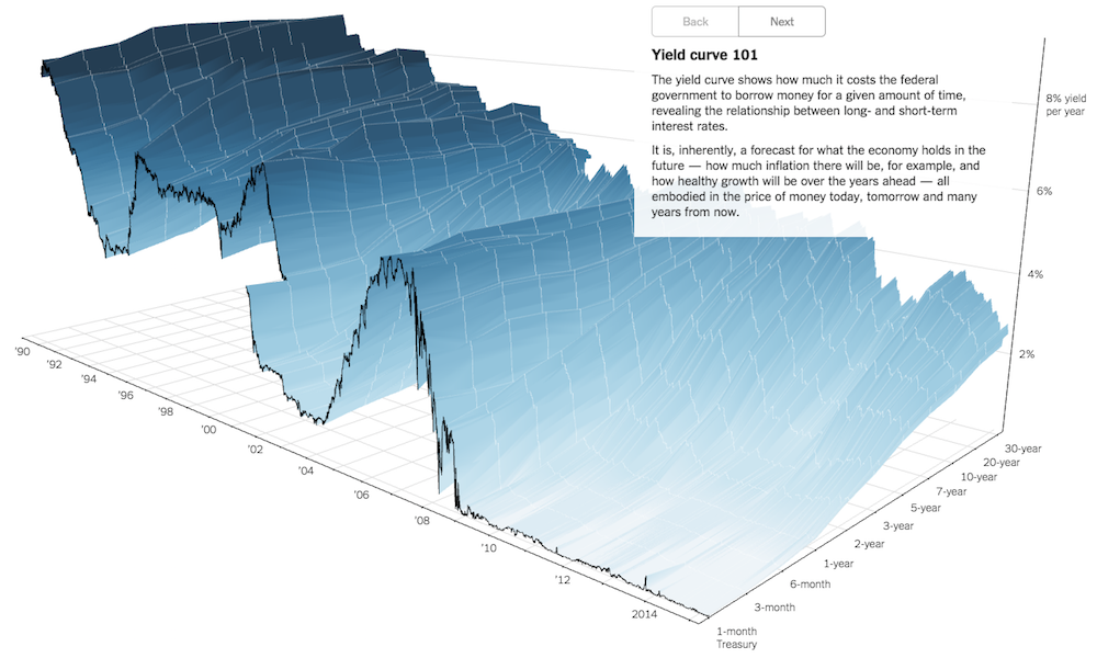
Earlier this week TheUpshot published a new interactive project visualising the ‘Yield Curve’. Created by Gregor Aisch and Amanda Cox the work provides a “3-D view of a chart that predicts the economic future”.

Last week I had the pleasure, as always of having a brief discussion with Jon Schwabish about life in the data visualisation scene. Helpfully the chat was recorded by NSA, Jon retrieved the audio and published it on his site.

It has taken a while to pull together but I’ve finally arrived at my final schedule of public data visualisation training events for the rest of 2015. For more information on the formats, types and coverage of each different event, visit the training page.

At the end of each month I pull together a collection of links to some of the most relevant, interesting or thought-provoking web content I’ve come across during the previous month. Here’s the latest collection from January 2015.

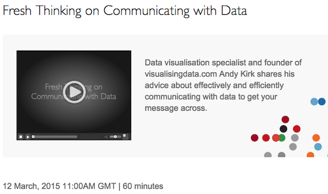
Next Thursday 12th March I will be doing a 60 minute webinar hosted by Tableau. The title of the talk is “Fresh Thinking on Communicating with Data” and is based around the theme of some of my recent talks.

This is an announcement for anyone interested in sponsoring this website. I have decided to open up three new banner spaces on the Home page for interested parties to advertise their product, services or general offerings.

During the week I posted an article about some of the issues and options around using colour to represent gender (that is, the binary of Male or Female). I included a one-question poll to gather some insights about the attitudes out there towards the use of colour with gender.

A quick post to share something that I’ve been really in to this past week or so: dendrochronology. Also known as tree-ring dating, it is the “scientific method of dating based on the analysis of patterns of tree rings”.

You work you’re way through the data, come up with an idea for the most interesting angle of analysis, chart your data, and delight yourself with the compelling emerging display: look how clearly it shows the difference between men vs. women!

The Bank of England has announced details of its first data visualisation competition, in conjunction with the One Bank Research Agenda conference and the release of new publicly available Bank data sets. The winning entry will receive £5000.

I’m musing about this visualisation work that has received a lot of love and attention on blogs and social media over the past few days. Created by the excellent people in the Wall Street Journal graphics team, it portrays data about the impact of vaccines in battling infectious diseases in the 20th Century.

One of the frequent questions I get asked, particularly by people from a scientific or financial domain, is how to effectively visualise uncertainty of data and of statistics. My response is usually to make suggestions around annotated markings and/or colour gradients to indicate increasing or declining certainties.

Today I am celebrating the 5th birthday of visualisingdata.com and I wanted to thank every single one of the half a million visitors who have been to my site. Whether you have been along just the once or have been back time and time again, you have all helped to make this such an incredibly rewarding activity.

We use analytics cookies to understand how you interact with our website, which helps us improve our content and your user experience. By clicking 'Accept', you consent to our use of these tools. You can change your preferences at any time.