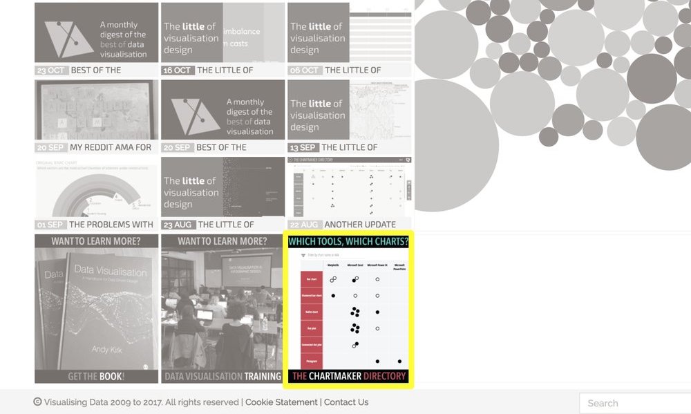
Home page link to Chartmaker Directory
A small note for site visitors just to sign-post the fact I have *finally* allocated a permanent place on the home page to point to the ‘Chartmaker Directory’.
Visualisingdata.com was originally launched in 2010 originally to serve as a blog to help continue the momentum of my learning from studying the subject via a Masters degree. I continue to publish articles and share announcements that track developments in my professional experiences as well as developments in the data visualisation field at large.
This is a collection of all my published posts, starting with the newest and dating back to 2010, tracking. These posts include articles, design commentaries, podcast updates, professional updates, and general news from across the data visualisation field.

A small note for site visitors just to sign-post the fact I have *finally* allocated a permanent place on the home page to point to the ‘Chartmaker Directory’.
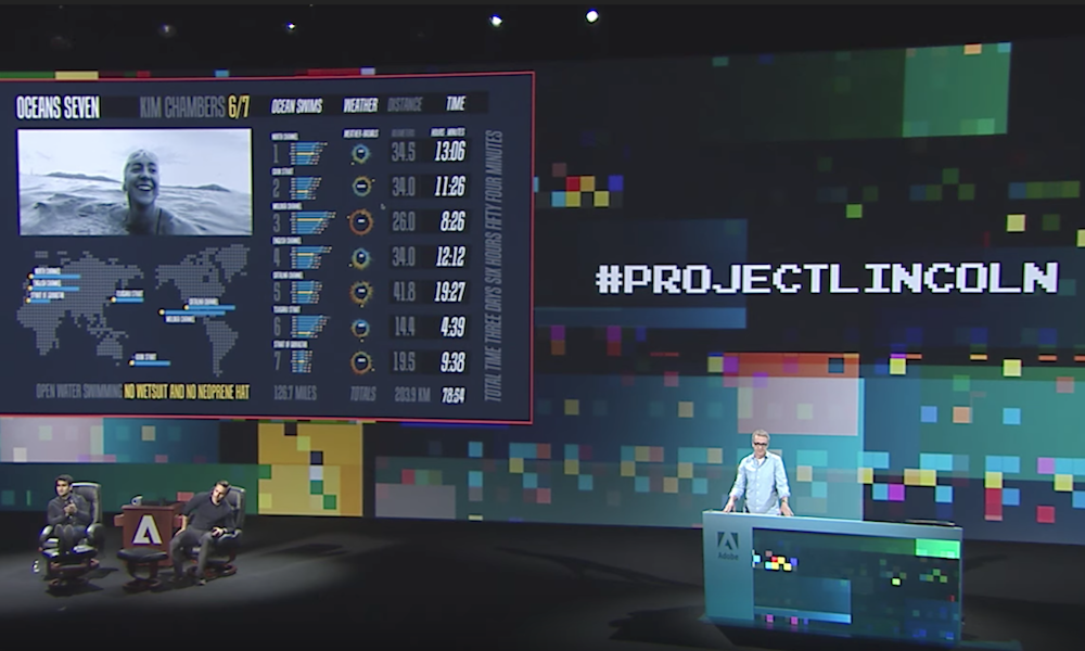
I retweeted a link to this on social media but I wanted to share here to a broader audience a short video from the Adobe MAX 2017 event. This is a ‘sneak peak’ presentation from Bernard Kerr about a tool he has been working on, known for now as Project Lincoln

At the end of each month I pull together a collection of links to some of the most relevant, interesting or thought-provoking web content I’ve come across during the previous month. Here’s the latest collection from August 2017.
This is part of a series of posts about the ‘little of visualisation design’, respecting the small decisions that make a big difference towards the good and bad of this discipline.
This is part of a series of posts about the ‘little of visualisation design’, respecting the small decisions that make a big difference towards the good and bad of this discipline.

I was delighted to be invited to do a Reddit AMA – “Ask Me Anything” – session today on the r/dataisbeautiful subreddit. As the name implies, this is a chance for people to ask me any questions they wish, mainly about data visualisation.

At the end of each month I pull together a collection of links to some of the most relevant, interesting or thought-provoking web content I’ve come across during the previous month. Here’s the latest collection from July 2017.
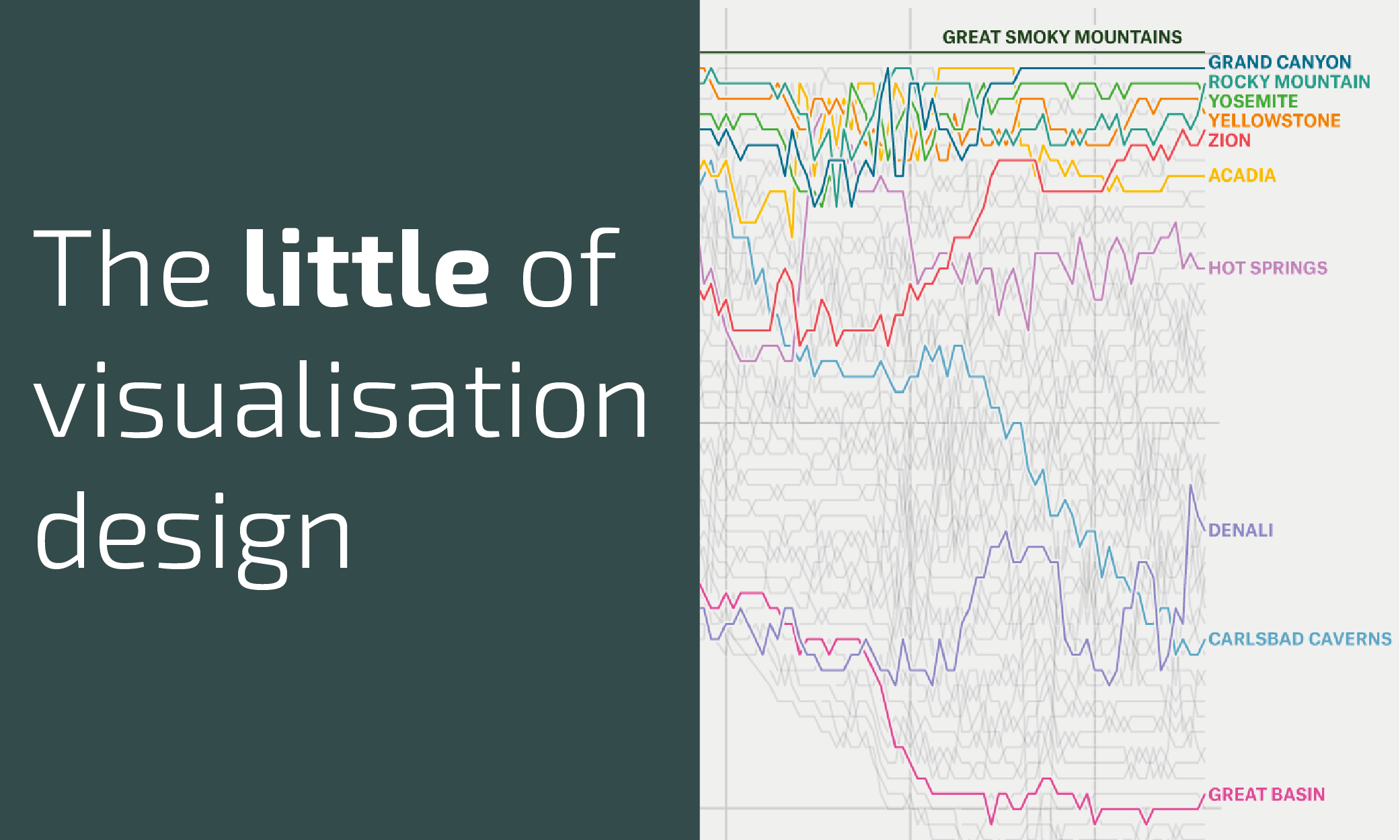
This is part of a series of posts about the ‘little of visualisation design’, respecting the small decisions that make a big difference towards the good and bad of this discipline.
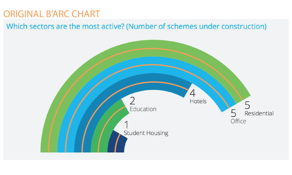
Almost one month ago I tweeted my contempt for radial bar charts, having come across a particularly egregious case. It seemed to gain a bit of traction on social media but was also met by genuine queries as to my reasoning for this disdain.
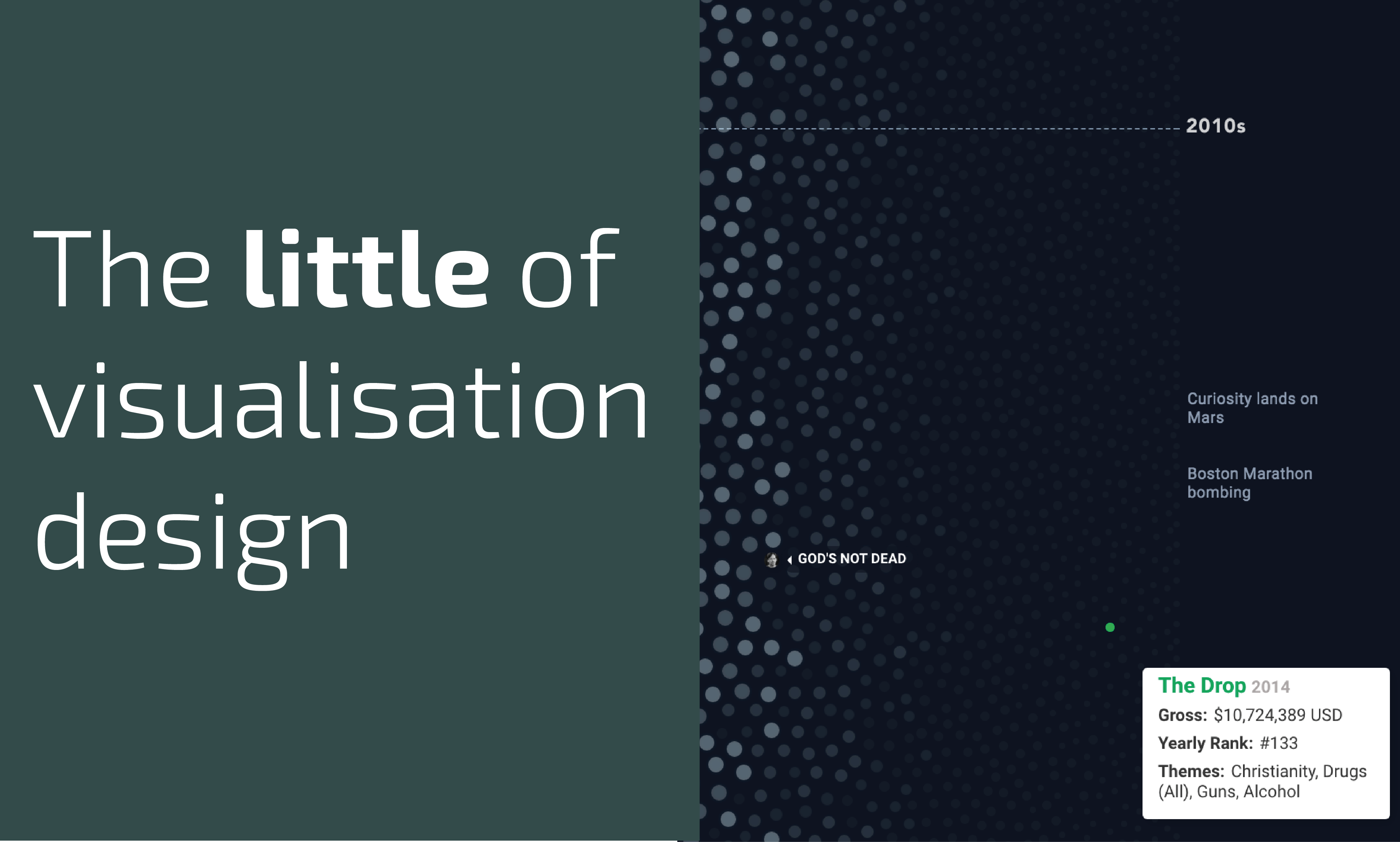
This is part of a series of posts about the ‘little of visualisation design’, respecting the small decisions that make a big difference towards the good and bad of this discipline.

A few weeks have now passed since I launched the CHARTMAKER DIRECTORY, an attempt to gather and organise a useful catalogue of references that will offer a good sense of what charts can be made using which tools and, where necessary, how.
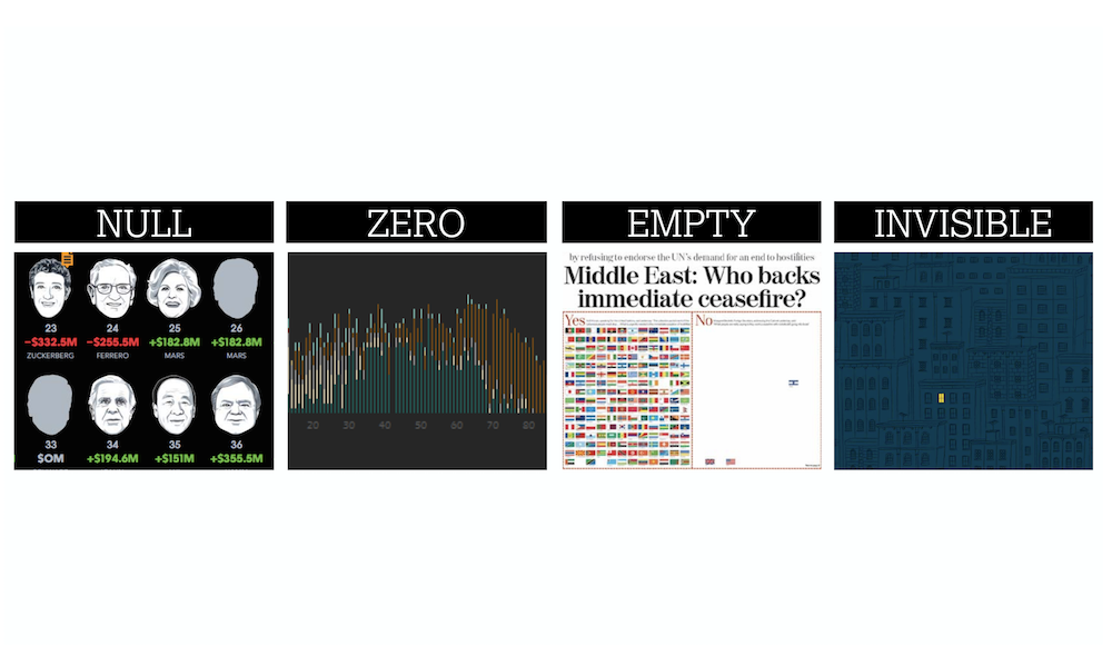
Earlier today I had the pleasure of delivering a second webinar presentation for Tableau this year. The title of my talk was ‘The Design of Nothing’.
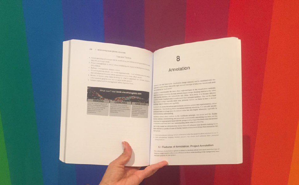
A couple of weeks ago I launched an ambitious endeavour notionally hashtagged as the ‘#VisBookFlipBook’ project. The idea was to mark the first anniversary of my book’s publication with an attempt to crowdsource photographs of every double-page spread of my book from the owners of my book.

Last week I launched the Chartmaker Directory, an attempt to gather and organise a useful catalogue of references that will offer a good sense of what charts can be made using which tools and, where necessary, how. I wanted to provide a brief update on the status of things 10 days on.

I’ve recently added a number of new events and locations to my public data visualisation training workshop schedule.
To mark each mid-year and end of year milestone I try to take a reflective glance over the previous 6 months period in the data visualisation field and compile a collection of some of the most significant developments.

At the end of each month I pull together a collection of links to some of the most relevant, interesting or thought-provoking web content I’ve come across during the previous month. Here’s the latest collection from June 2017.

After a long time sat patiently on my would-like-to-do list I am delighted to release a new project titled ‘The Chartmaker Directory’.

Sometimes, site editors like me are ignorant to the fact their RSS feed is not working and that thousands of keen readers and potentially valuable customers are cruelly being denied access to this rich array of award-winning and award-losing content.
I recently passed the 1 year anniversary since my book was published and I was thinking about how I might mark this event. Regular visitors to the site over the past few years will know that I’m somebody who is up for running the occasional experimental or creative activity with my readers and followers.
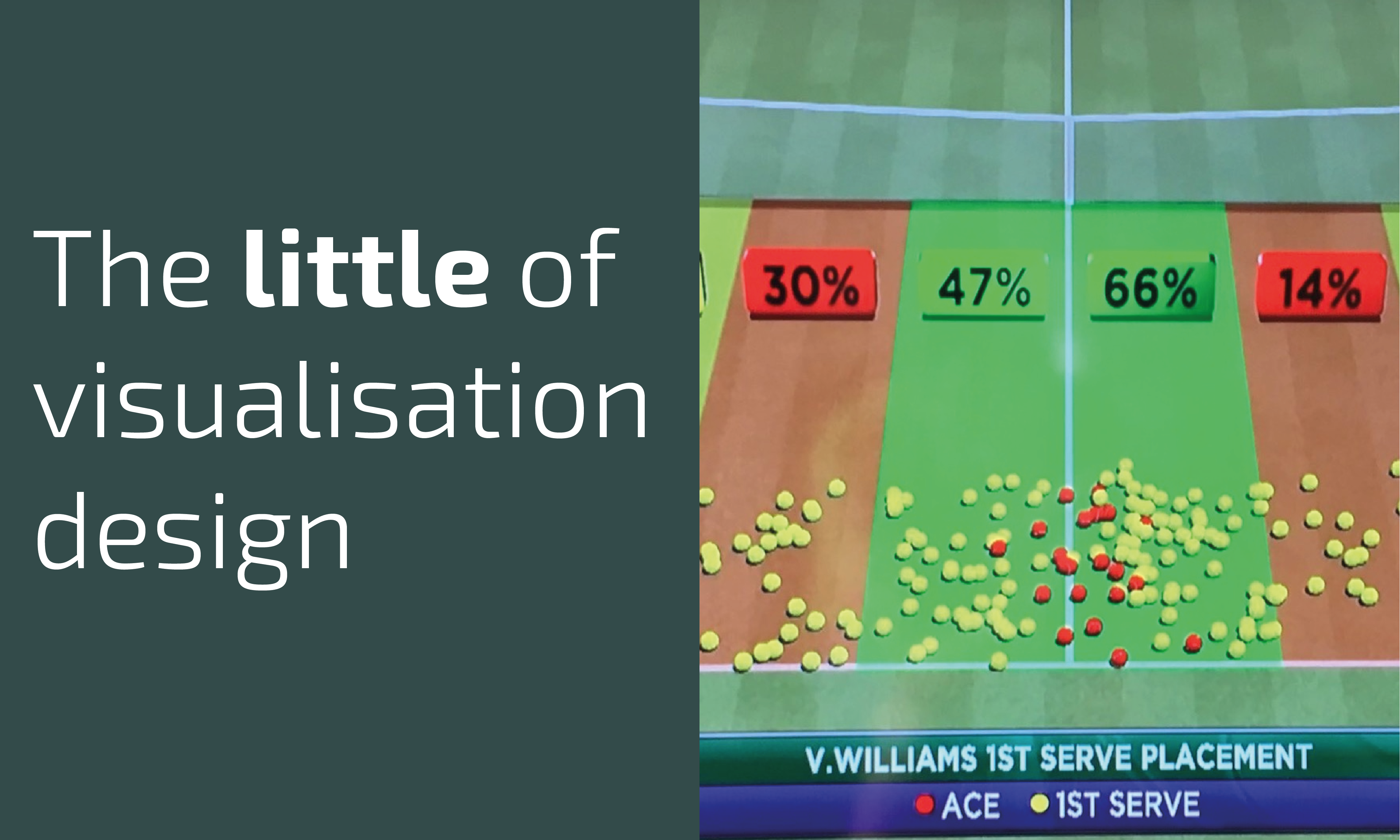
This is part of a series of posts about the ‘little of visualisation design’, respecting the small decisions that make a big difference towards the good and bad of this discipline.
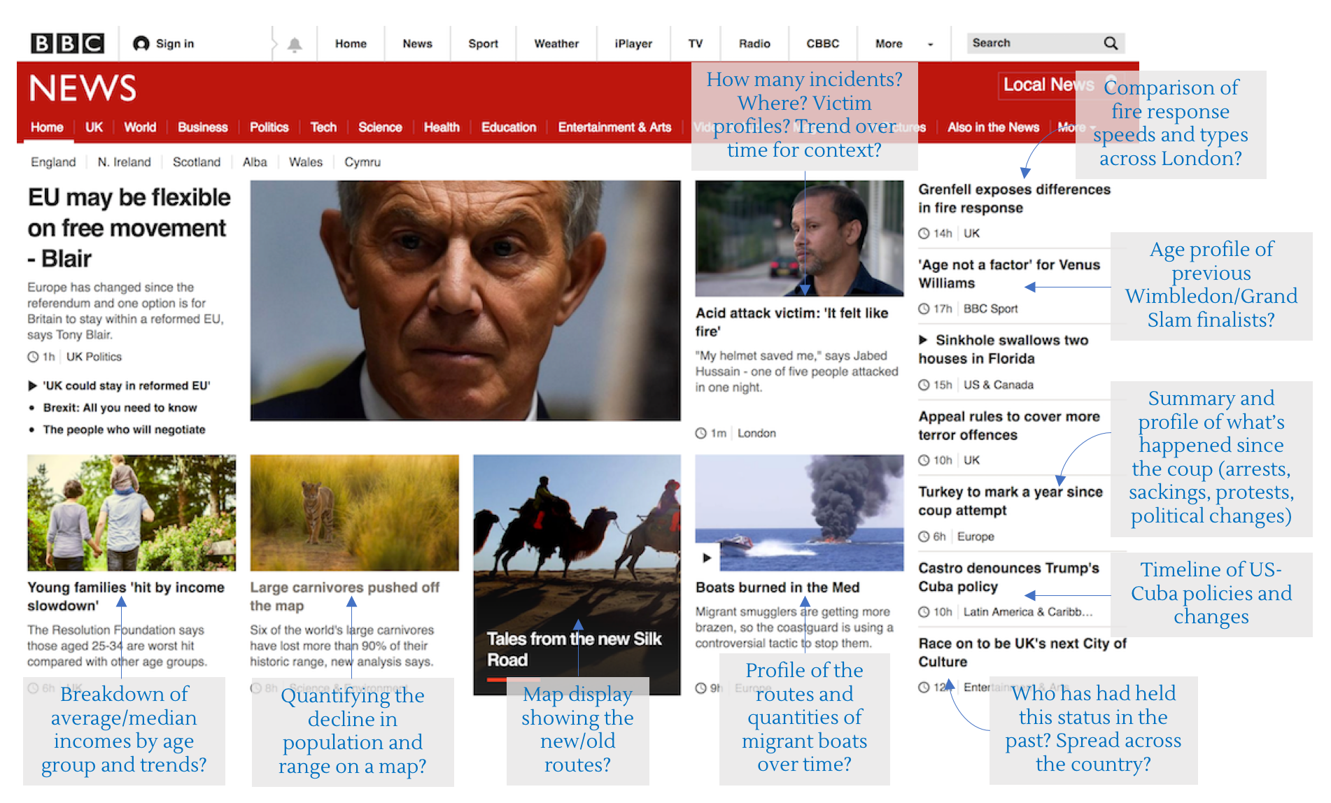
One of the standard pieces of advice I (and most others in a similar position) give to people looking to develop their data visualisation skills is to constantly seek opportunities to practice. Every task is different, every dataset presents new challenges

At the end of each month I pull together a collection of links to some of the most relevant, interesting or thought-provoking web content I’ve come across during the previous month. Here’s the latest collection from May 2017.
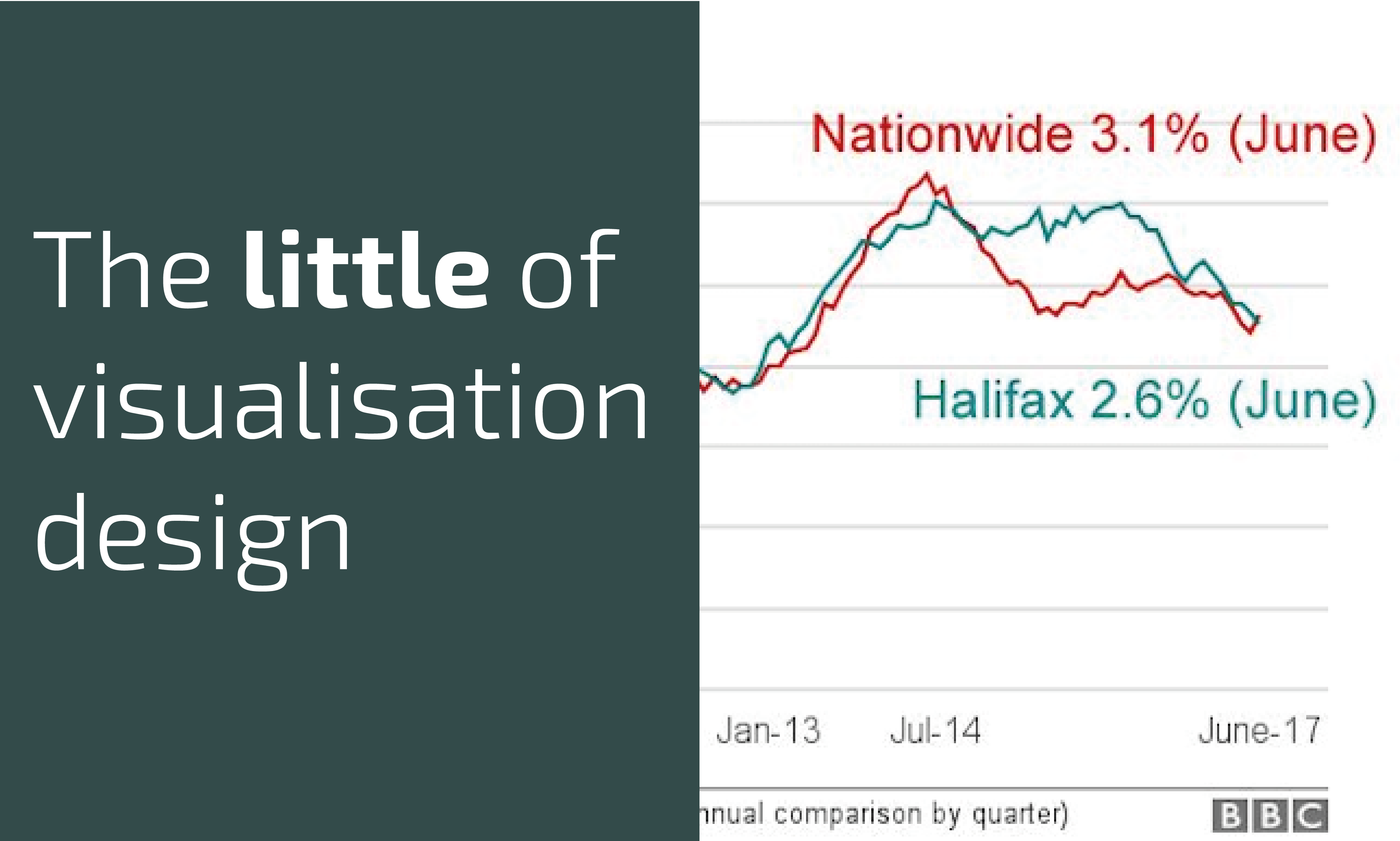
This is part of a series of posts about the ‘little of visualisation design’, respecting the small decisions that make a big difference towards the good and bad of this discipline.
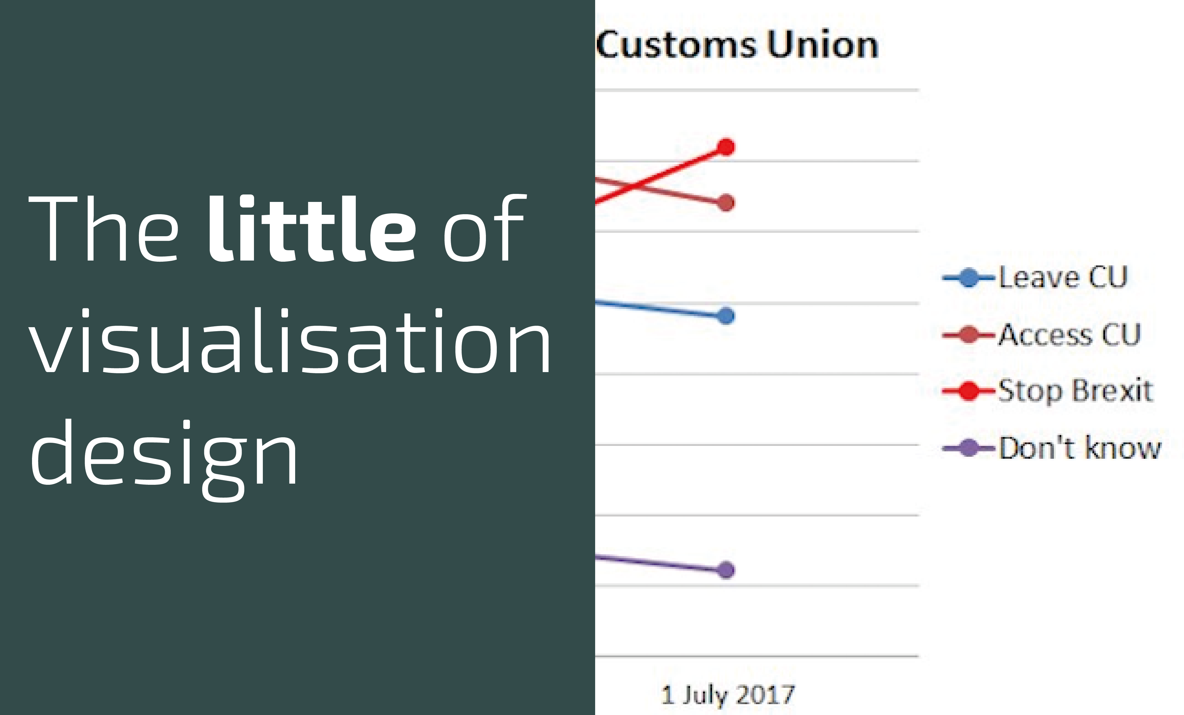
This is part of a series of posts about the ‘little of visualisation design’, respecting the small decisions that make a big difference towards the good and bad of this discipline.
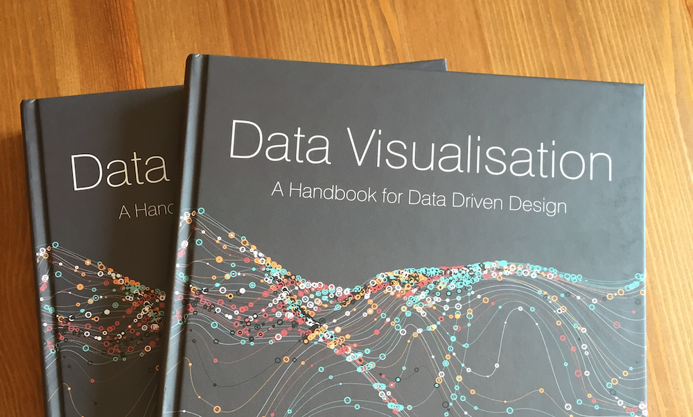
It is approaching the one year anniversary of my book being released in the wild. Though I will be doing something to mark this milestone in a couple of weeks, I wanted to share a one-page extract concerning a topic that has become ever more important since I wrote it.
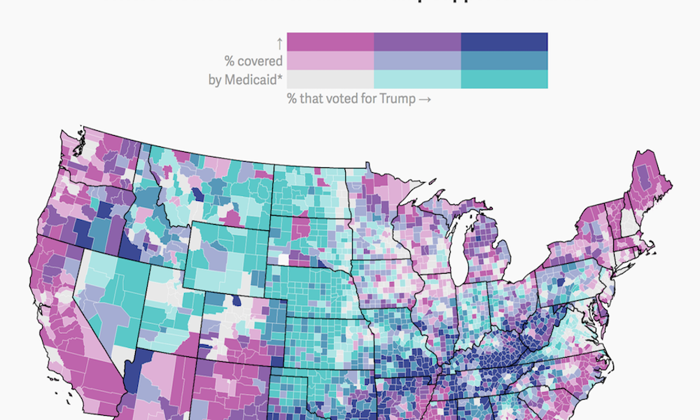
Yesterday, I came across an example of a bivariate choropleth map produced by Quartz. It isn’t an approach you see deployed too often so I was curious about what people thought about them on Twitter.
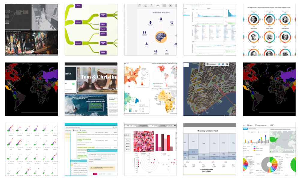
A quite note to announce that, after quite a delay since the last update, I have finally found time to go through a bunch of bookmarks to add a bunch of previously missing or new tools to my data visualisation resources collection.

At the end of each month I pull together a collection of links to some of the most relevant, interesting or thought-provoking web content I’ve come across during the previous month. Here’s the latest collection from April 2017.

This is part of a series of posts about the ‘little of visualisation design’, respecting the small decisions that make a big difference towards the good and bad of this discipline.