This is part of a series of posts about the ‘little of visualisation design’, respecting the small decisions that make a big difference towards the good and bad of this discipline. In each post I’m going to focus on just one small matter – a singular good or bad design choice – as demonstrated by a sample project. Each project may have many effective and ineffective aspects, but I’m just commenting on one.
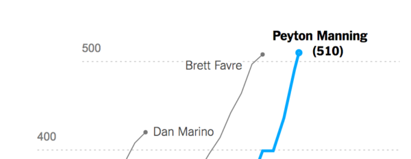
The ‘little’ of this next design concerns a clever way of cleaning up space and maximising the role of gridlines. The visualisation in focus here is from a few years ago and is one of my favourites for teaching, it comes from the New York Times and looks at the achievement of Peyton Manning breaking the record for the number of career touchdown passes.
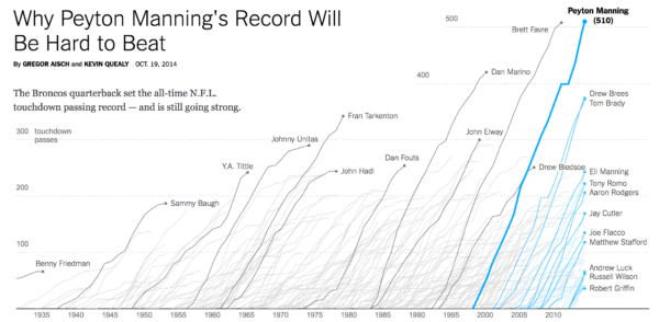
What I like here is the cropping of the horizontal gridlines indicating the position of the 400 and 500 values along the y-axis scale. Only three players have ever reached or exceeded these figures in their careers so it makes sense just to provide this reading assistance to the right of the chart where these lines are plotted. This in turn cleans up the overall display on the left, enabling the title and lede to occupy the empty space left behind by not having fully extended gridlines.