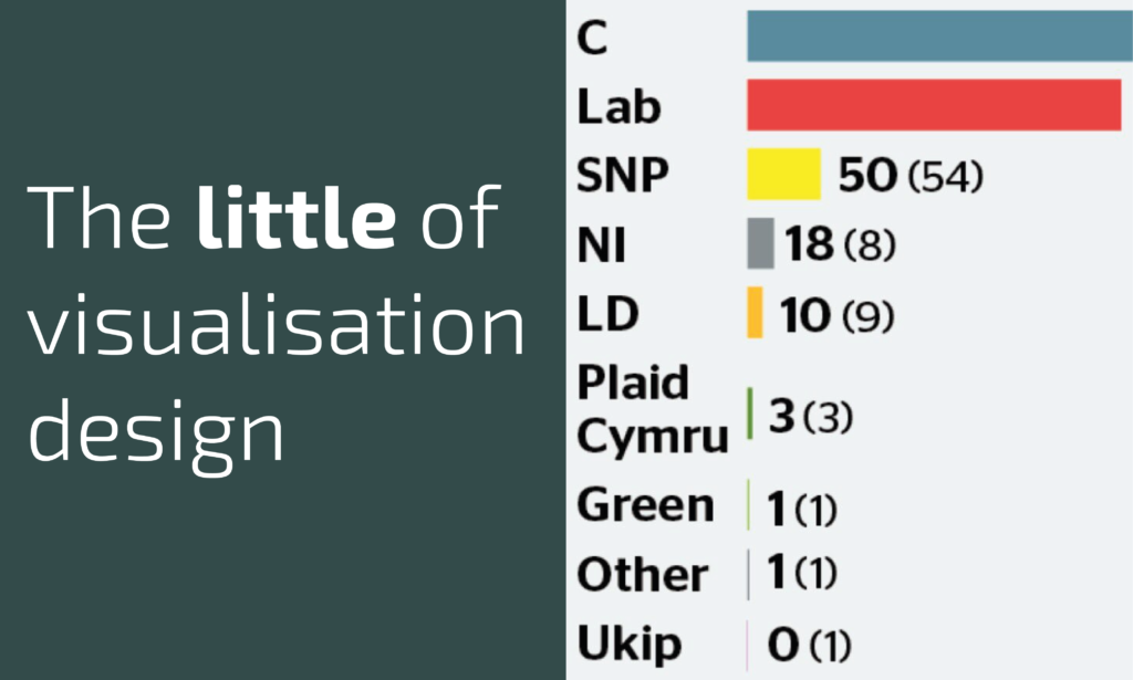
This is part of a series of posts about the ‘little of visualisation design’, respecting the small decisions that make a big difference towards the good and bad of this discipline. In each post I’m going to focus on just one small matter – a singular good or bad design choice – as demonstrated by a sample project. Each project may have many effective and ineffective aspects, but I’m just commenting on one.
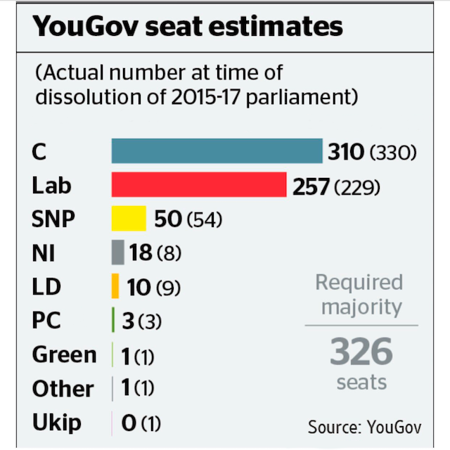
The ‘little’ of this next design concerns the small way in which a chart can immediately lose any sense of elegance. The chart in question was published in The Times overnight showing some latest modelling data from YouGov about the upcoming UK election.
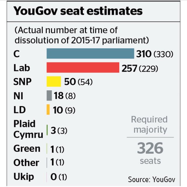
If you look down the y-axis you’ll notice the irregular space used to accommodate the ‘Plaid Cymru’ label. Unlike most of the other parties, no abbreviation or acronym has been used here which essentially means a double-row space is used, breaking up the visual rhythm of the arrangement of the bars.
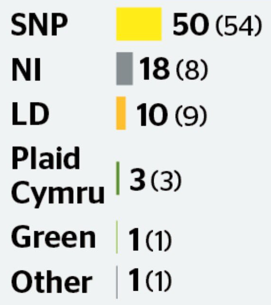
I know I’m probably guilty of being that guy but even though it might only be ‘only’ a bar chart we should still care about its appearance. This irregularity in space usage creates a jarring interruption to the flow of reading. Consistency is one of the most important concerns in visualisation design – consistency in line spacing, consistency in alignment, consistency in font, consistency in category label format. Why not reduce the label to PC? If you are interested in politics you’ll know what this stands for just as much as you’ll know what NI, SNP or LD stands for (incidentally, why not use ‘Con’ rather than C for Conservatives?). Here’s a photoshop reworking…