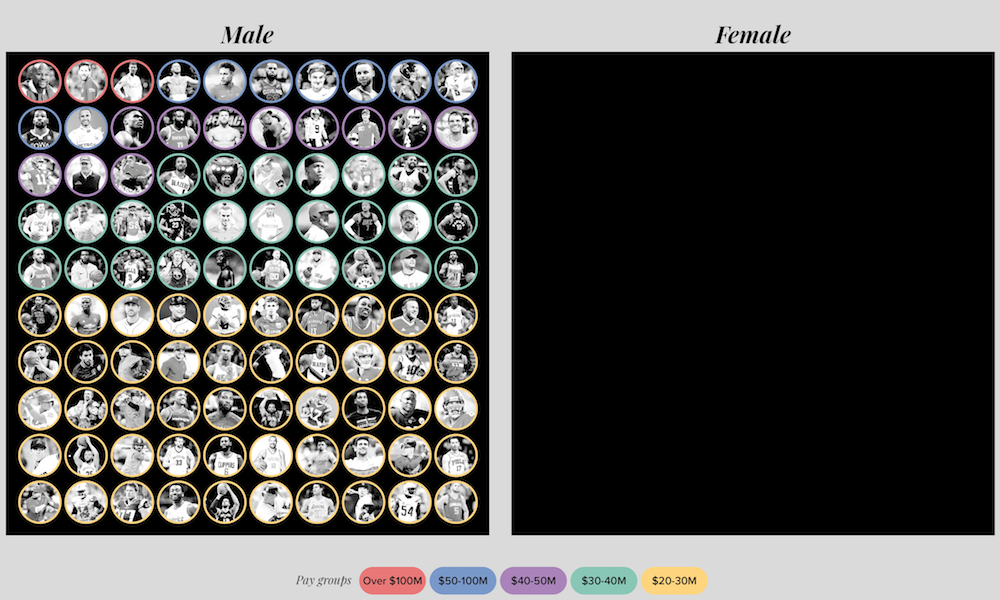
BLOG POSTS

Visualisingdata.com was originally launched in 2010 originally to serve as a blog to help continue the momentum of my learning from studying the subject via a Masters degree. I continue to publish articles and share announcements that track developments in my professional experiences as well as developments in the data visualisation field at large.

This is a collection of all my published posts, starting with the newest and dating back to 2010, tracking. These posts include articles, design commentaries, podcast updates, professional updates, and general news from across the data visualisation field.

Best Ofs

Best of the visualisation web… June 2017

At the end of each month I pull together a collection of links to some of the most relevant, interesting or thought-provoking web content I’ve come across during the previous month. Here’s the latest collection from June 2017.

Read More →
Announcements

Visualising Data RSS feed

Sometimes, site editors like me are ignorant to the fact their RSS feed is not working and that thousands of keen readers and potentially valuable customers are cruelly being denied access to this rich array of award-winning and award-losing content.

Read More →
Announcements

Help me create a gif flipbook of my book

I recently passed the 1 year anniversary since my book was published and I was thinking about how I might mark this event. Regular visitors to the site over the past few years will know that I’m somebody who is up for running the occasional experimental or creative activity with my readers and followers.

Read More →
Articles

Think like a journalist

One of the standard pieces of advice I (and most others in a similar position) give to people looking to develop their data visualisation skills is to constantly seek opportunities to practice. Every task is different, every dataset presents new challenges

Read More →
Best Ofs

Best of the visualisation web… May 2017

At the end of each month I pull together a collection of links to some of the most relevant, interesting or thought-provoking web content I’ve come across during the previous month. Here’s the latest collection from May 2017.

Read More →
Articles

Good data visualisation is trustworthy

It is approaching the one year anniversary of my book being released in the wild. Though I will be doing something to mark this milestone in a couple of weeks, I wanted to share a one-page extract concerning a topic that has become ever more important since I wrote it.

Read More →
Articles

Bivariate choropleth maps

Yesterday, I came across an example of a bivariate choropleth map produced by Quartz. It isn’t an approach you see deployed too often so I was curious about what people thought about them on Twitter.

Read More →
Announcements

Resources collection updated, now with 328 items

A quite note to announce that, after quite a delay since the last update, I have finally found time to go through a bunch of bookmarks to add a bunch of previously missing or new tools to my data visualisation resources collection.

Read More →
Best Ofs

Best of the visualisation web… April 2017

At the end of each month I pull together a collection of links to some of the most relevant, interesting or thought-provoking web content I’ve come across during the previous month. Here’s the latest collection from April 2017.

Read More →
Best Ofs

Best of the visualisation web… March 2017

At the end of each month I pull together a collection of links to some of the most relevant, interesting or thought-provoking web content I’ve come across during the previous month. Here’s the latest collection from March 2017.

Read More →
Best Ofs

Best of the visualisation web… February 2017

At the end of each month I pull together a collection of links to some of the most relevant, interesting or thought-provoking web content I’ve come across during the previous month. Here’s the latest collection from February 2017.

Read More →
Field News

The filming of a Malofiej 25 documentary

I have just returned from attending the always inspiring, humbling and exhausting Malofiej conference in Pamplona. This year was an extra special occasion in that it was the 25th annual event and was the first time I had returned since five years earlier

Read More →
Articles

Talk slides from DataFest17 ‘Data Summit’

Yesterday I had the pleasure of giving a short talk at the Data Summit 17 conference, part of the Data Fest 2017 festival in Edinburgh. My talk was titled ‘The Good, the Bad and the Greys of Data Visualisation Design’

Read More →
Articles

The fine line between intent and perception

I want to reflect on another occasion where the innocent intent of a chart has been at odds with the perceived incompetence claimed by a snarling audience. This is something of a companion piece to a similarly-motivated post I published almost three years ago.

Read More →
Best Ofs

Best of the visualisation web… January 2017

At the end of each month I pull together a collection of links to some of the most relevant, interesting or thought-provoking web content I’ve come across during the previous month. Here’s the latest collection from January 2017.

Read More →
Field News

#WhatCanWeDo collection of suggestions

As previewed last week, myself and Francis Gagnon organised a poster session at Tapestry to tap in to the collective wisdom of attendees seeking suggestions on how we as a community can help to navigate the choppy waters of this era of fake news etc.

Read More →
External

Data Stories podcast: Episode 92, Rosling Tribute

It was a pleasure to have the chance to share a short recorded tribute to the legacy of Hans Rosling in this special Data Stories episode where Enrico and Moritz offered their own remembrance alongside several other familiar contributors.

Read More →