Treemap data art
Details of a Treemap Art Project have come to my attention, showcasing data-generated artwork from one of the most influential names in data visualisation, Ben Shneiderman.

Details of a Treemap Art Project have come to my attention, showcasing data-generated artwork from one of the most influential names in data visualisation, Ben Shneiderman.
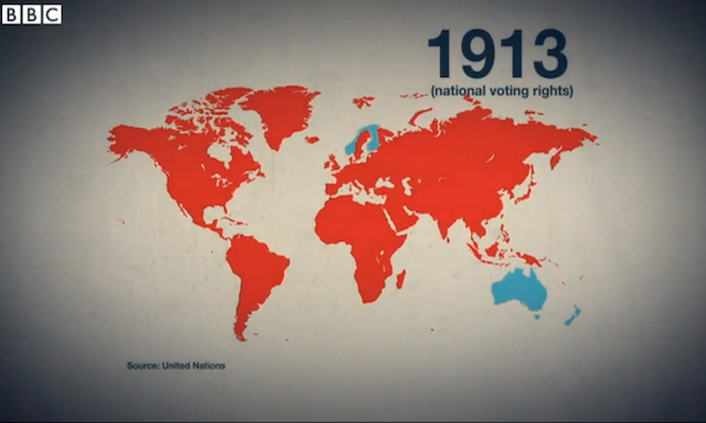
The BBC News website has today launched a new series titled ‘100 Women’, bringing together a range of interviews, profiles, articles and other digital content to look at the world we live in through the eyes of women.
Videographic for BBCs 100 Women season launch Read More »
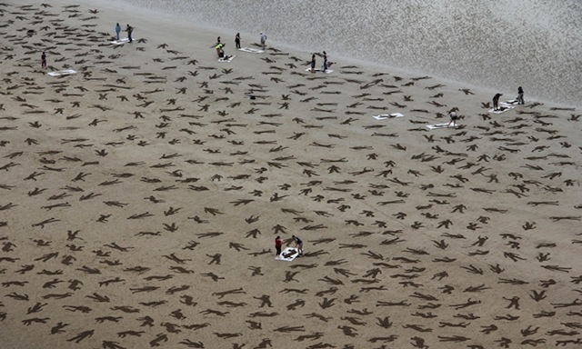
The Fallen 9000 was an artistic ‘event’ to coincide and mark International Peace day on 21st September. The project took place on the D-Day landing beach of Arromanches in France with the objective of representing the estimated 9,000 civilians, German forces and Allies who lost their lives on 6th June 1944.
Visualising the ‘Fallen’ Read More »
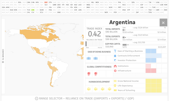
Launched yesterday comes a new interactive visualisation project and week-long accompanying series on global trade issues from ‘Ideas Lab’.
Ideas Lab: Visualizing Global Trade Read More »
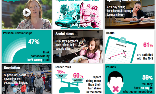
Thanks to Mel Taylor for sharing some nice work from NatCen, a leading independent social research agency, revealing the changes in British social attitudes over 30 years.
Changes in British social attitudes visualised over 30 years Read More »
A fantastic new visualisation work has been released today titled ‘Kindred Britain’. Created by Nicholas Jenkins and Elijah Meeks of Stanford University in partnership with Scott Murray (amongst others) the project offers a deep, exploratory interface into a network of nearly 30,000 key figures in British culture.
‘Kindred Britain’ maps 30,000 people in British history Read More »
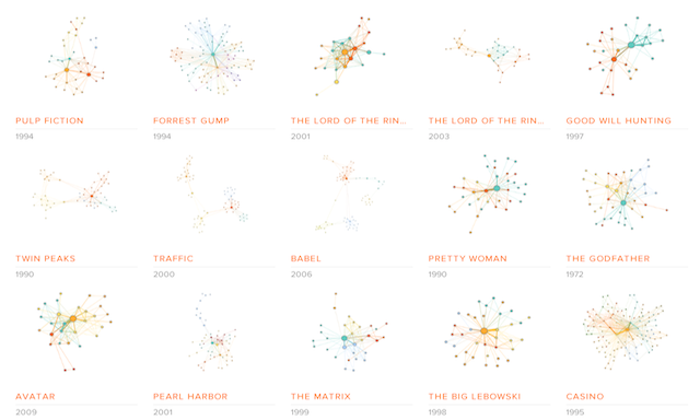
Jermain and Michael are co-founders of a data visualisation project called ‘Moviegalaxies’, “a place to discover the social graph in movies”. I recall I saw an early version of this project last year but it seems that the depth of movies now available has grown significantly.
‘Movie Galaxies’ social graphs in movies Read More »

Thanks to Rob Rolleston for sharing this video with me. It came up through some analysis of the Hint FM Wind Map and, as you can see for yourself, it provides a mesmerising ambient display of local wind patterns, making the invisible visible.
Windswept: Mesmerising wind observation installation Read More »
Many thanks to Luis van den Ende from Submarine Channel for sending me details of this fascinating interactive documentary titled ‘Unspeak’ that combines film, data visualisation, technology and design to investigate the issue of language that deliberately manipulates public opinion.
Unspeak: Interactive documentary looks at manipulative power of language Read More »
To accompany the launch of the Watch Dogs video game, ‘WatchDogs: WeAreData’ is a demonstration of some of the ‘smart cities’ concept that forms a major part of the game’s narrative.
‘Watch Dogs: WeAreData’ smart city data mapping Read More »