Updated training schedule
Just a quick note to share an update on my upcoming ‘Introduction to Data Visualisation & Infographic Design’ public training workshops.
Updated training schedule Read More »
Just a quick note to share an update on my upcoming ‘Introduction to Data Visualisation & Infographic Design’ public training workshops.
Updated training schedule Read More »
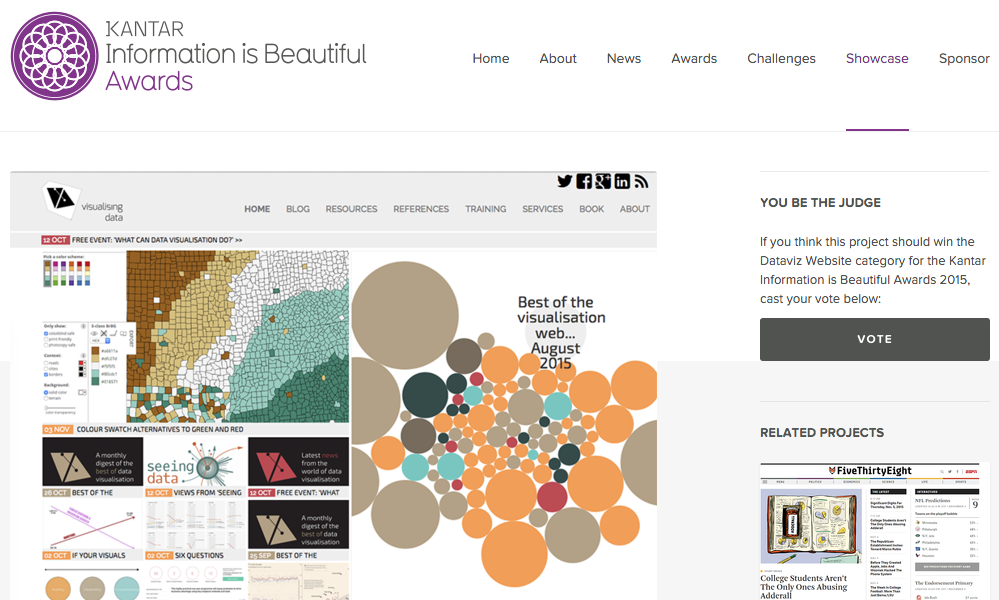
At the end of each month I pull together a collection of links to some of the most relevant, interesting or thought-provoking web content I’ve come across during the previous month. Here’s the latest collection from May 2014.
Best of the visualisation web… May 2014 Read More »
For cross-posting purposes: Over on the Seeing Data research project blog, I have posted a collection of 8 articles concerning visual and visualisation literacy.
8 Articles Discussing Visual and Visualisation Literacy Read More »
I’ve had this short post sat in my draft folder for weeks now, awaiting the right context before publishing. I’m finally motivated to post it having seen a few discussions on Twitter last week whilst on holiday.
Why visualisation is a pursuit of optimisation Read More »
I want to share some information about a really interesting research project I’m fortunate to be working on with a small research team from the Institute of Communication Studies at the University of Leeds and The Migration Observatory. The study is titled ‘Seeing Data’ and is funded by the Arts & Humanities Research Council (AHRC). Having commenced in January of this year the project runs through to March 2015.
Seeing Data: Researching visualisation literacy Read More »
As ever it was a privilege to be invited to take part in the latest episode 37 of the Data Stories podcast. I joined Enrico and Moritz alongside Scott Murray to discuss the challenges of learning and teaching data visualisation.
Data Stories podcast: Episode 37, teaching visualisation Read More »
Data Cuisine is an experimental workshop investigating the creative possibilities at the intersection between food and data: “exploring food as a medium for data expression”
Tasty visualisations from the Barcelona Data Cuisine Read More »
Visits is a new visualisation tool by Alice Thudt, Sheelagh Carpendale and Dominikus Baur that lets you browse your location histories and explore your trips and travels. The tool is based on a research project from the University of Calgary.
Visits: A visualisation tool for location histories and photos Read More »
Occasionally I invite folks to contribute guest posts to profile their work, ideas or knowledge. This guest post comes from Benn Stancil from a startup called Mode who have created a really interesting tool that allows you to reverse engineer analysis/visualisations in order to potentially take them in new directions.
Guest post: Using Mode to re-engineer data visualisations Read More »
A quick announcement to the broader visitorship out there, having briefly tweeted about it last week I am thrilled to have received approval to start work on my second book, which will be published by SAGE.
Beginning the journey towards book number two Read More »