Talk slides: The Design of Time (2019)
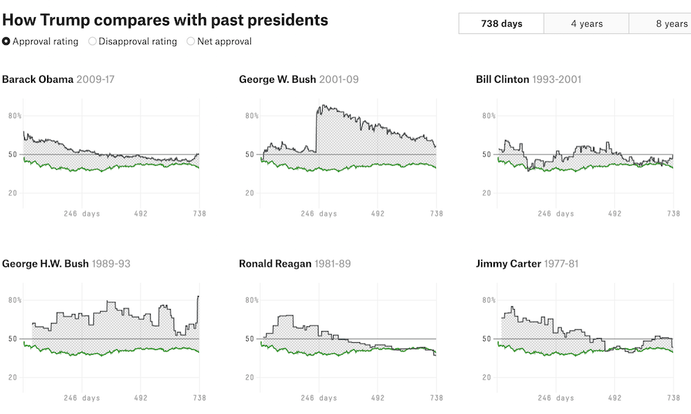
Earlier today I had the pleasure of delivering my first webinar presentation for Tableau this year. The title of my talk was ‘The Design of Time’.
Talk slides: The Design of Time (2019) Read More »
Earlier today I had the pleasure of delivering my first webinar presentation for Tableau this year. The title of my talk was ‘The Design of Time’.
Talk slides: The Design of Time (2019) Read More »
At the end of each month I pull together a collection of links to some of the most relevant, interesting or thought-provoking web content I’ve come across during the previous month. Here’s the latest collection from January 2019.
Best of the visualisation web… January 2019 Read More »
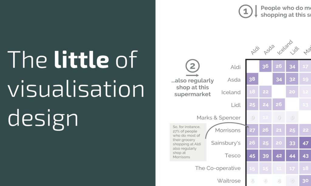
This is part of a series of posts about the ‘little of visualisation design’, respecting the small decisions that make a big difference towards the good and bad of this discipline.
The little of visualisation design: Part 62 Read More »
This is part of a series of posts about the ‘little of visualisation design’, respecting the small decisions that make a big difference towards the good and bad of this discipline.
The little of visualisation design: Part 61 Read More »
To mark each mid-year and end of year milestone I try to take a reflective glance over the previous 6 months period in the data visualisation field and compile a collection of some of the most significant developments. These are the main projects, events, new sites, trends, personalities and general observations that have struck me as being important to help further the development of this field.
10 significant visualisation developments: July to December 2018 Read More »
Last year I compiled a Twitter list, my first ever Twitter list I’ll have you know, to create a visible membership formed of ‘Freelancers offering data visualisation/infographic design and consultancy services around the world’.
Data visualisation freelancers list Read More »
As consumers of visualisations, before we form interpretations and conclusions from the charts we see, we have to remember that they are only a visual display of the data that has been collected and the way that data has been transformed.
What do charts actually show us? Read More »
At the end of each month I pull together a collection of links to some of the most relevant, interesting or thought-provoking web content I’ve come across during the previous month. Here’s the latest collection from December 2018.
Best of the visualisation web… December 2018 Read More »
Whilst driving yesterday evening I was listening to BBC Radio 6 Music and heard an interesting interview with members of the band Field Music. They are doing a pair of performances at the Imperial War Museums inspired by a document called ‘The End of the War’.
Sound ranging and the end of war Read More »
This is part of a series of posts about the ‘little of visualisation design’, respecting the small decisions that make a big difference towards the good and bad of this discipline.
The little of visualisation design: Part 60 Read More »