This is part of a series of posts about the ‘little of visualisation design’, respecting the small decisions that make a big difference towards the good and bad of this discipline. In each post I’m going to focus on just one small matter – a singular good or bad design choice – as demonstrated by a sample project. Each project may have many effective and ineffective aspects, but I’m just commenting on one.
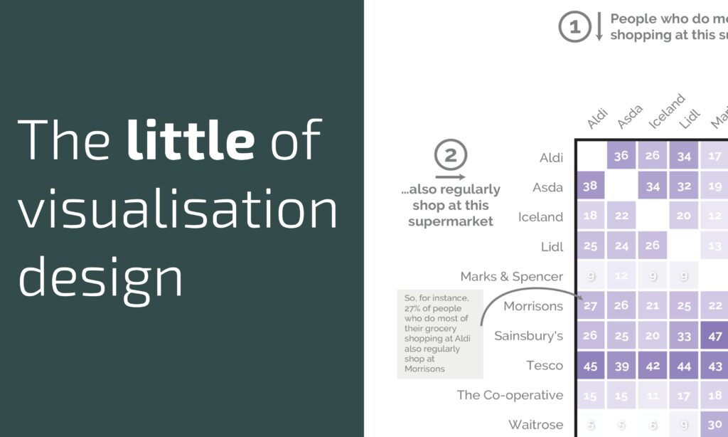
The ‘little’ of this next design concerns the use of step-by-step annotations to provide reading assistance. The work in question was created by Matthew Smith for YouGov about the dominance of Tesco supermarket.
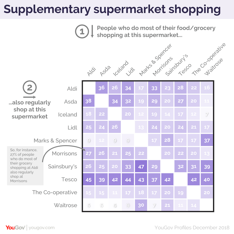
What I like about this work (and tip o’ the hat to Robert Grant for alerting me to it) exists in two layers of help. Firstly, the viewer is guided through the task of perceiving the heatmap, with numbered captions provided to explain what the values down the columns mean….

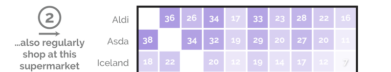
… and what the values across the rows mean.
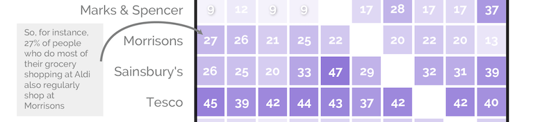
Secondly, a caption explains the meaning of an single intersecting cell, using plain English to help support the viewer’s interpretation rather than leave them to spend time forging their own understanding. This is a great example of a designer caring about an audience and coaching them through the reading process.