Talk slides: The State of the Union 2019+
Over the past few weeks I’ve had the opportunity to work on and present a talk titled ‘Data Visualisation: The State of the Union, 2019 and beyond”
Talk slides: The State of the Union 2019+ Read More »
Over the past few weeks I’ve had the opportunity to work on and present a talk titled ‘Data Visualisation: The State of the Union, 2019 and beyond”
Talk slides: The State of the Union 2019+ Read More »
At the end of each month I pull together a collection of links to some of the most relevant, interesting or thought-provoking web content I’ve come across during the previous month. Here’s the latest collection from September 2019.
Best of the visualisation web… September 2019 Read More »
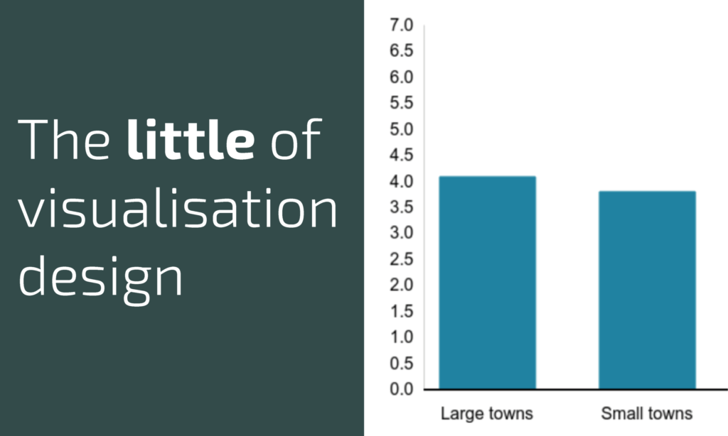
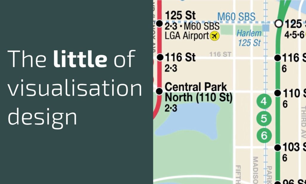
This is part of a series of posts about the ‘little of visualisation design’, respecting the small decisions that make a big difference towards the good and bad of this discipline.
The little of visualisation design: Part 69 Read More »
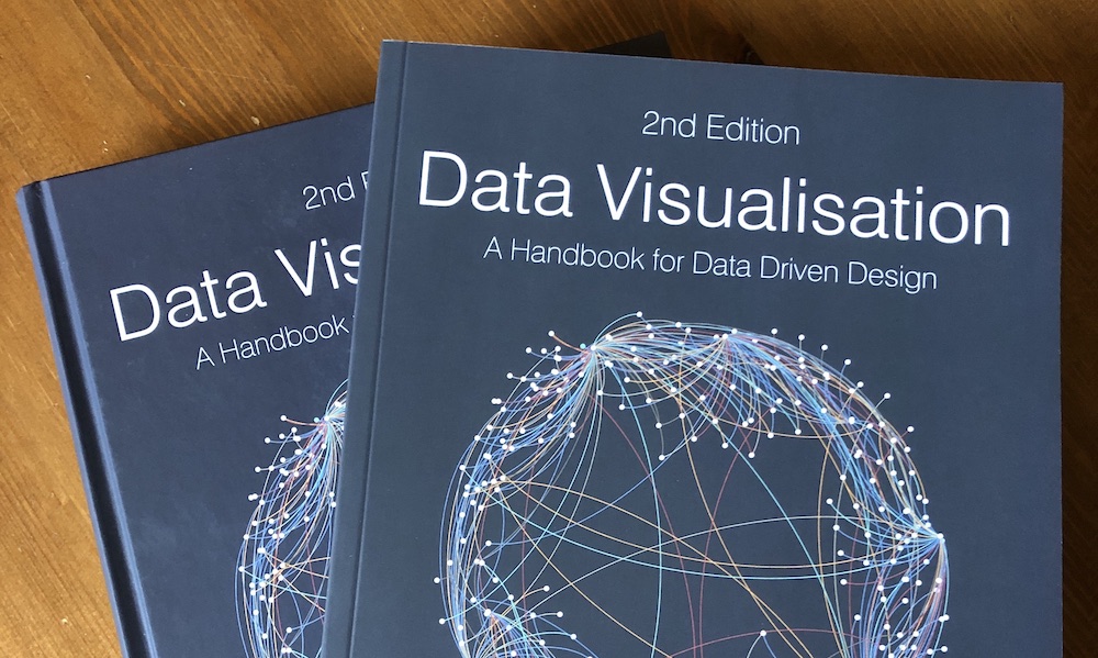
This is an appeal for anyone who has bought/read my book to possibly take out a few moments from their busy schedules to consider positing a rating and review on any book store selling it.
Please consider submitting a book review! Read More »
At the end of each month I pull together a collection of links to some of the most relevant, interesting or thought-provoking web content I’ve come across during the previous month. Here’s the latest collection from August 2019.
Best of the visualisation web… August 2019 Read More »
This is part of a series of posts about the ‘little of visualisation design’, respecting the small decisions that make a big difference towards the good and bad of this discipline.
The little of visualisation design: Part 68 Read More »
This is part of a series of posts about the ‘little of visualisation design’, respecting the small decisions that make a big difference towards the good and bad of this discipline.
The little of visualisation design: Part 67 Read More »
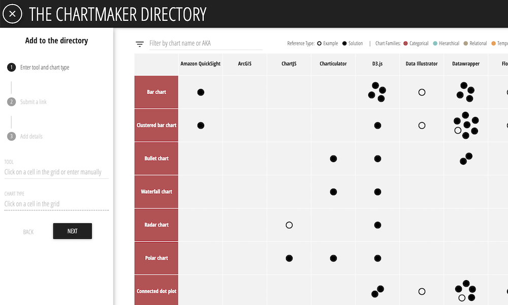
It is just over 2 years since I launched the Chartmaker Directory, an open resource to help people navigate through guidance on what charts can be made in which tools, and how. I’m delighted to note that we have just reached the milestone of 1000 references!
Chartmaker milestone! 1000 references Read More »
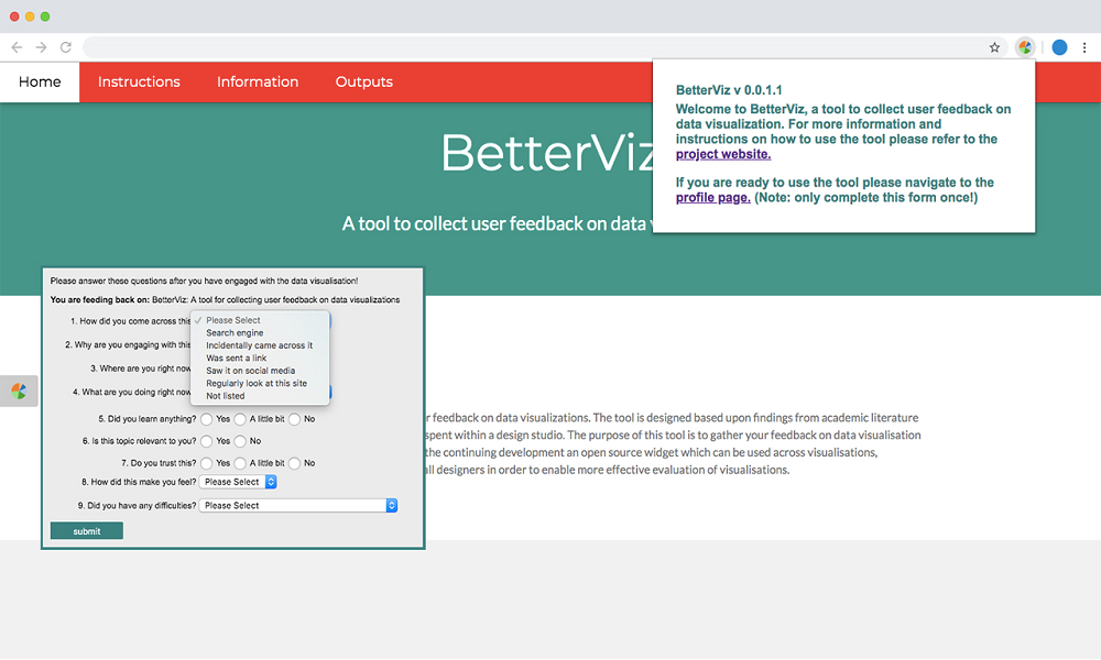
This post is from Arran Ridley, PhD Candidate at the School of Media and Communication, University of Leeds. Arran is working on a White Rose/ESRC funded project entitled ‘Measuring Visualisation Engagement’ which extends the work that originated from the Seeing Data project I was a member.
BetterViz: Understanding data visualisation effectiveness through a sociocultural lens Read More »
This is part of a series of posts about the ‘little of visualisation design’, respecting the small decisions that make a big difference towards the good and bad of this discipline.
The little of visualisation design: Part 66 Read More »