Announcements
Announcing the imminent release of my book!
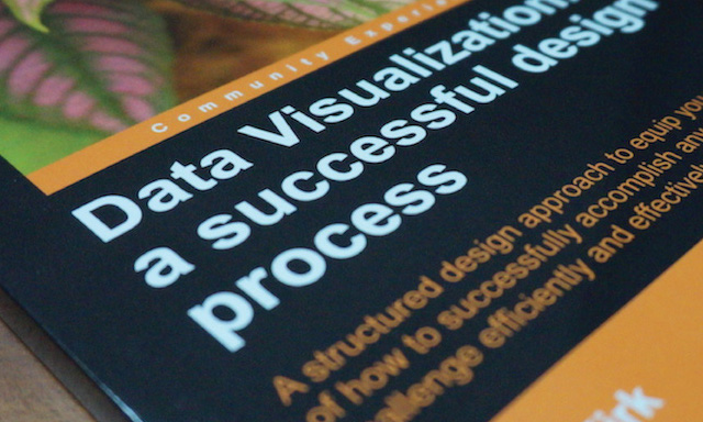
I’m delighted to announce that my book ‘Data Visualization: A Successful Design Process’ has finally been completed and is now ready to be published!

I’m delighted to announce that my book ‘Data Visualization: A Successful Design Process’ has finally been completed and is now ready to be published!

At the end of each month I pull together a collection of links to some of the most relevant, interesting or thought-provoking web content I’ve come across during the previous month. Here’s the latest collection from November 2012

Those of you with memories that stretch at least 362 days will recall my rather incendiary post (kind of) from December of last year that brought attention to the utter uselessness of Google’s 2011 Zeitgeist interactive report.

Confirming details of the finalised locations/venues for my forthcoming data visualisation training events that will taken place in Seattle, Seattle, San Francisco in January.
At the end of each month I pull together a collection of links to some of the most relevant, interesting or thought-provoking web content I’ve come across during the previous month. Here’s the latest collection from October 2012.
Following my recent visit to Johannesberg and Cape Town, I was interviewed by Gill Moodie for Journalism.co.za website, aimed at the Journalists of South Africa, to discuss ‘creating new kinds of stories with data visualisation’.
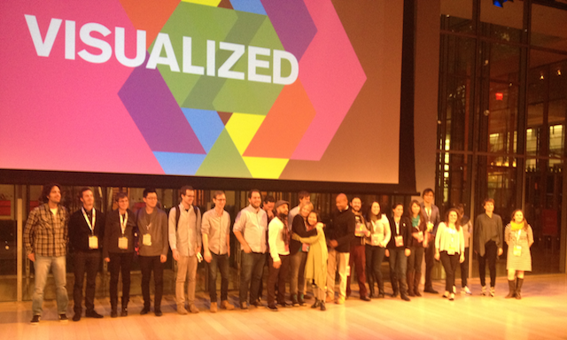
Back in August I shared details of the first ever ‘Visualized’ conference. The event has been taking place in New York over the past couple of days and so I wanted to share some quick reflections from what has been a fantastic event.

Came a cross a nice project yesterday developed by Distilled for the Trainline.com that visualises nearly 200 year of railway openings across Britain.
At the end of each month I pull together a collection of links to some of the most relevant, interesting or thought-provoking web content I’ve come across during the previous month. Here’s the latest collection from September 2012.
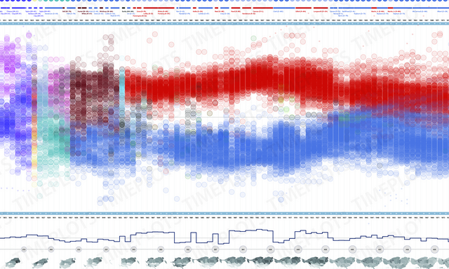
In the build up to next week’s US presidential elections, there are naturally many visualisation and infographic projects being released. A couple of contrasting projects have caught my eye about the ideological breakdown of the US Congress.

Just come across this great, simple and really effective project from Oliver O’Brien (@oobr) and James Cheshire (@spatialanalysis) of UCL CASA (Centre for Advanced Spatial Analysis).

Just want to alert everyone to an exciting and enlightening new blog that has been launched today. National Infographic is the perfectly titled blog of Juan Velasco, the Art Director of National Geographic magazine.
How many of you have heard of the Parsons Journal for Information Mapping (PJIM)? It’s a really good digital publication that comes out quarterly and covers data visualisation with articles on both the theoretical side as well as the practical, highlighting new developments, techniques and great projects from around the field.
Just to bring together the fragmented updates into a single announcement, I wanted to publish details of the finalised locations/venues for my forthcoming data visualisation training events that will taken place in November/December.
This is a final guest post from Jon Schwabish, an economist and data visualization creator, who has been keeping everybody up to date with the daily goings on at VisWeek.
This is a guest post from Jon Schwabish, an economist and data visualization creator. You can reach him at jschwabi@yahoo.com or by following him on Twitter @jschwabish. Many thanks to Job for his efforts to keep us poor folk who aren’t able to make it to this great flagship event.
This is a guest post from Jon Schwabish, an economist and data visualization creator. You can reach him at jschwabi@yahoo.com or by following him on Twitter @jschwabish. Many thanks to Job for his efforts to keep us poor folk who aren’t able to make it to this great flagship event.
This is a guest post from Jon Schwabish, an economist and data visualization creator. You can reach him at jschwabi@yahoo.com or by following him on Twitter @jschwabish. Many thanks to Job for his efforts to keep us poor folk who aren’t able to make it to this great flagship event.
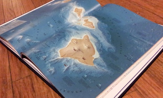
This has probably already been mentioned by other bloggers but, if not, there is a fascinating new book coming out this month called the ‘Atlas of Design’.
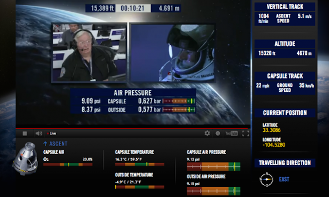
Large populations across the world will currently be viewing the live feed of the Red Bull Stratos mission – Felix Baumgartner’s attempt to break both the sound barrier in freefall and a 52-year-old record for highest-altitude jump.
At the end of each month I pull together a collection of links to some of the most relevant, interesting or thought-provoking web content I’ve come across during the previous month. Here’s the collection from August 2012.
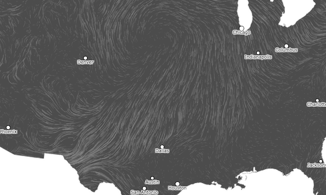
Given the attention on New Orleans and surrounding areas with respect to Hurricane Isaac, I’ve just taken a couple of quick screen recordings of Martin Wattenberg/Fernanda Viegas’ Hint FM ‘Wind Map’ and Stamen’s/TWC ‘Hurricane Tracker’ to show how things are developing down there.
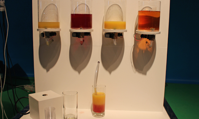
Tasty Tweets is a data visualisation experiment that expands the usual encoding options beyond simple visuals. Developed by students at the Copenhagen Institute of Interaction Design, the project allows users to explore current twitter trends through taste.

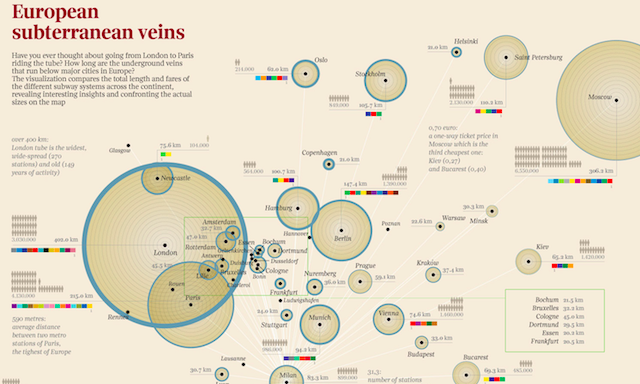
Corriere della Sera is an Italian daily newspaper (broadsheet) and La Lettura is a cultural supplement published in the Sunday edition of the newspaper. The supplement is highly regarded and includes articles and works from the most famous Italian experts
At the end of each month I pull together a collection of links to some of the most relevant, interesting or thought-provoking web content I’ve come across during the previous month. Here’s part two of the latest collection from July 2012.
At the end of each month I pull together a collection of links to some of the most relevant, interesting or thought-provoking web content I’ve come across during the previous month. Here’s part one of the latest collection from July 2012
About a month ago I announced the locations of my forthcoming series of ‘Introduction to Data Visualisation’ one-day training courses. After resolving some diary issues, I am finally now in position to announce the schedule of dates:
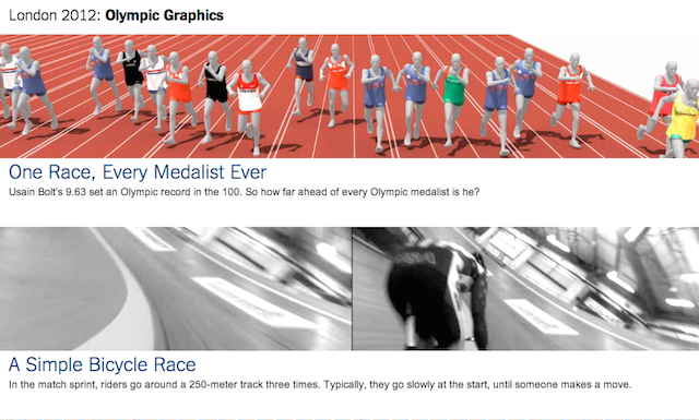
This post is not really an article more of a pointer to go elsewhere. Unless you’ve been absent from the data visualisation and infographics scene over the past 10 days, you can’t have failed to have come across one of the many amazing graphics that have been produced by the New York Times during the course of the Olympics.
Last Friday I posted my new data visualisation project titled ‘The Pursuit of Faster’. This was a project submitted for the Visualizing.org Olympics contest.
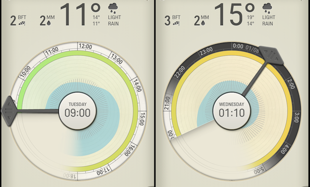
Last month I profiled a project titled ‘Energy technologies visualisation for the IEA’. Well, the Raureif folks have been busy and have just this week launched a stunning new data visualisation design in the form of a weather app for the iPhone called ‘Partly Cloudy’.