
Announcements
Visualising Data HQ on the move
After a happy two years living amongst the rolling hills and picturesque scenery of Hebden Bridge, this week, my wife and I are weighing anchor and moving back to the metropolis of Leeds.

After a happy two years living amongst the rolling hills and picturesque scenery of Hebden Bridge, this week, my wife and I are weighing anchor and moving back to the metropolis of Leeds.

On December 21st 2013 the New York Times published a project titled ‘How Y’all, Youse, and You Guys Talk’, developed by Wilson Andrews and Josh Katz. The project is based on Josh’s own research exploring ‘Regional Dialect Variation in the Continental US’ building on questions and data from the Harvard Dialect Survey, a linguistics project by Bert Vaux and Scott Golder.
The British Library will soon to be launching an exciting new season titled ‘Beautiful Science: Picturing Data, Inspiring Insight’. Running from 20th Feb to 26th May the season incorporates many events dedicated to the art and science of communicating data.

At the end of each month I pull together a collection of links to some of the most relevant, interesting or thought-provoking web content I’ve come across during the previous month. Here’s the latest collection from December 2013.

Below you will find an embedded slideshare version of the slides used in last week’s talk at the Design of Understanding 2014 conference. I also did a similar (but longer) talk to students on a Editorial Media Design course at Hogeschool Utrecht the day before.

It is always a thrill to be invited to contribute to a Data Stories podcast and last week I joined hosts Enrico and Moritz alongside Robert Kosara to review the major trends and developments during 2013 and preview the main hopes and expectations for 2014.
I was thrilled to be invited by George Aranda, editor of the excellent ‘Science Book a Day’, to take part in an interview about a range of visualisation-related themes and to discuss my book that he kindly profiled in December.

Big Data is a term that, according to the 2013 Gartner Hype Cycle, is reaching the ‘Peak of Inflated Expectations’ and about to face the slippery decline down the ‘Trough of Disillusionment’.
The Music Timeline is a new project from the Big Picture and Music Intelligence research groups at Google. The Big Picture group includes star names such as Fernanda Viégas and Martin Wattenberg.
I was catching up with my January RSS feeds earlier and my attention was drawn to an unusual item that had been reeled in from a site called ‘4-traders’.

I now have the final confirmed locations and dates for my data visualisation workshop schedule for the initial part of 2014. Chicago (16th May) and Montreal (19th) were the final outstanding pieces in the jigsaw.
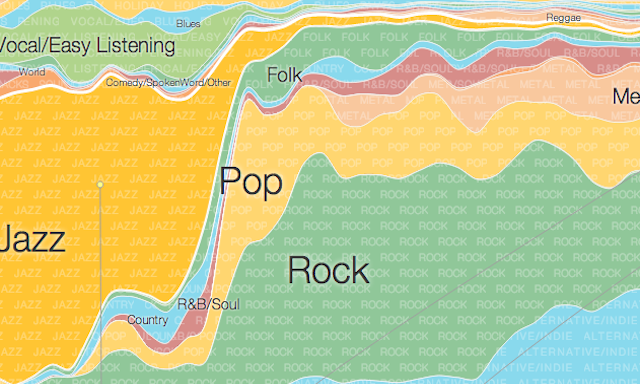
To mark the milestone of each mid-year and end of year I try to take a reflective glance over the previous 6 months period in the data visualisation field and compile a collection of some of the most significant developments.
At the end of each month I pull together a collection of links to some of the most relevant, interesting or thought-provoking web content I’ve come across during the previous month. Here’s the latest collection from November 2013.
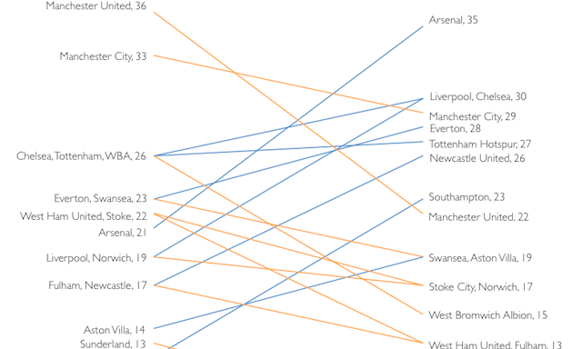
I love slopegraphs. I’m happy to nail my colours to the mast and declare it. I’d probably not go as far as to wear a t-shirt with such a slogan but I feel a need to express my praise for the still-underused slopegraph and try help continue spread the word of its worth.
At the end of each month I pull together a collection of links to some of the most relevant, interesting or thought-provoking web content I’ve come across during the previous month. Here’s the latest collection from October 2013.
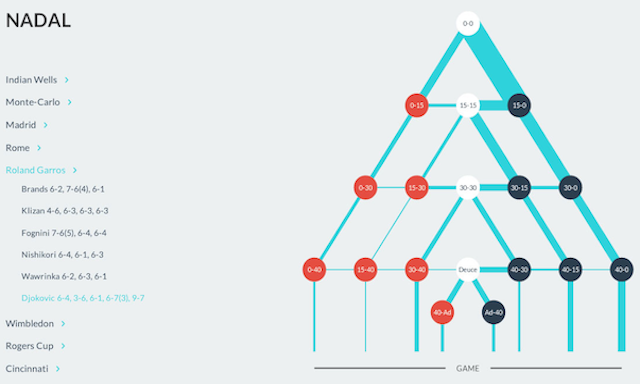
Really like this work from Damien Demaj to visualise a key facet of Rafael Nadal’s incredible 2013 season on the tennis tour. Damien runs GameSetMap, a blog that presents new ways of looking at tennis analytics and tennis spatial data in particular.
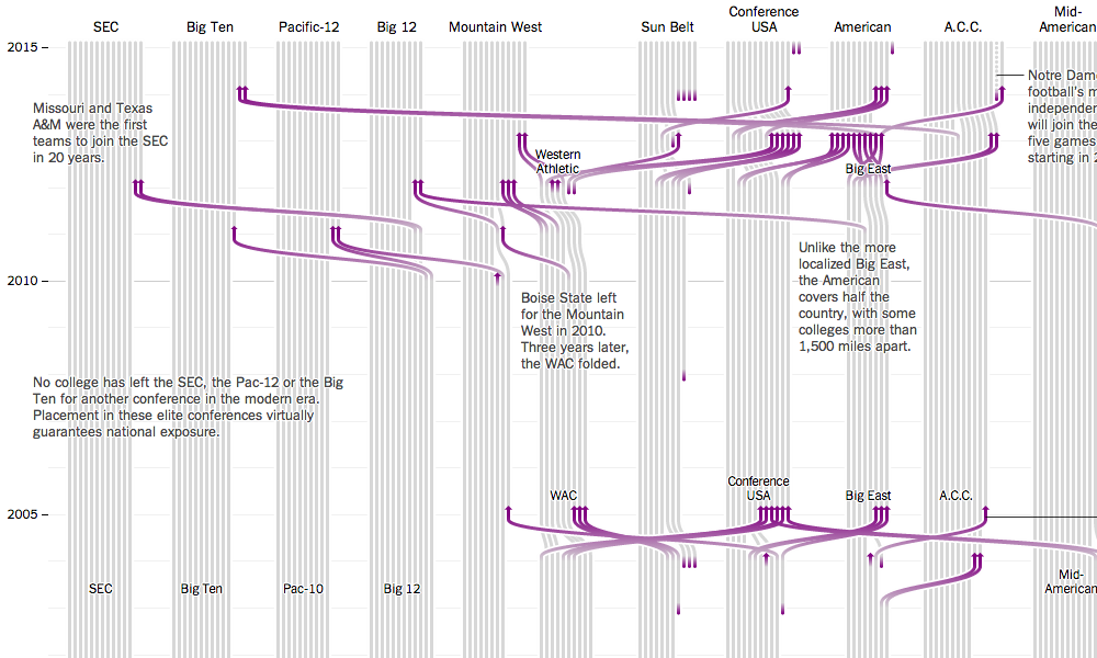
Just been looking in detail at the latest great project from the NYT’s ‘BosCarQue’ triumvirate, visualising the history of college athletics in the US. One of the elements that really grabbed me was the integration of a mini bar chart (sparkbars?) within the introduction text.
One of the re-occurring questions I get asked during or after a training workshop comes from delegates curious to know what tools were used to build ‘this’ or ‘that’ visualisation project.
A few weeks ago I invited suggestions for locations I should look to arrange my next schedule of public data visualisation training workshops up to around May 2014.
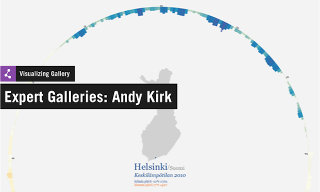
I was thrilled to be invited by Visualizing.org to compile the latest in their series of ‘expert galleries’. My choices were based on a selection of great time-based visualisation work.
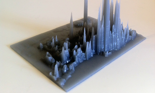
Last week I shared details of a treemap data art project, now here’s another way to transform your data into something more than just a form of communication.
Interesting to see news of MicrosStrategy’s release of a free tool called ‘Analytics Desktop’. In the various press releases I’ve seen it seems to be being pitched as a challenger to Tableau Public.
At the end of each month I pull together a collection of links to some of the most relevant, interesting or thought-provoking web content I’ve come across during the previous month. Here’s the latest collection from September 2013.
Details of a Treemap Art Project have come to my attention, showcasing data-generated artwork from one of the most influential names in data visualisation, Ben Shneiderman.
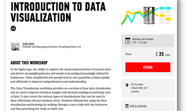
Quick announcement to say, thanks to General Assembly, I will be running a 90-minute evening introductory workshop on data visualisation, 19:45 to 21:15 on Monday 28th October. The cost is £25 per person.
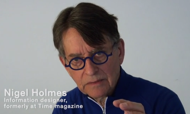
Here’s a nice 12 minute movie from Swissinfographics featuring some of the best names in infographic design discussing the challenge of achieving clear and functional designs, the essence of the graphic design style that originated from Switzerland in the 50s termed ‘Swiss Style’.
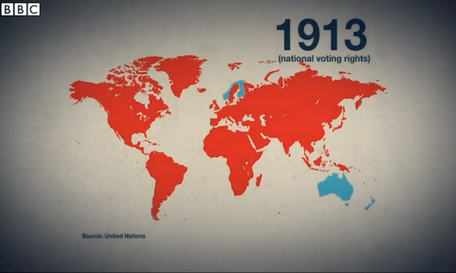
The BBC News website has today launched a new series titled ‘100 Women’, bringing together a range of interviews, profiles, articles and other digital content to look at the world we live in through the eyes of women.
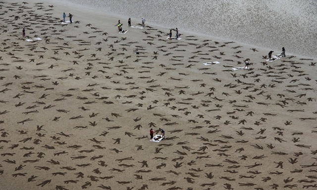
The Fallen 9000 was an artistic ‘event’ to coincide and mark International Peace day on 21st September. The project took place on the D-Day landing beach of Arromanches in France with the objective of representing the estimated 9,000 civilians, German forces and Allies who lost their lives on 6th June 1944.
At the end of each month I pull together a collection of links to some of the most relevant, interesting or thought-provoking web content I’ve come across during the previous month. Here’s the latest collection from August 2013.
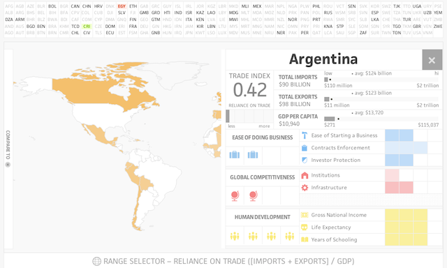
Launched yesterday comes a new interactive visualisation project and week-long accompanying series on global trade issues from ‘Ideas Lab’.