Articles

Metaphor too far? The anatomy of a visualisation designer

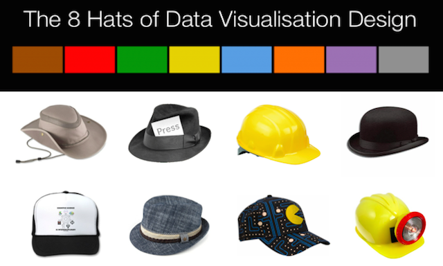
As I was writing my previous post about my thinking behind ‘The 8 hats of data visualisation design’ I realised that the theme of body parts was emerging strongly. So here’s an alternative perspective on this matter, throwing away the hats and switching on the Frankenstein lab… This is the super-hero visualisation designer I want

Metaphor too far? The anatomy of a visualisation designer Read More »

Visual.ly article “10 things you can learn from NYT data visualisations”

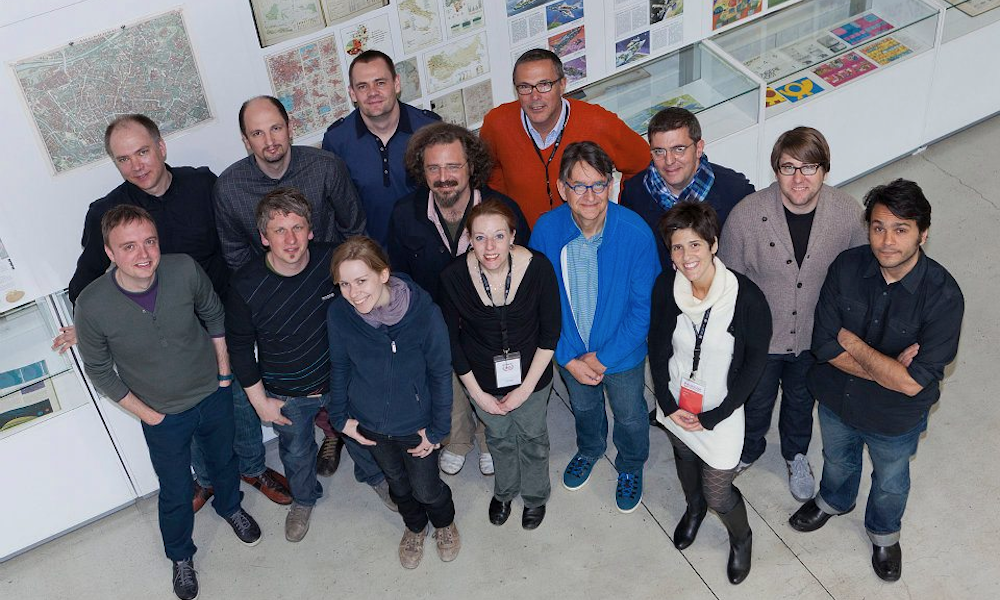
Really happy to have had the chance to publish a post on the impressive Visual.ly blog. In this article I have reflected on my experiences during the judging process at Malofiej and tried to isolate some of the most important characteristics of the all-conquering New York Times’ graphics department. Click on the preview image below

Visual.ly article “10 things you can learn from NYT data visualisations” Read More »