Data visualisation programmes and qualifications
The contents of this post are now published on the References page
Data visualisation programmes and qualifications Read More »
The contents of this post are now published on the References page
Data visualisation programmes and qualifications Read More »
“The Art of Clean Up: Life Made Neat and Tidy” is a new book by Swiss artist Ursus Wehrli presenting his wonderfully perfectionist’s eye for obsessively creating order where there is none.
The ‘Art of Clean Up’: creating order out of chaos Read More »
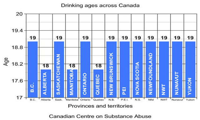
There is never a short supply of dumb charts, particularly thanks to the totemic uselessness of outlets like Fox news. However, sometimes you see an example that leaves you quite frozen with fascination: How did it come to be? What were they thinking? How many people let this pass through the approval for usage?
Dumb charts just got dumber Read More »
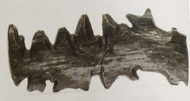
A theme of steadily increasing interest to me and many others in the field right now is the ideal of physical data visualisation. Not just visual sculptures as data art but actual tactile representations of data that maintain and offer function.
Tactile visualisations: Inuit wood maps Read More »
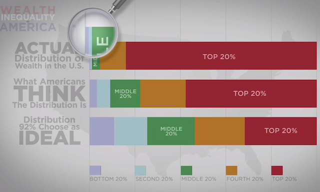
The video below has been hitting the social media circles today – though curiously not much within/across the data visualisation field – and I thought I would share it as a really great example of using video and narration to explain an interesting data-driven subject.
Video on the wealth inequality in the US Read More »
Over the past 18 months it has been a great thrill to have the opportunity to travel the world and deliver training courses in data visualisation.
Your chance to shape my training schedule Read More »
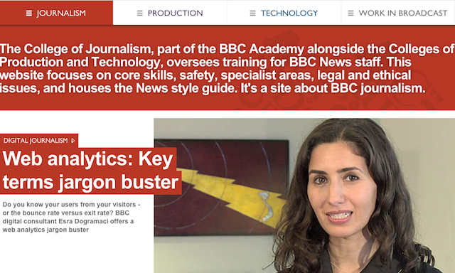
Came across this online resource by chance but the BBC College of Journalism site looks an excellent repository for some handy tips about all sorts of communication-related disciplines that can be applied to the practice of effective data visualisation
BBC College of Journalism Read More »
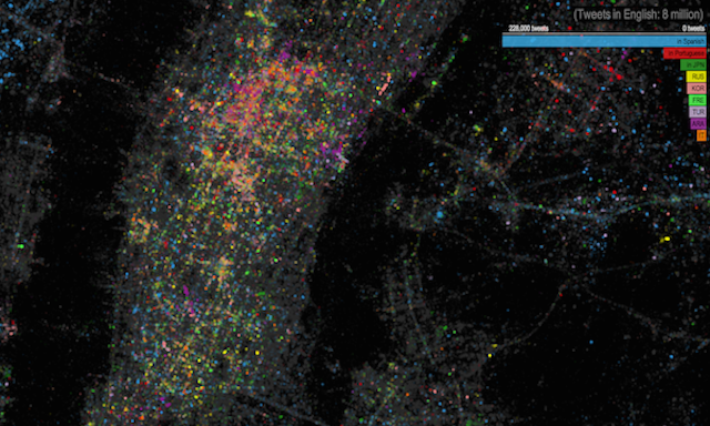
I’m not always positively struck by social-media related visualisations, however, I do like this Twitter languages map of New York project from James Cheshire, Ed Manley (of CASA) and John Barratt (of Trendsmap) – as well as several others.
Twitter languages map of NYC Read More »
At the end of each month I pull together a collection of links to some of the most relevant, interesting or thought-provoking web content I’ve come across during the previous month. Here’s the latest collection from January 2013.
Best of the visualisation web… January 2013 Read More »
Sometimes I find myself lazily defaulting to posting things on twitter but forget that, on occasion, they are of such grand importance that, really, they should be shared with the wider world. Here is one such example.
Visualising the strength of tea Read More »