This is part of a series of posts about the ‘little of visualisation design’, respecting the small decisions that make a big difference towards the good and bad of this discipline. In each post I’m going to focus on just one small matter – a singular good or bad design choice – as demonstrated by a sample project. Each project may have many effective and ineffective aspects, but I’m just commenting on one.
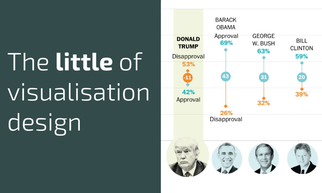
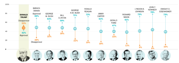
The ‘little’ of this next design concerns the value of consistent composition and style when using photo-imagery as an encoding or annotation device. The visualisation in focus here comes from the Washington Post and reflects on ‘Trump at 100 days‘.
It might appear to be a relatively simple matter, but gathering and preparing photo-imagery, especially people-based subjects like in the sequence of Presidential head-and-shoulders in this piece, can involve a lot of effort sourcing, editing and compiling each one. It is easy to take the elegance of the final solution for granted, especially in the pressured environment of media/news publishing: it is far more obvious to the eye when this effort has been absent – inconsistent face sizes, a jarring range of different facial expressions, subjects facing different directions, cropped foreheads, lack of care over the original image outlining/cropping.
Look closely at these and if we are being extraordinarily picky, you’d say the JFK (looking slightly upwards) and Eisenhower (facing to the right) images feel slightly inconsistent with the rest and I might have re-sized Clinton’s face a little larger to reduce the impact of his prominent shoulders, but there are always contextual factors to weigh up. Otherwise these look super nice, occupying the circular bubbles really neatly and with a suitable, cohesive overall style.
Other matters also come to the surface: what image would be most representative of Barack Obama, the young fresh-faced ‘yes we can’ guy or the grey-haired sage ‘I need a holiday’ guy? Do I have permission to use this image? The overall point is that this stuff isn’t always straightforward.
(Incidentally, look through the full project, see the ‘Washington DC’ diamond being used, perhaps similar to #LittleVis 33?


