This is part of a series of posts about the ‘little of visualisation design’, respecting the small decisions that make a big difference towards the good and bad of this discipline. In each post I’m going to focus on just one small matter – a singular good or bad design choice – as demonstrated by a sample project. Each project may have many effective and ineffective aspects, but I’m just commenting on one.
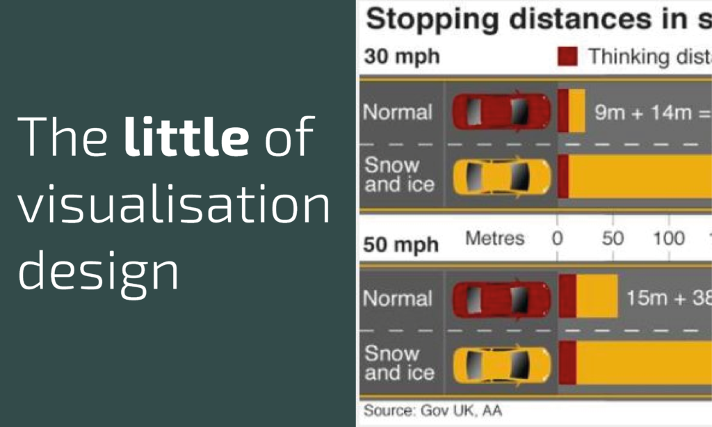
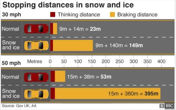
The ‘little’ of this next design concerns the potential consequence of misinterpretation caused by small (and probably very innocent) graphical errors. The work in question was published by the BBC during the recent heavy snow to offer advice about ‘stopping distances in snow and ice‘.
The problem with the original graphic, shown above, is the way a viewer may use the small car images to perceptually orientate their judgment of the size of the bars on the right hand side, showing the thinking and braking distances required for different speeds in different weather conditions. At first glance you might think that when travelling at 30 mph, in normal conditions, you only need to leave about a half-a-car length of distance for stopping, when the actual 23 metre stopping distance would be closer in equivalence to around 4/5 standard car lengths. (There is also confusion through the colouring of the cars and misleading association with red = thinking distance, yellow = braking distance).
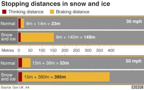
The original graphic has now been modified, probably due to the challenging coverage from commentators like Ben Goldacre on Twitter. Now the car icon is removed and only the bar measurements remain. Though this is an improvement, personally I would find it easier in a driving situation to think in terms of car lengths as the unit of judgement rather than only distances.


