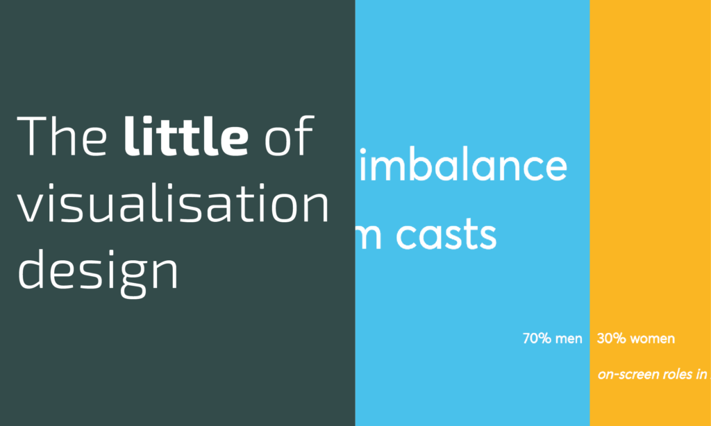
This is part of a series of posts about the ‘little of visualisation design’, respecting the small decisions that make a big difference towards the good and bad of this discipline. In each post I’m going to focus on just one small matter – a singular good or bad design choice – as demonstrated by a sample project. Each project may have many effective and ineffective aspects, but I’m just commenting on one.
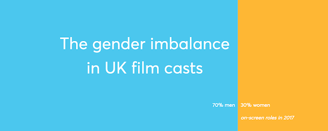
The ‘little’ of this next design concerns a neat way of squeezing more value from the space afforded to a project heading/title. The demonstration of this technique was found in a piece by Cath Sleeman for Nesta, titled ‘The gender imbalance in UK film casts‘.
This is a very straightforward device but something I’d never considered nor seen before. In the snapshot image above you see that the title space includes background colouring that doubles up as a stacked bar chart, showing the headline % split between male and female on-screen roles in movies. By placing this single, simple chart in the relatively dead space that would otherwise exist beneath and around the heading, it efficiently offers up an immediate visual to support the focus of the report that follows.


