This is part of a series of posts about the ‘little of visualisation design’, respecting the small decisions that make a big difference towards the good and bad of this discipline. In each post I’m going to focus on just one small matter – a singular good or bad design choice – as demonstrated by a sample project. Each project may have many effective and ineffective aspects, but I’m just commenting on one.
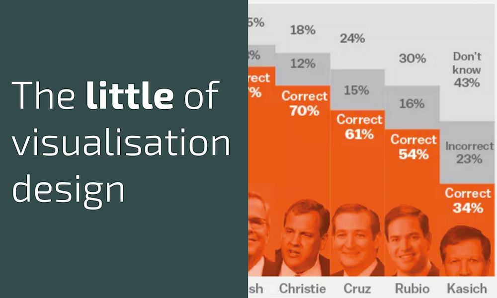
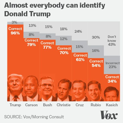
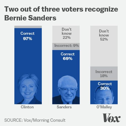
The ‘little’ of this next design concerns the juxtaposition of photo-imagery within a chart display. In this analysis by Vox 2,000 voters were surveyed to find out which of the 2016 candidates they were able to correctly recognise. The charts produced show the breakdown of the results and (logically) include a small image showing the faces of each candidate for reference.
One of the subtle design choices I like here is the deliberate cropping of the least recognised candidates’ images. Due to the smaller ‘correctly recognised’ values, the available space to accommodate the images is already diminished*. Rather than see this as a reason to relocate or perhaps proportionally shrink the images, notice how the faces of Kasich and O’Malley partially disappear below the axis, editorially reinforcing the findings of the analysis.
(* Incidentally, I probably wouldn’t normally repeat the value label word ‘Correct’ on each bar – once should be enough – and so removing this would create more space in practice).


