
This is part of a series of posts about the ‘little of visualisation design’, respecting the small decisions that make a big difference towards the good and bad of this discipline. In each post I’m going to focus on just one small matter – a singular good or bad design choice – as demonstrated by a sample project. Each project may have many effective and ineffective aspects, but I’m just commenting on one.
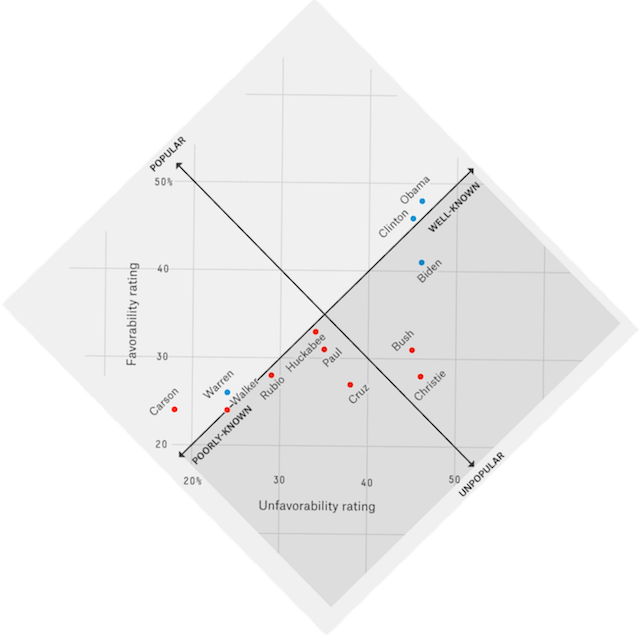
The ‘little’ of this next design concerns creative thinking about the most meaningful orientation of a chart, in this case a scatterplot produced by FiveThirtyEight that shows analysis about the average favourability and unfavourability scores of a range of political names across the first few months of 2015.
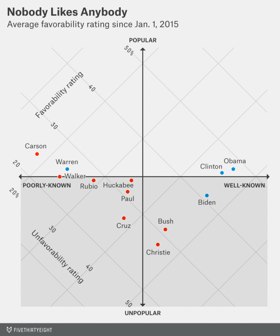
Rather than leave the chart in its typical y-axis up/x-axis across layout, it is rotated clockwise by 45° to draw focus on the relative mapping of the plotted records according to four meaningful quadrant regions within the chart, indicating the general popularity and profile of each politician. In particular, and substantiated by colour, there is vertical significance in being more popular (above the line) and less popular (below the line).
Although some readers may find it a little more challenging, as a consequence of this rotation, trying to read off the coordinate values compared to the more standard approach (simulated below), the presentational emphasis on the meaning of the position rather than the position itself represents an astute editorial choice.
(See also this chart by Adam Pearce)
