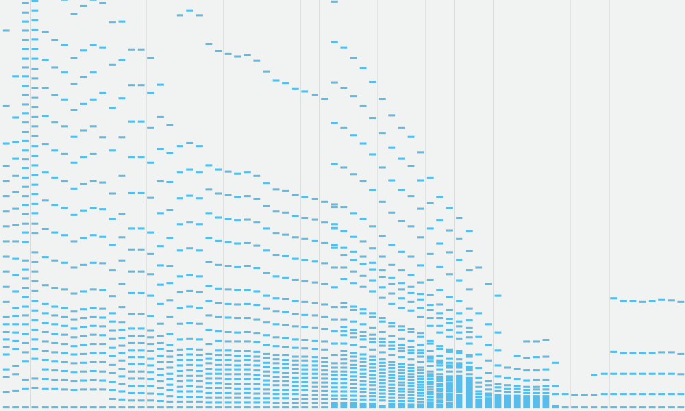
Best of the visualisation web… October 2015
At the end of each month I pull together a collection of links to some of the most relevant, interesting or thought-provoking web content I’ve come across during the previous month. Here’s the latest collection from October 2015.
Best of the visualisation web… October 2015 Read More »


